Story by Dylan Opet
In the last four posts, we’ve talked about why users make certain decisions. Now, let’s talk about how long they take. While it may not seem as exciting, Hick’s Law, which explains how fast people make choices, is one of the most important psychological principles in all of UX. Put simply, Hick’s makes it quick.
This post is part of a 9-part series on UX psychology. The next post in the series will be coming soon.
What is it?
Hick’s Law, or the Hick-Hyman Law, says that it takes more time to make a lot of complex choices than it does to make a few simple ones.
Think of your app as a restaurant menu. If your menu is super long, people will take forever to order.
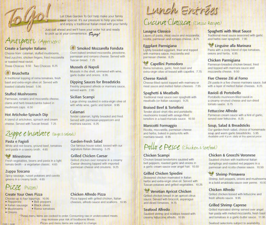
But if your menu is short, people will order super quickly.

A shorter menu means a shorter order time. You don’t need to be a psychologist to figure that out.
Of course, the real genius of Hick’s Law is in the details.
Hick’s Law Explained

Anyone can remember “Hick’s makes it quick,” but that’s only scratching the surface. The real nugget of gold is the mathematical formula used for figuring out reaction time (if you hate math, just skip to the “So What?” section).
The formula goes as follows:
Reaction Time = b log2 (n + 1)
In this equation, “b” is just a constant, so don’t worry about it. The “n” is what matters because it represents the number of choices. The relationship between “n” and “reaction time” is logarithmic, as shown below.
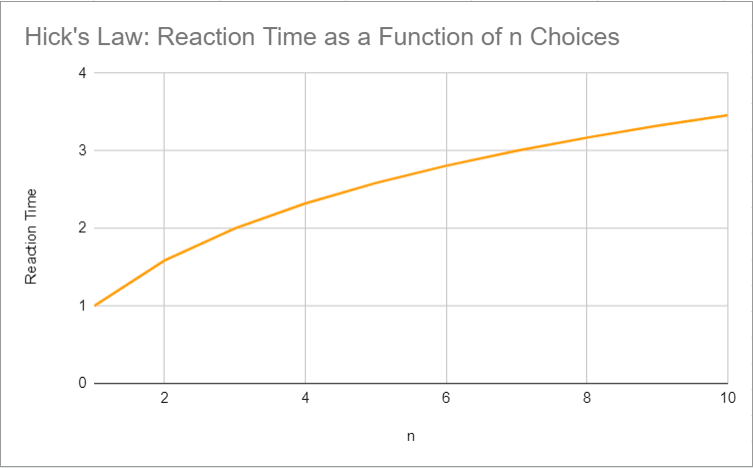
The graph shows that adding more choices can make a process take much longer–especially when you only have a few choices to begin with. In this example, one choice only takes the user one unit of time. However, a decision between eight choices will take more than three times as long. Of course, this example uses no real data, and real apps will all be different. However, the rule remains the same.
So What?
Time matters. If users spend too much time making a choice, the UX suffers. Maybe the user will pick an option you don’t want, or maybe they’ll get frustrated and stop using the app altogether. At the very least, they won’t enjoy the experience. To make the UX as user-friendly as possible, limit choices. Here are a few applications of Hick’s law to get you started.
Hick’s Law In The Real World

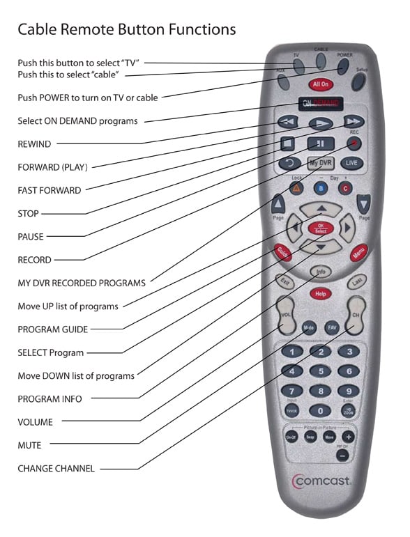
We’ve been over restaurant menus already, but there are lots of other examples of Hick’s Law in real-world interfaces. One of the greatest examples of Hick’s law in the real world is the TV remote. Most remotes are so confusing that websites like Boomer Tech Talk need to make a button diagram before people can understand how to use it.
Apple’s reaction was to make the remote simpler. The apple remote is much easier to understand. More importantly, users don’t have to spend so much time figuring out how to use it.
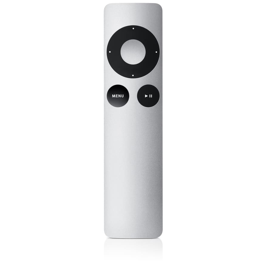
However, reaction time isn’t everything. Many people still hate the apple remote because it lost so much functionality. In response to this uproar, Swiss TV developed the alternative Salt remote. You can read more about the Salt remote in this Verge article.
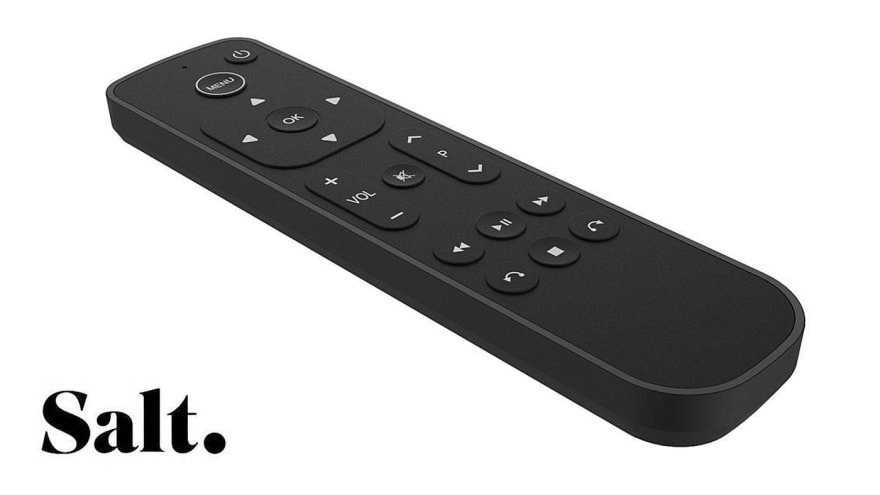
Salt still has 37 fewer buttons than the Comcast remote depicted above, but it has significantly more functionality than the three-button Apple remote. While both Apple and Salt use Hick’s Law to make the user experience more enjoyable, Salt also remembers to retain core functionality.
The same rule applies to any other simplification redesign: make things simpler without ruining your functionality.
Hick’s Law In Web Design

Let’s stop worrying about TV remotes and restaurant menus and start focusing on website menus instead.
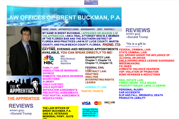
Hick’s law is incredibly important for web design. In fact, the worst websites on the internet are almost universally characterized by having too many options. For instance, take a look at the horrendous Brent Buckman website. It looks like a horrible Saul Goodman parody.
Even more atrocious (though oddly charming) is Ling’s Cars. The website is so busy that it’s hard to decide where to begin.
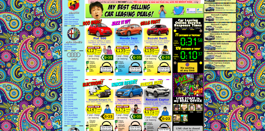
In addition to violating almost every web design rule in the book, Ling’s Cars lists way too many options. It’s hard to know where to start.
Modular Mining, on the other hand, is much easier to use. We built them a two-tier navigation system, which divides a lot of content into small, digestible pieces.

In total, this menu contains a whopping 34 options–that’s way too many to list at once. It would take users about 5.09b seconds to make a choice.
However, two-tier navigation solves that problem by splitting up the choices. Instead of choosing from 34 options at once, users never need to choose from more than seven. As a result, decision-making is up to five times as fast!
Want to learn more about this project? Read our case study!
Hick's Law in ECommerce

Getting people to buy things is hard.
When a shopper has to enter all their shopping data at once, they won’t purchase items as quickly–and slower purchasing is bad for business. If a shopper waits a long time then they won’t be as likely to buy from your website. That means you will likely see much more cart abandonment.
Want to boost sales? Use Hick’s law.
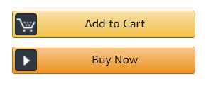
That’s what Amazon did. Now, customers don’t need to go through a lengthy checkout process every time they need to order something. Instead, they can simply click the “buy now with one click” button.
This simple change removes many of the time-consuming steps that prevent customers from buying things in the first place. As a result, cart abandonment plummets.
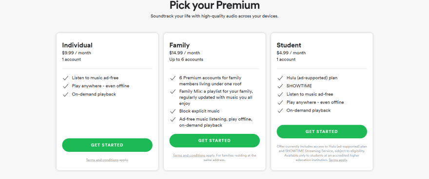
Subscription models function on the same psychological principles. They work because the user has to go through more steps to cancel the subscription than to make another monthly purchase. If customers had to re-enter their credit card information each month, Spotify Premium possibly would not be as popular.
Either way, Hick’s Law is extremely important in eCommerce. If you cut out extra steps, people will spend more money.
Hick’s Law In App Design

Hick’s Law is one of the most popular and important psychological principles in all of app design, and it’s easy to see why: modern UX is pretty much defined by Hick’s law. Don’t agree? Let’s look at some of the biggest trends in UX.
Linnear Navigation is the most obvious product of Hick’s Law. Once you start mapping out flowcharts, Hick’s Law becomes abundantly clear.
Take a look at a linear flowchart. Each step has its own screen, making the entire process more streamlined.

Even though some screens have several different options, each step has its own page. The alternative, where all the data is included on one page, would be a disaster. Linear navigation is much simpler.
The sheer popularity of linear navigation is proof that Hick’s Law works. While your app doesn’t need to be completely linear, consider how it could be streamlined.
Every app is different, so no two systems should apply Hick’s Law in exactly the same way. To explore how you can use psychology to create a more human-focused UX, reach out to us online or call us at 844.526.2253

Top comments (1)
Some comments may only be visible to logged-in visitors. Sign in to view all comments.