
Next.js is a React framework that optimizes your application, speeding up the development and production phases. It provides server-side rendering, search engine optimization, and a variety of other unique capabilities in your web application. On their official website, you can learn more about what Next.js has to offer.
Styles can help you create amazing layouts and a distinctive user experience for your web application. This allows easier navigation within the application. In this article, we'll look at how to use one of the various style frameworks and libraries available to create a customized theme.
What is Chakra UI?
Chakra UI is a basic component-level-based React library. It features a number of components that are adaptable and simple to utilize in your application. When developing the user experience of a web application, Chakra UI speeds up the development process.
Getting Started
To successfully create a Next.js application, use the following command:
npx create-next-app@latest
Install Dependencies
Following that, we'll look at how to add the Chakra UI library to a Next.Js application. We’ll use one of the instructions provided in the code blocks below:
yarn add @chakra-ui/react @chakra-ui/icons @emotion/react@^11 @emotion/styled@^11 framer-motion@^6
or
npm i @chakra-ui/react @chakra-ui/icons @emotion/react@^11 @emotion/styled@^11 framer-motion@^6
The instructions in the code block above will be used to configure Chakra UI in our Next.js application.
Chakra UI Set up
To utilize Chakra UI in your Next.js application, add the following code block to /pages/_app.js to import ChakraProvider at the root of your application:
import { ChakraProvider } from '@chakra-ui/react'

function MyApp({ Component, pageProps }) {
  return (
    <ChakraProvider>
      <Component {...pageProps} />
    </ChakraProvider>
  )
}

export default MyApp
Styling a Next.js app With Chakra UI
By leveraging the capabilities the library offers, Chakra UI makes it extremely simple to style components in your Next.js application. We’ll import components from Chakra UI and style them using the code block below in /pages/index.js:
import { Container, Box } from '@chakra-ui/react'
import Head from "next/head";

export default function Home() {

 return (
   <Container>
     <Head>
       <title>Create Next App</title>
       <meta name="description" content="Generated by create next app" />
       <link rel="icon" href="/favicon.ico" />
     </Head>

       <Box bg='teal' w='100%' p={4} color='white'>
          This is the Box
       </Box>
   </Container>
 );
}
The Container and Box components were imported from @chakra-ui/react as seen in the code block above. The Box component is utilizing the style props that Chakra UI provides. We used the following props: bg (short for background), w (short for width), and p (short for padding).

Color Mode in Next.js
By default, the Chakra UI Color Mode feature allows you to alter the color mode in your application. We can utilize the functionality to theme our application to specify the color we want to appear in dark mode, light Mode, or system theme for our layout or components.
The following code block will be pasted into the newly created file /styles/theme.js:
import { extendTheme } from "@chakra-ui/react";

export const theme = extendTheme({
  initialColorMode: "dark",
  useSystemColorMode: false,
});
export default theme;
From the code block above, we imported extendTheme, which accepts an object used to quickly override or modify the Chakra UI theme. The initialColorMode, which can be adjusted to dark, light, or system, allows us to choose the theme of our application. Additionally, useSystemColorMode accepts a boolean value, allowing use of the system’s theme.
To utilize theme.js, we’ll create a new component, /pages/_document.js, and insert the following code block into it:
import { ColorModeScript } from '@chakra-ui/react'
import NextDocument, { Html, Head, Main, NextScript } from 'next/document'
import theme from '../styles/theme'

export default class Document extends NextDocument {
  render() {
    return (
      <Html lang='en'>
        <Head />
        <body>
          <ColorModeScript  initialColorMode={theme.initialColorMode}  />
          <Main />
          <NextScript />
        </body>
      </Html>
    )
  }
}
The code block above shows ColorModeScript, which accepts a prop initialColorMode. This allows us to toggle between light and dark themes with ease.
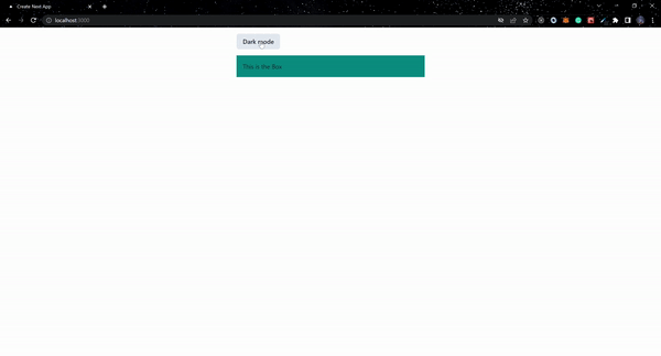
Next, we’ll modify /pages/index.js to use the useColorMode hook, which gives access to the current color mode. To use it, add the following code block:
import { Container, Box, Button, useColorMode } from '@chakra-ui/react'
import Head from "next/head";

export default function Home() {
const { colorMode, toggleColorMode } = useColorMode();

 return (
   <Container>
     <Head>
       <title>Create Next App</title>
       <meta name="description" content="Generated by create next app" />
       <link rel="icon" href="/favicon.ico" />
     </Head>

       <Button my={4} onClick={toggleColorMode}>
          {colorMode === "light" ? "Dark mode": "Light mode"}
        </Button>
       <Box bg='teal' w='100%' p={4}>
          This is the Box
       </Box>
   </Container>
 );
}
Custom Styles with Chakra UI
In this section, we'll look at how to create custom styles for the Chakra UI components. This will allow us to control which colors appear when we switch between light and dark modes. Moving on, we will modify theme.js to add custom colors to our application:
export const theme = extendTheme({
  initialColorMode: "dark",
  useSystemColorMode: false,
  colors: {
    primary: {
      dark: "#003100",
      light: "#e6f6e6",
    },
    secondary: "#009400",
    text: {
      dark: "#000",
      light: "#fff"
     },
    icon: '#ffd700',

  },
});
We now have custom colors of primary and secondary with dark and light color values in the code block above.
After that, we'll design unique styles for the Text and Button components. The mode function in Chakra UI accepts two arguments for dark and light modes.
Moving forward, we’ll now create /styles/ButtonStyles.js using the code block below:
import { mode } from "@chakra-ui/theme-tools";

export const ButtonStyle = {
  baseStyle: {},
  sizes: {},
  variants: {
    primary: (props) => ({
      color: mode("text.light", "white")(props),
      bg: mode("primary.dark", "secondary")(props),
    }),
  },
  defaultProps: {},
};
Also, we will create /styles/TextStyles.js:
import { mode } from "@chakra-ui/theme-tools";

export const TextStyle = {
  baseStyle: {},
  sizes: {},
  variants: {
    primary: (props) => ({
      color: mode("text.dark", "text.light")(props),
    }),
  },
  defaultProps: {},
};
The variants object takes in a primary function with a prop that indicates whether the current color mode is dark or light, and the function also returns an object from the above code block. We then utilize the mode function provided by Chakra UI to define what color appears when we flip between dark and light modes.
To utilize the custom component styles from the preceding code blocks, we’ll import them into theme.js and apply the styles to the components object in the following code block:
...
import { TextStyle as Text } from "./TextStyles";
import { ButtonStyle as Button } from "./ButtonStyles";

...
 components: {
    Text,
    Button,
  },
...
Customize a Component Using useColorModeValue
The useColorModeValue hook accepts two arguments: the light mode value and the dark mode value. It is used to switch between styles based on the color mode. Using the code block below, we will import the hook and modify index.js:
...
const bg = useColorModeValue("primary.light", "primary.dark");
...
...
<Box bg={bg} w='100%' p={4} color='white'>
 This is the Box
</Box>
...
Chakra UI Theme Using Color Mode
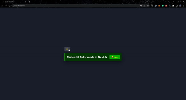
In this section, we’ll theme our application using the custom styles we created. Next, /pages/index.js will be modified:
import {
  Box,
  Button,
  Container,
  Text,
  useColorMode,
  useColorModeValue,
} from "@chakra-ui/react";
import Head from "next/head";
import { MoonIcon, SunIcon } from "@chakra-ui/icons";

export default function Home() {
  const { colorMode, toggleColorMode } = useColorMode();
  const bg = useColorModeValue("primary.light", "primary.dark");

  return (
    <Container
      h="100vh"
      display="flex"
      justifyContent="center"
      alignItems="center"
      maxW='container.sm'
    >
      <Head>
        <title>Create Next App</title>
        <meta name="description" content="Generated by create next app" />
        <link rel="icon" href="/favicon.ico" />
      </Head>

      <Box>
        <Button onClick={toggleColorMode}>
          {colorMode === "light" ? <MoonIcon /> : <SunIcon color="icon"/>}
        </Button>
        <Box
          bg={bg}
          w="100%"
          p={4}
          display="flex"
          mt="4"
          alignItems="center"
          cursor="pointer"
          borderLeft="6px solid"
          borderColor="secondary"
          borderRadius="5px"
          boxShadow='dark-lg'
        >
          <Text variant="primary" fontSize="24px" fontWeight="bold" mr="1.5rem">
            Chakra-UI Color mode in Next.Js
          </Text>
          <Button variant="primary">
            😀 open
          </Button>
        </Box>
      </Box>
    </Container>
  );
}
For the aim of switching between light mode and dark mode, the useColorModeValuehook and the custom component styles are used in the code block above.
Conclusion
This article explored how to style a Next.js application using Chakra UI, and how to create custom styles for the components the library offers. In addition, we used the Chakra UI color mode feature to create custom themes using the extendTheme function. To learn more about the library, visit the official documentation of Chakra UI. Also, you can get all of the code for this article on my GitHub repository. Visit chakra-ui-color-mode to test out the live version.

Top comments (0)