Introduction
SharePoint Framework version 1.21 is in RC at the time of writing and I couldn’t resist to try one of the new functionalities: the support to flexible sections.
I’m writing about a SPFx release candidate version, the final release can differ from the RC.
Flexible sections are a great new feature in SharePoint Online. Those sections enables a more customizable layout inside SharePoint pages. Covering this new feature is not the main scope of this blog post, if you want to know more about flexible sections check out the release article here.
By default, in a flexible section, all the custom web parts are supported. Here I want to cover how you can customize the default appearance of your web part.
To demonstrate this new feature I’ve created a sample solution, which shows something less than the default generated one. You can find the solution here.
Show me the code
Unlikely my usual sample blog post I will start with the code first and then show you the results.
As said before, by default, you don’t need to update your code in order to support flexible layout but you can update your code to specify a default behavior in the flexible sections.
To specify a custom flexible layout configuration you will need to update your web part’s manifest.json file with the following code:
"flexibleLayoutSizing": {
  "defaultRowHeight": <number>,
  "defaultColumnWidth": <number>
}
As the name suggest, the defaultRowHeight and defaultColumnWidth are used to set respectively the default height and the width of the web part in a flexible section.
When I first saw this JSON my question was: ok, but what number should I use?
The numbers specified here refer to how many “ squares ” you want your web part to occupy. Let me explain further. When you use a flexible section and drag an element onto it, you’ll see a grid made up of columns and rows. The intersections of these columns and rows form squares. The numbers you enter in the flexible layout configuration determine how many of these squares the web part will occupy by default. To have a better idea, here is a page in edit mode with a flexible section where I started dragging a web part:
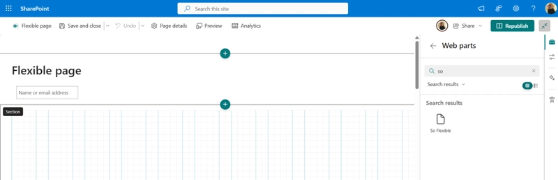
In the screenshot above, in the lower part, you can see a flexible section in action. When you start dragging a web part the grid will be shown and you are able to place the web part wherever you want. The grid you see here is the one I was explaining a short while ago, here you can see what I call “squares”.
Now that we have an idea of what’s the code, let’s see how the visual appearance change based on the flexible layout configurations.
Visual appearance
In this section I want to show three different configurations changing the flexibleLayoutSizing properties.
Set the width
Starting with the defaultColumnWidth property, as the name suggest, I am setting the default column width (in “squares”):
"flexibleLayoutSizing": {
  "defaultColumnWidth": 36
}
This will correspond to the following UX when dragging the web part:

If you count the horizontal “squares” you will see that the web part, as the configuration reads, is taking 36 “squares”.
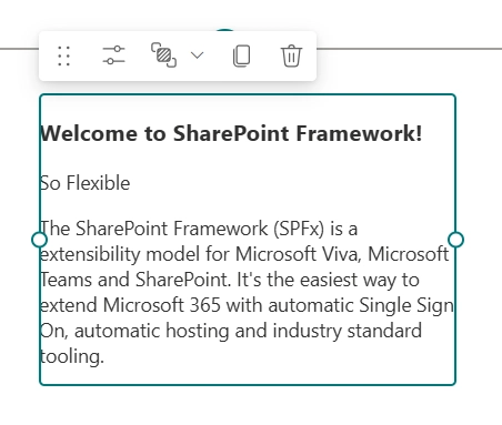
And will result in the following web part being placed in the flexible section:

Set the height
In this section, similar to the precedent, I am setting only one of the two dimensions. In this case I am specifying the defaultRowHeight property:
"flexibleLayoutSizing": {
  "defaultRowHeight": 8
}
As a result, the UX will update accordingly and show that the web part, by default, takes up to 8 vertical “squares” when it’s been dragged:

Of course, when I finish dragging the web part, it gets placed in the flexible section with the default height dimension:

Set both dimensions
I’ve shown how to set the default width and height of the web part, now let’s try setting both of them at the same time:
"flexibleLayoutSizing": {
  "defaultColumnWidth": 18,
  "defaultRowHeight": 12
}
Now, when dragging the web part, the preview will take 18 columns and 12 rows:

And the result is a little bit different than the previous example:
Conclusions
The new flexible sections are an amazing new feature in SharePoint Online and I think that we, as developers, should declare the flexible layout settings when developing our web parts. In the end is as simple as setting a JSON object which I think it’s pretty easy and convenient.
If you want to discover more about the release candidate of the SharePoint Framework version 1.21 you can have a look at the release notes here.
Hope this helps!

Top comments (0)