This is the second part of the Flutter series, that will get you started with Flutter. In the first part we learned what Dart is, and we sat up a simple ‘Hello world’-app. In this second part we will dig a little deeper into Flutter and build our very own Pokedex app.
If you are participating in IT Minds’ Tech Talent Night about Flutter you can use this article for reference.
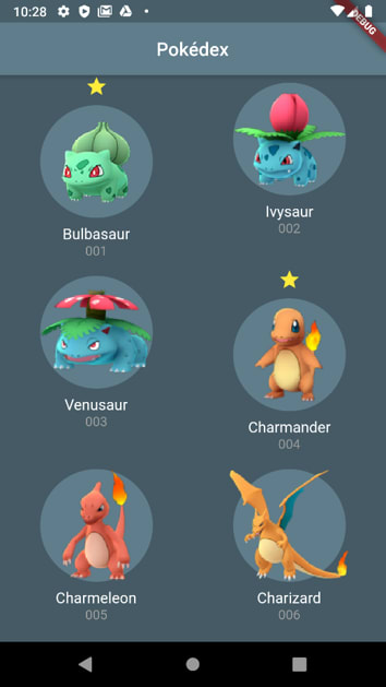
We will be building the following app:
The Setup
This article is solely based on getting to know the different Flutter widgets, therefore we will not setup HTTP calls and fetching data. Instead, we will be building upon this repository, where fetching data is already implemented. If you want an article based on data fetching, calling APIs and handling advanced state in Flutter, let me know by leaving a comment in the discussion section below.
Start by cloning the repository, this can be done by running the following command:
Git clone https://github.com/rsr-itminds/flutter-workshop.git
If you are feeling confident, I strongly encourage you to go ahead and solve the assignments yourself, and then use this article if you get stuck. The assignments and a slideshow can be found in the /docs folder. There are also two branches besides the master branch. One containing the finished app, and another containing a solution to the extra assignments.
Now run flutter run from within the repository folder or press F5 if you are using Visual Studio Code to launch the app. Pressing F5 will launch the app in debug mode. The app should look like this:
Building the Pokedex
In this section we will start building the pokedex itself. We will simply be solving the assignments found in the /docs folder one-by-one.
After cloning the repository, open the lib/main.dart file. Here you will find the runApp()-function, the Material- and Scaffold-widgets, that you learned about in part one. This is the base of our app. Besides those familiar concepts there is also a buildPokemonScreen()-function and a fetchPokemonsFromApi()-function.
fetchPokemonsFromApi() simply fetches the data from the API, and returns a list containing our Pokemons. The Pokemon model itself can be found in the lib/models folder. The buildPokemonScreen() calls the fetchPokemonsFromApi() and displays a HomeScreen-widget, which accepts the list of pokemons.
Using a GridView
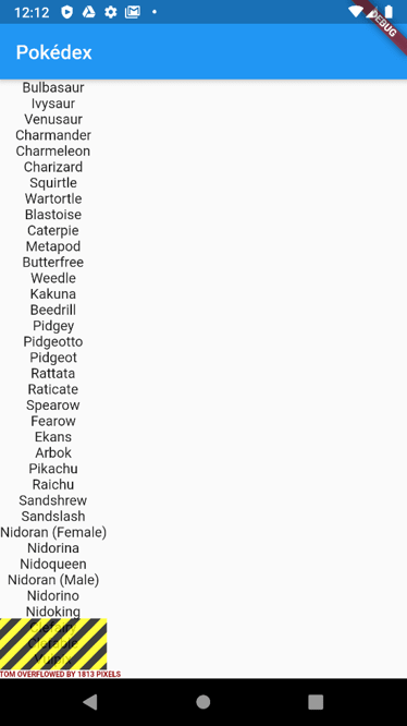
The list of Pokemons overflows the bottom of the screen, hence the black and yellow stripes, and you are not able to scroll through all the Pokemons. This happens in the HomeScreen-widget, which can be found in the screens folder. Right now, the HomeScreen-widget looks like this:
class HomeScreen extends StatelessWidget {
  final List<Pokemon> pokemons;

  HomeScreen({this.pokemons});

  @override
  Widget build(BuildContext context) {
    // Map the list of Pokémons to a list of Text widgets
    List<Widget> list = pokemons.map((p) => Text(p.name)).toList();

    // Show the Text widgets in a Column widget
    // Todo: return a GridView instead
    return Column(children: list);
  }
}
The widget accepts a list of Pokemons and displays them using a Column. We want the Pokemons to be layed out in a Grid. For that purpose, Flutter has a widget called GridView, which can be used like this:
return GridView.count(crossAxisCount: 2, children: list);
So instead of returning a Column, we are now returning a GridView, which has two items in the cross axis.

The black and yellow stripes disappeared, and we are now able to scroll through all our Pokemons.
Your first widget
To improve the quality of the app, we want to show more than just the name of the Pokemon. For this purpose, we are going to make our own widget. In the lib folder, make a new folder called widgets, and in there create a new file called pokemonGridItem.dart. In this new file create a new class that is extending StatelessWidget, and which accepts a Pokemon as a constructor argument. Furthermore we want to display the name of the Pokemon in the build()-function:
class PokemonGridItem extends StatelessWidget {
  final Pokemon pokemon;

  PokemonGridItem({this.pokemon});

  @override
  Widget build(BuildContext context) {
    return Container(
      child: Text(pokemon.name),
    );
  }
}
Now we want to use our newly created widget in the HomeScreen-widget. In the build()-function of the HomeScreen-widget, replace the Text-widget with our PokemonGridItem and pass in the pokemon as an argument.
@override
  Widget build(BuildContext context) {
    // Map the list of Pokémons to a list of Text widgets
    List<Widget> list = pokemons.map((p) => PokemonGridItem(pokemon: p)).toList();

    // Show the Text widgets in a Column widget
    return GridView.count(crossAxisCount: 2, children: list);
  }
This should not result in any visual changes, just a better foundation to build upon.
Showing images
Let's improve the visuals of the app by changing the colors. To change the color of the appbar, navigate to main.dart and find the AppBar-widget. I like the following color and centered title, but feel free to style it as you like. To change the background color of the app, the Scaffold-widget has a backgroundColor-property, we can change.
Widget build(BuildContext context) {
    return MaterialApp(
      title: 'Pokédex',
      home: Scaffold(
        backgroundColor: Colors.blueGrey[700],
        appBar: AppBar(
          title: Text("Pokédex"),
          backgroundColor: Colors.blueGrey[500],
          centerTitle: true,
        ),
        body: buildPokemonScreen(),
      ),
    );
  }
So far so good. Now let's style each grid item. You can style it however you want. The styling happens in the pokemonGridItem.dart file. As you can see in the following code snippet, I use a Column to lay out the image, name and number in a vertical order, and then style each of the three individually. For the image I use the Image.network-widget, which fetches an image from the web. I added a circle behind the image to make the image stand out a little more.
class PokemonGridItem extends StatelessWidget {
  final Pokemon pokemon;

  PokemonGridItem({this.pokemon});

  @override
  Widget build(BuildContext context) {
    return Column(
      children: <Widget>[
        Container(
          margin: EdgeInsets.all(8.0),
          decoration: BoxDecoration(
            color: Colors.blueGrey[500],
            shape: BoxShape.circle
          ),
          child: Image.network(pokemon.image),
        ),
        Text(pokemon.name, style: TextStyle(fontSize: 16, color: Colors.white)),
        Text(pokemon.number, style: TextStyle(color: Colors.grey)),
      ],
    );
  }
}
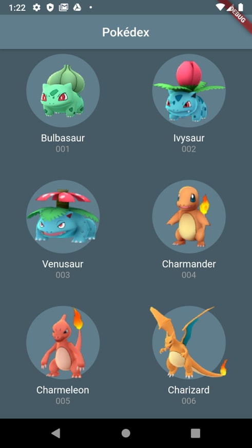
Then you should end up with something like this:
Showing details
The app is really starting to take shape now. Let’s add some navigation to a detailed view of each Pokemon. Create a file in the screens folder called details.screen.dart. Create a new class called DetailsScreen, which takes a Pokemon as a constructor argument and inherits from StatelessWidget. Since this is a new screen, it should return a Scaffold:
class DetailsScreen extends StatelessWidget {
  final Pokemon pokemon;

  DetailsScreen({this.pokemon});

  @override
  Widget build(BuildContext context) {
    return Scaffold(
      backgroundColor: Colors.blueGrey[700],
      appBar: AppBar(
        centerTitle: true,
        title: Text(pokemon.name),
        backgroundColor: Colors.blueGrey[500],
      ),
      body: Container()
    );
  }
}
Next, we want to be able to navigate to the DetailsScreen. To achieve this open the PokemonGridItem file, and wrap everything in a GestureDetector-widget. This widget allows us to listen for taps, and when the user taps a PokemonGridItem, we can navigate to the details screen.
Navigation in Flutter is based on a simple stack on which you can push and pop widgets. Thus, to navigate to another screen we simply push our DetailsScreen to the Navigation stack using the Navigator.push()-function. The widget we are pushing is wrapped inside a MaterialPageRoute:
  @override
  Widget build(BuildContext context) {
    return GestureDetector(
      onTap: () {
        Navigator.push(
          context,
          MaterialPageRoute(
            builder: (context) => DetailsScreen(
              pokemon: pokemon,
            ),
          ),
        );
      },
      child: Column(
        // unchanged
      ),
    );
  }
}
Now that we can navigate to the DetailsScreen, we can style the screen however we like. I will just style it as follows, but feel free to experiment a little here. You could create some kind of badge-widget to display the height and weight.
class DetailsScreen extends StatelessWidget {
  final Pokemon pokemon;
  final TextStyle style = TextStyle(color: Colors.white, fontSize: 16);

  DetailsScreen({this.pokemon});

  @override
  Widget build(BuildContext context) {
    return Scaffold(
      backgroundColor: Colors.blueGrey[700],
      appBar: AppBar(
        centerTitle: true,
        title: Text(pokemon.name),
        backgroundColor: Colors.blueGrey[500],
      ),
      body: Container(
        width: double.infinity,
        padding: EdgeInsets.only(top: 20),
        child: Column(
            crossAxisAlignment: CrossAxisAlignment.center,
            children: <Widget>[
              Image.network(pokemon.image),
              Text("Name: " + pokemon.name, style: style,),
              Text("Height: " + pokemon.height, style: style,),
              Text("Weight: " + pokemon.weight, style: style,)
            ],
          ),
      ),
    );
  }
}
Which gives the following result:

Animations
A neat thing to do is add some simple animations, when we navigate. We are going to use the Hero-widget for this purpose. Inside the pokemonGridItem-file, find the Image.network() and wrap it inside a Hero-widget, and assign the pokemon number as a tag:
Container(
   margin: EdgeInsets.all(8.0),
   decoration: BoxDecoration(
   color: Colors.blueGrey[500], shape: BoxShape.circle),
   child: Hero(
       tag: pokemon.number,
       child: Image.network(pokemon.image),
   ),
),
Now inside the DetailsScreen do the same thing:
Hero(
   tag: pokemon.number,
   child: Image.network(pokemon.image),
),
And we achieved some basic animation, when we are navigating.
Adding some simple state
At this point you are familiar with the StatelessWidget, but as mentioned in part 1 there also exists a StatefulWidget. The StatefulWidget is useful when you need to handle mutable state inside your widget. Lets convert our PokemonGridItem to a StatefulWidget and add the possibility to mark a pokemon as favorite.
A StatefulWidget actually consists of two classes: the StatefulWidget itself and a State-class. The StatefulWidget-class is still immutable and contains whatever configuration you want to pass in. The State-object on the other hand can contain variables that change. The exact differences are a little out of the scope of this article. If you are interested you can read more here. The following code snippet shows how a basic StatefulWidget looks. The build()-function is in the State-class, but we are using the SomeWidget-class to insert the widget into the tree.
class SomeWidget extends StatefulWidget {
  @override
  _SomeWidgetState createState() => _SomeWidgetState();
}

class _SomeWidgetState extends State<SomeWidget> {
  @override
  Widget build(BuildContext context) {
    return Container(

    );
  }
}
After that brief introduction to StatefulWidget let’s convert the PokemonGridItem into a StatefulWidget. This is easily done in Visual Studio Code by left clicking on the class name and selecting refactor. Afterwards you can choose “Convert to StatefulWidget”.

Having done this should result in having a PokemonGridItem that extends a StatefulWidget and creates a State object, besides that there should be another class called _PokemonGridItemState that contains the build()-function itself. We will mainly be working in the State-class.
Let’s add a favorite variable in the state-class.
class _PokemonGridItemState extends State<PokemonGridItem> {
  bool favorite = false;

  @override
  Widget build(BuildContext context) {
    // Unchanged
  }
}
Now in the GestureDetector let’s also add a callback for a long press. In this callback we want to call setState() and flip the value of favorite. This results in a rerender with the new value of favorite.
class _PokemonGridItemState extends State<PokemonGridItem> {
  bool favorite = false;

  @override
  Widget build(BuildContext context) {
    return GestureDetector(
      onLongPress: () {
        setState(() {
          favorite = !favorite;
        });
      },
      child: Column(
        // Rest is unchanged
      ),
    );
  }
}
Now inside the Column-widget, lets add an icon displaying a star, if favorite is true, else just add in an empty container.
@override
  Widget build(BuildContext context) {
    return GestureDetector(
      onLongPress: () {
        setState(() {
          favorite = !favorite;
        });
      },
      child: Column(
        children: <Widget>[
          favorite ? Icon(Icons.star, color: Colors.yellow) : Container(),
          // Rest is unchanged
        ],
      ),
    );
  }
This will give us the possibility to add a star on a pokemon, if we long press that pokemon.

What is next?
That wraps up this article series. The app is almost finished, we got all the features down, but the details screen could use more styling and finishing touches. Feel free to try and style a nice looking DetailsScreen. In the repository we cloned there are a couple of branches you can study, if you get stuck or need some inspiration.

Top comments (0)