This article was first published and hosted at jackdomleo.dev/blog/2020/learning-neumorphic-design.
The awesome design trend that never took off! What are the fundamentals to neumorphic design?
What is neumorphic design?
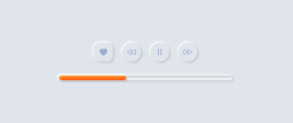
Neumorphic design is a combination of skeuomorphic design and flat design. It gives a soft UI vibe with a 3D, nearly-realistic style by cleverly and carefully combining background colours, gradients, shapes, rounded edges and shadows. The design trend is made to feel like the elements are being pushed through and/or out of the page while being one with the background.

Summarise neumorphic design in a few words:
- Soft
- Rounded
- Smooth
- Futuristic
- Modern
- Anti-accessible
Learning neumorphism
Learning neumorphism was quite difficult for me to begin with because I don't see myself as very design-minded (yet). I really struggled to get the CSS box-shadow looking right. When I first came across neumorphic design, I was instantly hooked; I was searching neumorphic on CodePen, I was searching neumorphic on Google and was reading many articles on the topic. I find the UI for neumorphic so inviting to learn and is definitely a skill and front-end developer or designer should learn at some point in their career. Here is what you need to know to get started:
Themes
Neumorphic design has many themes to consider, I have listed some of the primary theme to kick start your design.
Font
A theme of neumorphic design is roundness, so you should probably consider choosing a font with rounded letters. A rounded font will give your UI the soft vibe that comes with neumorphic design, rather than a sharp vibe. To further explain this, I created a simple CodePen below:
Sizing
When considering sizing with neumorphic, you shouldn't look at it as "Can a mouse click it?" You should come from the angle of, "Will my thumb be able to press it easily on mobile?" With this in mind, it's natural to have larger components.
Naturally, larger components will ultimately prevent you from creating small, cluttered and hard-to-read UIs. Think about padding. Neumorphism should allow for space and keeping things distanced apart.
Colour
This is where your neumorphic design starts looking neumorphic. You should remember:
The component and the background colour should be the same or very very similar
It's OK to have components that contrast with the background, as long as the majority of your components blend in. It's also OK to have components that contrast with the background if you apply the shadows correctly...
Shadow
Save the best until last. Shadows. This needs to be right, I spent ages learning the box-shadow CSS property. I played around with it by adding a shadow to an element, adding two shadows, three shadows, etc. You can't implement neumorphism effectively if you don't know about shadows.
Wait! Two shadows, three shadows? Yes. You can apply multiple shadows to a single CSS box-shadow property. Although the R2-D2 below doesn't have anything to do with neumorphic design, it does demonstrate multiple box-shadows quite well. Below is a CodePen I created a while back of a pixel art R2-D2. It consists of a single <div>, then a very long, but easy-to-understand box-shadow CSS property.
The trick to neumorphic design shadows is, there are two shadows on your box-shadow CSS property, one lighter and one darker. Now imagine you have a light source in the top-left hand corner of your page shining from the top-left to the bottom-right. Since a theme of neumorphism is 3D, you need to think, "Where will the shadow be?" Here is a little CodePen I created to help explain it.
Put it all together
When you combine all these themes, ideas, tips and tricks, you can end up with a nice set of components for your design system.
When not to use neumorphic design?
Neumorphic design became a big trend in early but was quickly discarded.
Neumorphic design became popular for its sexiness. It brought a really nice, Futuristic, 3D-like design to the UI and I have to admit, I do love how it looks. But good UI/UX design in , it's not all about good looks, it needs to be as equally accessible as it is sexy.
Neumorphic design lacks with colour contrast, since an element's background colour should be the same or very similar to the background it sits on to look neumorphic, this makes it difficult for some users to see, therefore making it difficult for them to use your website or application.
There are ways around this if you really want to include neumorphic design; you could learn about implementing different themes and offer a "high contrast" theme. The high contrast theme wouldn't be neumorphic but at least you're giving user's the option what vibe they want or need.
Where to start?
Reading this blog and other blogs and neumorphism is just the start. You need to play:
- Check out this CodePen collection I've put together and maybe give the collection and pens within it a like ❤
- Learn and practise box-shadow with single and multiple shadows
- Experiment making your own components
- Share this article
- Become an expert neumorphic designer!


Latest comments (0)