As you may know, in Xamarin.Forms entries are styled with Google's Material Design and the normal iOS control are used on iPhone. In a project I'm coding I wanted to create an Entry with the outlined style (border and floating label) from Material Design but currently, there is no default way to render an entry with this style.
This time we are going to create a custom control to simulate this behavior.
Creating custom renderer
In order to create an outlined entry as per the Material Design, we need to customize the Entry and remove its borders in both platforms, so we are going to use a custom renderer based on the Entry control. We are going to name the control BorderlessEntry.
namespace XamarinSamples.Views.Controls
{
    public class BorderlessEntry : Entry
    {

    }
}
Then we are going to crear a renderer for each platform.
[assembly: ExportRenderer(typeof(BorderlessEntry), typeof(BorderlessEntryRenderer))]
namespace XamarinSamples.Droid.UI.Renderers
{
    public class BorderlessEntryRenderer : EntryRenderer
    {
        public BorderlessEntryRenderer(Context context) : base(context)
        {
        }

        protected override void OnElementChanged(ElementChangedEventArgs<Entry> e)
        {
            base.OnElementChanged(e);

            //Configure native control (TextBox)
            if(Control != null)
            {
                Control.Background = null;
            }

            // Configure Entry properties
            if(e.NewElement != null)
            {

            }
        }
    }
}
[assembly: ExportRenderer(typeof(BorderlessEntry), typeof(BorderlessEntryRenderer))]
namespace XamarinSamples.iOS.UI.Renderers
{
    public class BorderlessEntryRenderer : EntryRenderer
    {
        protected override void OnElementChanged(ElementChangedEventArgs<Entry> e)
        {
            base.OnElementChanged(e);

            //Configure Native control (UITextField)
            if (Control != null)
            {
                Control.Layer.BorderWidth = 0;
                Control.BorderStyle = UIKit.UITextBorderStyle.None;
            }
        }
    }
}
Adding custom contol with the BorderlessEntry
Once we have the Entry without the borders, it's time to create our custom control that will host this Entry. For ease of use of the control we are going to add some bindable properties so you can configure the control directly from XAML. These properties will be Text, Placeholder, PlaceholderColor and BorderColor.
namespace XamarinSamples.Views.Controls
{
    [XamlCompilation(XamlCompilationOptions.Compile)]
    public partial class EntryOutlined : ContentPage
    {
        public EntryOutlined()
        {
            InitializeComponent();
            this.TextBox.PlaceholderColor = PlaceholderColor;
        }

        public static readonly BindableProperty TextProperty =
            BindableProperty.Create(nameof(Text), typeof(string), typeof(EntryOutlined), null);

        public string Text
        {
            get { return (string)GetValue(TextProperty); }
            set { SetValue(TextProperty, value); }
        }

        public static readonly BindableProperty PlaceholderProperty =
            BindableProperty.Create(nameof(Placeholder), typeof(string), typeof(EntryOutlined), null);

        public string Placeholder
        {
            get { return (string)GetValue(PlaceholderProperty); }
            set { SetValue(PlaceholderProperty, value); }
        }

        public static readonly BindableProperty PlaceholderColorProperty =
            BindableProperty.Create(nameof(PlaceholderColor), typeof(Color), typeof(EntryOutlined), Color.Blue);

        public Color PlaceholderColor
        {
            get { return (Color)GetValue(PlaceholderColorProperty); }
            set { SetValue(PlaceholderColorProperty, value); }
        }

        public static readonly BindableProperty BorderColorProperty =
            BindableProperty.Create(nameof(BorderColor), typeof(Color), typeof(EntryOutlined), Color.Blue);

        public Color BorderColor
        {
            get { return (Color)GetValue(BorderColorProperty); }
            set { SetValue(BorderColorProperty, value); }
        }

    }
}
<?xml version="1.0" encoding="utf-8"?>
<ContentView xmlns="http://xamarin.com/schemas/2014/forms"
             xmlns:x="http://schemas.microsoft.com/winfx/2009/xaml"
             x:Class="XamarinSamples.Views.Controls.EntryOutlined"
             xmlns:controls="clr-namespace:XamarinSamples.Views.Controls;assembly=XamarinSamples"
             Margin="{OnPlatform Android='3,0,3,5', iOS='3,0,3,5'}"
             x:Name="this">
    <ContentView.Content>
        <StackLayout>
            <Grid>
                <Frame HasShadow="False"
                       x:Name="EntryFrame"
                       BorderColor="{Binding BorderColor, Source={x:Reference this}}"
                       CornerRadius="{OnPlatform Android=3}"
                       Padding="{OnPlatform Android='5,0,5,0', iOS='8,0,8,0'}"
                       Margin="{OnPlatform Android='0,0,0,0', iOS='0,0,0,0'}" />

                <Label x:Name="PlaceHolderLabel"
                       BackgroundColor="White" HorizontalOptions="Start"
                       TextColor="{Binding PlaceholderColor, Source={Reference this}}"
                       Text="{Binding Placeholder,Source={x:Reference this}}"
                       Margin="10,0,0,0"
                       VerticalOptions="Center" />

                <controls:BorderlessEntry
                    HeightRequest="{OnPlatform iOS=40}"
                    x:Name="TextBox" VerticalOptions="FillAndExpand"
                    Text="{Binding Text,Source={x:Reference this},Mode=TwoWay}"
                    Margin="10,0,0,0"
                    />
            </Grid>
        </StackLayout>
    </ContentView.Content>
</ContentView>
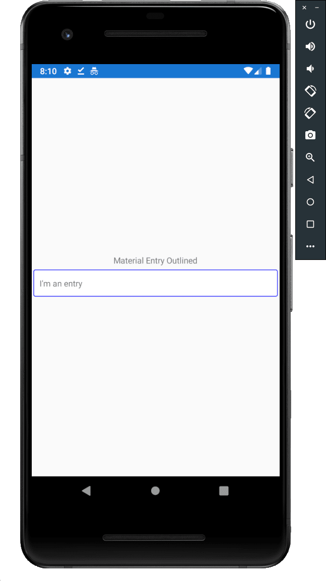
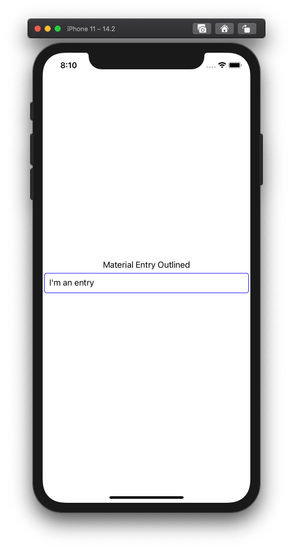
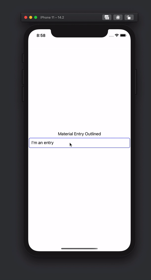
Now we are going to add the control to a simple page and it should look like this:
Translating placeholder into and out of the entry
Now that we have our control in place, it's time to move the placeholder into the top of the border when the Entry is focused and move it back to the Entry when focus is lost and the text is empty. So we are going to add a handler for the Focused and Unfocused events.
async void TextBox_Focused(object sender, FocusEventArgs e)
{
    await TranslateLabelToTitle();
}

async void TextBox_Unfocused(object sender, FocusEventArgs e)
{
    await TranslateLabelToPlaceHolder();
}

async Task TranslateLabelToTitle()
{
    if (string.IsNullOrEmpty(this.Text))
    {
        var placeHolder = this.PlaceHolderLabel;
        var distance = GetPlaceholderDistance(placeHolder);
        await placeHolder.TranslateTo(0, -distance);
    }

}

async Task TranslateLabelToPlaceHolder()
{
    if(string.IsNullOrEmpty(this.Text))
    {
        await this.PlaceHolderLabel.TranslateTo(0, 0);
    }
}

double GetPlaceholderDistance(Label control)
{
    // In Android we need to move the label slightly up so it's centered in the border frame.
    var distance = 0d;
    if(Device.RuntimePlatform == Device.iOS) distance = 0;
    else distance = 5;

    distance = control.Height + distance;
    return distance;
}
Now let's add these events to our control and test again our control in runtime.
<controls:BorderlessEntry
    HeightRequest="{OnPlatform iOS=40}"
    x:Name="TextBox" VerticalOptions="FillAndExpand"
    Text="{Binding Text,Source={x:Reference this},Mode=TwoWay}"
    Margin="10,0,0,0"
    Focused="TextBox_Focused"
    Unfocused="TextBox_Unfocused"
    />
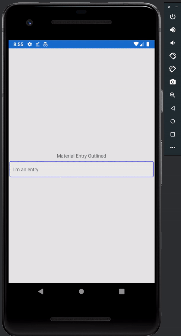
With these changes, our control should behave like this:
Adding text changed event for consumers
Finally, since we'd like to be notified when the text changes we're going to add an event to the EntryOutlined and wire it to the inner Entry
public event EventHandler<TextChangedEventArgs> TextChanged;

public virtual void OnTextChanged(System.Object sender, Xamarin.Forms.TextChangedEventArgs e)
{
    TextChanged?.Invoke(this, e);
}
<controls:BorderlessEntry
    HeightRequest="{OnPlatform iOS=40}"
    x:Name="TextBox" VerticalOptions="FillAndExpand"
    Text="{Binding Text,Source={x:Reference this},Mode=TwoWay}"
    Margin="10,0,0,0"
    Focused="TextBox_Focused"
    Unfocused="TextBox_Unfocused"
    TextChanged="OnTextChanged" />
And lastly, we can use the control from our page like this
<controls:EntryOutlined
            Placeholder="I'm an entry"
            BorderColor="Blue"
            PlaceholderColor="Red"
            TextChanged="EntryOutlined_OnTextChanged" />
Repository
Some people have asked me to provide a repository. Here is a basic repo with the code from the post.
 jpozo20
/
xamarin-samples
jpozo20
/
xamarin-samples
Xamarin code for posts published at dev.to/jefrypozo
xamarin-samples
Xamarin code for posts published at dev.to/jefrypozo
Conclusions
This time we saw a simple and easy way to create an outlined entry based on Google's Material Design. Thankfully, the folks from Xamarin.Forms have done a very nice work and we just need to do some simple things to achieve the desired result and in the next entry I'll show you how to add a label underneath the entry for validation purposes.
Stay tuned!

Top comments (2)
GitHub repository for the code mentioned would be of great help to all developers !!
Thanks for reading!
By popular request I added a basic repository at the end of the post.