Most people think that design is about making things look beautiful - a decoration. But design is both an art and a science, it is a cold working process. However, the design is not allowed to fail. The design of websites and mobile applications, as well as the design in general, is a complex and delicate process, it is more than making things pretty.
Every aspiring designer wants to create products that can become iconic and well-known worldwide, such as the unique wedge shape of Ferrari or the practicality of the Swiss army knife. But despite their high hopes, many people end up creating some very interesting and scary designs before becoming the next Giorgetto Giugiaro or Le Corbusier.
Jared Spool, the American writer, researcher and usability expert, once said: “Good design, when it is done well, becomes invisible. It is only when it is done poorly that we notice it.”
There are many reasons for a bad UX: maybe designers prefer beauty over usability (a standard over-function problem), or they support their design on their suppositions rather than precise user research. Maybe they integrated intrusive features (such as pop-up windows) in an attempt to push users to perform specific actions. Generally, if users have to research in-depth to achieve what they want, feel forced to do things they do not want to do, or get lost in the user flow, then it means that the UX design needs to be improved.
In this blog entry, we will go through some examples of products with a bad design that creates an overall bad UX.
1️⃣ Can you read between the lines?
These kinds of laundry machines can be found in many houses.
As you can see, the display is packed with different options that you can choose from. You may be able to figure out what some options do, however, some of them do not make any sense at all.
Besides, the worst part of this design is probably that all these settings are not even required. You can wash most clothes in cold water.
The interface on the washing machine could be simpler because, in my opinion, I would never use most of the settings. Probably, I would only use a couple of buttons on the machine.
On the other hand, I would say that some washing machines have a really good design. For example, the following one.
This interface only requires the user to press four buttons, which makes the machine easy to use. Does the user really need to choose the rotation speed? Probably not.
2️⃣ Are you hungry?
Most of the microwaves that common people use are a combination of excessive useless buttons with a completely flat surface that has zero tactile feedback.
The following microwave supports and contains 34 buttons.
The problem with this design is that usually only two of the buttons are used and therefore 94% of the buttons are not accounted for.
People usually get accustomed to using poorly designed microwaves thanks to trial and error. However, if companies would just study their customer base and ask them questions, they would probably find that many people complain that microwaves are not as easy to use as it seems.
In my opinion, a good design should be one that only has few buttons and the options are really clear. For example, I would say the microwave that can be found below has an amazing design.
This microwave has a clear and simple interface that can be interpreted by anyone.
3️⃣ Design in chaos
Having a bad design in a website can make you close it as soon as you enter. In this section, we will see the contrast between badly designed websites that most of the time will overwhelm anyone who enters them and well-designed ones that have a consistent, well-designed interface.
First of all, we can see Bella de Soto's website.
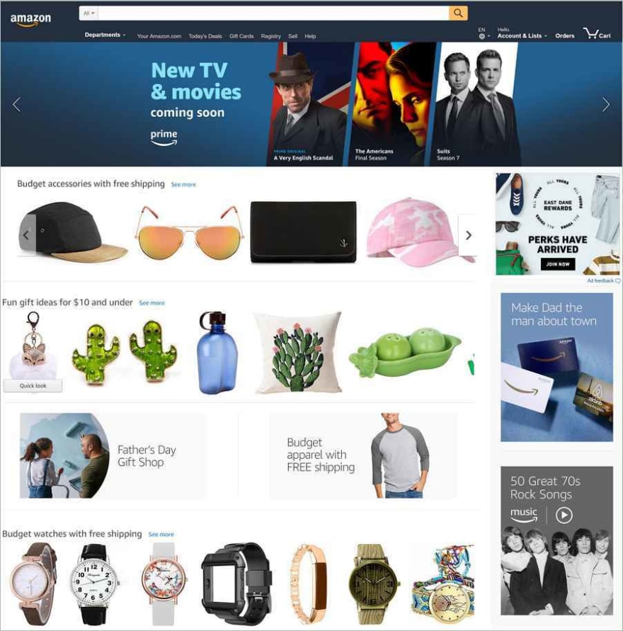
Every time you enter the site, you feel that these guys are trying to put all the content they have on one page. There are too many different content and many low-quality images on the homepage, that you will probably feel dizzy once you enter it. In addition, the homepage is too long and too wide, meaning that you will have to scroll it horizontally and vertically to find the information you need.
Nowadays, to create a user-friendly design as well as a good design, it is needed to keep it simple and create intuitive designs for users. If you don’t want to be the only user that visits the website, you need to create one where users should never get lost. In order to obtain a user-friendly website, web developers should remember to use a grid, which makes the process of placing elements on the web page very easy.
The success of a website usually depends on only one thing: how users perceive it. "Does this website bring me value? Is it easy to use? Is it pleasant to use?" These are the questions that visitors think of when interacting with the products, and with them, they form the basis for their decision to become regular users or not.
Below we can see the design of a well-organized page with a well-defined grid.
As you can see, on this page everything is clean and organized. All the elements are grouped and positioned in relation to each other. Besides, you will not probably get lost on this website. This is thanks to the use of the grid as explained above.
In conclusion, it is obvious that a good website not only involves design. However, customers want and expect an attractive visual layout. They will judge your business based on appearance before reading a word.
🌟 Extra information
Besides creating an overall bad UX, sometimes if the target user is not designed at the center of the design process, these technologies can lead to life-threatening situations.
Below we can find some examples that show how various designs failed to achieve their purpose, as well as the consequences of these failures.
On 20th January 1992, a tragic incident happened due to a thoughtless design that took the lives of eighty-seven people. Two skilled pilots with over 12,000 hours of flying experience between them were traveling to Strasbourg, Germany when adverse weather conditions caused interruptions with the flight’s scheduled course. With their joint experience, they calculated that a descent of 3.3 degrees would safely align them with the runway. Unfortunately once the clouds broke the pilots came face-to-face with a mountain and seconds later the horrific collision occurred, only nine people survived.
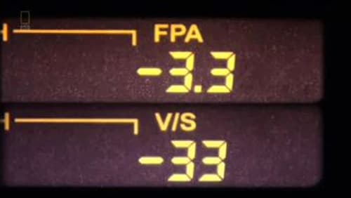
An investigation into how this accident occurred showed that the interface the pilots used to enter information was to blame. The reason that it was difficult to grasp what data was being entered was due to the same screen handled two pieces of key information — Flight Path Angle (FPA) and Vertical Speed (VS). Rather than enter -3.3 for the Flight Path Angle, the pilot entered -3,300ft/min for the Vertical Speed. The small interface and the only difference being a missing decimal point robbed people of their lives. This could have easily have been avoided if the interface was more carefully considered. When we design it is vital to understand that unclear information can lead to catastrophic incidents. (Source)
This is the interface that shows the Flight Path Angle and the Vertical Speed
Besides that, in the source, you will be able to find more examples that relate to the topic of life-threatening situations due to a bad design as well as other examples of bad designs.
Finally, I would like to mention an interesting research paper that talks about the importance of good interface design. This paper is well-written and goes in-depth with some aspects of interface evaluation.


Top comments (0)