
Don't want to code along? See this template on Github with even more features such as SEO, and deploy it instantly to Netlify or Zeit Now.
Recently, I had to create a blog for my Next.js personal website and portfolio. I looked online for any solution that could help me develop the blog, however, I could not find any simple solution like you would for Gatsby.js.
This post will try to create a blog similar to Gatsby Starter Blog with Next.js and tailwind.css.
There are many ways of parsing markdown such as using MDX. However, in this post, I'll focus on normal markdown with frontmatter so you can use a CMS like Netlify CMS with it.
Creating a Next.js project
We will create a Next.js app using its CLI. Run one of these commands. This will create an initial layout where we will start developing our blog.
npm init next-app
# or
yarn create next-app
Now run:
cd YOUR_PROJECT_NAME && yarn dev
Great! We have created our next app. You should be seeing this:

Installing main dependencies
We will be using gray-matter to parse our frontmatter and markdown, react-markdown for converting it to HTML and displaying it, and tailwind.css to streamline styles quickly.
Let's add all necessary dependencies:
  npm install --save-dev gray-matter react-markdown tailwindcss postcss-preset-env && npm install react-markdown
  # or
  yarn add -D gray-matter tailwindcss postcss-import autoprefixer && yarn add react-markdown
Configure Tailwind.css
Thanks to this tutorial, we can get started with Tailwind.css quickly. Initialize it with the next command; it will create our config:
npx tailwind init
Next, create a file called postcss.config.js to configure Postcss, and add this:
module.exports = {
  plugins: ["postcss-import", "tailwindcss", "autoprefixer"],
};
Then, let's create a CSS style sheet on styles/tailwind.css.
@import "tailwindcss/base";
@import "tailwindcss/components";
@import "tailwindcss/utilities";
Finally, create pages/_app.js and import our newly created style sheet:
// pages/_app.js
import "../styles/tailwind.css";

export default function MyApp({ Component, pageProps }) {
  return <Component {...pageProps} />;
}
Great! now we can start working on our blog directly.
Configure Purgecss for tailwind (optional)
Adding Purgecss is highly recommended when using tailwind.css or CSS. It automatically removes any unused CSS at build time, which can reduce our bundle size.
First, add the necessary dependency:
  npm install --save-dev @fullhuman/postcss-purgecss
  # or
  yarn add -D @fullhuman/postcss-purgecss
Then, update our postcss.config.js
const purgecss = [
  "@fullhuman/postcss-purgecss",
  {
    content: ["./components/**/*.js", "./pages/**/*.js"],
    defaultExtractor: (content) => content.match(/[\w-/:]+(?<!:)/g) || [],
  },
];

module.exports = {
  plugins: [
    "postcss-import",
    "tailwindcss",
    "autoprefixer",
    ...(process.env.NODE_ENV === "production" ? [purgecss] : []),
  ],
};
Creating Our Posts
We will be using markdown with jekyll's frontmatter syntax to write our posts. This will help us maintain our posts in a clean and easy to use format.
All our posts will be located in content/posts, so proceed to create this route and add our first post called first-post.md.
---
title: First post
description: The first post is the most memorable one.
date: 2020-04-16
---

# h1
## h2
### h3

Normal text
Now let's create a second one called second-post.md.
---
title: Second post
description: The second post is the least memorable.
updatedAt: 2020-04-16
---

# h1
## h2
### h3

Normal text
Fetching our posts
Having our initial posts, we can begin to work on our index page. Let's delete whatever we had previously, and start with a clean component:
export default function Home() {
  return (
    <div>
    </div>
  );
}
To get all posts we will use getSaticProps. This method will fetch all our posts and feed it as props to our page.
The main benefit of getStaticProps is its static generation which means the content will be generated at build time, and will not be fetched every time our user visits our blog.
import fs from "fs";
import matter from "gray-matter";

export default function Home({ posts }) {
  return (
    <div>
       {posts.map(({ frontmatter: { title, description, date } }) => (
        <article key={title}>
          <header>
            <h3>{title}</h3>
            <span>{date}</span>
          </header>
          <section>
            <p>{description}</p>
          </section>
        </article>
      ))}
    </div>
  );
}

export async function getStaticProps() {
  const files = fs.readdirSync(`${process.cwd()}/content/posts`);

  const posts = files.map((filename) => {
    const markdownWithMetadata = fs
      .readFileSync(`content/posts/${filename}`)
      .toString();

    const { data } = matter(markdownWithMetadata);

    // Convert post date to format: Month day, Year
    const options = { year: "numeric", month: "long", day: "numeric" };
    const formattedDate = data.date.toLocaleDateString("en-US", options);

    const frontmatter = {
      ...data,
      date: formattedDate,
    };

    return {
      slug: filename.replace(".md", ""),
      frontmatter,
    };
  });

  return {
    props: {
      posts,
    },
  };
}
Now you should be seeing this:

Awesome! We can see all our posts.
Adding Layout component
Before we start working on index.js styles. Let's first add a layout component that will wrap our pages. Create a components/layout.js and add this:
import Link from "next/link";
import { useRouter } from "next/router";
export default function Layout({ children }) {
const { pathname } = useRouter();
const isRoot = pathname === "/";
const header = isRoot ? (
<h1 className="mb-8">
<Link href="/">
<a className="text-6xl font-black text-black no-underline">
Next.Js Starter Blog
</a>
</Link>
</h1>
) : (
<h1 className="mb-2">
<Link href="/">
<a className="text-2xl font-black text-black no-underline">
Next.Js Starter Blog
</a>
</Link>
</h1>
);
return (
<div className="max-w-screen-sm px-4 py-8 mx-auto">
<header>{header}</header>
<main>{children}</main>
<footer>
© {new Date().getFullYear()}, Built with{" "}
<a href="https://nextjs.org/">Next.js</a> 🔥
</footer>
</div>
);
}
It should look like this:

Styling Our Blog's Index Page
Let's style our index page. We won't do anything fancy, but I welcome you to take your time and style is as best as you can.
So, lets start:
// ...

export default function Home({ posts }) {
  return (
    <Layout>
      {posts.map(({ frontmatter: { title, description, date } }) => (
        <article key={title}>
          <header>
            <h3 className="mb-1 text-3xl font-semibold text-orange-600">
              {title}
            </h3>
            <span className="mb-4 text-sm">{date}</span>
          </header>
          <section>
            <p className="mb-8">{description}</p>
          </section>
        </article>
      ))}
    </Layout>
  );
}

// ...
Creating Post Page
Right now we have something like this, pretty cool right?

However, what is the point of a blog if we can't read our posts. So let's get started at creating our post page. Go ahead and Create pages/post/[slug].js, and add this:
import React from "react";
import fs from "fs";
import path from "path";
import matter from "gray-matter";

export default function Post({ content, frontmatter }) {
  return (
    <Layout>
      <article></article>
    </Layout>
  );
}

export async function getStaticPaths() {
  const files = fs.readdirSync("content/posts");

  const paths = files.map((filename) => ({
    params: {
      slug: filename.replace(".md", ""),
    },
  }));

  return {
    paths,
    fallback: false,
  };
}

export async function getStaticProps({ params: { slug } }) {
   const markdownWithMetadata = fs
    .readFileSync(path.join("content/posts", slug + ".md"))
    .toString();

  const { data, content } = matter(markdownWithMetadata);

  // Convert post date to format: Month day, Year
  const options = { year: "numeric", month: "long", day: "numeric" };
  const formattedDate = data.date.toLocaleDateString("en-US", options);

  const frontmatter = {
    ...data,
    date: formattedDate,
  };

  return {
    props: {
      content: `# ${data.title}\n${content}`,
      frontmatter,
    },
  };
}
We created what is called a template, basically a blueprint of how our posts should look like. That [slug].js format indicates a dynamic route within Next.js, and based on the slug we will render the post we need. Read more on dynamic routes.
Here we used both getStaticProps and getStaticPaths to create our post's dynamic route. The method getStaticPaths allows us to render dynamic routes based on the parameters we provide, in this case, a slug. You may have noticed that we are receiving a params.slug parameter in getStaticProps. This is because getStaticPaths passes the current slug, for us to fetch the post we need.
We are providing our Post component both the content and frontmatter of our post. Now, all that is left is to render the markdown with React Markdown. React Markdown's job is to convert our markdown to HTML so we can display it on our site. Add the following to your [slug].js:
// ...

import ReactMarkdown from "react-markdown/with-html";

// ...

export default function Post({ content, frontmatter }) {
  return (
    <Layout>
      <article>
        <ReactMarkdown escapeHtml={false} source={content} />
      </article>
    </Layout>
  );
}

// ...
Connecting Our Index with Post
Our post template is done, but we have to be able to access it through a link on our page. Let's wrap our post's title with a (Link)[https://nextjs.org/docs/api-reference/next/link] component provided by Next.js on index.js.
// ...
import Link from "next/link";

export default function Home({ posts }) {
  return (
    <Layout>
      {posts.map(({ frontmatter: { title, description, date }, slug }) => (
        <article key={slug}>
          <header>
            <h3 className="mb-2">
              <Link href={"/post/[slug]"} as={`/post/${slug}`}>
                <a className="text-3xl font-semibold text-orange-600 no-underline">
                  {title}
                </a>
              </Link>
            </h3>
            <span className="mb-4 text-xs">{date}</span>
          </header>
          <section>
            <p className="mb-8">{description}</p>
          </section>
        </article>
      ))}
    </Layout>
  );
}

// ...
Click any of the posts and...
Isn't it beautiful? Well, not quite since our markdown is not being styled yet.
Styling Our Markdown
We could start adding rule by rule in CSS to style all the post's headings and other elements, however, that would be a tedious task. To avoid this, I'll be using Typography.js since it gives us access to more than 20 different themes, and add these styles automatically.
Don't feel pressured to use this solution. There are many ways you achieve this, feel free to choose whatever works for you best.
First, let's add Typography.js to our dependencies:
  npm install typography react-typography
  # or
  yarn add typography react-typography
I will be using Sutra theme since for me it looks really good and sleek. You can access Typography.js main site and preview all the different themes. Without further ado, let's add it:
  npm install typography-theme-sutro typeface-merriweather typeface-open-sans
  # or
  yarn add typography-theme-sutro typeface-merriweather typeface-open-sans
You may notice I'm adding some packages which contain local fonts. Typography gives us the option to get our fonts through Google Fonts, nevertheless, I prefer having these fonts locally.
Now that we have the packages we need, create a utils/typography.js to create our main Typography.js configuration:
import Typography from "typography";
import SutroTheme from "typography-theme-sutro";

delete SutroTheme.googleFonts;

SutroTheme.overrideThemeStyles = ({ rhythm }, options) => ({
  "h1,h2,h3,h4,h5,h6": {
    marginTop: rhythm(1 / 2),
  },
  h1: {
    fontWeight: 900,
    letterSpacing: "-1px",
  },
});
SutroTheme.scaleRatio = 5 / 2;

const typography = new Typography(SutroTheme)

// Hot reload typography in development.
if (process.env.NODE_ENV !== `production`) {
  typography.injectStyles();
}

export default typography;
Then, create pages/_document.js to inject our typography styles.
import Document, { Head, Main, NextScript } from "next/document";
import { TypographyStyle } from "react-typography";
import typography from "../utils/typography";

export default class MyDocument extends Document {
  render() {
    return (
      <html>
        <Head>
          <TypographyStyle typography={typography} />
        </Head>
        <body>
          <Main />
          <NextScript />
        </body>
      </html>
    );
  }
}
To import out typeface font go to pages/_app.js and add this line:
// ...

import "typeface-open-sans";
import "typeface-merriweather";

// ...
Typography.js includes a CSS normalization that will collide with tailwind's. Therefore, let's disables tailwind's normalization in tailwind.config.js
module.exports = {
  theme: {
    extend: {},
  },
  variants: {},
  plugins: [],
  corePlugins: {
    preflight: false,
  },
};
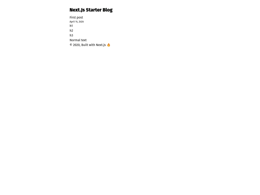
Now our blog's index page looks sleek:

Working With Images
Adding images is very straightforward with our setup. We add our desired image to public. For the sake of this tutorial I'll add this cute cat picture to my public folder.

Then, in content/posts/first-post:
---
title: First post
description: The first post is the most memorable one.
date: 2020-04-16
---
# h1
## h2
### h3
Normal text

Notice the forward-slash before cat.jpg. It indicates that it is located in the public folder.
We should have something like this:

That's it!! We have successfully created our static blog. Feel free to take a break, and pat yourself in the back.
(Bonus) Adding Code Blocks
Our current blog works perfectly for non-coding posts. However, if we were to add code blocks our users will not be able to see them as we expect them to with syntax highlighting.
To add syntax highlighting we will use react-syntax-highlighter and integrate it with react-markdown since the latter won't parse tokens for our code.
First, let's add a new post in content/posts/coding-post:
---
title: Coding Post
description: Coding is such a blissful activity.
date: 2020-04-16
---

\`\`\`jsx

import React from "react";

const CoolComponent = () => <div>I'm a cool component!!</div>;

export default CoolComponent;
\`\`\`
Remove the component's backslashes after you copy them, so it can be highlighted.
Then, add react-syntax-highlighter:
  npm install react-syntax-highlighter
  # or
  yarn add react-syntax-highlighter
Finally, change pages/post/[slug].js to:
import React from "react";
import fs from "fs";
import path from "path";
import matter from "gray-matter";
import ReactMarkdown from "react-markdown/with-html";
import { Prism as SyntaxHighlighter } from "react-syntax-highlighter";

import Layout from "../../components/Layout";

const CodeBlock = ({ language, value }) => {
  return <SyntaxHighlighter language={language}>{value}</SyntaxHighlighter>;
};

export default function Post({ content, frontmatter }) {
  return (
    <Layout>
      <article>
        <ReactMarkdown
          escapeHtml={false}
          source={content}
          renderers={{ code: CodeBlock }}
        />
      </article>
    </Layout>
  );
}

// ...
Now if we open our coding post, we should see this:

(Bonus) Optimize Our Images
Adding next-optimized-images in our blog will allow us to deliver optimized images in production which makes our site faster.
First, let's add next-optimized-images and next-compose-plugins to our packages:
  npm install next-optimized-images next-compose-plugins
  # or
  yarn add next-optimized-images next-compose-plugins
Then, create next.config.js in the root of our project:
const withPlugins = require("next-compose-plugins");
const optimizedImages = require("next-optimized-images");

module.exports = withPlugins([optimizedImages]);
Next Optimized Images uses external packages to optimize specific image formats, so we have to download whichever we need. In this case, I'll optimize JPG and PNG images, therefore I'll use the imagemin-mozjpeg and imagemin-optipng packages. Head to next-optimized-images's github to see which other packages are available.
Furthermore, we will also add lqip-loader to show a low-quality image preview before they load, just like Gatsby.js does.
npm install imagemin-mozjpeg imagemin-optipng lqip-loader
# or
yarn add imagemin-mozjpeg imagemin-optipng lqip-loader
Once added, next-optimized-images will automatically apply optimizations in production.
Now, let's head to pages/post/[slug].js and add the following:
import React, { useState } from "react";
import Layout from "../../components/Layout";

// ...

const Image = ({ alt, src }) => {
  const [imageLoaded, setImageLoaded] = useState(false);

  const styles = {
    lqip: {
      filter: "blur(10px)",
    },
  };

  // Hide preview when image has loaded.
  if (imageLoaded) {
    styles.lqip.opacity = 0;
  }

  return (
    <div className="relative">
      <img
        className="absolute top-0 left-0 z-10 w-full transition-opacity duration-500 ease-in opacity-100"
        src={require(`../../content/assets/${src}?lqip`)}
        alt={alt}
        style={styles.lqip}
      />

      <img
        className="w-full"
        src={require(`../../content/assets/${src}`)}
        alt={alt}
        onLoad={() => setImageLoaded(true)}
      />
    </div>
  );
};

export default function Post({ content, frontmatter }) {
  return (
    <Layout>
      <article>
        <header>
          <h1 className="my-0">{frontmatter.title}</h1>
          <p className="text-xs">{frontmatter.date}</p>
        </header>
        <ReactMarkdown
          escapeHtml={false}
          source={content}
          renderers={{ code: CodeBlock, image: Image }}
        />
      </article>
    </Layout>
  );
}

// ...
Finally, change content/posts/first-post.md image route:
---
title: First post
description: The first post is the most memorable one.
date: 2020-04-16
---
# h1
## h2
### h3
Normal text

With this, we have created a component that will render each time an image is found in our markdown. It will render the preview, and then hide it when our image has loaded.
Conclusion
Next.js is a really powerful and flexible library. There are many alternatives on how to create a blog. Regardless, I hope this has helped you create your own and notice it is not as hard as it seems.
I created a template of this post (look at it here next-starter-blog GitHub repository), which will be updated soon with more features such as a sitemap, SEO and RSS feed. Stay tuned!
For more up-to-date web development content, follow me on Twitter, and Dev.to! Thanks for reading! 😎
Did you know I have a newsletter? 📬
If you want to get notified when I publish new blog posts and receive an awesome weekly resource to stay ahead in web development, head over to https://jfelix.info/newsletter.

Top comments (14)
Hi Jose !
Thanks a lot for your article. I was following the steps and I got into some issues.
The first one is when you create the post and then write the index.js for the first time. I ran into an error because in the code you search for "date" and not for "updatedAt" for the date of the post.
I fixed that by changing the name of the property in the markdown files but maybe you want to edit the tutorial too.
My second problem is that I am stuck in the part of creating the layout component. I created the file layout.js under a components folder but I dont know how to link it in my index and I am getting an error because Layout is not defined.
I think I am missing a step.
I dont know nothing about react so maybe it is something very easy but I am afraid I cant continue. Could you help me?
Hi Ana! Thanks for pointing out about the
date. I have fixed it accordingly.You are missing the
layoutbecause you haven't imported it. At the top of your file add:Let me know if it worked. Cheers 😎
Hi Jose, thanks for your quick reply! I have now finished the tutorial, thanks again for posting it. I have found some more issues but searching in google I was able to resolve it.
in typography.js was missing the typography const
In [slug].js was also missing the Layout import
In the _app.js you imported typeface-lato but that typography was not installed, only the ones for sutro. so I had to install it with npm.
Those were simple things that with a little of inspection to the code and googling how to import in react I was able to solve but I you add it to the tutorial I think it would be perfect !!
thanks again for the guide :).
I'm glad you liked the tutorial 🙌. Thanks for making the blog post better, I really appreciate it! I have fixed all these accordingly.
Anyone who doesn't want to disable preflight in tailwindcss, just add headings, ul, ol etc. styles to your global CSS(ex: h1{@apply text-3xl} ), you can find this on tailwind docs. if you want to use google fonts make sure to add GoogleFont Tag in _document.tsx files. I prefer tailwind default rem, em sizes...which is more responsive.
Thanks for the post....
Thanks for the solution! I also have pondered on a way to substitute Typography; thankfully, I found a Tailwind plugin which does this job! It is called tailwindcss-typography. Soon, I will be updating the repository.
P.S. It is done! Check the repository.
I tried to adapt the last part of your blog (optimizing the images) to my own project. I ran into the following problem though: If the image is cached,
img.onLoadwon't trigger resulting in the lqip image staying "on top". I solved it the following way, but is there a nice way that doesn't useuseRef()?Hi Søren, thanks for the read! One alternative is to use lazysizes. It is an awesome library that lets you create High performance and SEO friendly lazy loader for images. Check it out. You can also see my implementation in the repository
Hi Jose!
Thanks for the article, I was following along and everything working at my end.
However, I noticed that the links inside the markdown files reload the whole page. For instance, I have a Contact Us page which URL is /contact-us and there is a link to that page in one markdown file. If I click on that link, the whole page is reloaded. In other words, it's the same behaviour as if it was added an a tag rather than the Link tag from next.
Is there any way to swap the a tag for a Link tag from the links coming from the Markdown files?
Thanks in advance!
Hi Esnare, thanks for reading my post! I'm glad you like it.
Yes, it is possible to switch the
<a/>with<Link/>. However, there is a caveat: using<Link/>for links outside your Next.js page will error out. My recommendation would be to create a<Link/>for the contact page, and an<a/>for everything else.So, to get started we have to modify React Markdown default
<a/>. For that, we have therenderersprop:After that, let's create the LinkNode component:
That's it! I hope this helped.
Thanks for your reply Jose,
That's good stuff, I shall test it now :)
While researching on that issue, I noticed this library called MDX github.com/mdx-js/mdx. Basically, it lets you use react components directly on the markdown files. Here is the integration it with with Next.js: mdxjs.com/getting-started/next, I am going to test this one too :)
Thanks for all mate!
Awesome!
I have read about MDX and it is really good for creating interactive blog posts. I didn't use it in this tutorial because it is not compatible with most git-based CMS. Some CMS like netlify-cms do support it with a plugin, but for me, it still isn't mature enough.
In the future, I will experiment with it more and see if there is an efficient solution.
Helpful post . Helped me set up my blog
I'm waiting sitemap, SEO and RSS feed!