
Introduction
Hello, Friends. Today, I would like to show you the portfolios that I found on the Internet. You know, I think that a good presentation of yourself is sometimes much more important than your professionalism (within reason, of course). And this also applies to beginners who still have a little development experience and can prove themselves by creating their own website, where they will be able to post their work in the future. In my opinion, this is better than just using github or other services for this. Your own portfolio will give you the opportunity to present yourself and your work the way you want.
Your personal portfolio gives you personality.
You can also read my post where I created a page for project presentations (I think you might like it) + there is a Demo on CodePen

Well, ladies and Gentlemen, let's get started.
Brittany Chiang

I really like the portfolio of this developer, because it is very concise and it seems that there is nothing superfluous in it. It is also very memorable and contains extremely useful and important information. It has a very nice design with a very good color scheme.
Riccardo Zanutta

A good portfolio with a beautiful minimalist style and nice animations.It is definitely worth paying attention to as an example for inspiration.
Patrick David
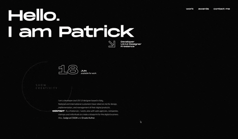
An excellent portfolio of an Italian developer and UI / UX designer. The site has an amazing design. The site also has a lot of beautiful animation and a very unusual preloader.
Fabian

You can say ," What did you find on this site?" Personally, I liked this portfolio for its design focused primarily on the font. This is one of those designs where the font plays a dominant role and sets the rest of the style. Moreover, such a site is not very difficult to create, it can appeal to those who do not really want to bother creating a complex design for their site. But you will have to worry about finding the font ;)
adeola.
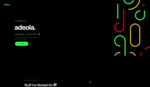
Portfolio of a Frontend developer from Lagos. A very nice one-page site, which has a beautiful animation. I think many people may like it because of its unusual style.
Adrien Gervaix
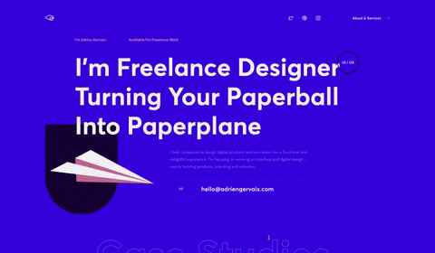
Portfolio of a French UI / UX freelance designer. On the site you can see beautiful svg elements and also a number of attractive animations.
SANJOO

Portfolio of a freelancer from India. The site is designed in the same style as the Fabian portfolio. Here, too, the design is dominated exclusively by the font.
Matthew Williams

Quite often found portfolios on the Internet. If you have ever searched the Internet for examples of good portfolios, then perhaps you could come across this example. The portfolio is owned by Matthew Williams, who is a full-stack web developer. A very decent portfolio, but in my opinion slightly outdated in terms of design and site elements. But in general, it can be a good example, especially for beginners.
Jack.

Portfolio of a Polish frontend developer. The site has a beautiful and unusual animation, as well as seamless transitions between the pages of the site. The portfolio has a very minimalistic design, which is very well combined with the selected colors for the site.
Bruno Simon

Amazing portfolio of web developer Bruno Simon, which is made in 3d style with the help of three.js. (and perhaps some other 3d libraries). I'm sure you knew about it, but I think it's a sin not to add this portfolio to your list. It is perfect in everything from the design to the way it provides information (you can even have fun playing bowling or overcoming obstacles on the site). To find out information about the developer, you need to use this car to drive to the appropriate fields with information about the developer himself, as well as about his work. Also on the site there is a physics of elements and characteristic sounds when interacting with them. This is a great portfolio, which in my opinion is extremely difficult to repeat. I think that in this way the author wanted to separate his portfolio from the usual one-page sites, which simply show graphs with developer skills (I never understood why they were needed).

The End
Well, that's it, thank you friends, for your time. I hope that this collection will help you and your inspiration to create your beautiful portfolio. (Please just don't use skill charts).


Oldest comments (24)
Nice websites
Thanks
Most of the platforms I used to learn HTML and CSS I saw in Html that one can add an image from the websites (it goes like this, url alt="Black Mustang in New York City>) but I wonder how can I add picture from my collections of photos in my laptop? (I mean how can I use pics from my Pc and add them to the Html codes?)
Apart from that, these are very beautiful portfolios, they're truly inspirational
To insert an image on a website via HTML, you can use the
<img>tag and use thesrcattribute to specify the path to the image relative to the html file. Let's say you have a fileindex.htmland next to it there is a folderimagesand in it a picturecar.jpg. In that case, it's for you need to write the img tag like this:<img src="images/car.jpg">Or you can use
css. To do this, write thebackground-imageproperty in the class, and then use the url to specify the path to the image.Example:
.image {
background-image: url('images/car.jpg');
}
Thank you very much
Clicked through the first half and had to stop. A few pieces of advise:
With all that said, the fourth portfolio is the only one I somewhat liked. The font size of the text is HUGE, but at least there was only a very short animation after opening the page and it starts out with a face on the screen.
I don't see how you can possibly read my comment that way, but just to clarify: I am talking about the websites you presented having some very lengthy animations before any content is shown. If I click on a website and see something like that, chances are, I'll just close it again and look at the next one. That's the last thing you want to happen to a portfolio, ergo the recommendation to not copy that.
And I never said that. All of these portfolios are definitely very well-done overall; that does not mean I cannot point out their obvious flaws, nor will I waste time prepending every criticism with a disclaimer that "but this is not to invalidate the thing as a whole".
Whether it's a good design idea is debateable, but that's not my point. Design is subjective, so even if the cursor was replaced with an animated GIF of a glittering heart I wouldn't say it's bad, only that I find it tasteless. My point is that hiding the cursor altogether (for me it took a good number of seconds before the circle appeared) is very distracting and confusing, specially on a multi-screen setup when your first instinct is to figure out where the cursor is before you realise it's just gone.
Oh wow, you were set up for disappointment from the start then. That website is trash, I have no problem in admitting that. I built it years ago and the whole front-end is really more of an after-thought to the backend which I was mostly playing around with at the time (and is also garbage, for a variety of other reasons).
That being said, I also never put my website in a list of exemplary portfolios (it's not even a portfolio in the first place), so I don't see why I would need to have a remarkable website :D
Well, as for your site, it can in any case be described as a portfolio, because it contains information about you. All the more reason I should have known that it had been made long ago.
As for the
lengthy animation, I take it you mean the Gif animations that are under the title? If so, I inserted them specifically for the convenience of readers, especially those who will read the article from the phone.Regarding the mouse cursor, here we have different tastes. I'm not a fan of circles instead of the cursor, but in my opinion in the fifth portfolio the cursor was well implemented. Again, I repeat.
There are no friends for the taste and color.No, I mean the actual sites you linked to
You see, some of these sites contain a considerable amount of graphic content. That is why there are preloaders, so that the person who goes to the site does not observe the slow loading of elements. That's all. Many of these animated preloaders are there for a reason. Moreover, they serve as a banner to represent your logo or brand. Well, it's just beautiful. Moreover, there is no problem to wait a couple of seconds until the animation ends. For simple information, there are social media profiles.
great work and amazing background experience, but personally i don't like animation in websites, for a website to attract me it should be fast, and well organized to deliver the information quickly, i won't even care if the buttons have no hovering style as long as the navigation is fast
Well, as for animation, it is purely a matter of taste for each person. Someone likes sites with a lot of animation, and in this way they want to demonstrate their capabilities in terms of creating sites. And for someone, speed and simplicity on the site are important. Probably it is unlikely to say that any option is bad or good. 🤔
i agree to the point that a portfolio is a ground to demonstrate capabilities
thanks mn for the collections
You're welcome 🙂
These are amazing portfolio's!!! 👏 👏👏
Thank you very much 🎉
Oh demn people fighting over designers portfolios
They need to show there skills in portfolio in design and development as
I see most of them are frontend and interface designers portfolios
In my opinion, you have a great portfolio, with a very unusual and memorable design. It's also very cool that it has interactive content. 🕹
Thanks for your article! You state that a "your personal portfolio gives you personality". I would rather say that it shows your personality, which has already been there before. But creating a portfolio can help help you find out what actually makes you stand out in a positive way.
Personally, even after more than twenty years in the web development business, I got new insights when I redesigned my personal portfolio website. I shared some of my thoughts here: Creating a fast and beautiful portfolio website using HTML, CSS, Elenty, and Netlify
Concerning the discussion about "not wasting thevusers' time", it can depend a lot on culture, style and profession, but Google currently favors pages that don't waste the users' loading time (and maybe even costly bandwidth) and which follow their usability guidelines (see Optimizing Speed and Usability for Google's Core Web Vitals ). But that does not not mean you should turn every portfolio site into an elevator pitch! Storytelling, both graphically and in writing, can capture your audience, but it helps to start with a headline and a subline or a short introductory paragraph to make it clear who you are and what you have to offer.
Ingo, thank you for your comment. I have looked at your articles and find them very useful when creating a portfolio. And I basically agree with the statements from Google that the site should not waste user time. But I also agree with you that you should not get hung up on the advice of large companies and create standard resume sites.
As for the discussion of the question that it is not necessary to waste the user's time in vain, then you are also right here, that this
can depend a lot on culture, style and profession. I honestly did not think that my article would be of interest to so many people, I just wanted to share those examples that I liked. And I certainly didn't think that this could cause serious controversy because of simple cursors and animations that last a couple of seconds.Personally, I think that when creating a frontend developer portfolio, you should still not avoid using animation to achieve the fastest loading time. And don't be afraid to use preloaders. Because I believe that the site, and especially if it is your portfolio, then it should be treated as a canvas on which you will paint your picture. Your soul should be visible in the portfolio. The work invested must be visible. It's almost creative. A portfolio should not be a place where standard information about yourself is simply written. For this purpose, there are social networks with Linkedin and Github. And your personal website should reflect a part of your soul.
Moreover, I have always been attracted to the possibility of
visualization and animation of elementsin Frontend development. And in my portfolio (which I will soon publish here), I certainly can not refuse animation.Thank you again, for your excellent comment! 🎉
I'd rather give value through my portfolio.
Some comments may only be visible to logged-in visitors. Sign in to view all comments.