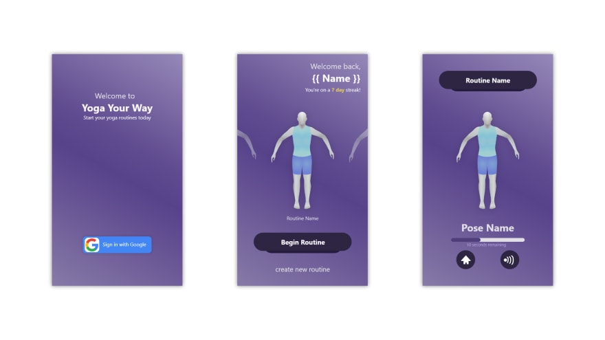
Yoga Your Way (YYW) is a school project that I and 6 other teens are assigned to as a "final" project (even though we started it in the 3rd quarter, it lasts until the 4th), and this year we are "expanding" on what we had last year, but that's looking more like rewritting the entire app from scratch as a Progressive Web App (PWA).
What was last years app like?
Starting from the beginning, last years version was a pretty crummy app that hardly worked (I can bash it since I made it). The main reason for it being a pretty trashy app is that for all of the "transitions," I used a custom JavaScript-based transition engine that functioned on for-looping through absolute positioning (top 0 to top 100 as an example). In theory, it worked well, however on mildly-lower end devices it absolutely died.
Also, the color scheme was horrendous. I don't know why I thought it was a good color scheme, but you live and you learn.
Whats different this year?
Over this past year, I've learned so much (and will continue doing so) that will help me lead a much better development life cycle. Also, my technical skills have grown immensely since last year, especially in the front-end realm as I've recently gone deep into CSS Grids and Flexboxes. While I'm still nowhere near perfect, I believe I can help produce a much higher quality product this year.
Also, last year we were relying on an "SVG" image for the pose, which didn't allow us to do any animating between poses. While it worked, it wasn't even close to good as it was a pain to register all of the poses. You may have noticed that SVG was in quotes, and that is because all of the team members were submitting different file formats (PNG, JPG, etc), or even just renaming a file.png to file.svg, which technically worked, however it didn't look good in the end and we finished with many poorly integrated poses.
This year, the team and I are working on an in-browser pose editor to help us create poses faster and more efficiently. While it is slowing development of poses down significantly, we believe it will be worth it in the end as we'll be able to mass produce poses in one place. Another plus about this system is that we can (theoretically) animate between poses easily, making a much more aesthetically pleasing flow of routines.
Finally, last year we did all design stuff on the fly. This year, we decided to step it up a notch and use Adobe XD to completely design and prototype the app. Our client LOVED that we did that because she could give us immediate feedback on how the design was by making comments on it. We also liked that our client could preview the app because if we made something the client didn't expect, it's not the requested app and we'd need to start from scratch. This nearly happened last year, but a full school day's worth of coding saved us from doom (this happened because we got caught up in some client and stakeholder communication mix ups where we thought the client was talking to a stakeholder when, in reality, there was no communication).

What has the team completed so far?
In all, the team has completed quite a bit, even though we do have a lot to finish before our 4/24 deadline. While this deadline may change because of our, as of now, 3 week hiatus from school due to the Coronavirus, our teachers have confirmed that this is still the plan.
Now, back to the question. What have we completed?
So far, we've gotten the registration, home, and a segment of the creation page complete, and they look very similar to the design concepts we had. Our Google OAuth flow is going really well too, we have successfully logged a user in and registered them an account with minimal user interaction. Because this app is a PWA, this means that we can have seamless continuity between a desktop version and mobile version if we wish.


Top comments (0)