
Creating navigation menus are now as easy as swiping right on Tinder :P with only less than 10 lines of CSS.
Thanks to FlexBox! FlexBox is a 1D property and that's enough for a nav menu. No more floating lefts and rights, all you need is a list of menu items inside 'ul' tag. Add your logo in that list too.
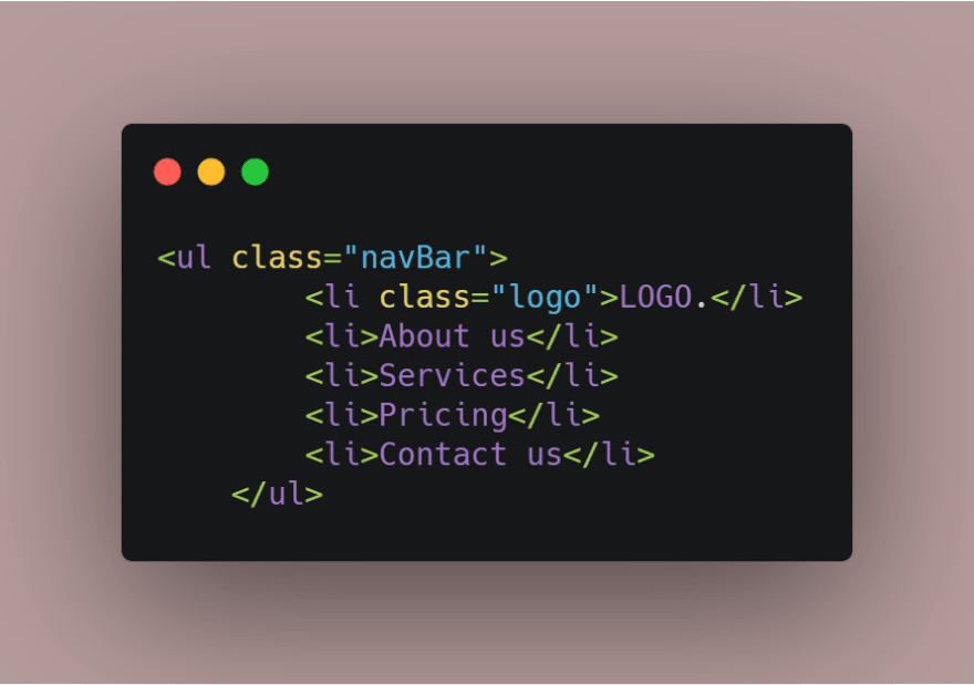
Here's the HTML:
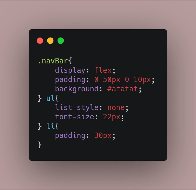
Now comes the CSS part. You just have to set the display property of the ul to 'flex' and the necessary padding.
Here's the CSS:
Now we want to push the menu to the right and the logo to the left, right? But we can't use float. We will just use one line of CSS for the '.logo' class.
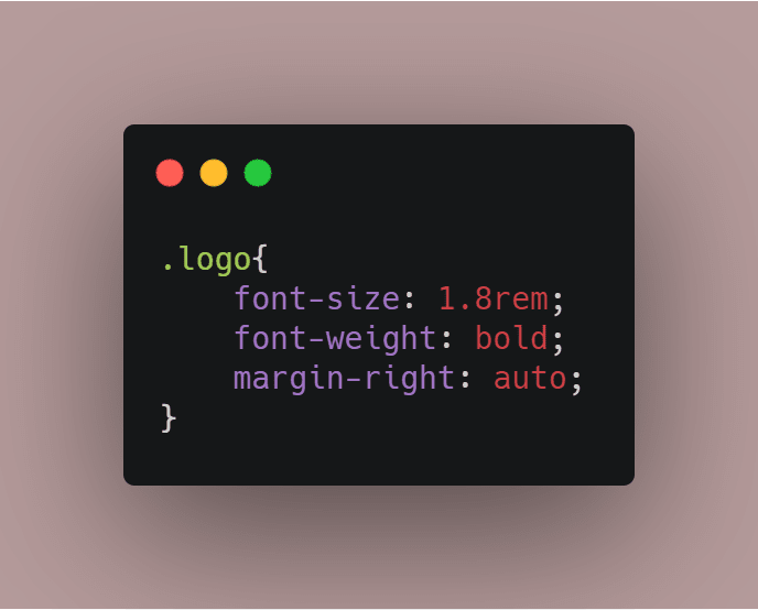
Do you see that 'margin-right: auto' property??
That is doing the whole magic. That is filling all the white-spaces to the right of the logo with the menu items. That gives us the logo on the left and the menu items on the right. Isn't that awesome?
Here's the output

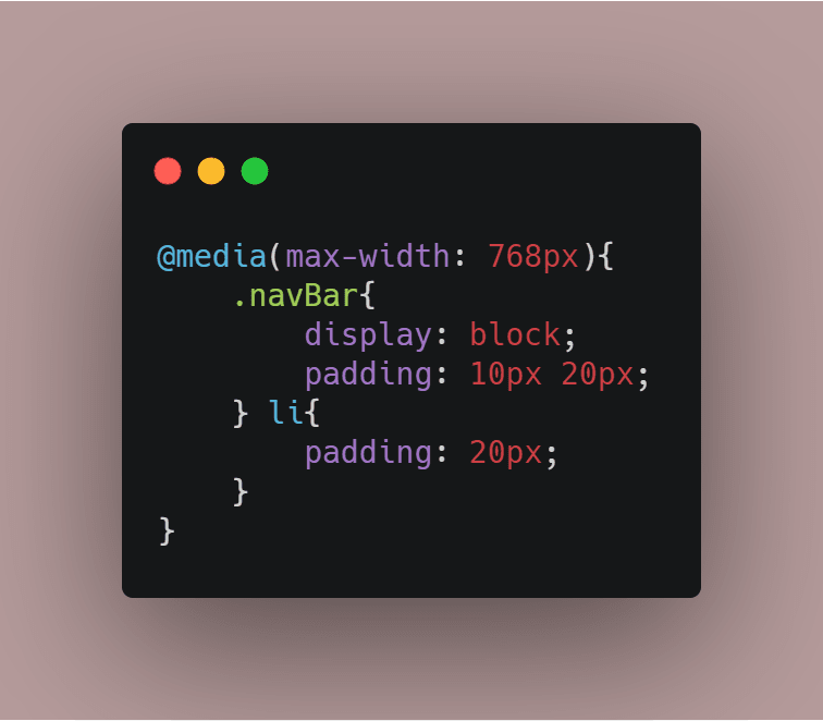
And that was all. That's all you need to know to create a responsive nav menu. Now to go to the next level, you can add media queries to change the menu for different devices.
Here's a simple media query for an iPad device
You can also check it out on my CodePen profile
Thanks for reading it to this far. I'm still working on my explanations. I know, I'm no expert. I'm just a learner.
You can share any of your feedback, I appreciate all. Thanks!

Top comments (0)