The following post is adapted from a tutorial I wrote on another blog a year and a half ago. Much has changed since then, so I decided to modernize the code here to use GSAP 3.x and React hooks instead of a class-based component. Enjoy!
Do you like Star Wars? Do you enjoy animating things in a web browser?
So do I!
I’ve wanted to dig into the GreenSock library for a while now, so of course, my first instinct was to try recreating the Star Wars opening crawl with it.
GreenSock (aka GSAP) is a library that makes animating DOM elements with JavaScript exceptionally easy. At first, the library can seem a bit daunting, but if you can wrap your head around a few core concepts you’ll be up and running in no time.
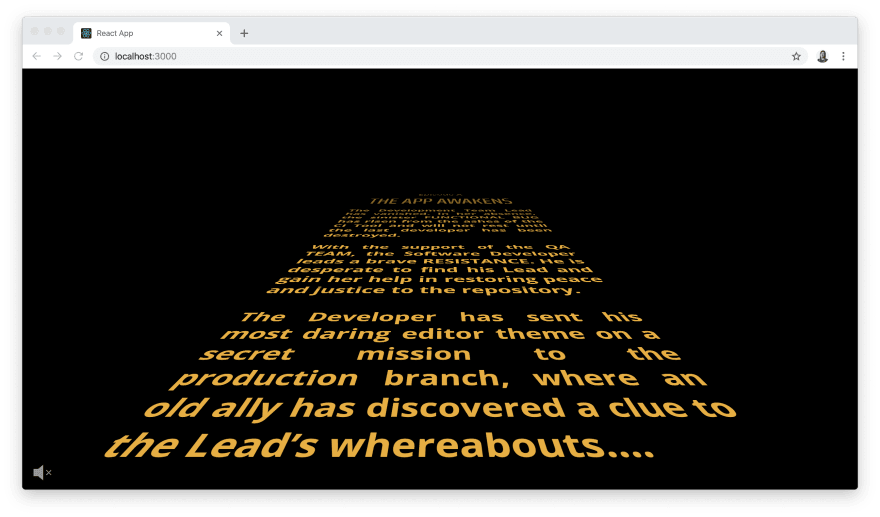
Here’s what we’re working towards:
TL;DR Check out a live demo of the crawl here and the complete repo here.
Note: This tutorial was partly inspired by another post by Christopher Kade that I saw here on dev.to. Check out that original post for a version of the Star Wars crawl that uses CSS keyframe animation instead of GSAP.
Getting Started
We’ll start by creating a new React app:
npx create-react-app star-wars-crawl-greensock-with-hooks
Then we'll start the app:
cd star-wars-crawl-greensock-with-hooks && yarn start
For the most part, we'll work with the default files in the React app we just scaffolded, but we’ll swap the logo.svg file for a Star Wars-inspired one and add additional SVGs for a volume button at the end.
The original opening crawl used various styles of Franklin Gothic, but we’ll keep it simple and use Open Sans, which is a readily-available, close approximation, and Saira Extra Condensed (both available on Google fonts).
We’ll start by adding our fonts and a minimal reset and to index.css:
/* Fonts */

@import url("https://fonts.googleapis.com/css?family=Open+Sans:400,600,700|Saira+Extra+Condensed:500");

/* Minimal Reset */

html,
body,
div,
h1,
h2,
p,
section,
audio {
  margin: 0;
  padding: 0;
  border: 0;
  font-size: 100%;
  font: inherit;
  vertical-align: baseline;
}

html {
  font-size: 24px;
}

body {
  align-items: center;
  background: black;
  color: rgb(229, 177, 58);
  display: flex;
  font-family: "Open Sans", sans-serif;
  font-weight: 400;
  height: 100vh;
  justify-content: center;
  line-height: 1.25;
  overflow: hidden;
}

div[id="root"] {
  width: 100%;
}
Now would be a good time to wipe out all of the default styles in App.css as well, because we’ll be adding our own CSS to this file as we go along.
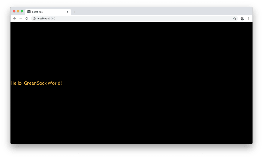
Lastly, we’ll edit the default code in App.js to be the following:
import React from "react";

import "./App.css";
import logo from "./logo.svg";

function App() {
  return (
    <div>
      <p>Hello, GreenSock World!</p>
    </div>
  );
}

export default App;
Note that you'll also want to replace the default logo.svg file in the src directory with our Star Wars-style logo available here too.
At this point, our React app should look like this:
Before we dive into GSAP, it’s a good idea to have a game plan. There are three separate animations we need to create. We’ll need to animate:
- The “A long time ago in a galaxy far, far away...” text first
- The logo entrance and exit
- And finally, the episode number/name and the main text crawl
Let’s tackle each of these in order...
Animate the Intro Text
Now for the fun part. Start by installing the GreenSock library in your app:
yarn add gsap
Next, we’ll import gsap, create a ref, add the intro text to our JSX, and describe how we want to animate it in the useEffect hook in App.js:
import gsap from "gsap";
import React, { useEffect, useRef } from "react";

import "./App.css";
import logo from "./logo.svg";

function App() {
  const intro = useRef();

  useEffect(() => {
    gsap.to(intro.current, { opacity: 1, delay: 1, duration: 4.5 });
    gsap.to(intro.current, { opacity: 0, delay: 5.5, duration: 1.5 });
  }, []);

  return (
    <div className="container">
      <section className="intro" ref={intro}>
        <p>
          A long time ago, in a galaxy far,
          <br /> far away....
        </p>
      </section>
    </div>
  );
}

export default App;
We’ll also need more CSS to horizontally and vertically centre the intro text, adjust its size, and change its colour to blue in App.css:
.container {
  height: 100vh;
  position: relative;
  width: 100%;
}

.intro {
  left: 50%;
  opacity: 0;
  position: absolute;
  transform: translate(-50%, -50%);
  top: 50%;
  z-index: 200;
}

.intro p {
  color: rgb(75, 213, 238);
  font-size: 1.25rem;
}
As a substitution for using componentDidMount to kick-off the animation we use the useEffect hook to transition the intro text from opacity: 0 to opacity: 1 and back again. This effect has no dependencies so we pass it an empty array as a second argument. It's important to include the dependency array argument in this call to useEffect because we only want our animation to start and run with the first render. We also need to call the useRef hook to create a ref to attach to the underlying section DOM node we want to animate.
In App.js we have our first encounter with GSAP. The gsap object's to method allows us to tween one or more properties of a specified target. It accepts two arguments: the reference to the element we want to animate (accessed via a ref) and a vars object describing the properties of the animation. If you used previous versions of GSAP, then you will see that it can be used as a replacement for TweenLite.to() or TweenMax.to(), but we add the duration length in the vars object now instead of including it as a separate argument.
We use gsap.to() twice so we can first animate the opacity of the intro text in for 4.5 seconds after a 1-second delay, then fade it out after a 5.5-second delay (because we need to wait for the first animation to complete before the second one begins).
Calculating delay times this way seems a bit awkward though...perhaps we can do better? Luckily, GSAP provides a more streamlined API for timing multiple animations using gsap.timeline().
Let’s refactor useEffect in App.js:
// ...

function App() {
  // ...

  useEffect(() => {
    let tl = new gsap.timeline();

    tl
      .to(intro.current, { opacity: 1, delay: 1, duration: 4.5 })
      .to(intro.current, { opacity: 0, duration: 1.5 });
  }, []);

  // ...
}

export default App;
Much better! A GSAP timeline acts as a container for sequencing a series of tweens over time, starting one after another by default (with the ability to overlap them if necessary). We’ll chain the rest of our animations onto this as we go.
Animate the Title
To give the title the appearance of dramatically popping onto the screen and gradually drawing back in space we’ll need to animate the logo's scale and opacity.
Start by adding another section directly below the intro to contain the logo.svg in App.js:
// ...

function App() {
  // ...

  return (
    <div className="container">
      {/* ... */}
      <section className="title" ref={title}>
        <img src={logo} alt="Code Wars title" />
      </section>
    </div>
  );
}

export default App;
Add the title class to the same rules that apply to the intro in App.css:
/* ... */

.intro,
.title {
  left: 50%;
  opacity: 0;
  position: absolute;
  transform: translate(-50%, -50%);
  top: 50%;
  z-index: 200;
}

/* ... */
And then add a few additional styles to center the logo.svg in its parent section:
/* ... */

.title {
  align-items: center;
  display: flex;
  justify-content: center;
  width: 18rem;
}
Onto the JS now—in App.js we'll need to create a title ref for the new section so we can animate it:
// ...

function App() {
  const intro = useRef();
  const title = useRef();

  // ...
}

export default App;
And chain on our additional animations in useEffect:
// ...

function App() {
  // ...

  useEffect(() => {
    let tl = new gsap.timeline();

    tl
      .to(intro.current, { opacity: 1, delay: 1, duration: 4.5 })
      .to(intro.current, { opacity: 0, duration: 1.5 })
      .set(title.current, { opacity: 1, scale: 2.75 })
      .to(title.current, { scale: 0.05, ease: "power2", duration: 8 })
      .to(title.current, { opacity: 0, duration: 1.5 }, "-=1.5");
  }, []);

  // ...
}

export default App;
As you can see, we chain the .set() method to flip the opacity of the logo to 1 and set the scale of the logo to 2.75 instantly after the intro animation completes.
We then use the .to() method to scale the logo down to 0.05 over 8 seconds. Simultaneously reducing the logo opacity over the same duration won’t look right because we don’t want to fade it out until it’s far off in the distance. GSAP's timeline makes it easy to work around this by chaining a separate .to() method to animate the opacity of the logo to 0, passing a third argument of '-=1.5' so it will start that animation 1.5 seconds before the end of the previous animation.
We also have our first encounter with a GSAP easing curve in our logo animation properties. I experimented with a few different curves and power2 felt the most like original animation to me, but feel free to experiment with others.
Animate the Crawl
We’re almost there! Add a final section containing the crawl text in App.js:
// ...
function App() {
// ...
return (
<div className="container">
{/* ... */}
<section className="crawl">
<div className="content" ref={content}>
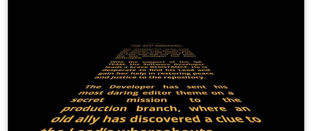
<h1 className="episode-number">Episode X</h1>
<h2 className="episode-title">THE APP AWAKENS</h2>
<p>The Development Team Lead has vanished. In her absence, the sinister FUNCTIONAL BUG has risen from the ashes of the CI Tool and will not rest until the last developer has been destroyed.</p>
<p>With the support of the QA TEAM, the Software Developer leads a brave RESISTANCE. He is desperate to find his Lead and gain her help in restoring peace and justice to the repository.</p>
<p>The Developer has sent his most daring editor theme on a secret mission to the production branch, where an old ally has discovered a clue to the Lead’s whereabouts....</p>
</div>
</section>
</div>
);
}
export default App;
Replicate the crawl text from your favourite episode, or have some fun with this!
The CSS for the crawl is tricky but luckily doesn’t involve any fancy camera rigging. Our implementation relies on a 3D transform with absolute positioning in App.css:
/* ... */

.container:before {
  background: linear-gradient(
    to bottom,
    rgba(0, 0, 0, 1) 0%,
    rgba(0, 0, 0, 1) 20%,
    rgba(0, 0, 0, 0) 40%,
    rgba(0, 0, 0, 0) 100%
  );
  bottom: 0;
  content: " ";
  left: 0;
  right: 0;
  position: absolute;
  top: 0;
  z-index: 100;
}

.crawl {
  font-size: 300%;
  bottom: 0;
  height: 80rem;
  left: 50%;
  position: absolute;
  transform: translateX(-50%) perspective(300px) rotateX(28deg);
  transform-origin: 50% 100%;
  width: 90%;
}

.content {
  position: absolute;
  top: 100%;
}

.episode-number {
  font-weight: 600;
  margin-bottom: 5rem;
  text-align: center;
}

.episode-title {
  font-family: "Saira Extra Condensed", sans-serif;
  font-size: 250%;
  font-weight: 500;
  line-height: 1;
  margin-bottom: 7rem;
  transform: scale(1, 1.5);
  text-align: center;
}

.content p {
  font-weight: 700;
  line-height: 1.33;
  margin-bottom: 4rem;
  text-align: justify;
}
The :before pseudo-element on the container class helps fade the text out as it recedes back in space.
Next, we'll add a third ref to the component in App.js:
// ...

function App() {
  const intro = useRef();
  const title = useRef();
  const content = useRef();

  // ...
}

export default App;
And chain a final .to() to scroll the text back into space:
// ...

function App() {
  // ...

  useEffect(() => {
    let tl = new gsap.timeline();

    tl
      .to(intro.current, { opacity: 1, delay: 1, duration: 4.5 })
      .to(intro.current, { opacity: 0, duration: 1.5 });
      .set(title.current, { opacity: 1, scale: 2.75 })
      .to(title.current, { scale: 0.05, ease: "power2", duration: 8 })
      .to(title.current, { opacity: 0, duration: 1.5 }, "-=1.5")
      .to(content.current, { top: "-170%", duration: 200 });
  }, []);

  // ...
}

export default App;
To scroll the text back, we simply need to animate its top property over approximately 200 seconds.
Finishing Touch (Adding Music)
Our animation looks pretty good at this point, but a Star Wars-inspired crawl wouldn’t be complete without a soundtrack to accompany it.
This would have a much easier to accomplish prior to the release of Chrome that blocked non-muted, autoplaying audio. To make our soundtrack Chrome-friendly we’ll need to start autoplaying the theme music at a point synchronized with our animation (it will start muted) and give the viewer the ability to unmute the audio if they wish.
We’ll start by importing two SVGs to App.js to use as a button to indicate to the viewer whether the audio is muted. We'll also need to import useState from React now too:
import gsap from "gsap";
import React, { useEffect, useRef, useState } from "react";

import "./App.css";
import logo from "./logo.svg";
import volumeOff from "./volume_off.svg";
import volumeOn from "./volume_on.svg";

// ...
You can find the volume_on.svg and volume_off.svg files in the repo for this tutorial. Shout-out to Agarunov Oktay-Abraham for the Noun Project icons.
We’ll need to add a final ref to the component in App.js, and we’ll also need to manage some state with respect to whether the audio is muted (initiating it as true):
// ...

function App() {
  const intro = useRef();
  const title = useRef();
  const content = useRef();
  const audio = useRef();

  const [muted, setMuted] = useState(true);

  // ...
}

export default App;
We’ll also need to add some JSX for the audio element and a button to trigger the unmute action just after the crawl section:
// ...

function App() {
  // ...

  return (
    <div className="container">
      {/* ... */}
      <audio ref={audio} muted>
        <source
          type="audio/mpeg" src="https://ia801501.us.archive.org/23/items/StarWars_20180709/Star%20Wars.mp3" />
      </audio>
      <button
        className="volume"
        type="button"
        onClick={() => {
          audio.current.muted = !muted;
          setMuted(!muted);
        }}
      >
        {muted ? (
          <img src={volumeOff} alt="Volume is off" />
        ) : (
          <img src={volumeOn} alt="Volume is on" />
        )}
      </button>
    </div>
  );
}

export default App;
And some CSS to style the SVG icon button in App.css:
/* ... */

.volume {
  background: transparent;
  border: 0;
  bottom: 10px;
  cursor: pointer;
  left: 10px;
  position: absolute;
  z-index: 1000;
}

.volume img {
  height: 24px;
}
Lastly, we need to start playing the audio at a synchronized point in the GSAP animation, which is right as the intro animation completes and the logo animation starts. The object of animation properties that .to() accepts can contain an onComplete method where we can trigger the audio to begin playing:
// ...

function App() {
  // ...

  useEffect(() => {
    let tl = new gsap.timeline();

    tl
      .to(intro.current, { opacity: 1, delay: 1, duration: 4.5 })
      .to(intro.current, {
        opacity: 0,
        duration: 1.5,
        onComplete: () => {
          audio.current.play(); // autoplay the theme music
        }
      })
      // add a short delay on the next step to sync better with the audio
      .set(title.current, { opacity: 1, scale: 2.75, delay: 0.5 })
      .to(title.current, { scale: 0.05, ease: "power2", duration: 8 })
      .to(title.current, { opacity: 0, duration: 1.5 }, "-=1.5")
      .to(content.current, { top: "-170%", duration: 200 });
  }, []);

  // ...
}

export default App;
I found that adding a slight delay on the logo animation at this point helped sync up the opening note of the theme with the beginning of the animation, but you may want to play around with this a bit more.
Congrats on making it to the end! By now, you hopefully have an idea of how easy it is to get started with GreenSock—and we’ve only scratched the surface of what it’s capable of. Have fun making your own Star Wars-inspired crawls, and feel free to post any questions in the comment section below.


Latest comments (5)
Mandi. Thanks for putting this together, I have a mobile app built on Ionic using Angular and adapted this to work there. It adds a lot of fun. I did run into one issue though once it was running on the iphone. I had to increase the transform perspective distance. On the iphone, if I didn't have a higher perspective distance, about 3/4 of the way through the crawl, the text would disappear. Once I increased the perspective value, it was all good.
A well explained and documented article! Thank you for this.
Looking forward to reading you again soon!
Mandi I really like your article. And I'll be using it on a project. I recently built this e-commerce website which uses semantic-ui. Check it out... happyeverafter.online.
I think the use of React doesn't add dead weight to the page. It's a web framework that is easy to set up and familiar to many developers out there.
Nicely done!
But why are you using react for something like this? Besides you wanting to learn react I can see no benefit in using it in this case. It only adds dead weight to the page.
I'm assuming you are just comfortable with building things in react and chose it for that reason. I'm really interested btw, not hating :)
Thanks for your comment! For context, when I wrote the original version of this post last year it was just a little experiment combining React and GSAP (I was testing the waters for using GSAP with a larger React-based project). If the only intention is to recreate the Star Wars crawl, then vanilla JS would definitely get the job done without a lot of extra JS behind the scenes :)