This is good stuff.. although, the stylesheets still load, even with a media attribute. Combining css into fewer sheets/links, and keeping the media queries in the stylesheet, is proving to be the fastest way to load.
If a user loads the website on phone in landscape that has more that 768px,
then rotates the screen into portrait, will the mobile.css file be loaded and applied?
That could make a big difference in my work. I could try that on my next project.
No, it won't be loaded by default since the media is checked on the loading time. However, you can actually call a javascript function which will add that link to head dynamically when a user rotates the screen but it depends if it fits your project needs
For further actions, you may consider blocking this person and/or reporting abuse
We're a place where coders share, stay up-to-date and grow their careers.

This is good stuff.. although, the stylesheets still load, even with a media attribute. Combining css into fewer sheets/links, and keeping the media queries in the stylesheet, is proving to be the fastest way to load.
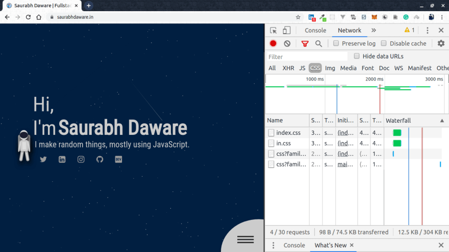
Hi Mark, I just checked my network tab and
mobile.cssis not really getting any request when I turn to desktop view.Mobile view

Desktop View
I'm not really sure about the browser support or for any gotchas in this but apparently this is how it works in new browsers.
Thank you for reading the article 🌻
I have a question on that matter.
If a user loads the website on phone in landscape that has more that 768px,
then rotates the screen into portrait, will the mobile.css file be loaded and applied?
That could make a big difference in my work. I could try that on my next project.
No, it won't be loaded by default since the media is checked on the loading time. However, you can actually call a javascript function which will add that link to head dynamically when a user rotates the screen but it depends if it fits your project needs