
I recently learned about three CSS functions I can't believe I'd never heard of before: min, max, and clamp. They let you define a fluid range of values for about any property in a single line. They sound simple but open up a lot of possibilities.
This excited me, but then I checked how long some major browsers had supported them. Most have done so for a few months, with Chrome supporting it since 2019 and Safari since 2018.
As the cliche goes, better late than never. Plus there's this whole pandemic occupying my thoughts, so I'm not upset with myself. But it's still embarrassing in a field about constant learning and following updates. So I thought I'd write a blog post about them to help anyone else who may not yet know about them. Also to prove to myself (and the world) I've finally caught up (for now).
What can These Functions do?
Let's say you have an article and want it to go full width, but stop at a certain size. CSS already makes that pretty easy with two lines.
article {
 width: 100%;
 max-width: 700px;
}
With min, you can pull this off with one line.
article {
 width: min(100%, 700px);
}
Same result, less CSS! Granted, this is a simple example, but that's because width is already a lucky property. It has complimenting properties like max-width and min-width to give it limits.
But consider all the properties that don't have this, like padding and font-size. Making a fluid CSS font size used to take complex math stuck into in a Sass mixin. But these functions bring all that to native CSS in a much simpler format.
How Exactly do they Work?
Let's start with min and max, since clamp is a combination of the two. I find the names misleading since how they work seems flipped around.
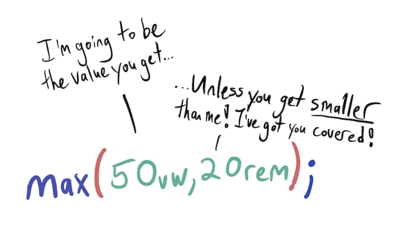
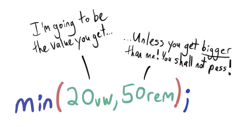
-
mintakes two arguments: a base value and a hard maximum the first can't be larger than. -
maxtakes two arguments: a base value and a hard minimum the second can't be smaller than.
Yes, min sets the largest possible value, and max sets the smallest possible value. No, this does not make any sense to me either. So I drew up some doodles for how the values work together as a reminder.
Thankfully clamp is easier to understand. It has three arguments: the smallest value, the base value, and the largest value. The base value is what kicks in as long as it's within that range.
p {
 font-size: clamp(1rem, 2.5vw, 2rem);
}
This example is pretty easy to understand at first glance. Paragraph tags will start at 1rem and grow as the screen size increases. But they'll stop growing when they hit 2rem. The base value just controls how fast that increase happens.
Remember when I mentioned these functions could make fluid typography faster and easier? This is exactly how one would do that.
Can I Use Them?
The big caveat with any neat CSS feature is always browser support. As of this writing, all major browsers support them except, of course, Internet Explorer. This isn't a big deal, since you can use them as a progressive enhancement over a functional baseline.
p {
 font-size: 1.2rem;
 font-size: clamp(1rem, 2.5vw, 2rem);
}
As I hope more and more designers come to learn, it doesn't need to look the same across browsers.
Go Forth and Find Your Limits!
I'm embarrassed that I'm finding useful CSS functions like these months after the fact. But they're here, they're useful, their names are confusing, but they're mostly ready to go! Go forth and embrace your CSS property limits to become more limitless.

Oldest comments (2)
This is great content.
That's quite a nice piece of writing. I've watched Ken Powell's video for that as well and both this and that video are amazing.