
There can be times when you want to request desktop site on iPhone or iPad to see how a web page looks or check some specific details or functionality that are only available in desktop mode. This tutorial talks about how to request desktop site on an iPhone.
A developer and a user don’t view a web application from the same perspective. When developing a web application, a developer works on a desktop machine. Ideally, the developers should keep checking their web applications on various devices using online cross browser testing tools. However, time constraints generally limit their freedom.
On the other hand, the end-users expect a consistent experience across each device and are less concerned about the technical aspects of the web applications. However, these ideal conditions do not always stand true, and we try to find other solutions to enhance our web experience and interact with the website.
This guide explains these solutions and demonstrates them for iOS users. In this tutorial, we look at how to request desktop site on iPhone.
Following the methods of requesting desktop sites on iPhone, iOS users can open a non-responsive website on their mobiles with a couple of clicks.
Understanding website responsiveness
Before discussing how to request desktop site on iPhone, let’s first discuss why it’s crucial to have a mobile-friendly website in today’s world.
Responsive design is not a new term in the web development world today. Whenever there is a requirement to create a web application, it is rare these days that “it should be responsive” is not on the requirement list.
As per a survey, mobile internet traffic is heavier than desktop traffic. Everyone wants to prepare for mobile users and develop their websites accordingly. As a result, responsive CSS frameworks such as Bootstrap give you a pre-cooked recipe that requires almost no assistance from the developer.
However, the responsiveness of a website is not just rescaling a website; it is not the only thing that will bug the user and force him to request desktop website on iPhone.

Snapshot from LT Browser
Responsiveness, in simple words, means each element should be adjusted and behave as if it was made just for the mobile device. If you have images, rescaling them down makes them small and out of focus. Here, special techniques are required to apply responsiveness to the images.
Along with image responsiveness, the other major element that needs attention is the CSS typography and font-related elements. If we start reducing fonts in the same proportions as the mobile screen has reduced, we may end up serving font size less than 6 points on a mobile device. Ideally, font size is recommended to be 16 points on a mobile screen.
**Need MD2 hashes? Protect your data with our powerful MD2 Hash Calculator that create secure, one-way hashes and make your data safe from prying eyes. Get started now. **
Risks associated with non-responsive websites
If we discuss risks associated with a non-responsive website, the biggest one is that users generally don’t consider the “switch to desktop” option. Either your website is unique, and the user has no choice but to interact, or it is a government website.
According to a survey, users judge websites in the blink of an eye. Therefore, being unable to render the website according to the mobile could be an icebreaker.
Another major risk that can haunt you when your web application is not rendering as it should on a mobile device is that it can slide back in Google search rankings considerably — survey. Since Google’s algorithm prefers mobile-first web designs, it knowingly pushes the website down to provide the users with a good experience. However, this happens only on a mobile.
Apart from this, issues such as low active user count and increased bounce rate are also bound to happen as a direct effect.
Looking for a quick way to generate hashes? Try our MD4 Hash Calculator to get strong hash values for your data and protect your information from cyber threats.
How to request desktop site on iPhone?
Requesting a desktop site is not a mobile feature but is implemented inside the browser. So you can quickly reproduce the steps we define in other browsers.
However, since iOS and Android applications have different user interfaces, you might face a slight change of steps on these operating systems. Therefore, this guide will focus on browsers installed on iOS (iPhone specifically).
To request desktop site on iPhone, we have two methods:
Request desktop site on iPhone using a native browser.
Request desktop site on iPhone using LambdaTest’s Real device cloud.
To understand how to request desktop sites on iPhone, let’s look at the above methods in detail.
Our Adler32 Hash Calculator is the perfect tool to create secure hashes to protect data from unauthorized access. Start creating your hashes now!
How to request desktop mode on iPhone using a native browser
The first method we’ll see is when you have the browser installed on the system and wish to request the desktop site from it. This method is ideal for users as they will find this exact scenario in the real world. But developers and testers should avoid this method.
Also, we will use the default Safari browser as it is available to every iPhone user. However, the steps would remain the same for other browsers too.
Below are steps on how to request desktop mode on iPhone.
Open Safari on your iPhone and navigate to the desired website.
Locate the ‘aA’ icon in the top corner near the address bar.

Tap the ‘aA’ icon to access the website view menu.
Within the menu options, select ‘Request Desktop Site’.
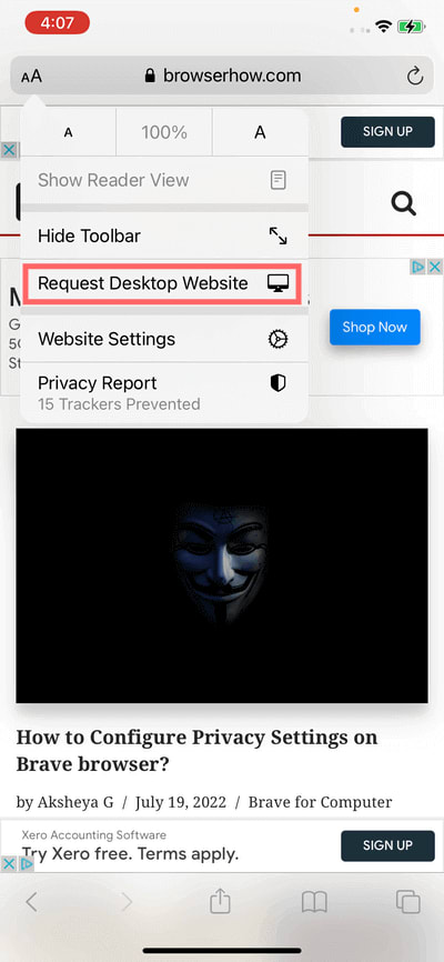
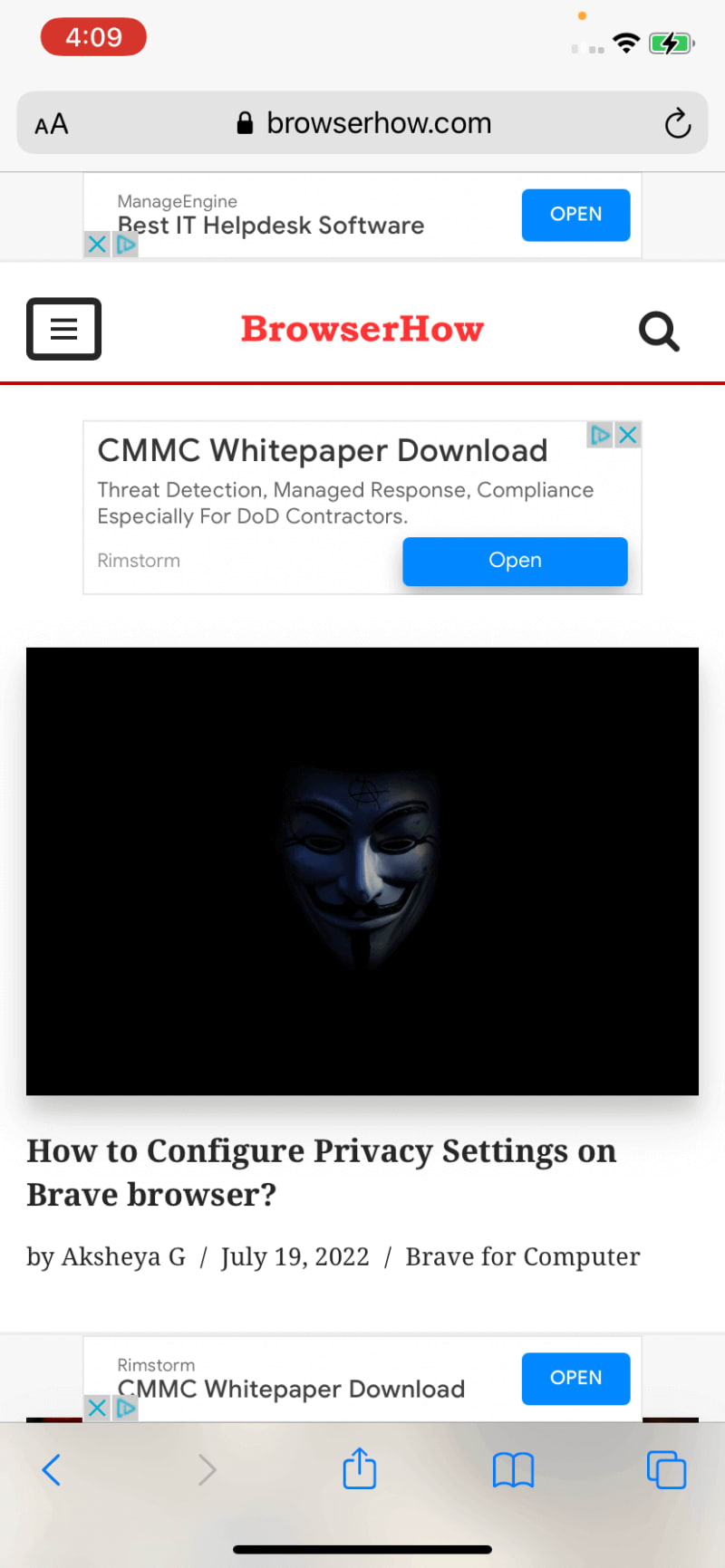
- By choosing this option, Safari will load the desktop version of the website, providing you with a comprehensive browsing experience.
As simple as it may seem, this is a practical method for regular users, not testers. This is because a tester has to check whether their web application can be accessed in the desktop and mobile versions on all the devices. If it can be done on an iPhone 14, it does not mean it can also be done on iPhone 12.
On top of it, buying a single device is not enough. A lot of the users do not update to the latest version. This became evident when Apple warned its users of security threats they may be vulnerable to if they do not get their software updates on time — report.
Therefore, the solution here is to buy more than a couple of similar devices with different specifications. However, this solution has a couple of problems:.
The budget for procuring so many devices can be a major expense in your project. Add this to the maintenance and testing budget, and your numbers may rise substantially.
There is no guarantee of what browser a person uses to access your web application. The current browser trend for iOS users is as follows:
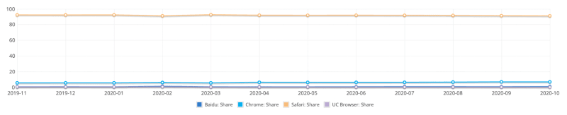
There is no doubt that Safari is the iOS user’s main preference topping out to more than 91% share. However, the rest of the 9% of users also use Chrome, Firefox, etc. If Apple has 1.2 billion iPhones, 9% accounts for 108 million iPhones — report. If you are ready to lose out on 108 million iPhones, you are losing a big chunk of your audience.
Therefore, theoretically, this is a good solution. But, practically, we may have to think about something else. In the next section on how to request desktop sites on iPhone, we look at the feasible option to request desktop sites on iPhone or iPad devices.
Need to create secure Gost hashes? Protect your sensitive information with our Gost hash calculator. Get started today and keep your data safe from hackers!
Request desktop site on iPhone using LambdaTest’s Real device cloud
When we have such a scenario where we need so many devices with varying specifications and want to cut down on costs and maintenance overwork, we look for people who do these things perfectly. Online cloud-based platforms know that testing on all devices is integral to a website’s success. Therefore, they provide devices to the testers through an online platform and take care of maintenance and other overheads. All you need to do is sign up on the platform, select the device, select the test environments, and start testing.
LambdaTest is one such continuous quality testing platform where you can test everything in a single place. With LambdaTest, you can perform online cross browser compatibility testing of websites and web applications on an online browser farm of 3000+ real browsers, devices, and operating systems. Requesting a desktop site on multiple browsers, which took probably an hour, can be done in minutes with LambdaTest.
You can leverage LambdaTest’s virtual testing and a real device cloud to test your mobile web apps at scale. It lets you test across various real Android and iOS devices and mobile emulators for browser testing.
Want to get started with Real device testing? Check out the below LambdaTest tutorial.
%{https://youtu.be/biHfV39PZBM}
Let’s look at how to request desktop site on iPhone using LambdaTest’s Real device cloud.
To start testing on LambdaTest, sign up for free and login to your LambdaTest account.
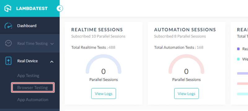
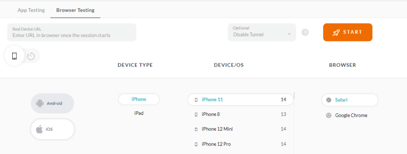
Once you’ve login, navigate to Real Device > Browser Testing.
- Select iOS, choose DEVICE TYPE, DEVICE/OS, and BROWSER. Click START.
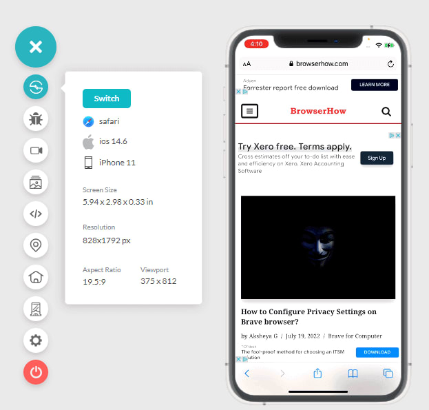
A cloud-based real iOS device will spin up based on your select device, browser, and OS combinations
Provide the website URL for which you want to request the desktop version and press Enter
- Click the AA icon and select Request Desktop Website.
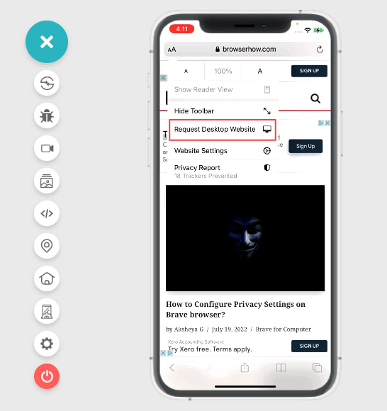
- It will load the particular website in its desktop version.
Although it is important to note here that even though this option will be available on any website you open on the browser, not all will load the desktop version. Some websites just refresh the page and load the same mobile website again.
Make your data tamper-proof with our Whirlpool Hash Calculator. Create secure hashes quickly and easily with just a few clicks. Try it out now!
Enabling desktop website on iPhones permanently
While using the methods described above, the server might start sending the mobile version of the web page when you visit other websites or web pages. Also, you might have to repeat the same pressing “Request Desktop Website” process if you are navigating to a different domain URL.
A better solution is to permanently turn on the desktop website feature until the testing part is complete. You can achieve this by making some changes in the settings as follows.
- Go to Settings.
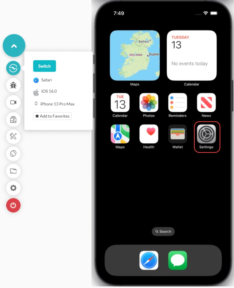
- Select Safari.
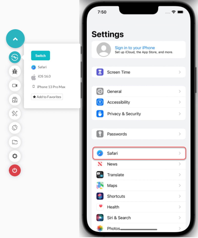
- Click the Request Desktop Website option.

- Enable the All Websites toggle button.
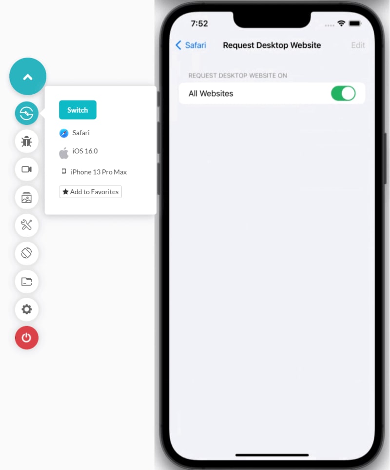
This will request the desktop version of the website regardless of the URL entered. You can think of this option as a permanent version of what we were doing through the browser
Need to create MD5 hashes quickly? Our MD5 hash calculator create reliable, one-way hashes quickly and keep your information secure. Try it out now!
Try it on other browsers
A user requests a desktop website on their iPhone for several reasons. I have often used this option when the UI crashes or the responsiveness is inadequate. The desktop website will get things done if you cannot accomplish the task on a mobile device. Hence, as a tester, you must ensure that your website grants access to the desktop version whenever requested.
In this guide on how to request desktop site on iPhone, we kept in mind both users and testers to highlight three methods of requesting a desktop site on an iPhone. In those sections, we discussed their shortcomings and what scenario each option would suit.
With this, I hope that these options will help you as a user or a tester while surfing the internet. For any suggestions and comments, please let us know in the comment sections.

Top comments (0)