This is my first time posting here. You can follow my weekly blog here, but I'll also start posting in DEV.
Last week was a lot of catching up as I was sick the first couple days, but I was able to get back on track by Sunday. It was a heavy week of material, but I feel much more capable of building out a responsive website. In fact, you could say I’m starting to feel like a real Web Dev!
Twitter Follower count: 33 (no change 😐 , you know what to do)
The Flexible Box Module
We learned the flexbox model. This truly is a game changer for me. I could not imagine being a developer before this was created. It makes it 1000% times easier to structure elements on the page and gives you better display control at varying screen widths. The elements’ positions are flexible.
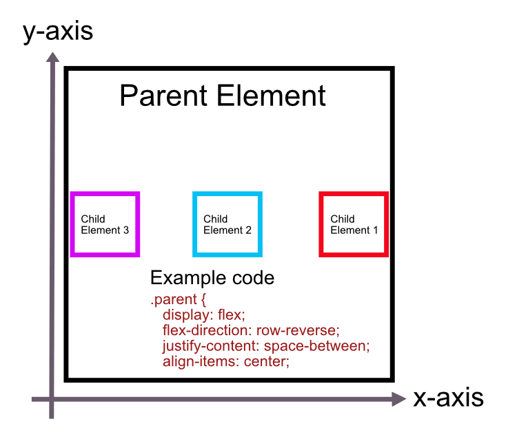
Let me try to show you how it works. You set the parent element to “display: flex”. This allows its child elements to display in a row or column. It would look something like this:
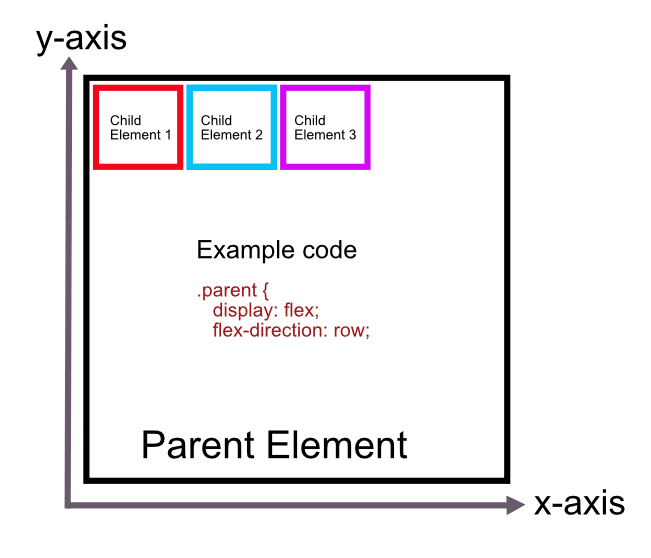
By default, the elements are always aligned to the top right, at the “start” of the parent element (I assume this is carried over from how we read text in the Western world).
Now that the child elements are behaved and orderly, you can decide if you want them to display at the top of the parent element, center, bottom, top right, bottom left, reverse order, etc. You can also automatically adjust even space between the child elements in case they’re prone to fighting.
To set where you want the children to sit, you can do either or both of the following:
justify-content: This aligns the child elements across the main axis. If they’re sitting in a row then it’s the x-axis because they’re sitting on the x-axis. If they’re sitting in a column, then the main axis is the y-axis because they’re aligned up and down. Here’s an example:
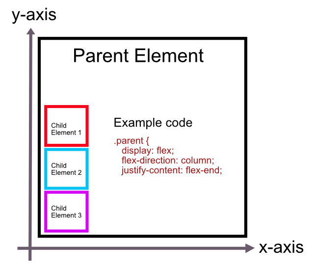
In the above example, we move the children to the bottom right by justifying them to “flex-end”. Remember the default is always top right, so we don’t have to align the items to the right, which the parent element reads as the “start”.
align-items: This aligns the elements on the cross axis. If they’re sitting in a row, then it’s the y-axis and if they’re in a column then it’s the x-axis as shown below.
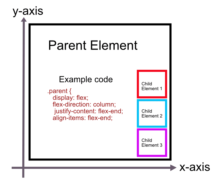
As you can see, the child elements are now aligned at the “end” of the cross axis.
If we were to apply the following code, where do you think the child elements would display?
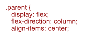
If you said, top middle, you’re correct! The default “justify-content” is going to be “flex-start” (the top) so we’re just moving the column to the middle of the parent now. And just to show off, here’s an example using “reverse”, which is does exactly what it says and “space-between”.
Super Responsive Layout Challenge**
**
After we learned about everything flexbox, we applied our learnings to a super responsive layout challenge. It was probably our hardest challenge to date, but it included everything we’ve learned up to this point and I think we all did a pretty good job. We were tasked with recreating this image at the various screen sizes:

As you can see there’s three different screen sizes, some images, a header, footer, main content area and some background images at the larger screen sizes.
Approaching this challenge seemed gargantuan at first glance for me, but once you start breaking down the elements it becomes easier. I can solve for the smaller elements and piece them together. I first wrote out the HTML structure of the page using inner-columns in each section (header, main, footer). This is something we learned and it looks like it applied in this case. In fact, most website use some form of an inner-column.
Learning from my past mistakes, I also started MOBILE FIRST. I made sure the CSS applied to the small screen first. Once I was able to get everything to look good on mobile, I expanded the screen width to 680px, where I felt like my content should switch to the medium screen size. I added the new background elements and shifted some of the content around from “column” to “row”. Then I moved onto the large screen size.
I definitely ran into some issues along the way, but was able to figure most of them out. It usually required me adding a parent element or applying CSS rules to the parent instead of the individual element. It was a fun challenge because it hit on everything we’ve learned and it was satisfying to use that knowledge and create a working, SUPER RESPONSIVE layout.
Since I started working on mine the day the 2022 NBA playoffs started, I decided to fill my content with just that. You can check it out here. I actually somewhat pleased with how it turned out. I will probably fix it up a bit and maybe even switch out Trae Young for Kyrie Irving (this’ll make sense if you visit my site).
More Typography
This class wouldn’t be called Design for the Web if it didn’t include DESIGN. We explored more typography and how it presents on a page, in our work a business card. We watched Ellen’s short class on Typography. It’s quite interesting in how type faces and it’s presentation can create different moods and feelings. After watching Ellen work through a business card, I tried applying her principles and created my own.

My name is vertical mostly because I thought it was fun. But I did align the top and bottom with the two other blocks of text. It’s also the biggest font size as that’s the main piece of information. I also thought making it vertical brings the eyes there first.
I changed the ampersand color to red to highlight that I do both development AND design. I thought it gives the card a little more character too instead of all black.
I spent probably a good hour rearranging the text to see what looked best in my opinion. While the content is minimal, there are a million different ways it can be displayed. I enjoy learning this part of the course. We’re not just putting content on the web and calling it a day. We’re learning the underlying motives and goals and how to use text, spacing, typography, colors etc to achieve those goals.
This was a long one, but thanks for hanging in there!
By the way, I predict the Celtics and Warriors going to the Finals with the Warriors winning in….6 games.

Top comments (0)