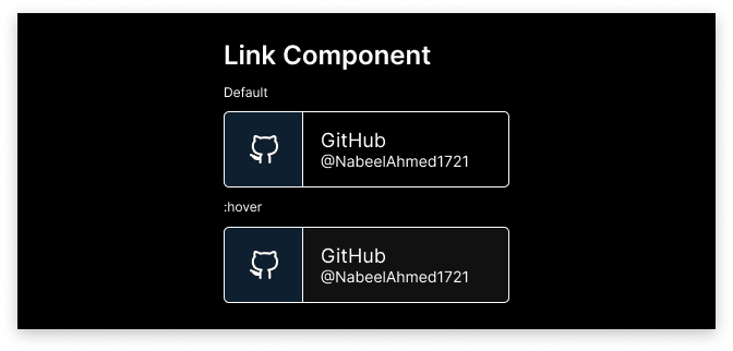
I wanted to create my own link component to showcase my social media because a lot of the ones I found online just didn't fit my aesthetic. 👽🧞
Recently I wanted to update my portfolio website. It had been almost two years since I had updated it. I had come a long way from simple HTML+CSS+JS Apache Server websites. I had learned several stacks and technologies over this period, and I wanted to put a lot of this knowledge to use by putting it into a site that reflects me.
Designing
There isn't much to talk about here. I just let my creative juices flow and spent a solid hour on Figma. I was able to design the following:
If you are wondering about specifics, I used the Inter font and the Feather Icon library.
Implementation
For the demo, I used TypeScript, React, and CSS for my stack. Here is the final result:
I made minor changes along the way such as adjusting the color of the description under the title.
Technicalities
This component is super responsive. No really, go on the embedded CodeSandbox project, view it in another window, and watch it beautifully align the links as you resize the window. 🏗
I also purposely designed the link to be chunky so it feels comfortable to tap on a smaller screen.
These are the possible props for the link component:
type LinkBadgeProps = {
  icon: ReactNode;
  title: string;
  desc: string;
  link: string;
  color?: string;
};
Everything is quite self-explanatory, however, something to note is that color, which can be hex or RGB, is not needed. It'll just default to #111.
Conclusion
Overall, I am happy with how it turned out. Feel free to use this component in any way, just give me credit :).
Well, that's it. Thanks for reading my post and consider following me on Instagram @nabeelahmed_.
~ Nabeel Ahmed


Top comments (0)