Hello Friends, In the last blog post we have learned how we can implement compound component pattern in react, you can read that post at below url
Exploring the Compound Component Pattern in React in 10 minutes – CodeLila
Today we are going to see an interesting pattern which can help us to write reusable styles and give flexibility to the component consumers to customize look and feel of the component we provided. You can download the code at react-design-pattern/style-pattern-example/src at main · navinprasadofficial/react-design-pattern · GitHub
Let us start with building simple example project and a sample component which will help us to learn style pattern in react. In the below example project I have created a simple component “MyComponent” and imported it in App component.

and imported the same in App component as below.

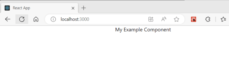
This is how it looks when we run the application.
1.Style Prop pattern
Let us updatethe code to apply some style on it. update the MyComponent Code as below.
function MyComponent() {
  return (
    <div
      style={{
        backgroundColor: "red",
        color: "white",
        padding: "1rem",
        textAlign: "center",
      }}
    >
      My Example Component
    </div>
  );
}

export default MyComponent;
In above code we have applied some style to the component using style attribute and it looks like below when rendered.

But there is one issue with above approch, it does not allow you to customized the style without changing the component code. what if we have a way to inject the style outside the component. Let us update the MyComponent code as below.
interface MyComponentProps {
  // props
  style: any;
}

function MyComponent(props: any) {
  const customStyle = props.style;
  return (
    <div
      style={{
        ...customStyle,
        backgroundColor: "red",
        color: "white",
      }}
    >
      My Example Component
    </div>
  );
}

export default MyComponent;
In above code we are expecting a style props to be passed if user want to customized our component style and then we are applying that to the component along with our default style for the component.
Let us see how we can pass the custom style to the component.
import React from "react";
import logo from "./logo.svg";
import "./App.css";
import MyComponent from "./components/MyComponent";

function App() {
  const customStyle = {
    padding: "1rem",
    textAlign: "center",
  };

  return (
    <div className="App">
      <MyComponent style={customStyle} />
    </div>
  );
}

export default App;
In above code we are passing a style object to the component using style prop. Let us see how it looks after render.

you can see that the custom style is applied along with stock style to the component. This is one way to extended the component style and give the component user flexibility to customized it using the style prop.
2. className prop pattern
Let us see another approch for extending the style which is using className props. Below is the updated code for MyComponent.tsx file
interface MyComponentProps {
  // props
  className?: string;
}

function MyComponent(props: any) {
  const customClassName = props.className;
  return (
    <div
      style={{
        backgroundColor: "red",
        color: "white",
      }}
      className={customClassName}
    >
      My Example Component
    </div>
  );
}

export default MyComponent;
In above code we are expecting a className prop for custom styling. To provide the custom className I am using module.css . Let us create a new file name CustomStyles.module.css at src folder and add below css code in it.
.MyComponentStyle{
    padding-left: 1rem;
    padding-top: 1rem;
    padding-bottom: 1rem;
    padding-right: 1rem;
    text-align: center;
  }
Now update the App.tsx code as below.
import React from "react";
import logo from "./logo.svg";
import "./App.css";
import customStyles from "./CustomStyles.module.css";
import MyComponent from "./components/MyComponent";

function App() {
  return (
    <div className="App">
      <MyComponent className={customStyles.MyComponentStyle} />
    </div>
  );
}

export default App;
In above code are importing the custom module css file and passing the desized className to the MyComponent react component using className prop.
Let us run the application and see if the className applied to the component or not.

You can see in above screen shot that the custom style is applied to the component using the className prop. you might be working the random suffix at end of className, this is by module.css and it prevent name conflicting.
Summary
In the above blog post we have learned that how we can provide the component styling flexibity to the user using the style and className props. You can use mix of both too as per your requirement.
Thanks and happy reading. Please like, share and subscrible the blog for regular updates. 
The post 2 Style Patterns in React for Extended Component Styling appeared first on CodeLila.

Top comments (0)