I happen to be using the React Grid component from DevExtreme Reactive for sometime now.
DevExtreme React Grid Overview
DevExtreme React Grid is a component that can be used to display table content from local and remote data sources. It includes a diversity of functionality on top of the table such as filtering, paging, grouping, sorting, selection and editing. On top of this all the elements and functionalities can be customized to our needs.
Problem statement
DevExtreme React Grid supports selection of items in the grid. In particular it supports selection of all items in the grid.
The Select All checkbox includes three different states - Selected, Unselected, Partially selected. When one or more but not all check boxes are selected, the Select All check box displays a partially selected state.

But there seems to be a difference in the color of the check box between the Selected and Partially Selected states. In the partially selected state, the checkbox seems to be in grey color. Our motive is to customize the color of this Partially Selected state of the Select all checkbox.
Customizing Select All checkbox
Each element in the table created with the help of a basic TableCell component. Hence customizing the Select All checkbox would mean customizing the TableCell that holds the checkbox.
We can do the same by utilizing the headerCellComponent property of the TableSelection component in DevExtreme React Grid.
<TableSelection
      showSelectAll={true}
      headerCellComponent={CustomHeaderCellWithCheckbox}
 />
Now that we know where to include the custom cell component, let's see how to create the component to customize the select all check box.
The headerCellComponent requires a Component that takes in the properties defined in type HeaderCellProps
The HeaderCellProps has four fields:
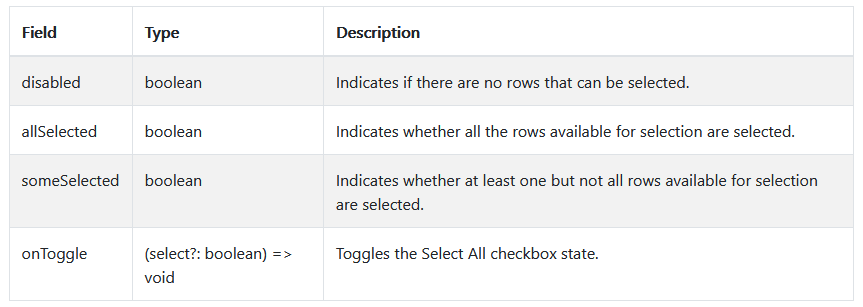
( img source: https://devexpress.github.io/devextreme-reactive/react/grid/docs/reference/table-selection/#tableselectionheadercellprops )
The custom component that we are going to write should handle all these four properties and manage the status of the checkbox based on these properties. Let's start writing the component CustomHeaderCellWithCheckbox.
const CustomHeaderCellWithCheckbox = ({
  disabled,
  allSelected,
  someSelected,
  onToggle,
}) => {
  return (
    // TODO: Map the input props to Checkbox's states
  );
};
Create a Checkbox element and wrap it inside a TableCell Component. Use necessary padding to have the checkbox in the center of the cell.
- Map the inbound
disabledproperty directly to thedisabledproperty of the checkbox. - Map the inbound
someSelectedproperty to theintermediateproperty of the checkbox. Theindeterminateboolean property is responsible for displaying the partially selected state of the checkbox. Mapping the state of thesomeSelectedproperty to it would let the check box know whether to display the indeterminate check box or not. - As this is the Select All check box, it would have to be checked if all items are selected. The
allSelectedinbound property reflects that state and can be mapped tocheckedproperty of the Checkbox.
<Checkbox
        disabled={disabled}
        indeterminate={someSelected}
        checked={allSelected}
/>
- Now the left over inbound property is onToggle, which is a function that takes in a boolean value. The onToggle function is used to change the state of the checkbox based on the current state. Our responsibility is to call the onToggle method with
trueorfalsebased on the state of someSelected and allSelected, whenever the checkbox is clicked. Hence we need to wire theonChangehandler of the checkbox with the onToggle method. We need to call onToggle based on the following logic.- If the check box was clicked when some elements were selected, we need to remove the selection.
- If the check box was clicked when all elements were selected, we need to remove the selection.
- If the check box was clicked when no elements were selected, we need to select the checkbox. The logic would then become,
onChange={(event) => {
          /**
           * Simplify the following logic
           * if (someSelected) {
           *   onToggle(!someSelected);
           * } else {
           *   onToggle(!allSelected);
           * }
           *
           * Explanation:
           *
           * If someSelected = true, allSelected = false
           * onToggle(false && true) => onToggle(false)
           *
           * If someSelected = false, allSelected = true
           * onToggle(true && false) => onToggle(false)
           *
           * If someSelected = false, allSelected = false
           * onToggle(true && true) => onToggle(true)
           */
          onToggle(!someSelected && !allSelected);
        }}
Changing the color of the partially selected checkbox
- Set the
colorof the checkbox to "secondary". Now this would change the color of the icon in checked status alone. - Our ultimate aim is to change the color of the partially selected checkbox. For this, we have to customize the indeterminate state icon. This can be done by setting the customized icon to
indeterminateIconproperty of the checkbox.indeterminateIcon={<IndeterminateCheckBox color="secondary" />} - IndeterminateCheckBox is available in Material UI icons package.
- Now we have set the color of the indeterminate check box icon to secondary color.
That's it. We have customized the Select All checkbox and changed the color of the checkbox in partially selected state.
Find the modified code sandbox here:

Top comments (0)