Work with CSS grids a couple of times and you’ll get the impression that it is a relatively easy concept to grasp - at least for simple to moderately complex layouts. And for the most part, it kind of is.
An understanding of the basic structural rules makes it easy to jump right into defining interesting layouts and arrangements. But even after using grids for a couple of layouts, I still have that tangible nagging that there is still so much to grids below the hood. So here’s going to be a series of explorations to find out.
While this is an article about grid, it is not intended to serve as an exhaustive coverage of the concept, or even as a tutorial for that matter. It is simply a documentation of observations I’ve made in the little while since I started working with CSS grids. That said, lets get into it.
An advice from the noble CSS master Kevin Powell, which has and still proves to be useful so far, is to always start with a simple set up. On a grid container, all you will usually ad necessarily need is:
- declare the display as a grid
- Define the column specifics - Number of tracks, sizes of tracks and flexibility
- Define the gutter spacing (If your layout requires that).

This example snippet initializes a simple grid with two columns that responsively sizes and redistributes to fill the available space within the container. The fr unit was probably the last unit I got comfortable with for no real reason other than fear of the unknown. But I’ve now found it to be the most comfortable unit to default to, especially when the grid to be created has no particular explicit constraints.
The fr unit basically directs CSS to take the available free (unassigned) space in the container and proportionately divide it across the number of declared tracks. In my example, the available space within the container is divided into two equal tracks. The equality here is only because all the values preceding the fr units are equal; to 1.
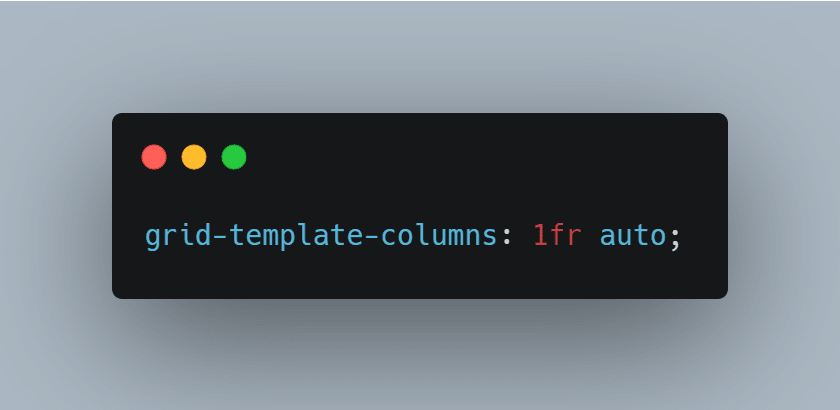
The proportion of an fr sized cell track is weighted by the number value preceding the fr unit. It’s observed size variation is relative to the available space, and the value of any other fr sized cell track in the container’s grid declaration. Basically, unless there is another fr sized cell track in the grid cell track declaration, as well as a difference between the fr values prefix, no proportional variation in size is observed.
Just one cell track sized with the fr unit used along side other tracks sized with relative or absolute units will not display the proportional flexibility you might expect it to.
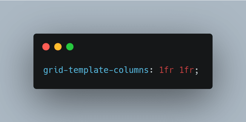
This:
will be visually identical to this:

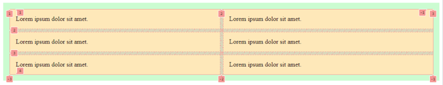
and this:

is the same as this:
To understand why it is mostly possible to have a fun grid rodeo without ever declaring the template rows, we have to appreciate the functionality of grids to have implicit and explicit cell tracks. In simple talk, there are grid cells you create and control (Explicit cells) and then there are cells the grid module automatically creates for you on the fly. Those automatically created cells are implicit grid cells.
Unless an explicit rule is declared to modify it’s behavior, CSS grid by default is designed to automatically create new cells to layout content that does not fit into the explicitly created grid, or content that may not yet have been added to the container at the moment of declaration.
Using our simple grid example, our container only has two column tracks. When those tracks are declared, all the child elements contained within our container will be automatically arranged to fill those created cells. the default arrangement order follows the normal document flow from the html.
So say we have 6 div children within our grid container, each of them automatically get placed on the grid we’ve created. Now since we’ve only defined our template columns, CSS grid intuitively creates a row with a default size of auto and because we have only two columns defined, the first two children get placed into the cells . Just as the first row was automatically or implicitly generated, a second row is generated to accommodate the next two children, then a third row for the next two and now all six child divs have cells over their heads.
This behavior to wrap the outstanding children into auto generated rows is simply because grids default design is to wrap elements to rows.
if our original grid structure only declared the template rows instead of columns as we have done, the outstanding children will still get wrapped onto new rows.

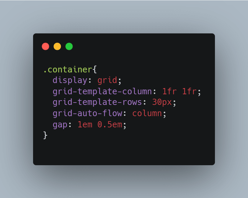
Depending on your layout objectives, This default wrap behavior can be modified by using the grid-auto-flow property and setting it to column.

The code above will define a grid where the child elements are arranged from top to bottom first before they’re wrapped to the next column. Numbering our child divs demonstrates this.

Now say we change the default wrap direction of a grid declared with only template columns, the implicit layout created with look like this:
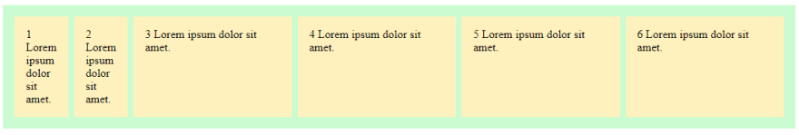

Because implicitly created cells are sized to auto by default, the auto columns are all sized to accommodate the default div size. The lorem ipsum content inside the child divs wrap on to newlines simply because my available viewport didn’t let them stretch. Naturally, the Grid module first assigns the available container space to the tracks with units other than fr, then divvies what is left to the fr-sized tracks - even though they were the explicitly declared tracks.
That snip also helps us on to another observation to reinforce a point we made earlier: since our grid structure declaration only defined the template columns, even the single row in which our child elements are placed was implicitly created by CSS grid. This mean its default height value is also auto.
That is why it stretches to accommodate the content of the divs on the 1fr columns which have been squished into multiple lines. Say we decide to define an explicit row with our own height value, if that height is less than enough to contain the squished content, we will end up with a situation where the children overflow the grid on the column axis.
For example, this:
will result in this:

This begins to clarify why it is advisable to only define the column tracks on the grid, and let CSS implicitly make our lives easier with its default grid-template-rows and grid-auto-flow property values. Unless otherwise demanded, this Just a way to easy grid living.
This article has only covered limited case scenarios involving grid container properties with basically none or only very cursory touches on grid child properties. Subsequent articles will explore child properties and behaviors as well as other container scenarios.

Top comments (2)
Wow....This is nice 🔥
Thank you! ☺️