case study: Agba Akin’s CSS clock.
Link to reference:
A Beautiful wall clock made with only Neumorphism CSS - Akinola Abdulakeem
I came across this project on Twitter and had made a note to replicate it but when I came around to it, I realized just reading the code and replicating it won’t satisfy me. I wanted to understand the engine beneath the hood - and that led to this article.
In this article and the others that will follow, I will try to understand the thought and build of this nice project by shedding particular focus on the CSS concepts it applies to achieve its make and functionality. The goal is not just to be able to build one clock, but to understand the concepts and their applications so as to be able to build several other clocks, as well as other interesting things.
Being a learner, the animation was mighty cool but The first challenge that really got my attention was the arrangement of the numbers - especially after seeing the HTML. So here’s to understanding the translate() function of the CSS transform property.
The translate() function can be passed as a value to the CSS transform property. The function repositions an element in the horizontal and vertical direction.
MDN docs describes it as being defined by a two dimensional vector. This simply means it is defined along two directions. It uses the graph X and Y axis to compute the movement direction of the element it is applied on.
The two values the function takes as parameters act as coordinates to determine how the element will move and be located on the horizontal (x) and vertical (y) axis.

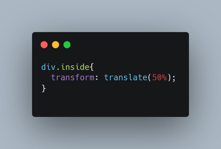
For example, The div with class “inside” will be translated 20px on the horizontal axis and 10px on the vertical axis. Without any prior positioning, the default origins as you may have assumed is 0,0 but unlike in our graphs from math class, here, we start from the top right corner of the container.
Before any transformation is applied on the element

And after the code snippet above is applied

While the code snippet above uses two parameters, the translate() function can also take only a single value. The value parameters have to be a length or percentage value.
When a single value is passed to the translate() function, it uses it to compute only the movement on the horizontal axis while the vertical (Y) axis is defaulted to 0.

transform: translate(50px) and
transform: translate(50px, 0px) will yield the same result:

When the translate function is passed a percentage value, the percentage will relate to the width of the element being transformed. Say we pass a value of 50% to our translate function, the positioned element will be translated a distance equal to 50% of its own width.
To demonstrate this;
this code snippet will result in this:

If we add another Div of the exact same size but without any transformation applied to it as a reference, and set the translate parameter of our first div to 100%, we see our translated div moves by exactly the width of the second div

So whenever a percentage parameter value is passed to the translate() function on an element, the distance it computes is the percentage of its own total width.
When double parameter values are passed to the translate() function, they define the horizontal and vertical vector in that particular order - The first value translates the element on the horizontal (x) axis, while the second value moves the element on the vertical (Y) axis.
The values passed can both be length values, percentage values or a mixture of length and percentage values. When both values are percentage values, the first value relates to the width of the referenced element, while the second value refers to the height of the referenced element.

The code snippet will move the div by a distance equal to 50% its own width on the horizontal axis, and a distance equal to 30% its own height on the vertical axis.

The width and height of our sample div is 15em (240px) and so its translated by 50% * 15em on the X-axis, and 30% * 15em on the Y-axis.
Note that the translate() function positions elements without altering their position in the normal document flow.
Now to the actual arrangement of the numbers.
Knowing how the translate function works, all that’s left is determining the values to define our position coordinates. The case study example first brings all the numbers to the center of the clock and then uses translate() to position them around the invisible round edge. The declarations of the code block that brings the numbers to the center is shown below:
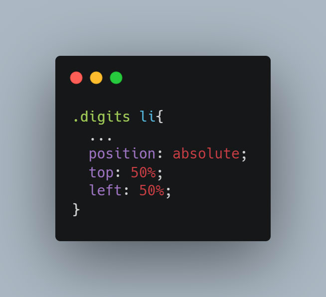
The (...) represents all the other code contained within this block. for the purpose of clarity and simplicity, I’m only sticking to what’s necessary four our current focus.
If the elements are not exactly centered by the code snippet above, make sure to check that the elements margins are reset to zero. The offset defined by default margins from the element styles can throw the elements off.
Next is positioning the numbers around the center point to appear like they radiate from the point. The translate() function comes in here but to get the parameter values that will serve as coordinates, we have to do a little geometry first.
The numbers are arranged around a circular path and their positions are points that can be mapped relative to the origin of the circle, its radius, and angle of each segment as represented below.

These points are used to determine the vertical and horizontal distances each number needs to be translated to.
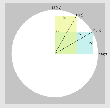
As is probably obvious from the above figure, the height and widths of the colored rectangles results in the X and Y values for each number’s position. 12 and 3 have 100% movement on the Y-axis and 0 movement on the X-axis and 100% movement on the X-axis and 0 movement on the Y-axis respectively.
the transform declaration becomes:
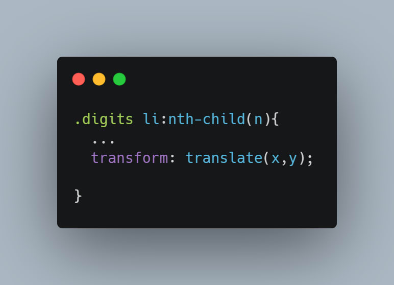
where
n = the occurring order of the child element within its container,
x = distance translated on the x-axis
y = distance translated on the y-axis
The ‘:nth-child(n) syntax’ is a pseudo selector that points to the number n child of a parent element
I used a circle of 345px in diameter and the coordinate values are as follows:

All that is needed now is to substitute these values with the translate() parameters accordingly. Note that I’ve only done one quadrant of the circle. This is because these values will be same for all the other quadrants although there is a catch - that draws attention to the next point to note.
You may have noticed the counter intuitive use of the negative symbol, especially if you are the math-y type. This is because by default, the movement of the translate() function is top-bottom on the Y-axis and left-right on the X-axis. Since the movement of the numbers starts from the center of the circle, the default movement of the positive- y will be down and the positive- x will move left. This default movement is easily modified by using negative values where necessary just as has been done for the Y value of 12.
Positioning of the other numbers in the other quadrants is simply achieved by switching the negative values appropriately between x and y. For example, to position the number 6, my transform declaration will look like this:

NB: The y-value may differ depending on the radius of the circle you use.
Further Explorations will try to understand some of the other CSS concepts that give the clock its functionality.

Top comments (1)
✊🏾🔥🔥🔥