Have fun with Animations
Let’s put the Dev hat on, and enjoy the fun of code today.
As I’m switching back to Dev role, I look for the most interesting work I always like: Animation. And there’s 1 story fits nicely in my interest: Core UI — Date text field with error integration.
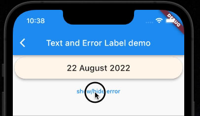
Here is the design I came up with.
And it can be transform into below UI, when error is shown

I also came up with a nice description of the animation I wish to have
Animation
When switching from normal state to error state, the error banner should slide down from behind the Date banner
When switching from error state to banner state, the error banner should slide up to hide behind the Date banner
Animation duration is 300ms
Now, let’s start coding.
Code Plan
Code plan is actually to analyse the problem at hand, and try to solve it with a plan, before I write any code at all.
For simple problem, I usually just think of what to do, then remember the step, and start writing the code. But for this problem, there are actually 2 different hard-to-remember solutions I can try, so I’m gonna write them down here, in case I may forget them.
The first step is to create the UI. Looking at the 2 UI (with and without error), There are 2 ways to create this UI
- Create a
Stack, with Label on top, and Error underneath - Create a
Column, and show/hide error as needed
Now, let’s analyse each solution
Solution 1 — Stack
So I’ll need a Stack, a large text for Label, and smaller text for error
Stack: need error background colour, so that when the error text is showed, this background colour will be showed.
Label: need container to wrap around it because I need the decoration, with border radius, and background colour
Error: Just text, white colour, with some padding
Now, let’s think of animation.
When switching from normal state to error state, the error banner should slide down from behind the Date banner.
This suggest I can use SlideTransition. But if I use SlideTransition on the error text, only the error text will slide down, without the red background colour. So no, not SlideTransition.
Next implementation I can think of is to create Error with its own container, with decoration and background colour to be error colour, then use AnimatedBuilder to update the height of this container.
But to what height should I change this container’s height to?
I know the size of the Error text, I know the padding value I wanna give to it. So maybe, I can calculate this height.
Okie, this sounds fun, although it does not sound like the best solution. Why? Because
with Accessibility large text, there’s a good chance that the calculation will fail
and each time to show/hide error, I’ll have to do a calculation again.
This sounds silly, but actually it will work. Actually I coded this as well in this PR, and tried to stop here, because this works.
But after thinking again and again, this is not best approach yet. So, let’s look at the 2nd solution.
Solution 2 — Column
This solution is straight-forward. First, I create a Column with 2 children: the Text for Label, and the Text for error.
I’ll need some decoration for Label, border radius, background colour, text size, text colour.
Then I’ll look at the error. If I create decoration for the Error, when the error is showed, it will totally be separated from the Label, and I will not have the effect that the Error is extended from the Label above.
To solve this, I need a container to wrap outside of the Column, and apply decoration for the Error on this Container.
When there’s no Error, this decoration is totally hidden behind the Label decoration, but when there is error, the lower part will be visible as if it’s the background of the error.
But wait, there’s shadow in the UI. In this case, I can wrap them in a Card, and use its elevation value to show shadow, and I can also decorate the Card by updating its shape.
Now, the animation part. The simplest animation is to change the height of this Error text, and create the illusion that the text slide down from underneath the Label.
The only thing I’m worried here is that the text in Error may be distorted during animation.
If I use the SizeTransition widget, I can change the value of axisAlignment, so maybe this can help saving the text from being distorted due to layout change.
That sounds like a good plan. It’s now time to code.
Write the code
Here is the link to the complete code of solution 2. And below is detail how the Code plan matches the code.
First step, create a StatelessWidget to host the custom widget I want to create.
Then, in the build method of this StatelessWidget, I create a Column widget, with 2 children: 1 Text for label, and 1 Text for error.
Column(
  children: [
    Text('label'),
    Text('error'),
  ],
)
But I need decoration for the label text, so I’ll separate it out to another method, to make it easy to implement and edit later. And I’ll do the same for error text as well, because it’ll need animation. The code now becomes
Column(
  mainAxisAlignment: MainAxisAlignment.center,
  crossAxisAlignment: CrossAxisAlignment.center,
  children: [
    _labelWidget(),
    _errorWidget(),
  ],
)
At this time, the 2 methods _labelWidget() and _errorWidget() are simply returning Text widget.
Now, let’s work on this line
I’ll need some decoration for Label, border radius, background colour, text size, text colour.
This implementation will go into _labelWidget() method, and I’ll need a Container widget for this. And also need to update the textStyle of this label to match the design.
Widget _labelWidget() => Container(
  alignment: Alignment.center,
  decoration: BoxDecoration(
      color: Theme.of(context).colorScheme.onBackground,
      borderRadius: const BorderRadius.all(
          Radius.circular(NartusDimens.padding24))),
  padding: const EdgeInsets.symmetric(
      horizontal: NartusDimens.padding16,
      vertical: NartusDimens.padding14),
  child:
  Text('Label', style: Theme.of(context).textTheme.headline6),
);
Then I also need to update the padding for my error text.
Widget _errorWidget() => Padding(
  padding: const EdgeInsets.symmetric(
      horizontal: NartusDimens.padding16,
      vertical: NartusDimens.padding4),
  child: Text(
    'error',
    style: Theme.of(context)
        .textTheme
        .subtitle1
        ?.copyWith(color: Theme.of(context).colorScheme.onError),
    textAlign: TextAlign.center,
  ),
);
Right now, the UI of this widget component looks like this

I still need decoration for the background of error text. So I’ll wrap the Column inside a Card widget, then do decoration on the Card itself.
Card(
  shape: const RoundedRectangleBorder(
    borderRadius: BorderRadius.all(Radius.circular(NartusDimens.padding24)),
  ),
  color: Theme.of(context).colorScheme.error,
  elevation: NartusDimens.padding4,
  child: Column(
    mainAxisAlignment: MainAxisAlignment.center,
    crossAxisAlignment: CrossAxisAlignment.center,
    children: [
      _labelWidget(),
      _errorWidget(),
    ],
  ),
)

Now it looks matching the designed UI. It’s time to implement animation.
In order to add animation to this widget, I’ll need to use SingleTickerProviderStateMixin, and with this mixin, I’ll need to convert my StatelessWidget to be a StatefulWidget, then implement the State of my StatefulWidget with SingleTickerProviderStateMixin
class _TextAndErrorLabelState extends State<TextAndErrorLabel>
 with SingleTickerProviderStateMixin {}
Actually I used Android Studio to do the conversion, so it’s like there’s no work on me at all.

I’m going to use SizeTransition widget, so I’ll need an AnimationController to control my animation, which will have the duration of 300ms.
late final AnimationController _controller = AnimationController(
    vsync: this, duration: const Duration(milliseconds: 300));
and an Animation with double for the actual animation.
late final Animation<double> _sizeAnimation =
    CurvedAnimation(curve: Curves.fastOutSlowIn, parent: _controller);
The controller will need a value, so I’ll define this value in initState()
@override
void initState() {
  super.initState();

  _controller.value = 1;
}
And of course, I also need to dispose the controller when I no longer need it.
@override
void dispose() {
  super.dispose();

  _controller.dispose();
}
All setup is done, now it's the time to wrap the error inside a SizeTransition.
The SizeTransition widget will take full space of parent’s width, so my error text will no longer be center align. Therefore I need to change to use Container to wrap it, in order to have both padding and alignment in 1 container.
I also change the axisAlignment value to 1 (default is 0) because I want the Container to update the size from the bottom of its height, not the center or top.
Widget _errorWidget() => SizeTransition(
      sizeFactor: _sizeAnimation,
      axisAlignment: 1,
      child: Container(
        alignment: Alignment.bottomCenter,
        padding: const EdgeInsets.symmetric(
            horizontal: NartusDimens.padding16,
            vertical: NartusDimens.padding4),
        child: Text(
          'error',
          style: Theme.of(context)
              .textTheme
              .subtitle1
              ?.copyWith(color: Theme.of(context).colorScheme.onError),
          textAlign: TextAlign.center,
        ),
      ),
    );
And I think this is done.
But wait. Is it done? There’s no animation although I already added SizeTransition in my error text.
The reason is because I still need to use the AnimationController to start my animation. To do this, simply run _controller.forward(); when it’s needed. In my case, because I’m going to use this widget in a bloc, so I’ll need it to run animation immediately as it’s showed, therefore this code will be in my build() method.
And that’s it. The animation works!
The full source code for this widget with animation can be found in this link.
That’s all for today. If you like my post, please follow me for more tips.

Top comments (0)