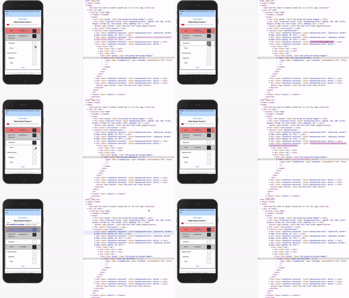
THE PROBLEM:
In my project, when I select and then unselect a button on mobile, it still remains dark because it's in focus and that's confusing:
Here's the deployed page: https://covid-19-mortality.netlify.com/
WHAT I WANT TO ACHIEVE:
I would like to override the button focused styling so that it is intuitive that the button is in focus and not selected.
WHAT I HAVE TRIED:
When I apply:
.btn:active {
  background: #fff !important;
  color: #343a40 !important;
}
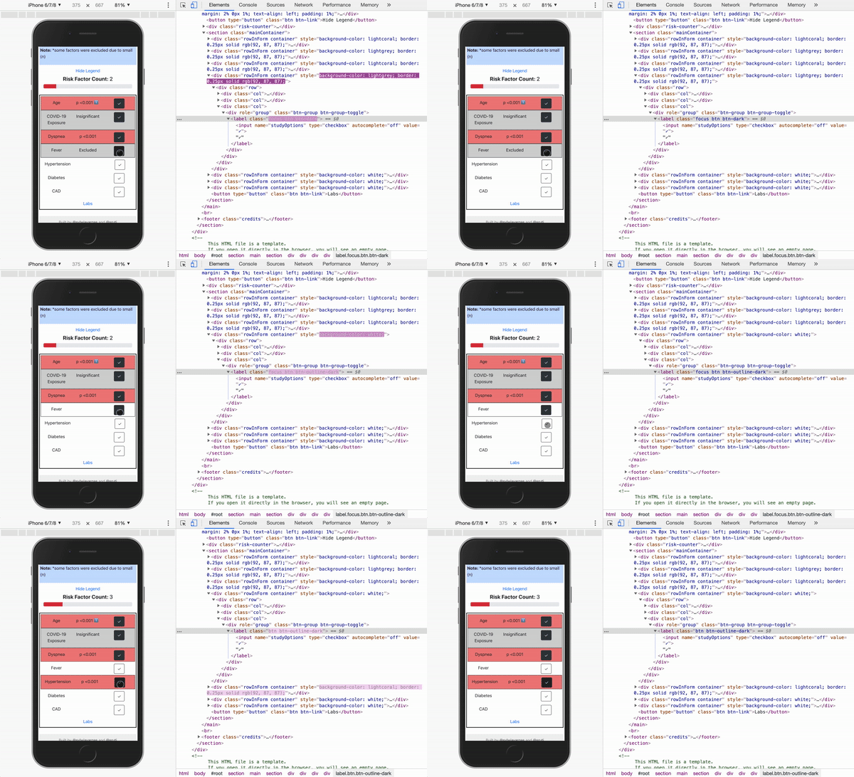
The button unclicks for a second and then goes back to the "selected" styling:

And when I apply:
.btn.focus,
.btn-dark.focus,
.btn:focus,
.btn-dark:focus {
    box-shadow: none !important;
    outline: none !important;
}
There's basically no difference
I have tried every solution in this stack overflow thread: bootstrap button shows blue outline when clicked.
I also created a stackOverflow question on that but to no avail.


Top comments (0)