
TL;DR: Visualize the gender parity in industrial employment using the Syncfusion .NET MAUI Bubble Chart. Learn to gather and bind data to the chart. We’ll also customize the chart by adding titles, legends, tooltip interactivity, and more.
Welcome to our Chart of the Week blog series!
This week’s edition will examine the gender distribution in industrial employment for 2019. This visualization will illustrate the contributions of males and females in the industrial sector across various countries based on their continents, highlighting the balance and diversity within the workforce.
In this blog, we’ll use the Syncfusion .NET MAUI Bubble Chart to explore how to represent this data effectively. It provides a step-by-step walkthrough for setting up your development environment, creating the Bubble Chart, and interpreting the data.
Refer to the following image.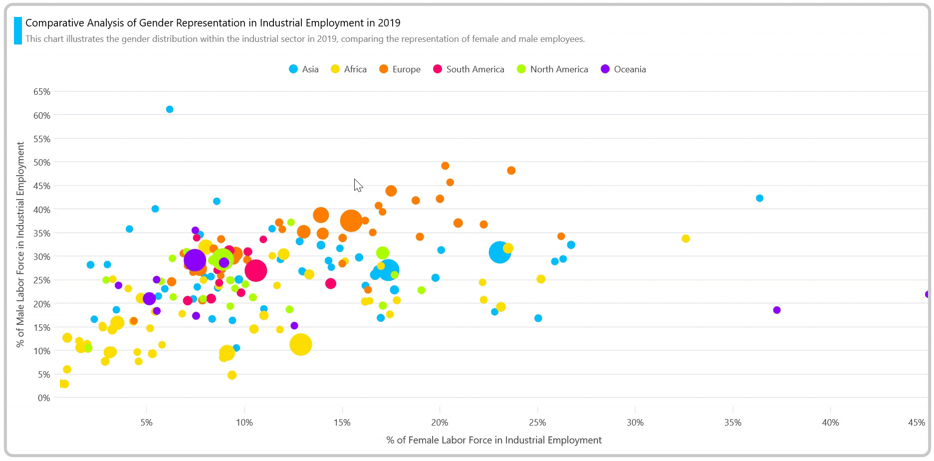
Let’s get started!
Step 1: Gathering the data
Our journey begins by gathering data on gender distribution in industrial employment for various countries in 2019.
Step 2: Preparing the data for the chart
Next, we’ll create a custom EmploymentDistributionModel class with Country, ShareOfMale, ShareOfFemale, Population, and Continent properties to store the percentage of male and female laborers in industrial sectors data for different countries.
Refer to the following code example.
public class EmploymentDistributionModel
{
    public string Country { get; set; }
    public double ShareOfFemale { get; set; }
    public double ShareOfMale { get; set; }
    public double Population { get; set; }
    public string Continent { get; set; }
}
Then, generate the employment distribution data collection using the EmploymentDistributionData class and AllCountriesData property. Assign the CSV data to the employment distribution data collection using the ReadCSV method and store it in the AllCountriesData property.
Additionally, expose the Asia, Africa, SouthAmerica, NorthAmerica, Europe, and Oceania properties to store the countries’ data respective to their continents.
Refer to the following code example.
public class EmploymentDistributionData
{
    public List<EmploymentDistributionModel> AllCountriesData { get; set; }

    public List<EmploymentDistributionModel> Asia { get; set; }

    public List<EmploymentDistributionModel> Africa { get; set; }

    public List<EmploymentDistributionModel> SouthAmerica { get; set; }

    public List<EmploymentDistributionModel> NorthAmerica { get; set; }

    public List<EmploymentDistributionModel> Oceania { get; set; }

    public List<EmploymentDistributionModel> Europe { get; set; }

    public EmploymentDistributionData()
    {
        AllCountriesData = new List<EmploymentDistributionModel>(ReadCSV());
        Asia = AllCountriesData.Where(d => d.Continent == "Asia").ToList();
        Africa = AllCountriesData.Where(d => d.Continent == "Africa").ToList();
        Europe = AllCountriesData.Where(d => d.Continent == "Europe").ToList();
        SouthAmerica = AllCountriesData.Where(d => d.Continent == "South America").ToList();
        NorthAmerica = AllCountriesData.Where(d => d.Continent == "North America").ToList();
        Oceania = AllCountriesData.Where(d => d.Continent == "Oceania").ToList();
    }

    public static IEnumerable<EmploymentDistributionModel> ReadCSV()
    {
        Assembly executingAssembly = typeof(App).GetTypeInfo().Assembly;
        Stream inputStream = executingAssembly.GetManifestResourceStream("EmployementDistribution.Resources.Raw.data.csv");

        string line;
        List<string> lines = new();

        using StreamReader reader = new(inputStream);
        while ((line = reader.ReadLine()) != null)
        {
            lines.Add(line);
        }
        lines.RemoveAt(0);
        return lines.Select(line =>
        {
            string[] data = line.Split(',');
            return new EmploymentDistributionModel(data[0], Convert.ToDouble(data[2]), Convert.ToDouble(data[3]), Convert.ToDouble(data[4]), data[5]);
        });
    }
}
Step 3: Configuring the Syncfusion .NET MAUI Charts control
Let’s configure the Syncfusion .NET MAUI Charts control using this documentation.
Refer to the following code example.
<ContentPage xmlns:chart="clr-namespace:Syncfusion.Maui.Charts;assembly=Syncfusion.Maui.Charts"
             xmlns:local="clr-namespace:EmployementDistribution">
 <chart:SfCartesianChart>
  <chart:SfCartesianChart.XAxes>
   <chart:LogarithmicAxis />
  </chart:SfCartesianChart.XAxes>
  <chart:SfCartesianChart.YAxes>
   <chart:NumericalAxis/>
  </chart:SfCartesianChart.YAxes>
 </chart:SfCartesianChart>
Step 4: Bind the data to the .NET MAUI Bubble Chart
Let’s bind the data on gender distribution in industrial employment to the Bubble series.
Refer to the following code example.
<!--Asian Countries Series-->
<chart:BubbleSeries ItemsSource="{Binding Asia}"
                    XBindingPath="ShareOfFemale"
                    YBindingPath="ShareOfMale"
                    SizeValuePath="Population"/>

<!--African Countries Series-->
<chart:BubbleSeries ItemsSource="{Binding Africa}"
                    XBindingPath="ShareOfFemale"
                    YBindingPath="ShareOfMale"
                    SizeValuePath="Population"/>

<!--European Countries Series-->
<chart:BubbleSeries ItemsSource="{Binding Europe}"
                    XBindingPath="ShareOfFemale"
                    YBindingPath="ShareOfMale"
                    SizeValuePath="Population"/>

<!--SouthAmerican Countries Series-->
<chart:BubbleSeries ItemsSource="{Binding SouthAmerica}"
                    XBindingPath="ShareOfFemale"
                    YBindingPath="ShareOfMale"
                    SizeValuePath="Population"/>

<!--NorthAmerican Countries Series-->
<chart:BubbleSeries ItemsSource="{Binding NorthAmerica}"
                    XBindingPath="ShareOfFemale"
                    YBindingPath="ShareOfMale"
                    SizeValuePath="Population"/>

<!--Oceania Countries Series-->
<chart:BubbleSeries ItemsSource="{Binding Oceania}"
                    XBindingPath="ShareOfFemale"
                    YBindingPath="ShareOfMale"
                    SizeValuePath="Population"/>
In this example, we bound the Bubble Chart with Asia, Africa, NorthAmerica, SouthAmerica, Europe, and Oceania data collection with the ItemsSource property, which contains the percentage of male and female workers in industrial sectors and populations for different countries. Additionally, we’ve specified the XBindingPath, YBindingPath, and SizeValuePath with the ShareOfFemale, ShareOfMale, and Population properties, respectively.
The SizeValuePath is often used to indicate the quantitative value associated with each data point. This quantitative value could be anything relevant to the dataset, such as population size, revenue, and sales volume. Here, the size of the bubble will correspond to the country’s population, allowing us to compare the percentage of female and male workers in each industry and the employment percentage in each country.
Step 5: Customizing the chart appearance
Now, let’s customize the Syncfusion .NET MAUI Bubble Chart’s appearance by changing the chart title, axis element’s appearance, using selection to highlight the selected country, and showing the tooltip with a customized template to show detailed information about the Bubble data point.
Customizing the chart title
Now, we can improve the readability of the plotted data by including the title with a description in the chart, as shown in the following code example.
<chart:SfCartesianChart.Title>
 <Grid>
  <Grid.ColumnDefinitions>
   <ColumnDefinition Width="1*"/>
   <ColumnDefinition Width="{OnPlatform Android=49*,WinUI=59*,MacCatalyst=59*,iOS=49*}"/>
  </Grid.ColumnDefinitions>
  <VerticalStackLayout Background="#01BEFE" Margin="10,15,0,15" Grid.Column="0" Grid.RowSpan="2"/>
  <VerticalStackLayout Grid.Column="1" Margin="5">
   <Label Text="Comparative Analysis of Gender Representation in Industrial Employment in 2019" FontSize="14" FontFamily="centurygothic" Padding="0,10,5,5" HorizontalTextAlignment="Start"/>
   <Label Text="This chart illustrates the gender distribution within the industrial sector in 2019, comparing the representation of female and male employees." HorizontalTextAlignment="Start" FontSize="{OnPlatform Android=10,WinUI=12,MacCatalyst=16,iOS=11}" FontFamily="centurygothic" TextColor="Grey" Padding="0,0,0,10"/>
  </VerticalStackLayout>
 </Grid>
</chart:SfCartesianChart.Title>
Customizing the legend
Let’s customize the chart legend. Add a Label for each series of charts that will be displayed with the corresponding legend. Then, use the ToggleSeriesVisibility property to show or hide the continents’ countries in the chart.
Refer to the following code example.
<chart:SfCartesianChart.Legend>
 <chart:ChartLegend ToggleSeriesVisibility="True"/>
</chart:SfCartesianChart.Legend>

<chart:BubbleSeries Label="Asia"/>
<chart:BubbleSeries Label="Africa"/>
<chart:BubbleSeries Label="Europe"/>
<chart:BubbleSeries Label="South America "/>
<chart:BubbleSeries Label="North America "/>
<chart:BubbleSeries Label="Oceania"/>
Customizing the chart axis
Let’s customize the X and Y axes with the Minimum, Maximum, EdgeLabelsDrawingMode, and ShowMajorGridLines properties as well as the axis Title, LabelStyle, LineStyle, and TickStyle properties.
Refer to the following code example.
<chart:SfCartesianChart.XAxes>
 <chart:NumericalAxis EdgeLabelsDrawingMode="Shift" ShowMajorGridLines="False">
  <chart:NumericalAxis.Title>
   <chart:ChartAxisTitle Text="% of Female Labor Force in Industrial Employment" FontSize="{OnPlatform Android=12,WinUI=13,MacCatalyst=13,iOS=10}"/>
  </chart:NumericalAxis.Title>
  <chart:NumericalAxis.LabelStyle>
   <chart:ChartAxisLabelStyle LabelFormat="0'%"/>
  </chart:NumericalAxis.LabelStyle>
  <chart:NumericalAxis.AxisLineStyle>
   <chart:ChartLineStyle StrokeWidth="0"/>
  </chart:NumericalAxis.AxisLineStyle>
  <chart:NumericalAxis.MajorTickStyle>
   <chart:ChartAxisTickStyle Stroke="#e6e6e6"/>
  </chart:NumericalAxis.MajorTickStyle>
 </chart:NumericalAxis>
</chart:SfCartesianChart.XAxes>

<chart:SfCartesianChart.YAxes>
 <chart:NumericalAxis EdgeLabelsDrawingMode="Fit" Interval="{OnPlatform Android=11,iOS=10,WinUI=5,MacCatalyst=5}">
  <chart:NumericalAxis.Title>
   <chart:ChartAxisTitle Text="% of Male Labor Force in Industrial Employment" FontSize="{OnPlatform Android=10,WinUI=13,MacCatalyst=13,iOS=10}"/>
  </chart:NumericalAxis.Title>
  <chart:NumericalAxis.LabelStyle>
   <chart:ChartAxisLabelStyle LabelFormat="0'%"/>
  </chart:NumericalAxis.LabelStyle>
  <chart:NumericalAxis.AxisLineStyle>
   <chart:ChartLineStyle StrokeWidth="0"/>
  </chart:NumericalAxis.AxisLineStyle>
  <chart:NumericalAxis.MajorTickStyle>
   <chart:ChartAxisTickStyle Stroke="#e6e6e6"/>
  </chart:NumericalAxis.MajorTickStyle>
 </chart:NumericalAxis>
</chart:SfCartesianChart.YAxes>
Adding interactivity to the chart
Let’s enhance the series by enabling the tooltip with the TooltipTemplate property to show the details of the countries.
Refer to the following code example.
<chart:SfCartesianChart.Resources>
 <ResourceDictionary>
  <local:PopulationValueConver x:Key="populationValueConverter"/>
  <DataTemplate x:Key="template">
   <StackLayout>
    <Label Text="{Binding Item.Country}" HorizontalTextAlignment="Center" HorizontalOptions="Center" VerticalTextAlignment="Center" TextColor="White" FontAttributes="Bold" FontFamily="Helvetica" Margin="0,2,0,2" FontSize="12" Grid.Row="0" Padding="0,1"/>
    <BoxView Color="Gray" HeightRequest="1" HorizontalOptions="Fill" Margin="2,0,2,0"/>
    <Grid Padding="3">
     <Grid.RowDefinitions>
      <RowDefinition Height="*"/>
      <RowDefinition Height="*"/>
      <RowDefinition Height="*"/>
     </Grid.RowDefinitions>
     <Label Grid.Row="0" Text="{Binding Item.ShareOfFemale,StringFormat='% of Female Employment : {0}%'}" TextColor="white" FontFamily="Helvetica" FontSize="12"/>
     <Label Grid.Row="1" Text="{Binding Item.ShareOfMale,StringFormat='% of Male Employment : {0}%'}" TextColor="white" FontFamily="Helvetica" FontSize="12"/>
     <Label Grid.Row="2" Text="{Binding Item.Population,Converter={StaticResource populationValueConverter},StringFormat='Population : {0}'}" TextColor="white" FontFamily="Helvetica" FontSize="12"/>
    </Grid>
   </StackLayout>
  </DataTemplate>
 </ResourceDictionary>
</chart:SfCartesianChart.Resources>

<!--Asian Countries Series-->
<chart:BubbleSeries EnableTooltip="True" TooltipTemplate="{StaticResource template}"/>
<!--African Countries Series-->
<chart:BubbleSeries EnableTooltip="True" TooltipTemplate="{StaticResource template}"/>
<!--European Countries Series-->
<chart:BubbleSeries EnableTooltip="True" TooltipTemplate="{StaticResource template}"/>
<!--SouthAmerican Countries Series-->
<chart:BubbleSeries EnableTooltip="True" TooltipTemplate="{StaticResource template}"/>
<!--NorthAmerican Countries Series-->
<chart:BubbleSeries EnableTooltip="True" TooltipTemplate="{StaticResource template}"/>
<!--Oceania Countries Series-->
<chart:BubbleSeries EnableTooltip="True" TooltipTemplate="{StaticResource template}"/>
Let’s further enhance the chart with the series selection feature using the SeriesSelectionBehavior. This will enable us to highlight the selected series with the help of the SelectionChanging event.
XAML
<chart:SfCartesianChart.SelectionBehavior>
 <chart:SeriesSelectionBehavior Type="Single" SelectionChanging="SeriesSelectionBehavior_SelectionChanging"/>
</chart:SfCartesianChart.SelectionBehavior>
C#
public partial class MainPage : ContentPage
{
    public MainPage()
    {
        InitializeComponent();
    }

    List<int> SelectedIndexes = new List<int>();

    List<SolidColorBrush> Brushes = new List<SolidColorBrush>
    {
        new SolidColorBrush(Color.FromArgb("#01BEFE")),
        new SolidColorBrush(Color.FromArgb("#FFDD00")),
        new SolidColorBrush(Color.FromArgb("#FF7D00")),
        new SolidColorBrush(Color.FromArgb("#FF006D")),
        new SolidColorBrush(Color.FromArgb("#ADFF02")),
        new SolidColorBrush(Color.FromArgb("#8F00FF")),
    };

    List<SolidColorBrush> AlphaBrushes = new List<SolidColorBrush>
    {
        new SolidColorBrush(Color.FromArgb("#3501BEFE")),
        new SolidColorBrush(Color.FromArgb("#35FFDD00")),
        new SolidColorBrush(Color.FromArgb("#35FF7D00")),
        new SolidColorBrush(Color.FromArgb("#35FF006D")),
        new SolidColorBrush(Color.FromArgb("#35ADFF02")),
        new SolidColorBrush(Color.FromArgb("#358F00FF")),
    };

    private void SeriesSelectionBehavior_SelectionChanging(object sender, ChartSelectionChangingEventArgs e)
    {
        foreach (var index in e.NewIndexes)
        {
            if (!SelectedIndexes.Contains(index))
            {
                SelectedIndexes.Add(index);
            }
        }

        foreach (var index in e.OldIndexes)
        {
            if (SelectedIndexes.Contains(index))
            {
                SelectedIndexes.Remove(index);
            }
            else if (e.NewIndexes.Count == 0)
            {
                SelectedIndexes.Add(index);
            }
        }

        if (SelectedIndexes.Count == 0)
        {
            foreach (var series in myChart.Series)
            {
                series.Fill = Brushes[myChart.Series.IndexOf(series)];
            }
        }
        else
        {
            foreach (var series in myChart.Series)
            {
                series.Fill = AlphaBrushes[myChart.Series.IndexOf(series)];
            }

            foreach (var index in SelectedIndexes)
            {
                myChart.Series[index].Fill = Brushes[index];
            }
        }
    }
}
After executing the above code examples, we’ll get the output like in the following GIF image.

GitHub reference
For more details, refer to the project on GitHub.
Conclusion
Thanks for reading! In this blog, we’ve seen how to visualize the percentage of male and female workers in the industrial sector using the Syncfusion .NET MAUI Bubble Chart. We strongly encourage you to follow the steps discussed in this blog and share your thoughts in the comments below.
If you require assistance, you can contact us through our support forums, support portal, or feedback portal. We are always happy to assist you!
See you in our next blog!
Related blogs
- Develop a Travel Destination List UI with .NET MAUI ListView [Webinar Show Notes]
- Chart of the Week: Creating a .NET MAUI Histogram Chart to Display the Distribution of Atomic Weights in the Periodic Table
- Chart of the Week: Creating a .NET MAUI Line Chart with Plot Bands to Explore Global GNI Per Capita with Income Thresholds

Top comments (0)