
About this article
This article is about :has() introduced in 2022.
The sample code and demos that appear in this article are taken from :has(): the family selector on the Chrome Developers Blog.
The following is a summary of the original blog, organized by the author.
What is :has()? 🤔
:has() is a parent selector we have been waiting for long time. But it seems it is more than that. The author of :has() the family selector put it, "parent" selector. 👨👩👧👦
Before :has(), the direction of the CSS selector was horizontal ➡️ or, in most cases, downward. ⬇️
/* When focusing on a <li> element with the special class (horizontal) */
li.special { … }

/* When focusing on the <span> element of a <p> element inside an <article> element (downwards) */
article p span { ... } }

/* When focusing on the <p> element that comes right after the <h1> element, which comes right after the <ul> element, which also comes right after the <ul> element (horizontally) */
h1 + ul + p { ... }
The arrival of :has() makes it possible to select parent elements in the upward ⬆️ direction. 🙌
Let's look at an example.
/* 👇 I want to specify this .everybody */
<div class="everybody">
  <div>
    <div class="a-good-time"></div>
  </div>
</div>

/* 🙅🏻 This is not specified */
<div class="everybody"></div>
Before :has(), you would target by specifying the position of .everybody, for example (horizontal)
.everybody:first-of-type { ... }
Using :has(), you can do as the following 🪄✨
(Targeting .everybody from .a-good-time upward)
.everybody:has(.a-good-time) { ... }
The syntax is as follows
/* Select parent elements by specifying conditions for child and grandchild elements */
<target>:has(<condition>) { <styles> }
It seems super handy. 😁
When do you use it? 🤔
You may have understood that :has() may be useful, but the use case may not yet be clear.
From here, we will take a look at some use cases introduced in :has(): the family selector on the Chrome Developers Blog to give you an idea of how to use it.
⚠️ The following sample code in this article is a simplified version of the sample code presented in the above blog.
Cards
This is an example of displaying multiple cards in a grid layout. The layout differs depending on whether the Card has a banner or not, and whether it has a photo or not.
To achieve this style, you may think "I need to add a class for each Card with different layout... 🤔", but by changing the mental model and using :has() approach, it can be expressed more simply.
<!-- The li element itself has the same structure -->
<ul>
  <li class="card"> ... </li>
  <li class="card"> ... </li>
  <li class="card"> ... </li>
  <li class="card"> ... </li>
  <li class="card"> ... </li>
</ul>
By using :has() to conditionally specify whether a child or grandchild element has a .card__banner ("FEATURED ⭐️" tag) or a .card__media (photo), you can style the target .card without adding extra classes. The following example shows how the layout differs from .card to .card. The following example uses has:() to create the layout differences.
/* If card has a banner, make it the full width of the Grid. */
.card:has(.card__banner) {
  grid-row: 1;
  grid-column: 1 / -1;
}
/* Specify the grid layout when photos are there. */
.card:has(.card__media) {
  grid-template-columns: 1fr 1fr;
  grid-template-rows: repeat(3, auto);
}
.card__media {
  grid-column: 2;
  grid-row: 1 / -1;
}
It requires mental model change, but using :has() will make the code cleaner. ✨
Forms
Next is a form.
This is an example of applying different styling depending on the state of the form input values. This is achieved without using JavaScript.
<form action="">
  <div class="form-group">
    <label for="email" class="form-label">
      <span class="sr-only">Email</span>
    </label>
    <div class="form-group__input">
      <input
        required type="email" id="email" class="form-input"
        pattern="[a-z0-9._%+-]+@[a-z0-9.-]+\.[a-z]{2,4}$"
        title="Enter valid email address"
        placeholder="Enter valid email address"/>
      <div class="form-group__error">Enter a valid email address</div>
    </div>
  </div>
</form>
:invalid 、 :focus、 :valid、 :placeholder-shown pseudo-classes are used in :has() condition to represent different styling.
/* Change the color of the invalid form */
.form-group:has(:invalid) {
  --color: var(--invalid);
}
/* Out of focus and no placeholder displayed, display the error message */
.form-group:has(:invalid:not(:focus):not(:placeholder-shown)) .form-group__error {
  display: block;
}
The use of several combinations of :has() conditions, like the styling above to control the display of error messages, is powerful! 🏋️
Content
In this example, a <figure> element representing self-contained content such as images, illustrations, graphs, code snippets, etc., is laid out according to whether it contains a <figcaption> element (a caption describing the content).
<main>
  <article>
    <h1>Some Awesome Article</h1>
    <p> ... </p>
    <figure>
      <img  alt="" width="200" height="200"
         src="https://assets.codepen.io/605876/team-awesome.png"
      />
    </figure>
    <p> ... </p>
    <figure>
      <img  alt="" width="200" height="200"
         src="https://assets.codepen.io/605876/team-awesome.png"
      />
      <figcaption>Shot of the CSS, UI, and DevTools Chrome Dev</figcaption>
    </figure>
    <p> ... </p>
  </article>
</main>
figure:not(:has(figcaption)) {
  float: left;
  margin: 2rem 2rem 2rem 0;
}
We can read and write it like "If figure has a figcaption..." and it's intuitive, simple and easy to understand. 👍
Reacting to State
Here is an example of a sliding Navbar that reacts to styles based on markup state. The aria-expanded attribute is changed on the click event for the hamburger menu button.
const NAV_CONTROL = document.querySelector('.nav-control')

const CONTROL_NAV = () => {
  NAV_CONTROL.setAttribute('aria-expanded',
    NAV_CONTROL.matches('[aria-expanded="false"]') ? true : false)
  NAV_CONTROL.setAttribute('aria-pressed',
    NAV_CONTROL.matches('[aria-expanded="false"]') ? true : false)
}

NAV_CONTROL.addEventListener('click', CONTROL_NAV)
In CSS, the value of the aria-expanded attribute is used as a condition to modify a custom CSS property to shift the body element.
body {
  transform: translateX(calc(var(--open) * -200px));
}
:root:has([aria-expanded="true"]) {
  --open: 1;
}
Instead of thinking like "Add class names in JavaScript...", JavaScript updates the markup, and CSS uses that information as a condition for :has() to achieve styling.
This is another change of mindset with :has(). 💡
Thinking outside the box
I am often amazed about the range of things that can be done with CSS alone, such as CSS art, but the following is another game made with just html and css 🤯 :hover.
Before :has(), it was still possible to create such works by using "tricks 🧙" with +, ~, etc., but with the advent of :has() may have made these "tricks 🧙" even less difficult.
⚠️ Please try the following demo in a separate tab of your browser.
Summary
Parent elements can now be selected with :has(). 🙌
/* Select parent elements by specifying conditions for child and grandchild elements */
<target>:has(<condition>) { <styles> }
Advantages of :has()
- You can get out of class name woes (typo/naming). Cleaner code. 🧹✨
- Use cases for
:has()seem much wider. 😼 -
:has()is a game changer for new ideas(!) 👩🏻🔬- Simpler element specification will broaden and lower the bar for what we can do with CSS.
- Good counter measure for too much use of JavaScript(!?)
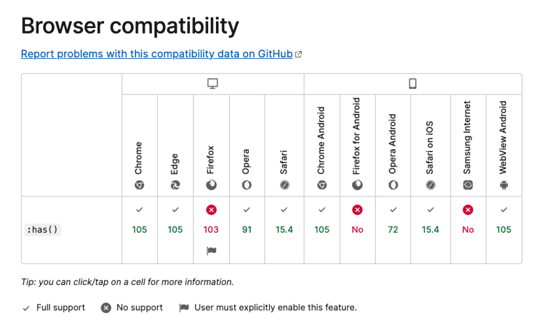
Browser Support Status
🚨 Note that Firefox is not yet supported as standard. (At the time of writing: 2023/01/13)
https://developer.mozilla.org/en-US/docs/Web/CSS/:has
See also
As mentioned in the introduction, this article is based on sample code and demos from :has(): the family selector on the Chrome Developers Blog below.
For a more detailed understanding, please read the article.
https://developer.chrome.com/blog/has-m105/
The article is also available in Japanese: https://zenn.dev/takuyakikuchi/articles/1d5a3f3ec6fbdc
Photo by Artem Kovalev on Unsplash


Top comments (0)