Web accessibility should be a priority when developing a website since an accessible website helps people with impairments participate actively in society. However, this task often gets put on the backburner and as a result, the internet’s potential remains largely unavailable to people with disabilities.
Here are some steps you could take to make your website more accessible to the visually impaired:
1. Provide Enough Color Contrast
Use high contrast between background color and text. This is especially important for color-blind users. Most color contrast checkers(links at the bottom) check for compliance with this standard.Since many partially sighted users highlight text as a trick to increase contrast, avoid using JavaScript or CSS techniques that prevent users from highlighting. As a final tip, don’t use crowded or watermarked background patterns that could be difficult to read or distracting for some users.
Adding text over background images often results in a problem, as the image might not have enough contrast with the text color. Unless you make sure there is enough contrast by using online tools to test this, avoid using text over background images altogether.

2. Limit Color and Don’t Rely On It
Using too many colors can be distracting and confusing. It can also make it difficult for users to identify important items, so try and limit the number of colors you use.
For color blind people, it’s especially important that you don’t rely on color alone to convey information (e.g., “click on the red button”).
3. Enable Manual Font Size Adjustment
Since there’s no best font size, you should have adaptive pages where users can manually adjust font size. With that said, make the default font size big enough (at least 10 points) so that most users won’t have to manually adjust it.
If most of your visitors are seniors or partially sighted people, make the default font size larger, and consider adding a button that loads a larger font size. Finally, make sure your website’s content layout doesn’t break when the text-only zoom is enabled. That could cause text to overlap with adjacent content and become illegible.
These issues usually stem from CSS which utilizes static units, that is, pixels for sizing.

The static sizing will restrict readability of the text; content sizing will increase but the text will be restricted from view.
To get around this issue, allow for the text and content containers to grow organically when the text is resized. When writing accessible CSS, static sizing units such as px are to be avoided. Whenever possible, use flexible units such as %, em, or rem.
4. Prioritize Important Information
Having the most important content at the top of the page is not only good for all users, but for search engine optimization as well. However, it is particularly useful for people using assistive technology, who can that way quickly decide if a page will include the information they’re looking for.
5. Organize Content With a Descriptive Title and Headings
Screen readers read the title as the first thing when users land on a page, and then users have the option to jump from heading to heading. Make your title as descriptive as possible, and include a table with “
Use correct CSS for layout and HTML for structure. For example
<p> for paragraphs, <h1>, <h2>, etc., for headings, and <ul>, <ol>, and <li> for lists. This will help screen readers understand the structure of your content and communicate it effectively.
6. Make Your Website Keyboard-Only Accessible
Since some users with visual disabilities rely on keyboards alone to navigate the web, allow keyboard shortcuts and commands to make it easier to navigate your site. In general, don’t make devices like a mouse a requirement.
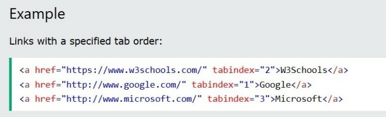
For example, users who use a keyboard will use the tab button to advance fields when filling in a contact form. To provide a good experience, you should use the “tabindex” attribute to indicate the correct order of fields to follow.
7. Limit the Number of Links
You should limit the number of links on your pages even without web accessibility in mind since that can be frustrating for users (and having too many outgoing links is bad for SEO).
But limiting links on a page becomes especially important when designing a website for visually impaired people. With some screen readers, the first thing users hear when landing on a page is the number of links, which can be overwhelming if there are many.
8. Add Relevant Anchor Text
Some screen readers have a navigation mode that makes the tool read all links on a page if the user is looking for specific resources. In this case, having anchor text like “Click here” will be useless and annoying.
When it comes to choosing the words where you’ll insert your links, make sure to add text that describes what the linked page is (e.g., “learn about the best website builders available”).
9. Provide Alternative Content
For visually impaired people using technology to access content, it becomes important to provide alternatives for some types of content.
Remember that screen readers can only read text and code, so users can’t get information that’s present on visual assets. If an image doesn’t have alt text, the screen reader will skip it. If it does have alt text, it will describe the type of content (e.g., “image”) and read the alt text.
Include alt text for images, alternative attributes for graphics, and alternative content for all other media(for example, transcripts or descriptions for video content or moving images). Make sure these are brief and get to the point quickly, and include them only if the information is important.
10. Use Empty Alt Text
For visual assets that are not necessary, it might be better to have screen readers skip them altogether. Since screen readers read code and not just text, some elements can be annoying for vision-impaired users when trying to access the content.
For example, if you have decorative images that don’t really add value or information for visually impaired people, use empty alt text to tell screen readers to skip this code.
alt=""
11. Reduce the Number of Ads on Your Page
Having too many ads on your website can create a bad user experience, especially for screen reader users who can’t easily distinguish this type of content from other content on your page.
For visual advertisements, keep in mind the same considerations as you would for other types of visual content (e.g., adding alt text), but also consider placing the word “advertisement” at the beginning of the alt text. This way, visually impaired people will know what type of content this is and can decide whether they want to consume it or not.
12. Add Language Information
Adding language information is especially important if your website has an international audience and content written in multiple languages.
Specify the language using a “lang” attribute so that assistive devices can figure it out and use proper pronunciation rules. This way, a screen reader will know when it encounters content that is in a foreign language, and you will avoid causing confusion for visually impaired users.
<html lang="fr-FR">
Useful links
http://colorsafe.co/ - provides AA & AAA compliant color suggestions based on your website’s existing elements.
https://chrome.google.com/webstore/detail/color-contrast-analyzer/dagdlcijhfbmgkjokkjicnnfimlebcll - finds text elements that aren’t compliant in terms of color contrast.
https://www.nvaccess.org/download/ - helps you see a website from the perspective of a visually impaired person.
https://webaim.org/resources/contrastchecker/ - finds errors in terms of accessibility to your website.

Top comments (0)