MDN definition of media-query:
Media queries are useful when you want to modify your site or app depending on a device's general type (such as print vs. screen) or specific characteristics and parameters (such as screen resolution or browser viewport width).
Now, let's understand what MDN said 👆 with an example:
<!DOCTYPE html>
<html lang="en">
<head>
    <meta charset="UTF-8">
    <meta http-equiv="X-UA-Compatible" content="IE=edge">
    <meta name="viewport" content="width=device-width, initial-scale=1.0">
    <title>Document</title>
    <style>
        body{
            display: flex;
            height: 100vh;
            justify-content: center;
            align-items: center;
        }
        h1{
            color: green;
            font-size: 60px;
        }
        @media screen and (max-width: 600px){
            h1{
                color: blueviolet;
            }
        }
    </style>
</head>
<body>
    <h1>This is Awesome</h1>
</body>
</html>

In the above example, we could see that as the screen width goes below 600px, the font color changes from green to blueviolet. Hence, we now know that the style inside the media block will only be executed when the condition provided will be true.
There are different approaches that people use while building websites. some use mobile first approach while applying media query to set different properties when the same website is opened on a desktop and some use desktop first approach.
I don't follow any of these approaches and believe in building as per the use case.
Mainly there are 2 types of media queries (although there are many more):
- screen: when u want to make changes as per view-port size (as shown in the above example).
- print: when you want your printer to print different color of text (or any other property) then what is shown on the screen.
All these types come after the media keyword. Although if we neither use print nor use screen in the media query then by default it will be set for all. Hence, for the above example we could have used 👇 (only media):
@media (max-width: 600px){
            h1{
                color: blueviolet;
            }
        }
We can use "or" and "and" operator between 2 or more media queries.
In order to separate two or more different conditions using the 'and' logic, we have to use the “and” keyword between the conditions. Here, our style in the media block will execute only when all the conditions are true that is both page orientation and the max-width condition have to be met in order for the h1 to turn blueviolet.
@media (orientation: landscape) and (max-width: 600px){
            h1{
                color: blueviolet;
            }
        }
In order to separate two or more different conditions using the 'or' logic, we have to use the “,” (comma) keyword between the conditions. Here, our style in the media block will execute when any one of the condition is true:
@media (orientation: landscape), (max-width: 600px){
            h1{
                color: blueviolet;
            }
        }
Now, we'll see how powerful media query is for responsive design by changing the web layout as we'll move from mobile to desktop.
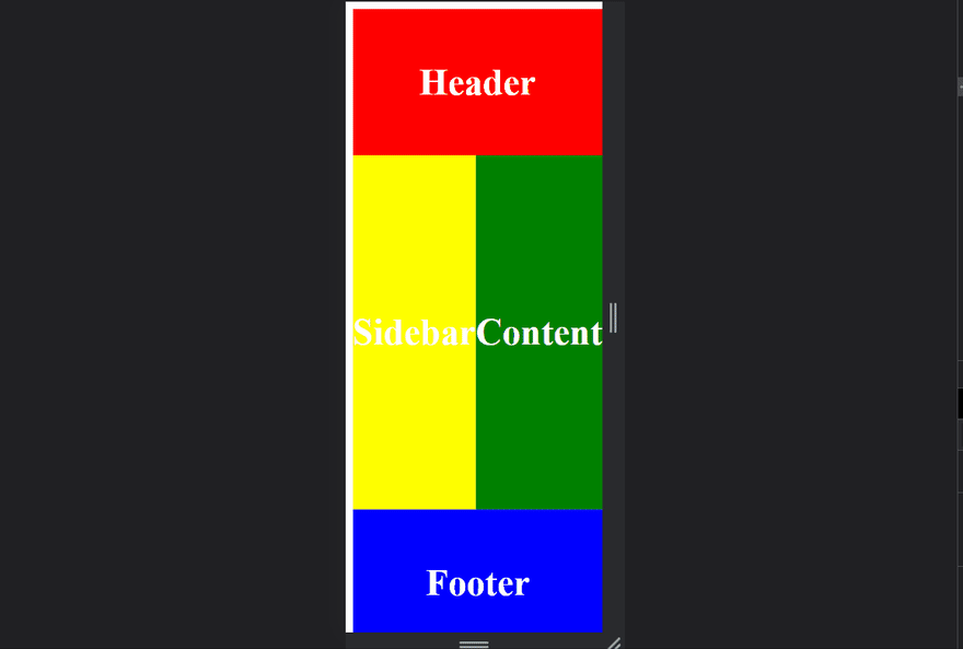
<!DOCTYPE html>
<html lang="en">
<head>
    <meta charset="UTF-8">
    <meta http-equiv="X-UA-Compatible" content="IE=edge">
    <meta name="viewport" content="width=device-width, initial-scale=1.0">
    <title>Document</title>
    <style>
        body{
            display: grid;
            height: 44rem;
            grid-template-areas:
            'header header header'
            'sidebar content content'
            'sidebar content content'
            'sidebar content content'
            'footer footer footer';
        }

        @media (min-width: 700px){
            body{
                display: grid;
                height: 44rem;
                grid-template-areas:
                'header sidebar content footer'
                'header sidebar content footer'
                'header sidebar content footer'
                'header sidebar content footer'
                'header sidebar content footer';
            }
        }
        div{
            color: white;
            background-color: blueviolet;
            display: grid;
            justify-content: center;
            align-items: center;
            font-size: 40px;
            font-weight: bolder;
        }

        div:nth-child(1){
            background-color: red;
            grid-area: header;
        }
        div:nth-child(2){
            background-color: yellow;
            grid-area: sidebar;
        }
        div:nth-child(3){
            background-color: green;
            grid-area: content;
        }
        div:nth-child(4){
            background-color: blue;
            grid-area: footer;
        }

    </style>
</head>
<body>
    <div class="header">Header</div>
    <div class="sidebar">Sidebar</div>
    <div class="content">Content</div>
    <div class="footer">Footer</div>
</body>
</html>
In the above example, the view-port width of 700px is the threshold above which the layout of our website changes.
If you have any doubt ask me in the comments section and I'll try to answer as soon as possible.
I write one article every day related to web-development (yes, every single f*cking day). Follow me here if you are learning the same..
my twitter handle: @therajatg
If you are the linkedin type, let's connect: https://www.linkedin.com/in/therajatg/
Have an awesome day ahead 😀!

Top comments (0)