Confusion Matrix
A Confusion Matrix is one of the easiest ways for you to visualize how well your Machine Learning Algorithm is doing. When you create a Confusion Matrix you will be able to see your True Negatives, False Negatives, True Positive and False Positives. But what do these terms mean? In this blog I will try to give you a better understanding of these terms and how to create a nice visualization with Python to use on your next Project.
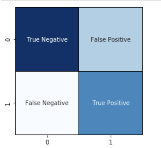
So let's get started with some values and a visual of what a confusion matrix looks like. For the sake of this tutorial I will be using some values I created, normally you would be comparing your test values to what predictions your model produced.
What is Going On
Now lets go over what this Confusion Matrix is showing us:
True Negative: We correctly predicted false. Therefore both our predicted value and test value are both 0.
False Positive: Our prediction was true but the actual value was false. Therefore our test value (left) is 0 but our predicted value (bottom) is 1.
False Negative: Our prediction was false but the actual value was true. So our test value (left) is 1 but our predicted value (bottom) is 0.
True Positive: We correctly predicted true. The test value was 1 and we predicted 1.
Creation
Now that we have an idea of what each square of our confusion matrix means let's add some data.
import pandas as pd
import seaborn as sn
from matplotlib import pyplot as plt
from sklearn.metrics import confusion_matrix

data = {'y_test': [1,1,1,1,1,0,0,0,0,0],
        'y_pred': [1,1,1,0,0,0,0,0,0,1]}

df = pd.DataFrame(data, columns=['y_test','y_pred'])

We have some columns of data now with our test values on the left column and our predictions on the right column, and even though I organized the columns so that all our rows have similar outcomes it is not easy to look at. By taking a closer look at our sample columns we can see we have 3 rows that are both ones (true positives), 2 rows that have ones for test and zero for prediction (false negatives), 4 rows that are both zeros (true negatives) and 1 row that is predicted a one but the test is a zero (false positives).
So here is how to create the confusion matrix to help make this data much easier to read. Our first command will just calculate the values for the confusion matrix and place them in an array that looks like [[4,2],[1,3]]. Then we will use the Matplotlib library to set a size for our confusion matrix's display, numerical values the same if you want a square. Then finally we can use the heatmap function from the Seaborn library to give life to our confusion matrix.
Visualize
#create confusion matrix array
cm1 = confusion_matrix(df['y_pred'],df['y_test'])

#set figure size
plt.figure(figsize = (4,4))

#create confusion matrix
sn.heatmap(cm1,linewidths=1,linecolor='black', annot=True,cbar=False,fmt="",cmap=plt.cm.Blues);

Now you have your very own confusion matrix too easily see how well your model is predicting values and to show off to your friends.

Top comments (0)