
Need a little help making a Choropleth Map? Look no further!
A Choropleth Map is probably the coolest way to visualize geographical data. It not only lets you view your data on a map but also lets you highlight points you want to show off in a stimulating way.
To make these awesome maps using Python I feel the easiest, most intovative way is to use GeoPandas. The great thing about using GeoPandas is that it allows you to keep all of your sorting and editing in the Pandas library and then visualize quickly with Matplotlib.
Data
So to get started let's download the data and libraries we will be using. If you want to follow along with what I am doing with US Covid Cases you can download it here. After you have downloaded the files move them into the local directory of your notebook (I like to consolidate them into a single data folder).
Now import the packages we will be using:
import pandas as pd
import numpy as np
import geopandas as gpd
import matplotlib.pyplot as plt
Now it's time to turn our files into Pandas DataFrames!
sd = "data/us_county.shp"
mapdf = gpd.read_file(sd)
csv = "data/covid_us_county.csv"
df=pd.read_csv(csv)
Now if we take a closer look at our .shp file we can see that it has shapes for every fips(county) code in the United States.
mapdf

Let's take a look at what all of those shapes plot out.
mapdf.plot()

So now if we take a look at our .csv file we can see that it also contains a fips column which will be perfect for merging our DataFrames together with.
Cleaning
Though before we begin the merge let's clean up our data a little bit. As you can see above in our data this database was updated at regular intervals, so let's just pull out the most recent data.
rdf=df[df['date'].str.contains("2020-08-10")]
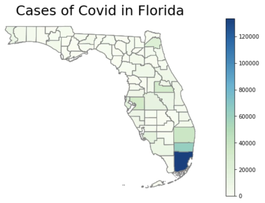
Also if we use the .describe() feature on our new DataFrame we can see that most of our data has 0 covid cases or deaths, so let's choose to focus on an active area like Florida for this demonstration, to get the most out of our Choropleth.
rdf=rdf[rdf['state'].str.contains("Florida")]
Lastly we need to make sure our fips columns are the same data type and we can merge our DataFrames together with a 'inner join' on the fips columns to match our locations with their shapes.
mapdf['fips']=mapdf['fips'].astype('float')
merged=pd.merge(mapdf,rdf,how='inner',on='fips')
Map
Now we can finally print out our Choropleth map by setting the parameters of our figure and adding a title (optional but recommended).
# set to min and max of data
vmin, vmax = 0, 133623

# create figure and axes for Matplotlib
fig, ax = plt.subplots(1, figsize=(14,6))

# add a title and annotation
ax.set_title('Cases of Covid in Flordia', fontdict={'fontsize': '25', 'fontweight' : '3'})

# create map
merged.plot(column='cases', cmap='GnBu', linewidth=1, ax=ax, edgecolor='.5')

And then if we want to make our map a little more slick we can add in commands to remove the axis and add a color bar!
# remove the axis
ax.axis('off')

# Create colorbar legend
sm = plt.cm.ScalarMappable(cmap='GnBu', norm=plt.Normalize(vmin=vmin, vmax=vmax))

# empty array for the data range
sm.set_array([])

#add colorbar
cbar = fig.colorbar(sm)
Or if you prefer you can take the coordinates from the geography column and annotate values right onto the Choropleth.
# Add location for the labels
merged['coords'] = merged['geometry'].apply(lambda x: x.representative_point().coords[:])
merged['coords'] = [coords[0] for coords in merged['coords']]

# Display names
for idx, row in merged.iterrows():
    plt.annotate(s=row['deaths'], xy=row['coords'],horizontalalignment='center',fontsize=9)


Top comments (0)