
Introduction
If you're building a project with TypeScript and want to use CSS, there are two main options:
Styled-Components
SCSS
I have been devoting the past few months to creating a brand-new app, giving it my all. I understood from the start that selecting the best styling library would be essential to the project's success.
I devoted several hours to investigating various possibilities and assessing their advantages and disadvantages. I was looking for a library that would give me the flexibility and control to create unique, visually stunning designs, without sacrificing performance or ease of use.
I chose Styled Components after giving it great thought and conducting research. Given its sizeable and vibrant community, excellent support for React and Typescript, and cutting-edge optimization tools, it seemed like the best option. I jumped right into coding when everything seemed to be going well.
Everything was going well for a while. However, as the app expanded and as I concentrated on delivering features, I started to notice some problems with styled components. The library didn't seem to be as adaptable as I had planned, and some of its peculiarities were giving me trouble.
Debugging was a bit more challenging, as it wasn't always clear what CSS rules were being applied where. And as with any new tool, there was a bit of a learning curve to get up to speed.
I made the decision to transition to using SCSS for styling in order to address these problems. With SCSS, I can name and organize my CSS code according to the BEM (Block Element Modifier) methodology, which makes it much simpler to debug and maintain. In comparison to Styled Components, SCSS provides more flexibility and dynamic styling options. Although setup and configuration might be slightly more involved, I think using SCSS will ultimately result in a better finished product of the application.
What is Styled-Component?
Styled-components are a CSS alternative to React components. They allow you to write your styles in JavaScript, which can be easier than writing them in SCSS or Less (a popular alternative).
Styled-components also have some benefits over SCSS:
They're faster because they don't have to compile into CSS before being used on the page. The browser can just render them out as plain old HTML tags and style them directly with JavaScript. This makes them great for prototyping and building fast prototypes!
You don't need any preprocessors like Sass or Less either - just plain old CSS will do fine here because it's all written in JavaScript anyway!
The Pros of Styled-Components
Styled-Components are a relatively new framework that allows you to style your React components using CSS syntax. The pros of using Styled-Components include:
Type safety: One of the biggest benefits of using Styled Components with TypeScript is the ability to ensure type safety in your CSS. TypeScript enables developers to define specific types for each of their styled components, which can help catch errors early in the development process.
Theming: Styled Components makes it easy to create themable components. You can define your theme variables and then use them throughout your components, making it easy to change the look and feel of your application with minimal code changes.
They're easier to read and write
You don't need to use classes anymore (which can be confusing)
It works with React, Vue and other frameworks
The Cons of Styled-Components
There are a few cons to using styled-components. First, it's harder to debug because you can't easily inspect the CSS code. Second, it requires more setup and configuration than SCSS does. Finally, not all browsers support CSS modules yet (but they will soon).
import * as React from "react";
import {
  SignUpFormFields,
  SignUpFormContainer,
  FormContainer,
} from "./SignUpForm.styled";

interface SignUpFormProps {}

export const SignUpForm: React.FunctionComponent<SignUpFormProps> = (props) => {
  return (
    <FormContainer>
      <SignUpFormContainer>
        <SignUpFormFields>
          <h2>Sign up and start learning</h2>
        </SignUpFormFields>
      </SignUpFormContainer>
    </FormContainer>
  );
};
Difficulty to inspect the CSS code as seen in the figure below:
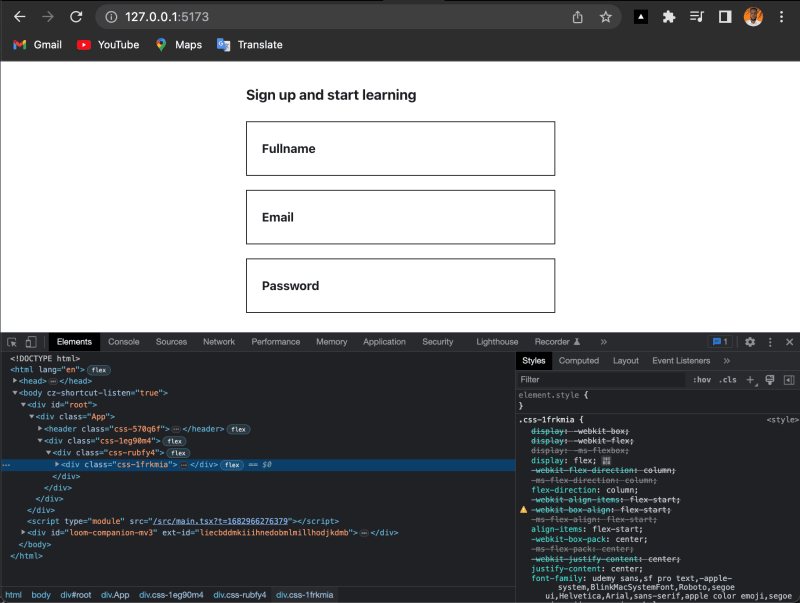
If we have several lines of styling in our SignUpForm.styled.tsx file, such as the example below which applies styles to the SignUpForm component:
import styled from "styled-components";

export const FormContainer = styled.div`
  display: flex;
  align-items: center;
  justify-content: center;
  font-weight: 400;
  line-height: 1.4;
  font-size: 16px;
  color: #1c1d1f;
  margin: 0;
  padding: 0;
  flex: 1 0 auto;
  width: 100%;
`;

export const SignUpFormContainer = styled.div`
  display: flex;
  align-items: center;
  justify-content: center;
  font-weight: 400;
  line-height: 1.4;
  font-size: 16px;
  color: #1c1d1f;
  margin: 0;
  padding: 0;
  width: 100%;
`;

export const SignUpFormFields = styled.div`
  display: flex;
  flex-direction: column;
  align-items: flex-start;
  justify-content: center;
  font-weight: 400;
  line-height: 1.4;
  font-size: 16px;
  color: #1c1d1f;
  padding: 0;
  width: 100%;
  padding-right: 24px;
  padding-left: 24px;
  max-width: 400px;
  margin: 48px auto;
`;
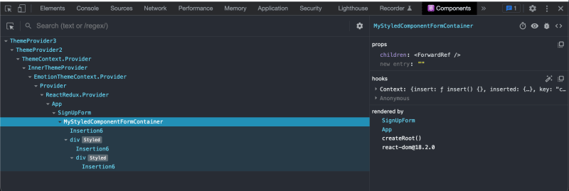
When you inspect a component in the React DevTools, it is helpful to see the component's display name in the tree. By default, styled components are given a generated display name based on their component hierarchy, which may not be very informative. By setting a custom display name, you can make it easier to identify the component when debugging or profiling your application.
import styled from "styled-components";

export const FormContainer = styled.div`
  display: flex;
  align-items: center;
  justify-content: center;
  font-weight: 400;
  line-height: 1.4;
  font-size: 16px;
  color: #1c1d1f;
  margin: 0;
  padding: 0;
  flex: 1 0 auto;
  width: 100%;
`;

FormContainer.displayName = "MyStyledComponentFormContainer";
In the example provided above, the display name of the FormContainer component is set to 'MyStyledComponentFormContainer'. This means that when you inspect this component in the React DevTools, it will be identified by this name instead of the default generated name.
What is SCSS?
The preprocessor scripting language called Sassy Cascading Style Sheets, or SCSS, is used to create CSS stylesheets. Variables, nesting, mixins, functions, and more are all added by SCSS to CSS as more features and abilities.
Standard CSS files are created from SCSS files, which are subsequently used in the creation of websites. The use of SCSS can provide developers more control over the styling of a web page or application and make creating and maintaining stylesheets easier and more effective. React, Angular, and Vue.js are a few examples of web development frameworks that use it frequently.
Pros of SCSS
Easier debugging: Because they're compiled into regular CSS at build time, using SCSS allows you to take advantage of all the features that come with preprocessors like variables (to keep track of colors), nesting (to organize your code), mixins (to reuse common styles) and more!
Familiar syntax: If you're already familiar with CSS, then the SCSS syntax should be relatively easy to pick up. This means you can start using SCSS right away without having to learn a new syntax.
Performance: Unlike Styled Components, SCSS is precompiled, which means that your CSS is generated at build time instead of runtime. This can offer better performance and a smaller bundle size.
Cons of SCSS
No support for dynamic styling
Less flexibility
More complex code and Less readability: With advanced features like mixins, functions, and nesting, SCSS code can sometimes become difficult to read and understand, especially for new developers.
Limited theming: While it is possible to create themable components with SCSS, it may require more effort and setup than it does with Styled Components.
Which One Should You Use?
When deciding which one to use, consider the requirements of your project. For example, if you're working on a large-scale application that needs to scale and be maintainable, then SCSS would be a better choice because it's more mature and has been around for longer. It has a larger community, which means it has a more extensive set of features, tools, and documentation.
for example as seen the SearchInput component below:
import React, { useState } from 'react';
import './SearchInput.scss';
import SearchIcon from '@mui/icons-material/Search';

interface SearchInputProps {
  onSubmit: (searchQuery: string) => void;
}

export default function SearchInput({ onSubmit }: SearchInputProps) {
  const [searchQuery, setSearchQuery] = useState('');

  const onSearchChange = (e: React.ChangeEvent<HTMLInputElement>) => {
    setSearchQuery(e.target.value);
  };

  const handleSubmit = (e: React.FormEvent<HTMLFormElement>) => {
    e.preventDefault();
    if (!disableSearchButton) {
      onSubmit(searchQuery);
    }
  };

  const disableSearchButton: boolean = !searchQuery.length;

  return (
    <div className='search'>
      <form className='search__form' onSubmit={handleSubmit}>
        <button className='search__button' disabled={disableSearchButton}>
          <SearchIcon className='search__icon' />
        </button>
        <input
          placeholder='Search for anything'
          className='search__input'
          value={searchQuery}
          onChange={onSearchChange}
        />
      </form>
    </div>
  );
}
SearchInputProps.scss
.search {
  height: 48px;
  width: 100%;
  margin: 0 1.2rem;
  border-radius: 9999px;
  border: 1px solid #1c1d1f;
  background-color: #f7f9fa;
  &__form {
    display: flex;
    align-items: center;
    justify-content: center;
    height: 100%;
    padding: 0 2.4rem 0 0;
  }

  &__button {
    display: flex;
    justify-content: center;
    align-items: center;
    border: none;
    background: none;
    height: 4.8rem;
    width: 4.8rem;
    cursor: pointer;

    &:hover:disabled {
      cursor: not-allowed;
    }
  }

  &__icon {
    height: 1rem;
    width: 1rem;
    color: #9b9d9e;
  }

  &__input {
    height: 34px;
    background-color: #f7f9fa;
    border: none;
    width: 100%;
    font-size: 14px;
    &:focus {
      outline: none;
    }
  }
}
Using SCSS with BEM (Block Element Modifier) methodology can result in more organized and maintainable code. BEM is a naming convention for classes in HTML and CSS that provides a clear and consistent structure for styling. It can help developers avoid specificity issues and create modular and reusable code.
However, if you're starting a new project or working on a small project, you may want to consider using CSS-in-JS libraries like styled-components.

Top comments (1)
Сongratulations 🥳! Your article hit the top posts for the week - dev.to/fruntend/top-10-posts-for-f...
Keep it up 👍