The WordPress Interactivity is a relatively new API that allows the creation of declarative templates natively. It harnesses Preact and offers SSR out-of-the-box.
1. When and why did the WP Interactivity API appear?
WordPress 6.5, released in April 2024, brings a significant shift with its own front-end reactivity system. In recent years, decoupled (headless) WordPress installations have become more popular. They allow you to leverage modern front-end frameworks like React or Vue.
However, this approach is time-consuming and has a clear drawback: you lose the WP ecosystem features on the front end, such as plugins. Tools like Yoast must be forgotten and switched to manual implementation.
WordPress 6.5 introduces a game-changing feature by adding reactivity tools to its core, allowing you to master modern front-end natively without turning to the decoupled approach. This feature has been developed by the WP Core team for a while but was delivered only in April 2024. Therefore, many developers aren’t familiar with it yet.
While there is a section in the official documentation that explains the key aspects of the Interactivity API, it isn’t as comprehensive as you might want. In addition, in some places it mentions parts related to the Gutenberg blocks only (though it can be used fully independently), so if you’re new to both, it might make understanding more difficult.
That’s why we made this comprehensive and in-depth explanation, in which we’ll share our knowledge with you.
2. WordPress Interactivity API definition
Now let’s figure out what exactly is behind the WordPress Interactivity API name.
The Interactivity API is a standard system of directives, based on declarative code, for adding front-end interactivity to blocks.
In other words, it’s a way to create the front end of a WP website using a declarative approach. If the official definition seems unclear to you, don’t worry, we’ll tackle it piece by piece.
Declarative VS Imperative approach
Declarative, um, what’s that? If you aren’t familiar with React or Vue, this word might be totally unfamiliar to you. But since the WordPress Interactivity API is based on it, we need to understand it. There are two different approaches to mastering the front end: imperative and declarative.
Since the early web days and for decades, we all have been using the imperative approach. The imperative way is when we have a static initial markup and then add interactivity by manually making changes to the markup using JS code. So, we manually query the right nodes and make changes for every action.
The declarative approach is a modern alternative that suggests building a dynamic layout by declaring the elements and their behavior rules all at once. When a user interacts with it, the layout is updated automatically according to the behavior rules we specified, so we don’t need to manually query nodes and make changes.
Drawbacks of the Imperative approach
As an example, let’s review an advanced accordion, which shows its state above. While you’re rarely going to meet similar accordions in real life, the idea is to showcase the weak sides of the imperative way when it comes to handling multiple states.
Besides the classic items toggle feature, we simply need to display the current accordion state (opened or closed) with the item name (so opened item name and last closed item name). The markup can be:
<div class="accordion">
  <div class='accordion__panel'>
    <div class='accordion__heading-opened' hidden>
      Current open item is <span class='accordion__open-item-name'></span>
    </div>
    <div class='accordion__heading-closed'>
      Items are closed.
      <p class='accordion__closed-item' hidden>
        Last opened item is <span class='accordion__closed-item-name'></span>
      </p>
    </div>
  </div>

  <div class='accordion__item'>
    <p class='accordion__item-title'>Title</p>
    <div class='accordion__item-content'>Content</div>
  </div>

  <!--other items-->
</div>
For hiding elements, we’ll use the “hidden” HTML attribute, and for the initial state, we hide the ‘__heading-open’ and ‘__closed-item’ elements. So, what would a classic JS implementation look like? Something like this:
document.addEventListener('DOMContentLoaded', () => {
    document.body.querySelectorAll('.accordion__item-title').forEach((title) => {
        title.addEventListener('click', () => {
            let item = title.closest('.accordion__item');
            let isToOpen = !item.classList.contains('accordion__item--open');
            let accordion = item.closest('.accordion');
            let prevItem = accordion.querySelector('.accordion__item--open');

            // Handle closing the previous item
            if (prevItem) {
                prevItem.classList.remove('accordion__item--open');
                accordion.querySelector('.accordion__closed-item').removeAttribute('hidden');
                accordion.querySelector('.accordion__closed-item-name').innerText = prevItem.querySelector('.accordion__item-title').innerText;
            }

            // Toggle the current item
            if (isToOpen) {
                accordion.querySelector('.accordion__heading-closed').setAttribute('hidden', true);
                accordion.querySelector('.accordion__heading-opened').removeAttribute('hidden');
                item.classList.add('accordion__item--open');
                accordion.querySelector('.accordion__open-item-name').innerText = title.innerText;
            } else {
                accordion.querySelector('.accordion__heading-opened').setAttribute('hidden', true);
                accordion.querySelector('.accordion__heading-closed').removeAttribute('hidden');
                item.classList.remove('accordion__item--open');
                accordion.querySelector('.accordion__closed-item-name').innerText = title.innerText;
            }
        });
    });
});
As you see, the task that looked straightforward and sounded quite simple when described in text turned into a series of conditional checks and DOM queries.
If you’re an experienced developer, you know how the JS code looks for real complex logic scenarios in real life. With the imperative approach, we must write an update query chain for every possible action manually.
The more actions we support, the more complex the code becomes. Gaining experience, you indeed can find shorter and better solutions, but you can’t write less than the necessary minimum, which is still tough.
Benefits of the Declarative approach
As we saw above, the main drawback of the imperative approach is the necessity of manually handling conditionals and queries. The declarative approach offers a solution by declaring the elements and their behavior rules all at once.
Let’s consider this with an advanced accordion example, without getting into the implementation details for now. Starting from the top, we have the panel with two different headings: “__heading-open” and “__heading-closed”.
Only one of them should be shown at a time. So, we conclude that we need an isOpen state and bind this state to the visibility of the items. When isOpen is true, “__heading-open” is visible while “__heading-closed” is hidden, and vice versa.
Introducing this state and moving conditional checks to the markup would allow us to simplify the JS code and change the UI as simply as changing the boolean value of our state. Let’s see how it should look in pseudo-code:
<div class='accordion__heading-opened' {if !isOpen then add 'hidden' attribute}>
  Current open item is <span class='accordion__open-item-name'></span>
</div>
<div class='accordion__heading-closed' {if isOpen then add 'hidden' attribute}>
  Items are closed.
  <p class='accordion__closed-item' hidden>
    Last opened item is <span class='accordion__closed-item-name'></span>
  </p>
</div>
Then in JS, we can just do:
isOpen = true || isOpen = false;
and the layout will change its state without manual node queries.
We hope that now you get the idea of the declarative approach. Don’t worry about the implementation details or other accordion elements, as the example above is only for demonstrating the idea. Below in the article, we’ll implement the advanced accordion example completely using the WP Interactivity API.
For now, you should know that nowadays there are multiple JS frameworks based on the declarative approach, including React, Vue, Preact, and others. The WordPress Interactivity API is another way to achieve this, built on top of the Preact framework.
Interactivity VS Reactivity
If you’re familiar with React or Vue, you know that both frameworks use the term reactivity.
For example, Vue’s documentation states: “One of Vue’s most distinctive features is the unobtrusive reactivity system. Component state consists of reactive JavaScript objects. When you modify them, the view updates.
This term is widely used and describes a key characteristic of the declarative approach, allowing the layout to change as soon as the variables used in it change.
What about interactivity? Let’s review its definition again:
The Interactivity API is a standard system of directives, based on declarative code, for adding front-end interactivity to blocks.
From this description, you might think that reactivity and interactivity are very similar, or even the same.
In fact, Interactivity is just the name that WordPress has chosen for this API. The Interactivity API’s front end is built on top of Preact, which is a reactive framework. So, when you’re using the WP Interactivity API, you can say that it’s a reactive tool as well.
Additionally, keep in mind that reactivity is a feature, even if it’s a key feature of the Interactivity API. Besides it, the API includes more, such as Server Side Rendering, which has its own implementation.
We’ll delve into SSR later, but for now, you should know that the Interactivity API encompasses all the features related to it, while reactivity is an important part of it.
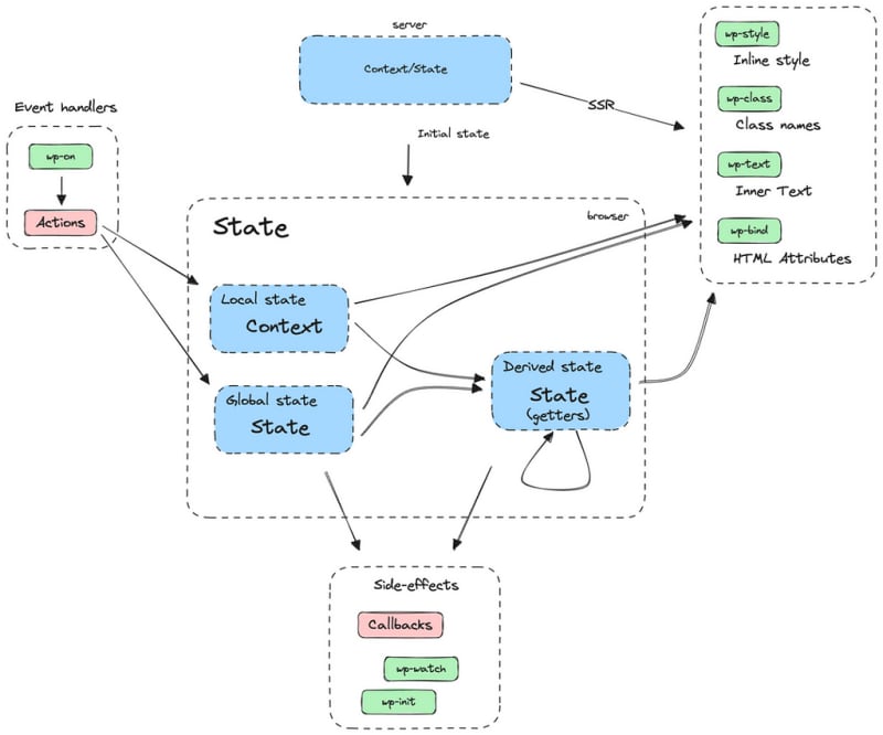
3. Key aspects of the WP Interactivity API
The WordPress Interactivity API consists of two main features: directives and store , which are used in blocks. The store is a common term that describes state and context storages.
Let’s figure out the new terms:
Block — it’s an independent page element with its own store and template that contains directives . One block can include other blocks as children and can also “talk” to each other.
Storage — it’s a set of variables based on which we write directives and add any logic. It’s the way to ‘expose’ some variable to the declarative template.
Directive — it’s a declaration rule added to the markup that controls an element’s behavior based on the element’s state. In pseudocode, it looks like this: {if isOpen then add ‘hidden’ attribute} .
While state and context have differences that we’ll review below, both of them act as a scope of variables for specific elements.
If you’re familiar with React or Vue, you’ll likely understand the concepts more easily. However, the WP Interactivity API has its own implementation, and you can’t directly use things from the React world as is.
If you are encountering this for the first time, don’t worry if you haven’t grasped all the terms yet. In this chapter, we’ll review each in detail and apply them to the accordion example mentioned above.
Usage note
Keep in mind that though the WP Interactivity API is built into the WP core, it isn’t applied to all the HTML by default. By default, it works only within your custom Gutenberg blocks that have the related option enabled. It’s also supported by the Advanced Views Framework.
We recommend reading this chapter without practical reproducing. After getting familiar with the key concepts, you can try implementing them on your own. The ‘Where you can use’ chapter below will share when and how you can harness it.
3.1) Block
Let’s start with this basic term.
A block is an independent page element with its own store and template that contains directives . One block can include other blocks as children and can also “talk” to each other.
We can turn any HTML tag into a block as simply as adding a data attribute. So, in our case, the top accordion element is going to be a block.
<div class="accordion" data-wp-interactive="my-accordion">
  <!-- inner HTML elements here -->
</div>
The data-wp-interactive attribute is necessary to ‘mark’ a specific element as a block. Everything inside it will be considered as block parts. As mentioned above, we can have a block within a block, so:
<div class="accordion" data-wp-interactive="my-accordion">
  <!-- inner HTML elements here -->
  <div class='popup' data-wp-interactive="my-popup"></div>
</div>
This is a valid example. As the attribute value, we can pass any string, but it must be unique within the page. We recommend always giving clear and human-readable names because to ‘talk’ with some block on the page from another block, we’ll use exactly the name defined in this attribute.
3.2) State
So, we’ve defined an interactive block. But before we use any ‘magic’ directives , we need to define some data that can be used in the directives.
State is a set of variables based on which we can write directives and add any logic. It’s one of the ways to ‘expose’ some variable to the declarative template. The main characteristics of the Block state are that it is global and public, i.e., it’s saved in the page scope under the block name and available to others.
Note: State is an optional feature, so we can have an interactive block without the _ **_state** .
So, any variables defined in the state are:
- Global across all the blocks with the same type (within the current page) This means that even if you have multiple blocks of the same type on the same page, they’ll all share the same state. That’s the primary difference from the context , which allows defining ‘current block-only’ variables.
- Public This means other blocks can ‘request’ their values based on the variable name and use the block name as a ‘namespace’.
State variable can be passed from the backend, or defined on the front. Since WordPress is a PHP framework, the state can be passed from the backend by calling a PHP function.
If we need to define a state variable on the backend, we must call a specific function above the block definition. The function is called wp_interactivity_state. So let’s introduce the isOpen state and add it to our accordion.
<?php echo wp_interactivity_state( 'my-accordion', [
 'isOpen' => false,
] ); ?>
<div class="accordion" data-wp-interactive="my-accordion">
  <!-- inner HTML elements here -->
</div>
The wp_interactivity_state is a WordPress function that accepts two arguments: the block name, and an array of state variables.
If we have nothing to pass from the backend, we can define the state on the front end in the JS code like this:
const { state } = store("my-accordion", {
  state: {
    isOpen: false
  },
});
FYI: The ‘mixed’ way is also supported, so you can pass some state variables from the backend while defining others on the front.
3.3) Context
Context is another way to define variables that can be used in directives.
Context is a set of variables based on which we can write directives and add any logic. It’s one of the ways to ‘expose’ some variable to the declarative template. The main characteristics of the Block context are that it is local and private, i.e., it’s saved within the current block and not available to others.
Note: Context is an optional feature, so we can have an interactive block without the _ **_context** .
So, any variables defined in the context are:
- Current block only This means that even if you have multiple blocks of the same type on the same page, each of them will have its own context. That’s the primary difference from the state , which allows sharing variables across block instances with the same type.
- Private This means other blocks can’t ‘request’ their values directly.
- Inheritable Context variables are available to the current node and all its inner elements.
Unlike state variables, which can be defined both on the back-end and front-end side, context can only be defined on the back-end. Context variables must be passed as JSON using the data-wp-context attribute. Let’s add the isOpen context variable to our accordion block:
<div class="accordion" data-wp-interactive="my-accordion"
data-wp-context='{"isOpen": false}'>
  <!-- inner HTML elements here -->
</div>
So, that’s how it looks like in the markup. But in real life, you’ll likely want to pass PHP variables. It can be done like so:
<div class="accordion" data-wp-interactive="my-accordion"
data-wp-context='<?php echo json_encode(["isOpen" => false]); ?>'>
  <!-- inner HTML elements here -->
</div>
You can define the data-wp-context attribute manually or call wp_interactivity_data_wp_context , a special WP function, like this:
<div class="accordion"
data-wp-interactive="my-accordion"
<?php echo wp_interactivity_data_wp_context(["isOpen" => false]); ?>'>
  <!-- inner HTML elements here -->
</div>
As we mentioned, the context is private and inheritable, so it’s available only for the current node and all its children. So you can have multiple contexts inside your block:
<div class="accordion" data-wp-interactive="my-accordion">
  <div data-wp-context='<?php echo json_encode(["someVar" => "some value"]); ?>'>
    <!-- inner HTML elements here -->
  </div>
  <div data-wp-context='<?php echo json_encode(["anotherVar" => true]); ?>'>
    <!-- inner HTML elements here -->
  </div>
</div>
3.4) Directives
Now, let’s review directives , the key feature of the Interactivity API, which allows us to create reactive layouts.
Directives are custom attributes added to the markup of your block to define behavior of the DOM elements.
At first glance, they appear to be plain HTML data attributes, familiar to everyone. They follow the data-wp format, appearing as data-wp-{x}=”y” , where x is the directive name, and y is the value.
To illustrate with our accordion example, let’s recall the heading part in pseudocode:
<div class='accordion__heading-opened' {if !isOpen then add 'hidden' attribute}>
  Current open item is <span class='accordion__open-item-name'></span>
</div>
<div class='accordion__heading-closed' {if isOpen then add 'hidden' attribute}>
  Items are closed.
  <p class='accordion__closed-item' hidden>
    Last opened item is <span class='accordion__closed-item-name'></span>
  </p>
</div>
Now, let’s convert it into real WP Interactive code:
<div class="accordion"
     data-wp-interactive="my-accordion"
     data-wp-context='{"isOpen": false}'>
    <div class='accordion__panel'>
        <div class='accordion__heading-opened' data-wp-bind--hidden="!context.isOpen">
            Current open item is <span class='accordion__open-item-name'></span>
        </div>
        <div class='accordion__heading-closed' data-wp-bind--hidden="context.isOpen">
            Items are closed.
        </div>
    </div>
    <!--other items-->
</div>
In this example:
- We defined the ‘my-accordion’ block.
- Defined isOpen variable in the block context.
- Added ‘data-wp-bind — hidden’ directives to the target elements.
Directive explanation
Let’s examine the first directive: data-wp-bind — hidden=”!context.isOpen”.
For the data attribute name, we used:
- data-wp- as a common prefix, necessary for any directive.
- bind , which is a directive name. Bind is one of the WP directives that allows controlling attributes based on boolean variables.
- — hidden , representing the name of the attribute we want to control. Here, we can place any valid HTML attribute.
Now, let’s review the value: !context.isOpen.
This is reactive code, creating a bind that persists until the page is closed. Even if you change isOpen later, after some action or timeout, it will execute our rule and keep the attribute in sync.
Why did Interactivity API choose directives instead of JSX or others?
If you’re familiar with Vue or React, you can draw an analogy with their approaches. For example, in Vue, we also use built-in directives, like v-bind:src=”srcVariable” , and in React, we use className={className}. In WordPress, we use data-wp-class — classname=”y”.
While the longer directive format may initially frustrate you, you’ll likely agree that their names are very clear. Keep in mind that WordPress is built on a classic base, and the WP Interactivity API is designed to work with any plain HTML code. Here the official documentation explains all the reasons directives were chosen.
So, even though JSX style is shorter, WP uses the classic data-attribute approach. From our experience, after creating several blocks, you’ll get used to it and won’t notice it at all. If you’re still considering that the WP Interactivity API isn’t as great as you envisioned, it has something to make you happier:
Unlike React and Vue, it offers SSR (Server-Side Rendering) out-of-the-box! This means that initially the directives will be processed on the server side by WordPress, and the browser will receive the already correct markup, with all classes and attributes set.
Also, WordPress will take care of hydration/rehydration and will sync the data and markup, so in JavaScript, you’ll be able to access and change state , context , and more.
We have taken a step away from the directives to show the power of the Interactivity API. We’ll review SSR in detail a little later. For now, let’s return to directives.
List of the available directives
The Interactivity API brings a row of directives that cover all our needs. You can find the full list on this page of the official documentation. Let’s review commonly used:
- wp-bind As you saw, this directive allows you to control any HTML attribute, like data-wp-bind — hidden=”context.isOpen”.
- wp-text Allows you to control the innerText of the node. Inside the value, you should pass a string variable, e.g., data-wp-text=”state.submitLabel”.
- wp-class Allows you to control the class appearance based on a boolean value. E.g., data-wp-class — active=”context.isActive”. The class name can contain any valid characters, so don’t worry, things like button — enabled won’t break the directive.
- wp-style Allows you to control inline styles, e.g., data-wp-style — color=”context.color”.
- wp-on Allows you to assign listeners. E.g., data-wp-on — click=”actions.submit”.
3.5) JS code
Now let’s review the final piece: the JavaScript code itself, which allows us to attach listeners and add external actions, like Ajax. On the frontend, the WordPress Interactivity API is available as a separate file — a tiny library (35KB) built on top of Preact.
We import this library in the JavaScript code of any block. Not all blocks require JavaScript code, so it’s optional. If we don’t need to add listeners to our block, we don’t include JavaScript code, and consequently, the library won’t be imported.
As we mentioned earlier, the Interactivity API provides Server-Side Rendering out-of-the-box, so directives will be executed on the server side. When we need to set state variables on the frontend or define any actions, we have to add the following line to our JS code:
import { store } from '@wordpress/interactivity';
This is a classic JavaScript module import, and @wordpress/interactivity is an alias to /wp-includes/js/dist/interactivity.min.js , added by WordPress using the ImportMap feature. The following parts are available to import: store , getContext , and getElement. Let’s review all of them.
For now, let’s focus on the store , the primary one. To define the block in JavaScript, we must call the store function imported from the Interactivity library.
The first argument must be the name of our block from the data-interactive attribute, and the second is an object with the settings. Let’s add the isClosed state to our accordion block:
import { store } from '@wordpress/interactivity';

const { state } = store("my-accordion", {
  state: {
    isClosed: false,
  },
});
The object supports the following keys: state , actions , callbacks. Items defined inside the state key are used as state variables. Items inside actions are used in action directives, such as wp-on — click. Callbacks are for internal events, like init , which is called when the node is created.
Note: As we mentioned earlier, you can define a state both on the backend and frontend. This means if we’ve defined the isOpen state on the backend using the wp_interactivity_state function, we can access this property in JavaScript code too, even without defining it again.
So we can write let isOpen = state.isOpen in our JS code and it’ll return the value of the state variable that we defined on the backend, as WordPress will pass them to the front as JSON automatically. However, keep in mind that state variables defined in JavaScript will only be available on the client side.
This means if you haven’t defined a state variable on the backend but only on the frontend, you can still use this ‘front-only’ state in directives. However, such directives will be skipped during Server-Side Rendering and executed only on the frontend.
Consequently, if you use them for UI control, the client may see the element you want to hide until JavaScript is loaded and executed. Therefore, if you use state variables in directives that affect the initial UI, we recommend defining them on the backend.
getContext function
Besides state , we can also get access to the block context. For this, we need to import the getContext function from the Interactivity library. After that, we can call getContext() in any action and get any context variable as a property.
import {store, getContext} from '@wordpress/interactivity';

store("my-accordion", {
    actions: {
        toggleItem: () => {
            let context = getContext();
            context.isItemClosed = !context.isItemClosed;
        }
    }
});
Similar to store variables, the context variables are also writable, so you can change them when needed, and it will update all the directives where the context variable is used.
Note: The getContext() call will automatically get the closest context to the node on which the event is fired. This means if you’ve added data-wp-context to a block and its inner child, and then added a click listener to that child, in the action method, the getContext() call will return the context of this child.
Store variables in Actions
Let’s combine store and actions to add a click action to our accordion example to see how it all looks together:
import { store } from '@wordpress/interactivity';

const { state } = store("my-accordion", {
  state: {
    isClosed: true,
  },
  actions: {
    toggle: (event) => {
      state.isClosed = !state.isClosed;
    },
  },
});
Then we assign this listener to our accordion item using the wp-on directive:
<div class='accordion__item'>
  <p class='accordion__item-title' data-wp-on--click="actions.toggle">Title</p>
  <div class='accordion__item-content' data-wp-bind--hidden="!state.isOpen">Content</div>
</div>
That’s it! Thanks to the reactivity, when we change the state variable, it will execute directives in which that variable was used and will add or remove the hidden attribute. We can use the same variable in multiple directives.
getElement function
Using the getElement function, we can directly access the HTMLElement of the current block. In most cases, you won’t need it, but there are rare instances when it’s useful. For example, if you need to access the browser’s API to scroll the content inside or get the element’s width.
To get the HTMLElement, we need to get the ref part of the function response:
const { ref } = getElement();
// ref is an ordinary HTMLElement instance, so we can do anything with it, like:
console.log(ref.getBoundingClientRect());
Callbacks
Returning to the store object keys: state , actions , and callbacks — we have seen the first two in the action. The third key, callbacks , is used to define general block callbacks that are called by the library, such as init or run.
init is called only once when the node is created, while run is called on every node rendering. To add them to the block, besides defining them in JS, we need to set them in directives too, like this:
import {store, getElement, getContext} from '@wordpress/interactivity';

store("my-accordion", {
    callbacks: {
        init: () => {
            let {ref} = getElement();

            console.log('Accordion node is parsed', {
                HTMLElement: ref,
                isOpen: getContext().isOpen,
            });
        }
    }
});

<div class="accordion"
     data-wp-interactive="my-accordion"
     data-wp-context='{"isOpen": false}'
     data-wp-init="callbacks.init">
    <!--inner items-->
</div>
3.6) Summary
Breathe out, because at this step, we can congratulate you — the most complex parts are behind you, and you’ve learned the key aspects of the Interactivity API.
Let’s depict them all at once so you can get a complete picture in your mind.
The WordPress Interactivity API is based on plain HTML and provides directives , store , and context , which allow for declarative templates. Let’s look at a simple example:
<?php wp_interactivity_state('my-accordion', ['isClosed' => true,]) ?>
<div class="accordion"
     data-wp-interactive="my-accordion"
     data-wp-context='{"isOpen": false}'
     data-wp-init="callbacks.init">
    <div class='accordion__panel'>
        <div class='accordion__heading-opened' data-wp-bind--hidden="state.isClosed">
            Current open item is <span class='accordion__open-item-name'></span>
        </div>
        <div class='accordion__heading-closed' data-wp-bind--hidden="context.isOpen">
            Items are closed.
        </div>
    </div>
    <!--other items-->
</div>

import { store, getElement, getContext } from '@wordpress/interactivity';

const { state } = store("my-accordion", {
    callbacks: {
        init: () => {
            let { ref } = getElement();

            console.log('Accordion node is parsed', {
                HTMLElement: ref,
                isOpen: getContext().isOpen,
                isClosed: state.isClosed,
            });
        }
    }
});
So what’s happening here?
1. In the PHP backend, the templates are rendered and directives are processed
Before passing to the browser, WordPress processes the directives and updates the markup accordingly. In addition, WP converts all the state variables into JSON and passes them to the browser along with the markup.
In our case, the __heading-opened element will have the hidden attribute, according to the false value of the isOpen context variable. Meanwhile, the __heading-closed element won’t have this attribute, because isClosed state variable is true.
2. On the frontend, our JS code loads the interactivity API JS library
That library parses the JSON (in React it’s called rehydration) and calls our block definition. The WP Interactivity.js library will put the store variables defined on the backend into the state variable in our JS code ( isClosed in our case).
It will also call the init callback to which we added a listener using the wp-init directive. In this callback, we print the HTML element of the block, along with the isOpen variable from the context and the isClosed variable from the state.
From a logical point of view, it’s pointless to have both variables at once, but we included them to showcase how you can use both store and context simultaneously. That’s the way the WordPress Interactivity API works, so make sure you get the whole picture.
If something is unclear, we recommend re-read the related explanation above before continuing with the article.
4. Server Side Rendering in the Interactivity API
Note: This information is useful for understanding how the SSR works in the Interactivity API behind the scenes, but it is not necessary for the basic API usage. You can safely skip this chapter.
About the SSR overall
The main drawback of any reactive frameworks in JS is client-side rendering. While classical applications send ready HTML to the client, reactive frameworks like React or Vue create HTML on the fly, based on the defined components and their data.
In practice, this means clients will see an empty page, or at least sections, for some time until JS processes everything. This not only hurts the UX but also SEO, as search engines can’t immediately parse the page content.
Many search engines don’t support it, and while Google claims to support it, SEO experts don’t recommend using client-side rendering for pages sensitive to SEO scores. If you’re familiar with React/Vue, you know that full-stack frameworks like Next.js (React) and Nuxt.js (Vue) offer SSR.
They can ‘preload’ HTML by executing JavaScript on the server side (Node.js) and passing already prepared HTML along with the necessary states, so the client can ‘hydrate’ this data and restore its state. They seamlessly handle all the nuances, but behind the scenes, it requires quite a significant effort.
One of the difficulties here is that frameworks use Node.js on the backend and plain JavaScript on the client side in the browser. This means that the same piece of code can be executed in either of these environments, which are quite different.
SSR implementation in the WP Interactivity API
Now, back to WordPress. As we mentioned, the Interactivity.js on the front end is based on Preact, so it doesn’t offer any SSR. Fortunately, WordPress comes with its own SSR solution, and while it may sound a little crude, it’s a nice solution that supports any plain HTML.
SSR in WordPress Interactivity API is based on its own HTML API ( WP_HTML_Tag_Processor), which WordPress introduced in version 6.2.
The idea is to parse HTML pieces with the interactive directives on the backend (PHP) and modify the markup based on them, to deliver the built markup ready to the client. In addition, it includes ‘hydration’ on the client, to transfer all the states to the client side.
In this way, all state variables that we add to the blocks using the wp_interactivity_state function call in PHP, and context variables from the data-wp-context attribute, will be used during directives execution in PHP SSR.
Afterward, the state variables will be added to the current page as JSON, and then will be parsed on the client and attached to the JS block states, as we showed in the JS code explanation. In this way, the client and SEO engines get the ready HTML from the beginning, while developers can access all the data from the backend.
Though it required directive support in PHP from WordPress, it integrates well with the WP ecosystem, making developers’ lives easier and the user experience much better. If you think this is a rough solution that may be bad for performance, you shouldn’t worry about it.
It’s implemented smartly, so WordPress doesn’t parse all the page HTML, but only the pieces where the Interactivity API can be used, additionally limiting parsing to nodes with data-wp attributes. In this way, it doesn’t add significant overhead to the whole process.
5. Where you can use WordPress Interactivity API
Since we’ve learned the basics, let’s now see where we can apply this knowledge. As we mentioned earlier, the Interactivity API SSR isn’t applied to all the page content, so by default, you can’t start using it in any template. Below we provide the ways you can apply it:
5.1) In custom Gutenberg blocks (created manually)
By default, the WordPress Interactivity API is available in Gutenberg blocks. To enable its support for a specific block, you need to define “interactivity”: true in the block.json data and can use all the WP Interactivity features in render.php and view.js files.
This is good news if you’re already familiar with and experienced with the custom Gutenberg block creation process. Otherwise, we wouldn’t recommend this method, as creating custom Gutenberg blocks from scratch is time-consuming and requires React knowledge.
In most cases, you’ll need to write the markup for the same block twice: first in React for the Gutenberg editor, then in PHP for the front end.
5.2) In custom Gutenberg blocks (created using a third-party vendor)
Overall, building WordPress pages from custom Gutenberg blocks is still a good idea because they’re modular, efficient on the front end, and provide a good UX for editors. In our agency, we harness the ACF Blocks feature of the Advanced Custom Fields plugin.
This feature allows the creation of custom Gutenberg blocks without hassle. You can also use MB Blocks or Pods blocks features. Check our best custom field plugins review to compare and learn how to use them.
5.3) In templates of the Advanced Views Framework
The Advanced Views Framework introduces smart templates for the WordPress front-end, simplifying post queries and template creation. These templates harness the Twig engine and support the Interactivity APIout-of-the-box, so you can use it in any template without extra actions.
These templates can be stored inside your theme, making them Git and IDE-friendly. Additionally, you can employ TypeScript/Sass and Tailwind for them.
Another benefit is that it also supports Gutenberg block creation (via third-party vendors mentioned above), so you can turn any template into a custom Gutenberg block, providing a nice experience for editors while enjoying the modular approach and Interactivity API features.
5.4) In plain PHP templates
Though the Interactivity API may seem like a Gutenberg-oriented tool, it isn’t so by the fact. It’s a core and public API that can be used anywhere.
In your theme or plugin, you can call the wp_interactivity_process_directives function and pass a string with the HTML code that has directives. These directives will be executed, and the function will return the updated markup.
So it may look like this:
<?php

echo wp_interactivity_state('my-accordion', [
    'isOpen' => false,
]);

ob_start();
?>

<div class="accordion" data-wp-interactive="my-accordion">
  <!-- inner HTML elements here -->
</div>

<?php

$html = (string) ob_get_clean();
echo wp_interactivity_process_directives($html);


import { store, getElement, getContext } from '/wp-includes/js/dist/interactivity.min.js';

store('my-accordion', {
    actions: {
        // ...
    }
});
While it’s possible to use the Interactivity API in this manner, we recommend building websites modularly, using independent blocks with their own assets, as in the case of custom Gutenberg blocks and smart templates of the Advanced Views Framework.
6. Example of the interactive block
Now, you have all the knowledge, and we recommend you to make several examples with your own hands to practice and store the knowledge better in your head. Below, as promised, we provide an advanced accordion example mentioned above, turned into the WP Interactive block.
<?php

wp_interactivity_state( 'my-accordion', [
 'isOpen' => false,
 'isLastItemSet' => false,
 'lastOpenedItemName' => "",
] ); ?>

<div class="accordion"
     data-wp-interactive="my-accordion">
    <div class='accordion__panel'>
        <div class='accordion__heading-opened' data-wp-bind--hidden="!state.isOpen">
            Current open item is <span class='accordion__open-item-name' data-wp-text="state.lastOpenedItemName"></span>
        </div>
        <div class='accordion__heading-closed' data-wp-bind--hidden="state.isOpen">
            Items are closed.
            <p class='accordion__closed-item' data-wp-bind--hidden="!state.isLastItemSet">
                Last opened item is <span class='accordion__closed-item-name'
                                          data-wp-text="state.lastOpenedItemName"></span>
            </p>
        </div>
    </div>

    <div class='accordion__item' data-wp-context='{"isItemClosed":true,"itemName":"First"}'>
        <p class='accordion__item-title' data-wp-on--click="actions.toggleItem" data-wp-text="context.itemName"></p>
        <div class='accordion__item-content' data-wp-bind--hidden="context.isItemClosed">Content of the first item</div>
    </div>

    <div class='accordion__item' data-wp-context='{"isItemClosed":true, "itemName":"Second"}'>
        <p class='accordion__item-title' data-wp-on--click="actions.toggleItem" data-wp-text="context.itemName"></p>
        <div class='accordion__item-content' data-wp-bind--hidden="context.isItemClosed">Content of the second item
        </div>
    </div>
</div>

import {store, getContext} from '@wordpress/interactivity';

const {state} = store("my-accordion", {
    state: {
        openedItemTitle: null,
        get isLastItemSet() {
            return '' !== state.lastOpenedItemName;
        },
        get isOpen() {
            return null !== state.openedItemTitle;
        }
    },
    actions: {
        toggleItem: (event) => {
            let titleElement = event.target;
            let context = getContext();

            // Handle closing the previous item
            if (null !== state.openedItemTitle &&
                titleElement !== state.openedItemTitle) {
                state.openedItemTitle.click();
            }

            // Toggle the current item
            context.isItemClosed = !context.isItemClosed;

            // update the top state
            state.lastOpenedItemName = context.itemName;
            state.openedItemTitle = false === context.isItemClosed ?
                titleElement :
                null;
        }
    }
});
Getters: In this implementation, we used the built-in JS getter feature to add dynamic state variables. This feature can be added to any object in JS and is particularly useful in our case, as wp-bind boolean properties support only boolean primitives, so we couldn’t add conditions there.
So, this is a declarative implementation of the accordion block. Let’s now recall how the JS code looked in the imperative approach:
document.addEventListener('DOMContentLoaded', () => {
    document.body.querySelectorAll('.accordion__item-title').forEach((title) => {
        title.addEventListener('click', () => {
            let item = title.closest('.accordion__item');
            let isToOpen = !item.classList.contains('accordion__item--open');
            let accordion = item.closest('.accordion');
            let prevItem = accordion.querySelector('.accordion__item--open');

            // Handle closing the previous item
            if (prevItem) {
                prevItem.classList.remove('accordion__item--open');
                accordion.querySelector('.accordion__closed-item').removeAttribute('hidden');
                accordion.querySelector('.accordion__closed-item-name').innerText = prevItem.querySelector('.accordion__item-title').innerText;
            }

            // Toggle the current item
            if (isToOpen) {
                accordion.querySelector('.accordion__heading-closed').setAttribute('hidden', true);
                accordion.querySelector('.accordion__heading-opened').removeAttribute('hidden');
                item.classList.add('accordion__item--open');
                accordion.querySelector('.accordion__open-item-name').innerText = title.innerText;
            } else {
                accordion.querySelector('.accordion__heading-opened').setAttribute('hidden', true);
                accordion.querySelector('.accordion__heading-closed').removeAttribute('hidden');
                item.classList.remove('accordion__item--open');
                accordion.querySelector('.accordion__closed-item-name').innerText = title.innerText;
            }
        });
    });
});
Wow, how much shorter the event handler is now, and what a nice thing to update variables instead of querying nodes directly and updating attributes manually!
You can already see the huge benefit and shift in the approach even in this small example. Recall all your JS code from real life, and envision now how much better it’s going to be when it’s written using the Interactivity API.
Now it’s a great time to experiment! Try to change something in that to get practical experience with the WordPress Interactivity API!
Demonstration note: If you’re an exprienced web developer, you can see that our implementations are quite simple and can be improved. In real life, it would use the wp-each directive, or at least a PHP loop by the data array. But don’t judge strictly, we made it as simple as possible for demonstration purposes.
7. Pro Tips on the Interactivity API
There are several useful things you should know to harness the full potential of the API. Some of them we already briefly mentioned, and now let’s review them in detail:
7.1) Getters in State
As you saw in the declarative advanced accordion implementation above, we can define any getters in the state object. This is a very useful feature, and you’re going to use it often due to the fact that most directives support only boolean variables.
It means you can’t write conditional statements, like in plain JS code, data-wp-bind — hidden=”state.isFirst && !state.isSecond” or “state.name == ‘’”. These won’t work. So when you need such conditions, you can put them into a getter and define that getter inside the attribute.
import {store, getContext} from '@wordpress/interactivity';

const {state} = store("my-accordion", {
    state: {
        get isLastItemSet() {
            return '' !== state.lastOpenedItemName;
        },
    },
});
Inside that getter, we can also harness context variables by calling getContext(). Also, pay attention that getters defined in the JS code aren’t available on the backend, so during SSR, directives that include them will be skipped.
In these cases when you want them to participate in SSR, you can define them using the wp_interactivity_state function as primitive booleans, and then just override them in the JS by assigning a function to the same name.
7.2) Event object in Actions
When we assign our callback to some element in plain JavaScript, like .addEventListener(‘click’), this callback will receive the first argument with the Event type. The object will vary depending on the action itself, but in all cases, it implements the general Event interface.
Actions in the WP Interactivity API also receive this object, so you can use it as you need, e.g., to get the current element, like event.target :
import {store} from '@wordpress/interactivity';

store("my-accordion", {
    actions: {
        toggle: (event) => {
            let clickedHTMLElement = event.target;
            // clickedHTMLElement.innerHTML = 'x';
        }
    }
});
7.3) Loop Directive: wp-each
It’s an advanced directive, which you’ll need only in cases where the interface requires dynamic item creation and removal. An example is the classic ‘todo’ list, where besides editing, items can be added and removed.
This directive allows defining a template that will be applied to all items of the list. The idea is that when you change the related variable in JS, it’ll keep the items in sync automatically.
Let’s review this example:
<?php

$context = [
 'list' => [
  [
   "id" => "en",
   "value" => "hello"
  ],
  [
   "id" => "es",
   "value" => "hola"
  ],
  [
   "id" => "pt",
   "value" => "olá"
  ]
 ]
];

?>

<div class="accordion"
     data-wp-interactive="my-accordion"
     data-wp-context='<?php
     echo json_encode( $context ); ?>'>
    <ul>
        <template
                data-wp-each--item="context.list"
                data-wp-each-key="context.item.id">
            <li data-wp-text="context.item.value"></li>
        </template>
    </ul>
    <button data-wp-on--click="actions.removeLastItem">Remove last item</button>
</div>

import {store, getContext} from '@wordpress/interactivity';

const {state} = store("my-accordion", {
    actions: {
        removeLastItem: (event) => {
            let context = getContext();

            context.list.pop();
        }
    }
});
In this example, we have a list of items, where each has an id and value. Using the special Template tag and data-wp-each directive, we define the loop by the list. In the directive name, we define the item name, in our case item (data-wp-each — item=), and as value, we define the list itself, which can be either a context or state variable.
Pay attention that we use the wp-each-key directive to point to the unique item ID, thanks to which the Interactivity API will keep items in sync.
This loop will be processed during SSR and replaced with the markup built based on the items. But unlike a plain PHP loop, it’ll keep the list context variable defined in the wp-each directive in sync with the markup, so when we remove the last item of the array in the action, it’ll remove the target item in the markup automatically.
7.4) Cross Block Communication
As we mentioned earlier, all the block state variables are public, so they can be accessible from other blocks. But how can we do it?
To get the state of another block, we should call the store function with the name of the target block, but without passing the second argument, as we did before.
Below we show how to get the someData state variable from the my-another-block. This code can be placed anywhere, e.g., inside any action of our accordion block.
import {store} from '@wordpress/interactivity';

// ....

console.log(store("my-another-block").state.someData);
8. Conclusions
The appearance of the WordPress Interactivity API is a significant shift in the WordPress ecosystem. Although it was released recently and hasn’t gained widespread recognition yet, it is definitely going to play a crucial role in WordPress development in the near future.
This built-in integration will help developers build interactive frontends easily. Thanks to the unified approach, plugin and theme vendors can develop their own interactive blocks, which will be able to interact with each other, regardless of the vendor.
We hope this article was useful and that you’ve understood all the key aspects of the Interactivity API. Happy developing!

Top comments (0)