
After reading Don’t Make Me Think, I has learned a lot and rethinking the design of my personal site, my repo, etc. This is summary and reading notes meanwhile, most of them are picked from the origin.
Here are a few things you won’t find in this book:
- Hard and fast usability rules
- Predictions about the future of technology and the Web
- Bad-mouthing of poorly designed sites and apps.
You’ll find a lot of different definitions of usability often breaking it down into attributes like:
- Useful: Does it do something people need done?
- Learnable: Can people figure out how to use it?
- Memorable: Do they have to relearn it each time they use
- Effective: Does it get the job done?
- Efficient: Does it do it with a reasonable amount of time and effort?
- Desirable: Do people want it?
- Delightful: Is using it enjoyable, or even fun?
Person of average (or even below average) ability and experience can figure out how to use the thing [i.e., it’s learnable] to accomplish something[effective] without it being more trouble than it’s worth [efficient].
Chapter 1. Dont make me think
What’s the most important thing I should do if i want to make sure my site or app is easy to use? It’s not “Nothing important should ever be more than two clicks away” or “Speak the user’ s language” or “Be consistent.” It’s Dont make me think.
All kinds of things on a Web page can make us stop and think unnecessarily. Your goal should be for each page or screen to be self-evident, so that just by looking at it the average user. Here’s the rule: If you can t make something self-evident, you at least need to make it self-explanatory.
On a self-explanatory page, it takes a little thought to get it, but only a little. The appearance of things (like size, color, and layout), their well-chosen names, and the small amounts of carefully crafted text should all work together to create a sense of nearly effortless understanding.
Chapter 2. How we really use the Web
When we’re creating Sites, we act as though people are going to pore over each page, reading all of our carefully crafted text, figuring out how we’ve organized things, and weighing their options before deciding which link to click.
What they actually do most of the time (if were lucky is glance at each new page, scan some of the text, and click on the first link that catches their interest or vaguely resembles the thing they’re looking for.
- FACT OF LIFE #1: We dont read pages. We scan them
- FACT OF LIFE #2: We dont make optimal choices. We satisfice.
- FACT OF LIFE #3: We don’t figure out how things work. We muddle through.
Chapter 3. Billboard Design 101
DESIGNING FOR SCANNING, NOT READING
Take advantage of conventions
Like Stop signs, Given how crucial it is that drivers see and recognize them at a glance at a distance, in all kinds of weather and lighting conditions, it’s a really good thing that all stop signs look the same.

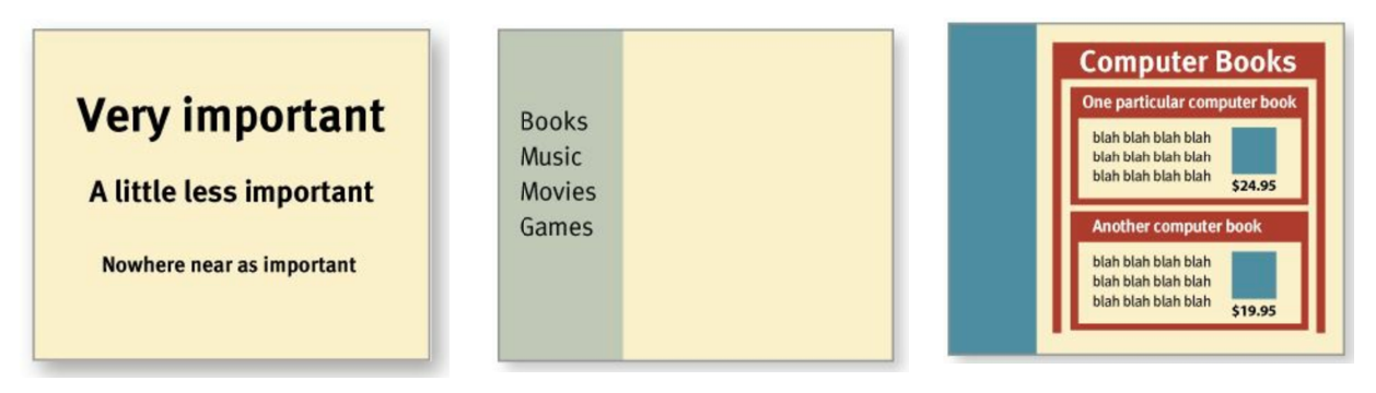
Create effective visual hierarchies
- The more important something is, the more prominent it is.
- Things that are related logically are related visually.
- Things are”nested visually to show what’s part of what
Break pages up into clearly defined areas
Web page scanning suggest that users decide very quickly in their initial glances which parts of the page are likely to have useful information and then rarely look at the other parts.
Banner blindness-the ability of users to completely ignore areas they think will
contain ads — is just the extreme case.
Make it obvious what’s clickable
As we scan a page, we’re looking for a variety of visual cues that identify things as clickable(or tappable?’on touch screens )-things like shape(buttons, tabs, etc.), location(in a menu bar, for instance), and formatting(color and underlining).
Eliminate distractions/noise
One of the great enemies of easy-to-grasp pages is visual noise. There are really three different kinds of noise:
- Shouting: Automated slideshows, animation, pop-ups, and the never-ending array of new attention-grabbing ad formats! Shouting is usually the result of a failure to make tough decisions about which elements are really the most important and then create a visual hierarchy that guides users to them first.
- Disorganization: This is a sure sign that the designer doesn’t understand the importance of using grids to align the elements on a page.
- Clutter: It’s hard to find and focus on the messages you actually care about.
A good idea to start with the assumption that everything is visual noise (the “presumed guilty until proven innocent” approach) and get rid of anything that’s not making a real contribution.
Format content to support scanning
- Use plenty of headings.
- Keep paragraphs short.
- Use bulleted lists.
- Highlight key terms.
Chapter 4. Animal, Vegetable, or Mineral? WHY USERS LIKE MINDLESS CHOICES
It doesn’t matter how many times I have to click, as long as each click is a mindless, unambiguous. But over time I’ve come to think that what really counts is not the number of clicks it takes me to get to what I want (although there are limits), but rather how hard each click is — the amount of thought required and the amount of uncertainty about whether I’m making the right choice.
Some assistance may be required
This guidance works best when it’s
- Brief: The smallest amount of information that will help me
- Timely: Placed so I encounter it exactly when I need it
- Unavoidable: Formatted in a way that ensures that I’ll notice it
Chapter 5. Omit needless words
Get rid of half the words on each page, then get rid of half of what’s left.
- Happy talk must die: It’s the introductory text that’s supposed to welcome us to the site and tell us how great it is or to tell us what we’re about to see in the section we’ve just entered. Happy talk is like small talk — content-free, basically just a way to be sociable. But most Web users don’t have time for small talk; they want to get right to the point. You can — and should — eliminate as much happy talk as possible.
- Instructions must die: Your objective should always be to eliminate instructions entirely by making everything self-explanatory, or as close to it as possible.
Chapter 6. Street signs and Breadcrumbs
Web Navigation 101
In many ways, you go through the same process when you enter a Web site.
- You’re usually trying to find something.
- You decide whether to ask first or browse first. The difference is that on a Web site there’s no one standing around who can tell you where things are. The Web equivalent of asking directions is searching — typing a description of what you’re looking for in a search box and getting back a list of links to places.
Some people (Jakob Nielsen calls them “search-dominant” users) will almost always look for a search box as soon as they enter a site. Other people (Nielsen’s “link-dominant” users) will almost always browse first, searching only when they’ve run out of likely links to click or when they have gotten sufficiently frustrated by the site.
Web experience is missing many of the cues we’ve relied on all our lives to negotiate spaces. Consider these oddities of Web space:
- No sense of scale.
- No sense of direction.
- No sense of location.
This lack of physicality is both good and bad. On the plus side, the sense of weightlessness can be exhilarating and partly explains why it’s so easy to lose track of time on the Web — the same as when we’re “lost” in a good book.
On the negative side, If you look up navigation in a dictionary, it’s about doing two things: getting from one place to another, and figuring out where you are.
Two of the purposes of navigation are fairly obvious: to help us find whatever it is we’re looking for and to tell us where we are.
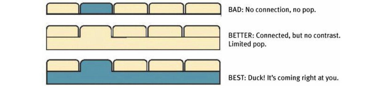
Persistent navigation
Just having the navigation appear in the same place on every page with a consistent look gives you instant confirmation that you’re still in the same site.
Persistent navigation should include the four elements you most need to have on hand at all times:
On pages where a form needs to be filled in, the persistent navigation can sometimes be an unnecessary distraction.
One of the ways navigation can counteract the Web’s inherent “lost in space” feeling is by showing
me where I am in the scheme of things.
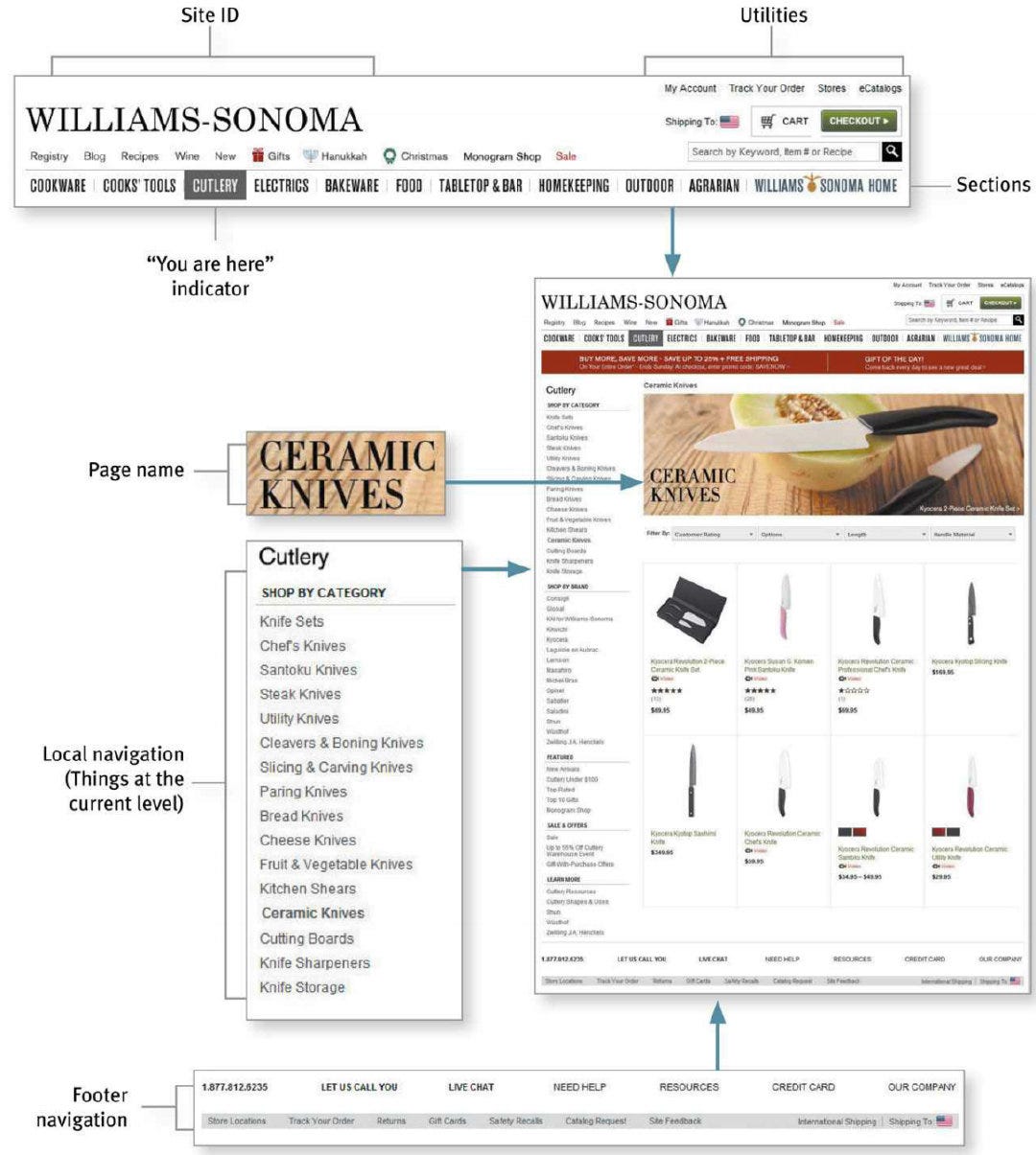
Pages
There are four things you need to know about page names:
- Every page needs a name. Just as every corner should have a street sign, every page should have a name.
- The name needs to be in the right place. In the visual hierarchy of the page, the page name should appear to be framing the content that is unique to this page

- The name needs to be prominent.
- The name needs to match what I clicked.
Breadcrumbs
Like “You are here” indicators, Breadcrumbs show you where you are. They’re called Breadcrumbs because they’re reminiscent of the trail of crumbs Hansel dropped in the woods so he and Gretel could find their way back home.
Breadcrumbs show you the path from the Home page to where you are and make it easy to move back up to higher levels in the hierarchy of a site.
- Put them at the top.
- Use > between levels.
- Boldface the last item.
Tabs
Tabs are one of the very few cases where using a physical metaphor in a user interface actually works. Here’s why I like them:
- They’re self-evident.
- They’re hard to miss.
- They’re slick.

If the page is well designed, when your vision clears you should be able to answer these questions without hesitation:
- What site is this? (Site ID)
- What page am I on? (Page name)
- What are the major sections of this site? (Sections)
- What are my options at this level? (Local navigation)
- Where am I in the scheme of things? (“You are here” indicators)
- How can I search?
Here’s how you perform the trunk test:
- Step 1: Choose a page anywhere in the site at random, and print it.
- Step 2: Hold it at arm’s length or squint so you can’t really study it closely.
- Step 3: As quickly as possible, try to find and circle each of these items:
- Site ID
- Page name
- Sections (Primary navigation)
- Local navigation
- “You are here” indicator(s)
- Search
Chapter 7. The Big Bang Theory of Web Design
THE IMPORTANCE OFGETTING PEOPLE OFFON THE RIGHT FOOT.
As quickly and clearly as possible, the Home page needs to answer the four questions I have in my
head when I enter a new site for the first time:
This is what I call the Big Bang Theory of Web Design. Like the Big Bang Theory, it’s based on the idea that the first few seconds you spend on a new Web site or Web page are critical.
Everything on the Home page can contribute to our understanding of what the site is. But there are
three important places on the page where we expect to find explicit statements of what the site is
about.
- The tag line
One of the most valuable bits of real estate is the space right next to the Site ID. When we see a phrase that’s visually connected to the ID, we know it’s meant to be a tagline, and so we read it as a description of the whole site. We’ll look at taglines in detail in the next section.
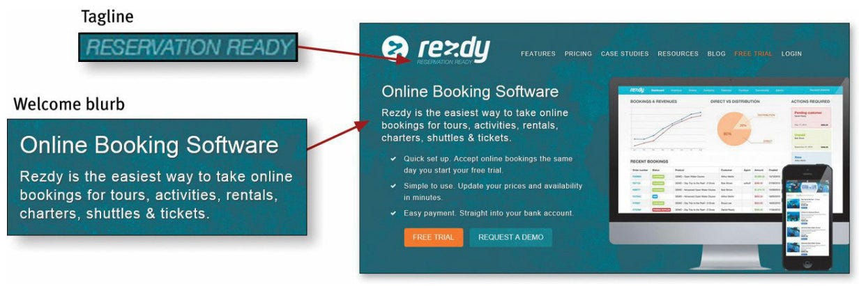
- The Welcome blurb.
The Welcome blurb is a terse description of the site, displayed in a
prominent block on the Home page, usually at the top left or center of the content space so it’s the first thing that catches your eye.
- The “Learn more.”
Innovative products and business models tend to require a fair amount of
explanation, often more than most people have the patience for. But people have become accustomed to watching short videos on their computers and mobile devices. As a result, people have now come to expect a short explanatory video on most sites and are often willing to watch them.
Chapter 8. “The Farmer and the Cowman Should Be Friends” | 论内部协作
Left to their own devices, Web teams aren’t notoriously successful at making decisions about usability questions. Most teams end up spending a lot of precious time rehashing the same issues over and over.
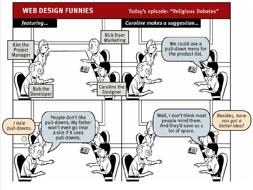
The point is, it’s not productive to ask questions like “Do most people like pull-down menus?” The right kind of question to ask is “Does this pull-down, with these items and this wording in this context on this page create a good experience for most people who are likely to use this site?”
And there’s really only one way to answer that kind of question: testing. You have to use the collective skill, experience, creativity, and common sense of the team to build some version of the thing (even a crude version), then watch some people carefully as they try to figure out what it is and
how to use it.
Chapter 9. Usability testing on 10 cents a day
Usability testing has been around for a long time, and the basic idea is pretty simple: If you want to know whether something is easy enough to use, watch some people while they try to use it and note where they run into problems. Testing one user is 100 percent better than testing none. Testing one user early in the project is better than testing 50 near the end.
Repeat after me: Focus groups are not usability tests
Here’s the difference in a nutshell:
- In a focus group, a small group of people (usually 5 to 10) sit around a table and talk about things, like their opinions about products, their past experiences with them, or their reactions to new concepts. Focus groups are good for quickly getting a sampling of users’ feelings and opinions about things.
- Usability tests are about watching one person at a time try to use something (whether it’s a Web site, a prototype, or some sketches of a new design) to do typical tasks so you can detect and fix the things that confuse or frustrate them.
The main difference is that in usability tests, you watch people actually use things, instead of just
listening to them talk about them.
Do-it-yourself usability testing
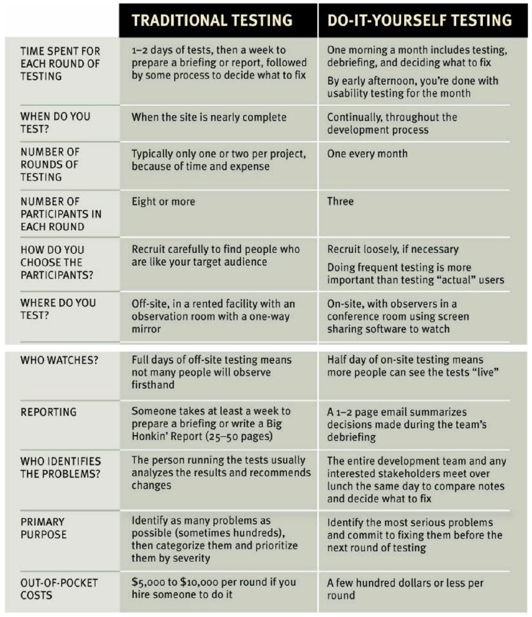
The purpose of this kind of testing isn’t to prove anything. You don’t need to find all of the problems. In fact, you’ll never find all of the problems in anything you test. And it wouldn’t help if you did, because of this fact:
You can find more problems in half a day than you can fix in a month.
A typical one-hour test would be broken down something like this:
- Welcome (4 minutes). You begin by explaining how the test will work so the participant knows what to expect.
- The questions (2 minutes). Next you ask the participant a few questions about themselves. This helps put them at ease and gives you an idea of how computer-savvy and Web-savvy they are.
- The Home page tour (3 minutes). Then you open the Home page of the site you’re testing and ask the participant to look around and tell you what they make of it. This will give you an idea of how easy it is to understand your Home page and how much the participant already knows your domain.
- The tasks (35 minutes). This is the heart of the test: watching the participant try to perform a series of tasks (or in some cases, just one long task). Again, your job is to make sure the participant stays focused on the tasks and keeps thinking aloud. If the participant stops saying what they’re thinking, prompt them by saying — wait for it — “What are you thinking?” (For variety, you can also say things like “What are you looking at?” and “What are you doing now?”) During this part of the test, it’s crucial that you let them work on their own and don’t do or say anything to influence them. Don’t ask them leading questions, and don’t give them any clues or assistance unless they’re hopelessly stuck or extremely frustrated. If they ask for help, just say something like “What would you do if I wasn’t here?”
- Probing (5 minutes). After the tasks, you can ask the participant questions about anything that happened during the test and any questions that the people in the observation room would like you to ask.
- Wrapping up (5 minutes). Finally, you thank them for their help, pay them, and show them to the door.
The debriefing: Deciding what to fix
Here are some of the types of problems you’re going to see most often:
- Users are unclear on the concept.
- The words they’re looking for aren’t there.
- There’s too much going on.
FOCUS RUTHLESSLY ON FIXING THE MOST SERIOUS PROBLEMS FIRST
Chapter 10. Mobile: It’s not just a city in Alabama anymore
So, what’s different about usability when you’re designing for use on a mobile device?In one sense, the answer is: Not much. The basic principles are still the same. If anything, people are
moving faster and reading even less on small screens. Most of the challenges in creating good mobile usability boil down to making good tradeoffs.
Which parts do you leave out? One approach was Mobile First. Instead of designing a full-featured (and perhaps bloated) version of your Web site first and then paring it down to create the mobile version, you design the mobile version first based on the features and content that are most important to your users. Then you add on more features and content to create the desktop/full version
Breeding chameleons
If there are two things I can tell you about scalable design (a/k/a dynamic layout, fluid design, adaptive design, and responsive design), they’re these:
- It tends to be a lot of work.
- It’s very hard to do it well.
In the meantime, here are three suggestions:
- Allow zooming.
- Don’t leave me standing at the front door. You tap on a link in an email or a social media site and instead of taking you to the article in question it takes you to the mobile Home page, leaving you to hunt for the thing yourself.
- Always provide a link to the “full” Web site.
Be careful that your responsive design solutions aren’t loading up pages with huge amounts of code and images that are larger than necessary for the user’s screen.
Don’t hide your affordances under a bushel
Affordances are visual clues in an object’s design that suggest how we can use it.
This is not to say that all affordances need to hit you in the face. They just have to be visible enough
that people can notice the ones they need to get their tasks done.
Flat design has a tendency to take along with it not just the potentially distracting decoration but also the useful information that the more textured elements were conveying.
Delightful & Learnable
Delightful apps usually come from marrying an idea about something people would really enjoy being able to do, but don’t imagine is possible, with a bright idea about how to use some new technology to accomplish it.
One of the biggest problems with apps is that if they have more than a few features they may not be very easy to learn.
That’s not to say that no one in the real world learns how to use it. It gets great reviews and is
consistently a best seller. But I have to wonder how many people who bought it have never mastered
it, or how many more sales they could make if it were easier to learn.
There’s one more attribute that’s important: memorability. Once you’ve figured out how to use an app,
will you remember how to use it the next time you try or will you have to start over again from
scratch?
Usability testing on mobile devices
Here are some of the issues you have to deal with:
- Do you need to let the participants use their own devices?
- Do they need to hold the device naturally, or can it be sitting on a table or propped up on a stand?
- What do the observers need to see (e.g., just the screen, or both the screen and the participant’s fingers so they can see their gestures)? And how do you display it in the observation room?
- How do you create a recording?
Until better technology-based solutions come along, here’s what I’d lean toward:
- Use a camera pointed at the screen instead of mirroring.
- Attach the camera to the device so the user can hold it naturally.
- Don’t bother with a camera pointed at the participant.

Chapter 11. Usability as common courtesy(绅士)
Here are a few of the things that tend to make users feel like the people publishing a site don’t have their best interests at heart(避免做以下的事):
- Hiding information that I want. The most common things to hide are customer support phone numbers, shipping rates, and prices.
- Punishing me for not doing things your way. I should never have to think about formatting data: whether or not to put dashes in my Social Security number, spaces in my credit card number, or parentheses in my phone number.
- Asking me for information you don’t really need.
- Shucking and jiving me. We’re always on the lookout for faux sincerity, and disingenuous attempts to convince me that you care about me can be particularly annoying.
- Putting sizzle in my way. Having to wade through pages bloated with feel-good marketing photos makes it clear that you don’t understand — or care — that I’m in a hurry.
- Your site looks amateurish. You can lose goodwill if your site looks sloppy, disorganized, or unprofessional, like no effort has gone into making it presentable.
The good news is that even if you make mistakes, it’s possible to restore my goodwill by doing things that convince me that you do have my interests at heart. Most of these are just the flip side of the other list:
- Know the main things that people want to do on your site and make them obvious and eas
- Tell me what I want to know.
- Save me steps wherever you can.

Top comments (0)