What is CSS Grid
A two dimensional system made up of rows and columns that helps you position your html elements.
How to enable and use CSS Grid
On any element, declare display:grid ;
Every item that is added to that element will by default occupy a row.
So if I add five divs to the grid, you will see five rows created and occupied by the divs.
How to modify default behaviour of the grid container element
If you want to create a 3x2 (3 rows x 2 columns) grid then this is what you need to declare on the grid element:
display:grid;
grid-template-rows: 1fr 1fr 1fr;
grid-template-columns: 1fr 1fr;
Note: There are many other units you can use here in place of fr, like px, %, and many more. Fr units means the remaining space so in this example all the rows have the same height and all the columns have the same width.
How the items position themselves in a grid container
By default, items flow from left to right, top to bottom. So continuing last section's example, the 1st item will occupy the top left cell, the 2nd item will occupy the top center cell and so on, until the first row is filled up. Then the items will move down to the next row.
Note: This is the default behaviour which can be changed by specifying grid-auto-flow: column, then the items will flow from top to bottom then left to right.
How to position a specific element into a certain cell
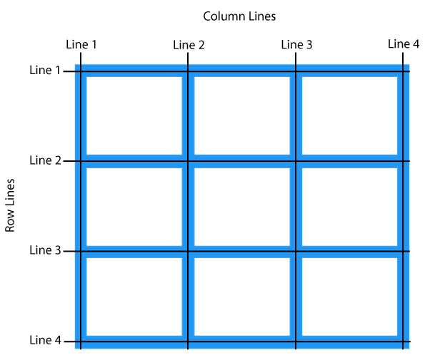
Say we have a 3x3 grid.

If we want to position an element with class item into the center cell we have to declare
.item {
  grid-area: 2/2/3/3;
}
grid-area: row-start/ col-start/ row-end/ col-end;
Here the row-start etc, refer to the lines.


Top comments (0)