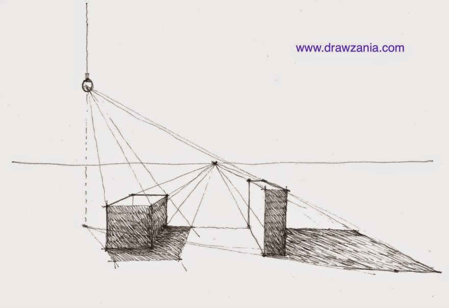
While coding the new UI for my company’s website (calypsu.com)I came across an interesting shadow style which they call neumorphic design. It’s like what you do while sketching, you consider direction of light and the side from which light is coming is lighter and there’s a shadow on the other side.
Following similar methodology, they created shadows like the one shown in the image below. Top and left shadows are lighter in color while the bottom and right shadows are darker.
I did some research and realised box-shadows in CSS suppers multiple comma-separated values. Just like this.
.box {
box-shadow:
0 2.8px 2.2px rgba(0, 0, 0, 0.034),
0 6.7px 5.3px rgba(0, 0, 0, 0.048),
0 12.5px 10px rgba(0, 0, 0, 0.06),
0 22.3px 17.9px rgba(0, 0, 0, 0.072),
0 41.8px 33.4px rgba(0, 0, 0, 0.086),
0 100px 80px rgba(0, 0, 0, 0.12)
;
So to code neumorphic shadow as my team wanted, I just had to add two shadows with different colors and different horizontal/vertical offset value. I used rgba(101, 96, 96, 0.533) as color of negative horizontal/vertical offset and rgba(0, 0, 0, 0.4) as color of positiove horizontal/vertical offset. Below is the two line code that you get doing this.
.box {
box-shadow: 2px 2px 5px rgba(0, 0, 0, 0.4),
-2px -2px 5px rgba(101, 96, 96, 0.533);
}
Here you go. Experiment with it, use it in your UI projects and do share your creative outputs.


Top comments (0)