
There are different ways to create the form in the Mojolicious and it is difficult to tell which one is correct method. In this article, we discuss we the inbuilt Mojolicious way to create the Forms.
Prerequisites
As always before proceeding, you need to know the following:
- Perl
- Mojolicious
In this article we skip few of the concepts of the Mojolicous. It fair to assume that you already have some familiarity with the Mojolicious framework.
Create a Form
Quickly create an App and start the server
mojo generate app forms
cd forms
morbo script/forms
It starts the app at port 3000
Next step is to create the Controller and add the route in the main lib file.
Create a new file MyForm.pm under the Controller directory and add the below content
package Forms::Controller::MyForms;
use Mojo::Base 'Mojolicious::Controller';

# This action will render a template
sub index {
  my $self = shift;

  # Render template "example/welcome.html.ep" with message
  $self->render(template => 'myforms/index');
}

1;
In the main file, Forms.pm add a route
$r->get('/forms')->to('myforms#index');
Next is to create a template index under myforms directory.
Open the index.html.ep template and add the following:
%= form_for login => begin
    %= text_field 'username', id => 'username'
% end
Visit the page http://localhost:3000/forms and you can see a page like this.

text_field is to add the input type text to the html page.
Let's add the label for it
%= form_for login => begin
    %= label_for username => 'Username:'
    %= text_field 'username', id => 'username'
    %= label_for password => 'Password:'
    %= password_field 'password', id => "password"
    %= submit_button 'Login'
% end
label_for is to add the label for the input field
password_field is to add the password type input field.
submit_button is to add the submit button to our form.
Right now the form looks very ordinary. Lets add some CSS styles to it. In most our tutorials, we use tailwind css framework and this article is no exception. In the default.html.ep add the
<link href="https://unpkg.com/tailwindcss@^1.0/dist/tailwind.min.css" rel="stylesheet">
Modify the index.html.ep
% layout 'default';

<section class="py-8">
    <div class="w-full border max-w-sm  mx-auto">
        %= form_for login => begin
        <h3 class="text-2xl text-center mb-6 font-heading"> Login Form </h3>
        <div class="mb-4 ml-2 mr-2">
            %= label_for username => 'Username:'
            %= text_field 'username', id => 'username', class => 'appearance-none block w-full py-3 px-4 leading-tight text-gray-700 focus:bg-white border border-gray-200 focus:border-gray-500 rounded focus:outline-none'
        </div>
        <div class="mb-4 ml-2 mr-2">
            %= label_for password => 'Password:'
            %= password_field 'password', id => "password", class => 'appearance-none block w-full py-3 px-4 leading-tight text-gray-700 focus:bg-white border border-gray-200 focus:border-gray-500 rounded focus:outline-none'
        </div>
        <div class="mb-4 ml-2 mr-2">
            %= check_box 'keep_login', id => "keep_login"
            Keep me login
        </div>
        <div class="mb-6 ml-2 mr-2">
            %= submit_button 'Login', class => 'inline-block w-full py-4 px-8 leading-none text-white bg-teal-500 hover:bg-teal-600 rounded shadow'
        </div>
        % end
    </div>
</section>
check_box is to create a checkbox.
Refresh the webpage.

Now our form looks much better than before.
Offcourse there is still an important topic left that is the form validation, that we will cover in the next article.
In this article, we cover all the other types of inputs used in the form.
Text Area Field
Text Area is useful if we want user to write a message to us in the contact form or can be used in the profile description or at blogs also.
<div class="w-full max-w-sm  mx-auto">
    <div class="mb-8 ml-2 mr-2 mt-2">
        %= text_area 'message', placeholder => 'Write to Us...', rows => 8, class => 'appearance-none block w-full py-3 px-4 leading-tight text-gray-700 focus:bg-white border border-gray-200 focus:border-gray-500 rounded focus:outline-none'
        %= submit_button 'Submit', class => 'inline-block w-full py-4 px-8 leading-none text-white bg-teal-500 hover:bg-teal-600 rounded shadow'
    </div>
</div>

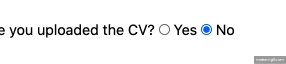
Radio Button
Have you uploaded the CV?
%= radio_button cv => 'yes'
Yes
%= radio_button cv => 'No', checked => undef
No
Here is the how it looks on web page.
Select Field
Sometimes, we have to create a select field where user needs to chose from dropdown list of items.
<div class="w-full max-w-sm  mx-auto">
    <div class="mb-4 ml-2 mr-2 mt-2">
        %= select_field language => ['-- Select --', 'Perl', 'Python', 'PHP'], class => 'appearance-none block w-full py-3 px-4 leading-tight text-gray-700 focus:bg-white border border-gray-200 focus:border-gray-500 rounded focus:outline-none'
    </div>
</div>
It will show something like this on the web page.

What if we want multiple, option groups. Mojolicious has a solution for it.
<div class="w-full max-w-sm  mx-auto">
    <div class="mb-4 ml-2 mr-2 mt-2">
        %= select_field language => [c(Languages => ['Perl5', 'Perl7', 'Raku']), c(Framework => ['Mojolicious', 'Catalyst', 'Bailador'])], class => 'appearance-none block w-full py-3 px-4 leading-tight text-gray-700 focus:bg-white border border-gray-200 focus:border-gray-500 rounded focus:outline-none'
    </div>
</div>
Again with less hassle, we achieve the multiple option groups in select field. We can also get the dropdownlist from the database.
Either we can pass the array reference in the template or we can use Class::DBI::Formbuilder.

Now we proceed towards Date Field.
Date Field
Sometimes, we need to select the date in the HTML forms. Lets say for 'Booking of Air Travels or any other modes of transport'.
Mojolicious has date_field keyword to achieve this.
<div class="w-full max-w-sm  mx-auto">
    <div class="mb-8 ml-2 mr-2 mt-2">
        %= label_for 'start_date' => 'Start Date:'
        %= date_field id => 'start_date', class => 'appearance-none block w-full py-3 px-4 leading-tight text-gray-700 focus:bg-white border border-gray-200 focus:border-gray-500 rounded focus:outline-none'
        %= label_for 'end_date' => 'End Date:'
        %= date_field id => 'end_date', class => 'appearance-none block w-full py-3 px-4 leading-tight text-gray-700 focus:bg-white border border-gray-200 focus:border-gray-500 rounded focus:outline-none'
    </div>
</div>
Here is the demo

If you want to show the time in date time, use datetime_field instead of date_time.
<div class="w-full max-w-sm  mx-auto">
    <div class="mb-8 ml-2 mr-2 mt-2">
        %= label_for 'start_date' => 'Start Date:'
        %= datetime_field id => 'start_date', class => 'appearance-none block w-full py-3 px-4 leading-tight text-gray-700 focus:bg-white border border-gray-200 focus:border-gray-500 rounded focus:outline-none'
        %= label_for 'end_date' => 'End Date:'
        %= datetime_field id => 'end_date', class => 'appearance-none block w-full py-3 px-4 leading-tight text-gray-700 focus:bg-white border border-gray-200 focus:border-gray-500 rounded focus:outline-none'
    </div>
</div>
Hidden Field
In form, we mostly use hidden field to protect the auto submit of form using the bots. The hidden_field keyword is used for the same.
%= hidden_field role="admin", id='user_role'
Number Type Field
We already discussed about the text field, what if we need to add some numbers field like age or years or months etc.
%= number_field 'marks'
If we want to add some default value
%= number_field 'marks' => 40
There is one problem. User can still input negative marks. We need to restrict the user to input the value between 0 to 100
%= number_field 'marks' => 40, min => 0, max => 100
Clean Approach.
Range Field
This can also be used if you want user to select the between the range.
%= range_field 'marks' => 40, min => 0, max => 100
File input Field
File inout field used to upload the file from our local machine to the server.
<div class="w-full max-w-sm  mx-auto">
    <div class="mb-8 ml-2 mr-2 mt-2">
        %= file_field 'resume', id => 'upload_file', class => 'appearance-none block w-full py-3 px-4 leading-tight text-gray-700 focus:bg-white border border-gray-200 focus:border-gray-500 rounded focus:outline-none'
        %= submit_button 'Upload', class => 'inline-block w-full py-4 px-8 leading-none text-white bg-teal-500 hover:bg-teal-600 rounded shadow'
    </div>
</div>

Mojolicious forms are powerfull and can be used in place of html to write a clean code and developed the application in Mojolicious way.
Summary
In this article, we learn to create the forms in the Mojolicious application and we also use different input fields type requires to create a form.

Top comments (0)