
What is a media-query?
A Media Query is a CSS Technique that uses a @media and @import at-rules which helps in invoking CSS properties inside a block only if the desired condition is true for various device resolutions.
Ex:
@media only screen and (max-width: 600px) {
  body {
    background-color: lightyellow;
  }
}
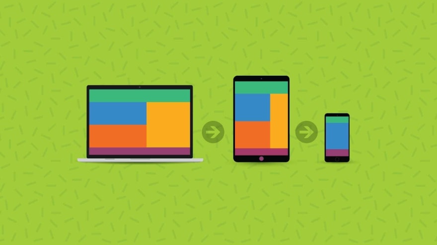
Adding breakpoints..
Breakpoints help in eliminating clutter of rows and columns made in a web page. It was responsive but it wasn't made for a smaller screen with a lower resolution like Mobile Phones, Tablets, etc.
Ex:
@media (max-width: 768px) {
  html {
   color: gray;
   font-size: 1rem;
  }
}
Improving the compatibility with outdated or older browsers
Certain browsers don't support media queries and the applied media features like styling does not get implemented. The example being displayed below has no effects on modern browsers.
@media only screen and (max-width: 600px) {
  body {
    background-color: lightblue;
  }
}
Are media queries really that important?
Media queries have always been a powerful tool and is being used widely as a CSS Toolbox with great power. Accomodating a design to every possible situation will lead to complexity to maintain. Having a universal design on the web is pretty hard and it almost sounds non existent.
Therefore, media queries play an important role in responsive web designing as they allow us to create various layouts with accurate spacing and clarity with no clutter depending on the viewport’s size. Media queries can also be used to detect the users environment the site is being run for example if the user is using a touchscreen or a joystick other than a mouse to navigate on a website.

Latest comments (3)
Hi, Sai Pavan! Nice topic!
I have a question:
There is a pattern for breakpoints or should they be done as per the project layout?
Hey Gabriel Duete , Thanks for the compliment!
As far as your question is concerned, the answer is no.. there isn't any specific pattern for breakpoints.. Although there are global media query properties that can be used based on different device resolutions along with landscape/portrait modes. Breakpoints can be added in any order according to you're desire of satisfying your webpage's requirements in order to enhance responsiveness and provide the end user with a great experience.. :)
Thanks for the clarification, Sai! o/