What we're doing
This assignment for our Open Source class has us doing some work with Markdown, HTML, and CSS to transfer the C Programming notes from Seneca College from a website, to a Docusaurus website using Markdown/HTML. Because the initial conversion was done doing an automatic tool, we are tasked with auditing and making sure the notes match the website. Images loading properly, looking good in dark mode, different screen sizes, etc.
Code Reviews
Part of the process of 50+ students working on a project is having a lot of reviewing to do so nothing breaks. The professor can't possibly do all of that and we're going to need to review in our developer journey, so it's time to learn!
For this review I did a PR review for my friend Kevan Yang who was adding PWA support to the application. Overall, there was not much to say about the code and Kevan did a great job. One small thing I noticed which is nitpicking is in the manifest.json file the "name" and "description" for what the website does were different and needed to be the same: "IPC144 - Course Notes".
Furthermore an issue with the PWA approach was the application launch icon being blurry.

We tried to resolve this, and my suggestion was to attempt to resize the image and up the resolution using Adobe tools. The article I recommended to Kevan is here which provides tools to use to try and change the image.
Although it seemed like a good idea it didn't work, and a separate issue ended up being filed because Kevan had done a lot on the issue already. Fixing the image would have been too much in addition to that.
Review 2
For my second review, I decided to review one of my fellow students doing an audit/review of a Markdown file, information.md. The tool used to transfer the notes from a web page to Markdown files may have missed some syntax or images in the process.
By the time I reviewed, Yoda-Canada (Tengzhen) had already made several fixes to the page
- Fixed images in to be readable in dark mode
- Added alt text for diagram images.
- Replacing blockquotes with Markdown style admonitions like note.
My suggestions
The issues themselves were super well spotted and Tengzhen did a great job taking notice when reviewing the page. Some things I noticed because I also ran into them on my own auditing:
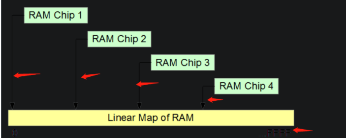
- To fix the dark mode image issue, I suggested wrapping them in a tag and adding class "mdImg" to it. Then, using this, we can apply global CSS and have the background of the image white. On normal screens this does nothing but on dark mode it stops this from happening:
 Instead, the image is white background and the arrows stay black.
- I suggested removing the
<img>and<div>tags and sticking with the original Markdown images. The issue with using<div>is that block-style elements may mess with CSS and responsiveness by accident.<span>on the other hand is inline-styled. - For regular text, I don't believe it is necessary to wrap them in
tags because we're using a Markdown file and so regular text that isn't preceded by a symbol like
###is treated like normal text. I suggested Tengzhen remove them.
Propose a solution
What I learned from doing code reviews, is that it's really appreciated when you don't just point out the problem. Point out some reasons you think it's happening, a potential solution or how you've fixed a similar problem in the past. The person you are reviewing will really appreciate a solution oriented approach.
Doing code reviews and having my own reviewed is great because it allows you and others to catch things you may not see because it's your code. This in turn catches mistakes, bugs, and makes the code overall better developed.
Happy reviewing!!!
Andre


Top comments (0)