
How Psychology Shapes UX Design:
A Story of Two Apps: Frustration vs. Flow
Meet Alex.
Alex is looking for a budgeting app to track monthly expenses. After some searching, two options catch his eye: App A and App B.
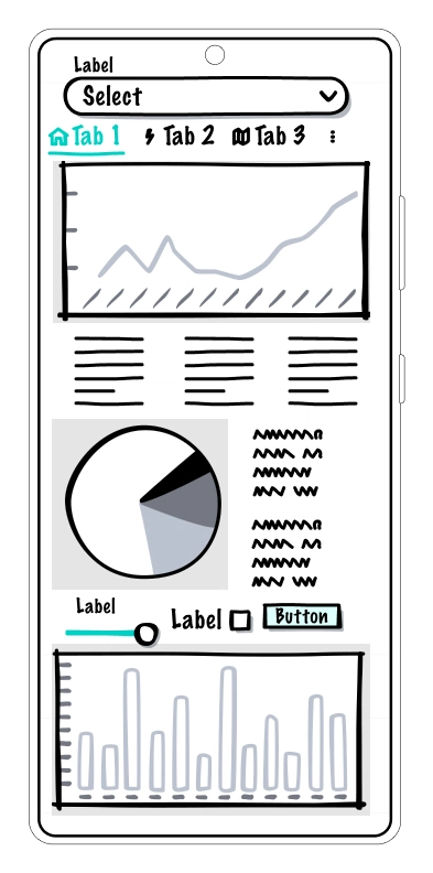
App A: The Overwhelming Nightmare
The moment Alex opens App A, he's bombarded with too many options, unclear buttons, and a cluttered dashboard. He struggles to find where to start. The app asks him to input a long list of financial details before he even understands how it works.
Frustrated, Alex gives up. He abandons App A within two minutes.
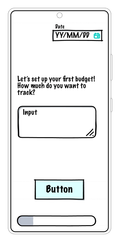
App B: The Effortless Experience
App B welcomes Alex with a simple, friendly greeting: "Let’s set up your first budget! How much do you want to track?"
Instead of dumping everything at once, it guides him step by step—asking one question at a time. The key actions are easy to find, the buttons are large and clear, and there's even a little progress bar to keep him motivated.
Alex quickly sets up his budget and feels accomplished. He not only stays but also recommends the app to a friend.
What made the difference? Psychology-driven UX design.
The Science Behind Great UX Design
A well-designed product isn’t just visually appealing—it works with the way people think. Let’s break down the psychology behind these two experiences.
1. Cognitive Load: Why Too Much Information Kills Engagement
📌 Fact: The human brain can only hold about 4–7 pieces of information at once (Miller’s Law).
App A overwhelmed Alex by presenting everything at once, while App B used progressive disclosure, revealing information gradually.
How to fix it: ✅ Break complex tasks into small, digestible steps (e.g., step-by-step forms). ✅ Use visual hierarchy to prioritize key actions. ✅ Minimize distractions—less clutter means better focus.
🔹 Example: Airbnb’s booking process simplifies complex decisions by showing only the most relevant information at each step

2. Hick’s Law: How Too Many Choices Cause Decision Paralysis
📌 Stat: When faced with too many choices, users are 10x more likely to abandon a decision (Columbia University study).
App A had an overwhelming number of buttons, options, and menus, making it hard for Alex to decide what to do next.
How to fix it: ✅ Limit choices (e.g., offering 3 pricing tiers instead of 10). ✅ Use default options to help users make quick decisions. ✅ Group similar actions together to make navigation easier.
🔹 Example: Netflix’s recommendation engine limits choices to a curated selection instead of showing the entire catalog at once.

3. Status Quo Bias: Why People Resist Change
When users encounter something unfamiliar, their instinct is to stick with what they know.
How to fix it: ✅ Keep common UI elements consistent (e.g., a shopping cart always represents checkout). ✅ Provide gentle onboarding, like tooltips or guided tours. ✅ Allow users to revert changes if they feel uncomfortable with an update.
🔹 Example: Facebook’s gradual redesigns—instead of changing everything overnight, they introduce updates in phases.

4. Fitts’s Law: Why Button Size and Placement Matter
App A had tiny, hard-to-click buttons placed in inconvenient spots. App B made primary actions big, easy to tap, and within reach.
How to fix it: ✅ Make key buttons bigger and bolder (e.g., "Buy Now" or "Start Free Trial"). ✅ Keep frequently used actions near the user's natural interaction zone. ✅ Ensure touch targets are large enough for mobile users.
🔹 Example: Google’s search bar—large, centered, and easy to click.

- The Peak-End Rule: How Users Remember Experiences 📌 Fact: People judge an experience based on its peak moments and how it ends (Kahneman’s Peak-End Rule).
Alex had a terrible peak (frustration in App A) and a great ending (success in App B).
How to fix it: ✅ Create small moments of delight—animations, micro-interactions, or positive feedback. ✅ Make sure error messages are friendly and offer solutions. ✅ End on a high note—a confirmation message, a thank-you note, or a small reward.
🔹 Example: Duolingo’s “Streak” feature keeps users engaged by celebrating progress.

Final Thoughts: Design for the Mind, Not Just the Screen
Alex's journey isn't unique. Every day, millions of users quit apps and websites due to poor UX. The best designs aren't just visually appealing - they're built around how people think, feel, and behave.
By applying psychology-driven principles like:
✅ Reducing cognitive load
✅ Minimizing decision paralysis
✅ Making transitions smooth
✅ Optimizing button placement
✅ Ending on a high note
…we can create experiences that users love and remember.
💡 Follow Arshida for more insights on creating user-friendly digital experiences that solve real challenges. 🚀
👥 Let's start a conversation!
Have you ever quit an app due to bad UX? Or did you find one that felt just right?
💬 Drop your thoughts in the comments!
🔄 Share this post with a fellow designer or developer.
Drop your thoughts in the comments below or share this post with someone who might find it useful! Let's work together to make change a smoother journey for everyone. 🚀

Top comments (0)