
This article is the second part of a comprehensive guide on how to build your own CSS framework, starting from planning, designing all the way to coding. These are the things that I learnt while I built my own CSS Framework Sleek, which is completely useless.
If you haven’t seen the previous article, go check it out here: How to Make your Own CSS Framework - Part 1
Let’s start Planning
Now that you have decided to start making a CSS Framework, it’s time to start planning and chalk things out. There are two main things that you need to address at this stage:
Both of these are something that you need to determine before you go any further. Let’s have a look at each one of them.
CSS Architectures
Now, the unique thing about CSS is,it has no rules. What I mean is that there are several ways to achieve the same thing. For example, if you want to center a text, you can use text-align, or you can use margin and padding to align it, or you can use flexbox to justify it, or use a code that you copied from stackoverflow. It’s like a lawless jungle. Since CSS doesn’t have any such rules, people might end up writing haphazard code with weird classnames and styles.
What are CSS Architectures?
CSS architectures are guidelines on how to name, organize and write your CSS classes and styles with a focus on maintainability, scalability and reusability , which is really important when building a framework. You can use these architectures even when writing the CSS for a website. They help you write better CSS with a lot of flexibility.
If you haven’t heard of CSS Architectures before, then this is a really good place to start. In this article, I’ll be looking at mainly four popular architectures:
- OOCSS - Object Oriented CSS
- BEM - Block Element Modifier
- SMACSS - Scalable Modular Architecture for CSS
- ACSS - Atomic CSS
Again, these are not strict rules but rather guidelines to better organize your code. You need not stick completely to these guidelines. You can always go wild and modify it according to your needs.
Object Oriented CSS (OOCSS)
Object Oriented CSS is loosely based on object oriented programming. Object Oriented Programming promotes the use of classes, object with a focus on reusability and modularity. The aim of OOCSS is the same.
But what does an object in OOCSS mean? Here, an object refers to any repeating style that can be converted into reusable code. If something repeats again and again, make it into a reusable snippet, as simple as that.
Here is a quick overview of the OOCSS guidelines.
Reusability
If you have something like this:
.box1 {
    margin: 10px;
    padding: 10px;
    background-color: red;
}

.box2{
    margin: 10px;
    padding: 10px;
    background-color: green;
}
We can convert this into following:
.box {
    margin: 10px;
    padding: 10px;
}

.redbox{
    background-color: red;
}
.greenbox{
    background-color: green;
}
And then you can use it HTML like <div class="box redbox"> or <div class="box greenbox">.
Separation of Skin and Structure
We should also separate the skin and structure of components.
Structure involves physical attributes like height, width, margin, overflow, padding etc.
Skin refers to visual details like color, font, border etc.
Here is a simple example of separation of skin and structure:
.box-structure{
  width: 100px;
  height: 100px;
  margin: 10px;
}

.box-skin1{
  border: 1px solid black;
  background-color: red;
}

.box-skin2{
  border: 1px solid green;
  background-color: yellow;
}
Separating skin also improves modularity and reusability. A same structure can be used multiple times with different skins.
Separation of Container and Content
Let’s say you have a <div class="shape"> and an <img> inside the div.
Try to avoid combining the styles of parent and child. For example :
.shape img{
  width: auto;
  height: auto;
  border: 1px solid black;
}
Doing this prevents reusability of code. Always separate the container and the content.
Many of the popular frameworks such as Bootstrap and bulma use the OOCSS guidelines. This was just a brief overview of some of the OOCSS guidelines. You can read about it in this amazing article by Smashing Magazine or at it’s Github page.
Block Element Modifier (BEM)
The BEM contains guidelines on how one can go about naming their CSS classes. BEM is actually a subset of the bigger OOCSS architecure. As it’s name suggests, in BEM you essentially split you CSS into blocks, elements and modifiers.
Blocks : A block is a standalone entity that is meaningful on its own. Headers, footers, Forms etc fall can be considered as blocks.
Elements : Elements are a part of a block that has no standalone meaning and is semantically tied to its block. Buttons in Navbar, Text Inputs in a form etc are elements associated with blocks.
Modifiers : Modifiers are variants/extension of the Blocks and Elements. They might be offer different size, different color etc.
Elements of a block class .block{} are denoted as .block__element{} and a modifier is denoted as .block--modifier{}.
The codepen below illustrates an example of BEM based CSS
This was just a simple overview of the BEM style guide. You can find out more about it on it’s website BEM.
Scalable Modular Architecture for CSS (SMACSS)
SMACSS provides a way to maintain and organize your code such that it is scalable and modular. It divides the complete CSS codebase into five different categories:
-
Base : Base contains the code for all the default values. For example, you might want to remove all margins from
html, or set a default size forh1,h2etc. All of these fall under this category.
html {
    margin: 0;
    padding: 0;
    font-family: Arial;
}

a {
    color: #ffffff;
}

h1 {
    font-size: 50px;
}
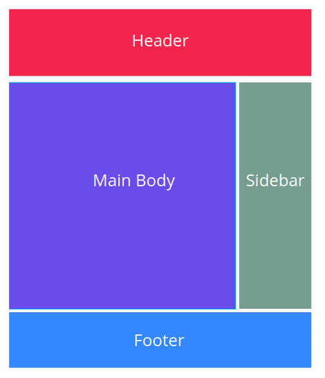
- Layout : These components help divide the page into major sections. This includes components like header, footer, body etc.
Modules : These are the reusable modular components of a design. That includes components like buttons, cards, alerts, lists etc
State : State describe how things look when in a particular state (hidden/expanded or active/inactive). These are generally prefixed with
is-. For example,is-active,is-inactive,is-expanded,is-hidden.Theme : Theme define things that have to do with the appearance like a color scheme or typography etc.
Frameworks like Bulma and PureCSS follow the SMACSS guidelines. The SMACSS website has more in-depth information about each one of those categories. But this much should be enough to proceed further.
Atomic CSS (ACSS)
Atomic CSS is completely different from conventional CSS Architecture. Tailwind CSS uses Atomic design and if you have used it before you must know that it is quite a unique way of working with CSS.
Atomic CSS is the approach to CSS architecture that favors small, single-purpose classes with names based on visual function.
Atomic CSS, also known as Functional CSS is nothing but a collection of single purpose styling units. Atomic CSS is like a common “vocabulary” meant to style documents regardless of context or content.
The code below shows a simple example:
/*red background*/
.bg-r{
  background-color: #eb4034;
}

/*green background*/
.bg-g{
  background-color: #34eb59;
}

/*small margin*/
.mr-s{
  margin: 10px;
}

/*medium margin*/
.mr-m{
  margin: 20px;
}
You can keep building CSS vocabulary like this and use it in your HTML. The codepen below illustrates the same.
The CSS classes themselves are small and immutable, you cannot modify them. And the most important thing is that Atomic CSS is unopinionated. It’s not a framework with fancy components having fancy design. Rather, it’s just a bunch of utility classes that you can put to use. You can construct your own design out of these utility classes.
Which architecture is the best?
When we build our own CSS Framework in Part 4 of this series, we won’t be sticking to any one architecture. These are just guidelines to facilitate the process of making the framework. We will be borrowing a lot of concepts from these architectures and build one of our own. For example, we will use SMACSS guidelines to organize our folder, we will use OOCSS and BEM to name our classes and structure the styles and we will build some utility classes just like in Atomic CSS.
There is no such thing as the “best” architecture. Each has it’s own set of advantages, disadvantages and use cases. You are free to choose whichever framework depending on what your vision for the framework is.
Complexity of your Framework
The complexity of your framework can lie anywhere between 0 to 10, with frameworks like PureCSS and Milligram at level 1 and frameworks like Bootstrap, Semantic and Foundation at a level of 10.
Remember, there is nothing right or wrong here. Bootstrap is complex because Bootstrap is meant for rapid prototyping. You can put together a big website using bootstrap in a matter of minutes; just put a navbar at the top, a jumbotron, a couple of cards, some grid layout and you are set. PureCSS on the other hand is meant to be simple and extensible. It’s less than 10kB and it only comes with a few basic components, typographies and layouts. You can easily extend it with your own CSS or combine it with any other frameworks too.
The complexity of your framework depends on what your vision for the framework is. You don’t need to stuff it with all sorts of different components, unless that’s what your aim is.
If you are building one for learning purposes, it doesn’t exactly matter what you are doing. You are free to make it however you want because no one is probably gonna use it.
If you want to make a design system as a part of an organization or for yourself, start small. First implement the bare minimums like buttons and layouts that are used frequently. Incrementally add more and more components until you have a collection of components.
And finally, if you are building it for other people to use, you might wanna think about how it is different from the existing ones out there. Does your framework offer a superior design? Or maybe some components that people use frequently but isn’t provided by any existing frameworks. What is it’s selling point? It should be really good in order to make people leave their existing framework and use a new one. Most of the developers take a liking to framework and never come out of the comfort zone.
If it’s just another framework with a couple of layouts, buttons and cards, no one will probably use it, just like my framework Sleek.
Here’s an Assignment for you
Go through the components list of each and every framework out there, have a look at the various components they offer and how they look, feel and work. Make a list of components that you would like to have in the V0.0.1 of your framework.
Here’s a link to some of the framework’s documentation. My favourite component to start off with is the button. So, I have linked to buttons of all these frameworks. Use this as a starting point and check out all the other components.
Remember, only choose components that are essential. You can always add more components in the future.
Conclusion
If you managed to read till this point, I hope this article gives some insight into what goes into planning a CSS framework. When you finish your planning, you should have an idea about the components that you will be including in your framework and have some clarity on different CSS architectures.
In the next article, we will talk about some basic design guidlines after which we will start coding the framework in SASS.
Further Links
This is the second article out of a series of article I am going to write. I hope this gave you more insight into how to plan out your framework.
This is still a work in progress. I will be finishing up these articles soon so that you can get started building your own framework.
How to make your own CSS Framework - Designing (Coming on 14th December)
How to make your own CSS Framework - Coding/Documenting (Coming on 16th December)
There are various other architectures likes SuitCSS which I haven’t mentioned here for the purpose of keeping this aricle short and concise. You can find more about it by just seraching them on the internet.

Top comments (0)