
Forms are deceptively difficult. When you create a form for your website you need to make a lot of decisions. You have to worry about validation, structure, and how to send the data to your backend. You need to figure out how to handle errors, and how to style and configure your form. You’ll need to make sure your forms are accessible. With this in mind, AWS Amplify Studio with its form builder can help!
In this post I’ll discuss how to add a new form using Amplify Studio that is connected to an AWS Appsync data source. We’ll look at how to customize that form by adding in a dark/light mode. We’ll look at how we can further customize the validation rules and edit the error messages! We’ll then test our submissions by displaying the results using Amplify’s JavaScript GraphQL API library.
If you'd like to see the completed code. Please check out this repo!
Getting Started
We’ll create a basic Todo form using Amplify studio.
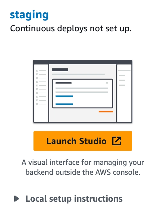
To begin, sign into your AWS Console and search for AWS Amplify and click on it. If this is the first time using Amplify, choose Get Started and click on the Get started again under Amplify Studio. If you’ve already created an Amplify app in this region you can click New app → Build an app. Choose an app name, click Confirm deployment. Afterwords click Launch Studio to begin!
If you are an existing Amplify Studio user, Launch Studio from your existing application. This feature is available to all.
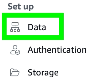
Data
Inside Amplify Studio let’s create a data source that we can use with our form. Click on Data in the menu.
Click Add model and create Todo. Add the completed and the title fields.
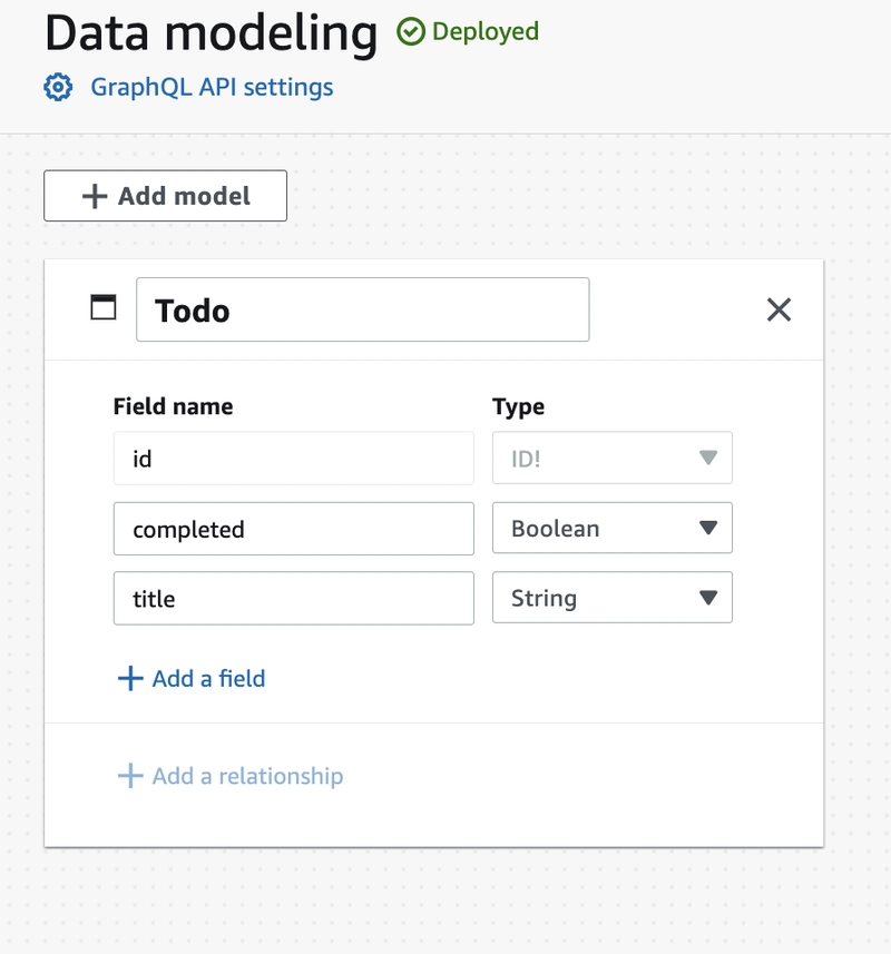
After adding these models make sure you click the Save and Deploy button in the top right hand corner. It may take a few minutes to deploy.
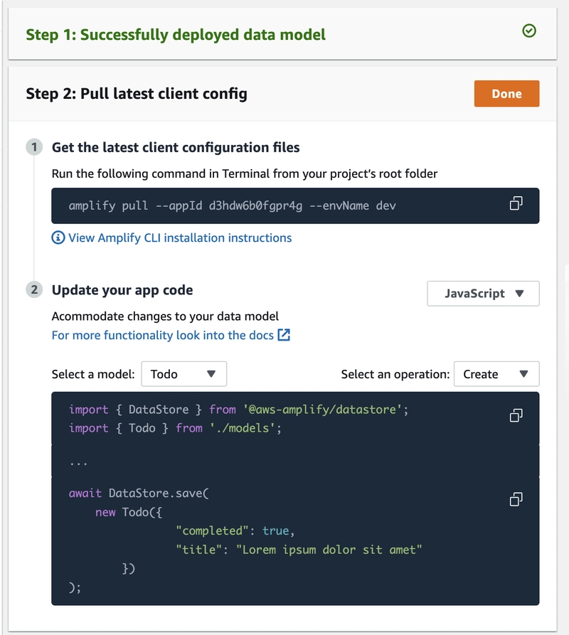
After the model is deployed you’ll see a page with some instructions to pull the latest client config into your React application. Make sure to copy the pull command.
Next.js App Setup
Now that we have our data and forms in place we can pull the information into our existing application. I’ll assume that you’ve already created a new Next.js application. If not, and you are starting a new Next.js application, make sure the App router turned off.
Open up your app and install these libraries with your favorite package manager.
$ npm install @aws-amplify/ui-react aws-amplify react-icons
If not already installed, make sure you also install the Amplify CLI globally.
$ npm install @aws-amplify/cli -g
If this is the first time using Amplify in a while, make sure you upgrade to the latest version of the CLI.
$ amplify upgrade
Next, take the command you copied from the last section and paste it into your terminal running it in the root of your Next.js project.
$ amplify pull --appId <replace-this-with-your-id> --envName <replace-with-env-name>
You should now see a few new files and directories in your project.
Since we are dealing with AppSync, you’ll need to generate some GraphQL query files.
$ amplify codegen add
This will generate some helpful GraphQL query/subscription/mutation files that we’ll use later on in this tutorial.
Let’s setup Amplify so we can use our new forms!
Note: If you are using Next.js with the app router or using Vite, you may need some small additional configuration. Please follow the Next.js or Vite usage guide.
Adding Our Form and Customizing it
Let’s begin setting up our Next application so it can talk to our AppSync backend.
Inside your main entry point file in your application, add these lines to configure Amplify with the correct styles.
import { Amplify } from "aws-amplify";
import awsExports from "../aws-exports";
Amplify.configure(awsExports);
import "@aws-amplify/ui-react/styles.css";
Next, we’ll be adding in a special theme file. This file is used to customize global themes throughout your application. In our case we will us to to override the default theme of our forms to support a dark mode. The defaultDarkModeOverride will add this for us.
Create a new file called theme.tsx in your src folder.
import { Theme, defaultDarkModeOverride } from "@aws-amplify/ui-react";

export const theme: Theme = {
  name: "theme",
  overrides: [defaultDarkModeOverride],
};
Next, we’ll add this Theme provider to a new Layout file. In the src/components folder create a new Layout.tsx file. Inside this file we’ll add a new colorMode useState variable that we’ll use to change the color of the theme.
The ThemeProvider surrounds our application and provides theming capabilities with design tokens to our app. These tokens can completely override the look and feel of our application. The official documentation discuss this in more detail.
import { theme } from "@/theme";
import { ColorMode, ThemeProvider } from "@aws-amplify/ui-react";
import React from "react";


export default function Layout({ children }: React.PropsWithChildren) {
  const [colorMode, setColorMode] = React.useState<ColorMode>("light");
  return (
    <ThemeProvider theme={theme} colorMode={colorMode}>
        {children}
    </ThemeProvider>
  )
}
Let’s add in a toggle button so users can select between dark and light mode. We’ll be using the react-icons/md set for these icons.
import { theme } from "@/theme";
import { MdOutlineDarkMode, MdOutlineLightMode } from "react-icons/md";
import { ColorMode, Flex, ThemeProvider, ToggleButton, ToggleButtonGroup } from "@aws-amplify/ui-react";
import React from "react";


export default function Layout({ children }: React.PropsWithChildren) {
  const [colorMode, setColorMode] = React.useState<ColorMode>("light");
  return (
    <ThemeProvider theme={theme} colorMode={colorMode}>
      <Flex direction="column" gap="0" width="100vw" height="100vh" backgroundColor="background.primary">
          <ToggleButtonGroup
            value={colorMode}
            size="small"
            isExclusive
            onChange={(value) => setColorMode(value as ColorMode)}
          >
            <ToggleButton value="light">
              <MdOutlineLightMode />
            </ToggleButton>
            <ToggleButton value="dark">
              <MdOutlineDarkMode />
            </ToggleButton>
          </ToggleButtonGroup>
        {children}
      </Flex>
    </ThemeProvider>
  )
}
The ToggleButtonGroup is from a set of UI primitives offered by the @aws-amplify/ui-react library. It creates a nice looking toggle button. On every click of the toggle button the colorMode is set, and is updated in the ThemeProvider. This will cause the screen to change between dark and light mode.
Finally, we’ll add in an AppHeader component to help sticky this layout to the top left hand corner. We’ll also add a nice icon using the Icon component primitive.
import { theme } from "@/theme";
import { MdOutlineDarkMode, MdOutlineLightMode } from "react-icons/md";
import {
  ColorMode,
  Flex,
  Icon,
  ThemeProvider,
  ToggleButton,
  ToggleButtonGroup,
} from "@aws-amplify/ui-react";
import React from "react";

function AppHeader({ children }: React.PropsWithChildren) {
  return (
    <Flex
      as="header"
      direction="row"
      justifyContent="space-between"
      alignItems="center"
      padding="1rem"
      boxShadow="small"
      position="sticky"
      top="0"
      left="0"
      width="100%"
      backgroundColor="background.primary"
    >
      {children}
    </Flex>
  );
}

export default function Layout({ children }: React.PropsWithChildren) {
  const [colorMode, setColorMode] = React.useState<ColorMode>("light");
  return (
    <ThemeProvider theme={theme} colorMode={colorMode}>
      <Flex
        direction="column"
        gap="0"
        width="100vw"
        height="100vh"
        backgroundColor="background.primary"
      >
        <AppHeader>
          <Icon
            color="brand.primary.60"
            fontSize="xl"
            paths={[
              {
                d: "M10.8484 4.19838C10.7939 4.2926 10.7939 4.40867 10.8484 4.50288L21.3585 22.6711C21.413 22.7653 21.5138 22.8233 21.6228 22.8233H23.9901C24.225 22.8233 24.3718 22.5696 24.2543 22.3666L12.5605 2.15225C12.4431 1.94925 12.1495 1.94925 12.0321 2.15225L10.8484 4.19838Z",
              },
              {
                d: "M15.2084 22.6711C15.2629 22.7653 15.3636 22.8233 15.4726 22.8233H17.8461C18.081 22.8233 18.2278 22.5696 18.1104 22.3666L9.48857 7.46259C9.37113 7.25959 9.07755 7.25959 8.96011 7.46259C6.09213 12.4203 3.21732 17.4003 0.336955 22.3816C0.219574 22.5846 0.366371 22.8383 0.601212 22.8383H11.7185C11.9533 22.8383 12.1001 22.5846 11.9827 22.3816L10.8455 20.4158C10.791 20.3216 10.6903 20.2635 10.5813 20.2635H4.8952C4.77776 20.2635 4.70437 20.1367 4.76308 20.0352L9.0912 12.5534C9.14991 12.4519 9.29671 12.4519 9.35542 12.5534L15.2084 22.6711Z",
              },
            ]}
          />
          <ToggleButtonGroup
            value={colorMode}
            size="small"
            isExclusive
            onChange={(value) => setColorMode(value as ColorMode)}
          >
            <ToggleButton value="light">
              <MdOutlineLightMode />
            </ToggleButton>
            <ToggleButton value="dark">
              <MdOutlineDarkMode />
            </ToggleButton>
          </ToggleButtonGroup>
        </AppHeader>
        {children}
      </Flex>
    </ThemeProvider>
  );
}
We’ll need to update the _app.tsx file so our new layout surrounds the application.
...
export default function App({ Component, pageProps }: AppProps) {
  return (
    <Layout>
      <Component {...pageProps} />
    </Layout>
  );
}
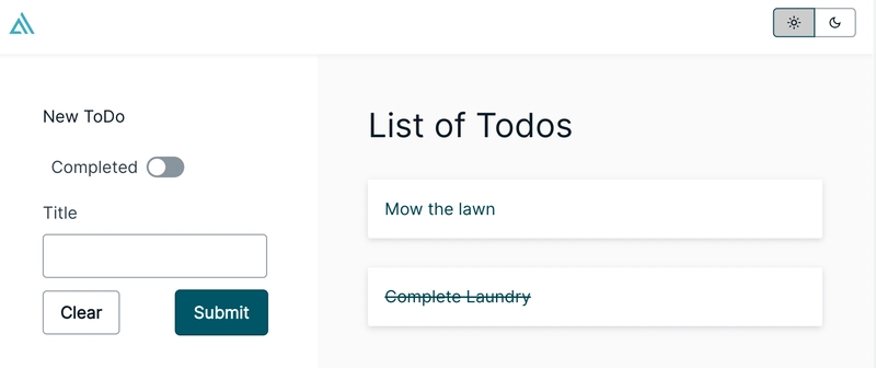
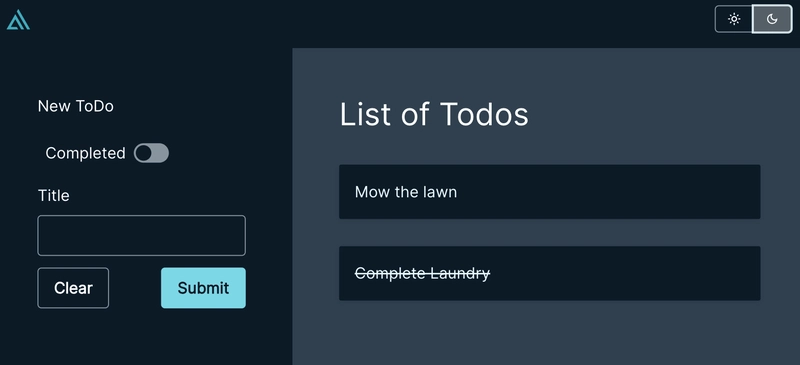
Toggle the dark mode and see it in action.
Before:
After:

Adding our form and customizing them
Let’s now add in our form to the main route index.tsx file in our Next.js application.
Import the form onto the page.
import TodoForm from "@/ui-components/TodoCreateForm";

export default function Home() {

return <TodoForm/>

}
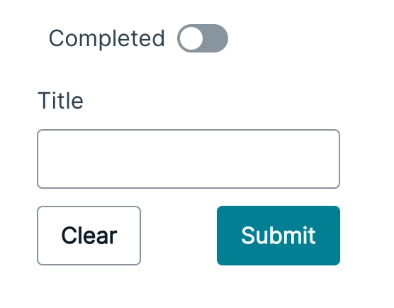
By convention this form is already connected to the AppSync model we created earlier. Under the covers it uses something called DataStore to sync and send data to the backend.
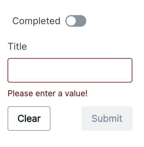
We can customize this form to our liking. Let’s update the validation rule first. Assume that we don’t want users to enter in empty spaces. We’ll add a check for that and display a custom error message.
 <TodoForm
    padding="0"
    onValidate={{
       title: (value, validateResponse) => {
         if (value.trim().length === 0) {
             return {
             hasError: true,
               errorMessage: "Please enter a value!",
             };
          }
          return validateResponse;
       },
     }}
  />
With this validation in place, users won’t be able to submit a blank input in without getting an error. The forms logic will handle the rest and will disable the input as well.
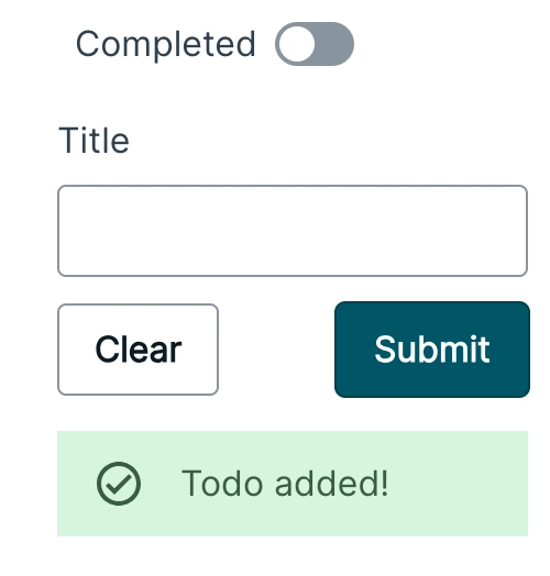
Imagine we want to show a message every time the user successfully submit a todo. The generated forms have event handlers that you can hook into and listen for. In this example, we’ll create a showSuccess variable that we can use to trigger an alert message, that fades after two seconds.
const [showSuccess, setShowSuccess] = useState(false);
  ...
        <TodoForm
          padding="0"
          onValidate={{
            title: (value, validateResponse) => {
              if (value.trim().length === 0) {
                return {
                  hasError: true,
                  errorMessage: "Please enter a value!",
                };
              }
              return validateResponse;
            },
          }}
          onSuccess={() => {
            setShowSuccess(true);
            setTimeout(() => {
              setShowSuccess(false);
            }, 2000);
          }}
        />
        {showSuccess && <Alert variation="success">Todo added!</Alert>}
The onSuccess handler will trigger as soon as the form has submitted successfully. We can then show an alert! This Alert is another @aws-amplify/ui-react UI primitive.
Now that we have a way to add todo’s, we will need a way to show them.
Let’s add a method that grabs all the todos. This will use the Amplify JS library GraphQL API.
import { API, graphqlOperation } from "aws-amplify";
import { GraphQLQuery, GraphQLSubscription } from "@aws-amplify/api";
import { ListTodosQuery, Todo, OnCreateTodoSubscription } from "@/API";
import { listTodos } from "@/graphql/queries";
...
const [todos, setTodo] = useState<Todo[]>([]);


const getTodos = async () => {
    const allTodos = await API.graphql<GraphQLQuery<ListTodosQuery>>({
      query: listTodos,
    });

    const filteredTodos = allTodos.data?.listTodos?.items
      .filter((todo) => !todo?._deleted)
      .sort(
        (a, b) =>
          new Date(a?.createdAt!).getTime() - new Date(b?.createdAt!).getTime()
      );

    setTodo(filteredTodos as Todo[]);
  };
Since we created our application using Studio and form builder, by convention our forms uses DataStore and conflict resolution turned on in the background. Conflict resolution creates a versioned data source that enhances the object data model with metadata. At this time, you cannot turn this off when using Form Builder and studio.
What that means is that our Data model has a few extra meta fields including _deleted and _version . These are automatically added to our data model when the model was created. When you delete a record, it doesn’t get deleted, the way you normally may expect. Instead, the _deleted field gets set to true and the record remains. Keep this in mind when dealing with data with conflict resolution turned on. This is why we must filter out records with _deleted set to true in our code, that way we don’t accidentally show deleted data.
It’s good to know that if you decide to make updates or deletions to any record using the Amplify GraphQL API, you must also include the _version in the GraphQL input since conflict resolution is turned on. The _version field will increment on every change that occurs to the record. You’ll need to keep track of this _version field when you make updates or delete an item.
To guarantee the correct order, we sort by the createdAt time.
Now that we have a way to grab data, we’ll create a GraphQL subscription that will load as soon as the application loads using a useEffect.
import { API, graphqlOperation } from "aws-amplify";
import { GraphQLQuery, GraphQLSubscription } from "@aws-amplify/api";
import { ListTodosQuery, Todo, OnCreateTodoSubscription } from "@/API";
import { onCreateTodo } from "@/graphql/subscriptions";
import { useEffect, useState } from "react";
...

const [todos, setTodo] = useState<Todo[]>([]);

useEffect(() => {
    getTodos();
    const sub = API.graphql<GraphQLSubscription<OnCreateTodoSubscription>>(
      graphqlOperation(onCreateTodo)
    ).subscribe({
      next: ({ provider, value }) => {
        setTodo((prevValue) => [
          ...prevValue,
          value.data?.onCreateTodo as Todo,
        ]);
      },
      error: (error) => console.warn(error),
    });

    return () => sub.unsubscribe();
  }, []);
We first trigger the getTodos and then run our subscription. As soon as a new Todo is created, the subscription is triggered. We can then use our setTodo to save the data into the array. Alternatively, we could call getTodos again on every subscription change, however for the sake of this post we’ll manipulate the todos array and add the new todo to it instead.
Let’s put this all together into one file. I’ve added a few more UI primitives to make things easier including a Collection component that is used with the array to display data in a nice row.
import {
  Alert,
  Card,
  Collection,
  Flex,
  Heading,
  Text,
  useTheme,
} from "@aws-amplify/ui-react";
import TodoForm from "@/ui-components/TodoCreateForm";
import { API, graphqlOperation } from "aws-amplify";
import { GraphQLQuery, GraphQLSubscription } from "@aws-amplify/api";
import { ListTodosQuery, Todo, OnCreateTodoSubscription } from "@/API";
import { listTodos } from "@/graphql/queries";
import { onCreateTodo } from "@/graphql/subscriptions";
import { useEffect, useState } from "react";

export default function Home() {
  const [showSuccess, setShowSuccess] = useState(false);
  const [todos, setTodo] = useState<Todo[]>([]);

  const getTodos = async () => {
    const allTodos = await API.graphql<GraphQLQuery<ListTodosQuery>>({
      query: listTodos,
    });

    const filteredTodos = allTodos.data?.listTodos?.items
      .filter((todo) => !todo?._deleted)
      .sort(
        (a, b) =>
          new Date(a?.createdAt!).getTime() - new Date(b?.createdAt!).getTime()
      );

    setTodo(filteredTodos as Todo[]);
  };

  useEffect(() => {
    getTodos();
    const sub = API.graphql<GraphQLSubscription<OnCreateTodoSubscription>>(
      graphqlOperation(onCreateTodo)
    ).subscribe({
      next: ({ provider, value }) => {
        setTodo((prevValue) => [
          ...prevValue,
          value.data?.onCreateTodo as Todo,
        ]);
      },
      error: (error) => console.warn(error),
    });

    return () => sub.unsubscribe();
  }, []);

  const { tokens } = useTheme();

  return (
    <Flex
      direction="row"
      height="100%"
      width="100%"
      justifyContent="stretch"
      gap="0"
    >
      <Flex
        direction="column"
        gap="medium"
        padding="xxl"
        backgroundColor="background.primary"
      >
        <Text>New ToDo</Text>
        <TodoForm
          padding="0"
          onValidate={{
            title: (value, validateResponse) => {
              if (value.trim().length === 0) {
                return {
                  hasError: true,
                  errorMessage: "Please enter a value!",
                };
              }
              return validateResponse;
            },
          }}
          onSuccess={() => {
            setShowSuccess(true);
            setTimeout(() => {
              setShowSuccess(false);
            }, 2000);
          }}
        />
        {showSuccess && <Alert variation="success">Todo added!</Alert>}
      </Flex>
      <Flex
        direction="column"
        flex="1"
        padding="xxl"
        backgroundColor="background.secondary"
      >
        <Heading level={3}>List of Todos</Heading>

        <Collection gap="small" type="list" items={todos}>
          {(todo) => (
            <Card
              variation="elevated"
              color={tokens.colors.brand.primary[100]}
              marginTop="1rem"
              padding="1rem"
              key={todo.id}
              textDecoration={todo?.completed ? "line-through" : ""}
            >
              {todo?.title}
            </Card>
          )}
        </Collection>
      </Flex>
    </Flex>
  );
}
Let’s take a look at it in action:
And with dark mode, after clicking the dark mode icon!
There is a lot more we could do here. We could add a way to take already existing todos and delete them and mark them complete. I’ll leave that exercise for you!
Deletion
Once you’re done with your application you can delete all your resources by running amplify delete.
Conclusion
In this blog post we’ve learned about Amplify Studio forms, how to customize them and how to add additional validation error messages. If you’d like to learn more about Amplify in general please check out the official docs. You can also check the Amplify Studio tutorial for more information on how to use it.
Please let me know if you have any questions, I’m at ErikCH on Twitter!

Top comments (1)