
Custom UI Components are the latest innovation to introduced in UI Builder. This new release offers you the full flexibility of code on the frontend, fully integrated into your Codeless application. Read all about it here!
Hello, I’m Vladimir, team lead of the Backendless JS team and architect of UI Builder. In this article, I’m so excited to introduce you to a brand new feature in UI Builder called Custom UI Components.
Looking at our customers’ and our consulting teams‘ experience in building applications using UI Builder, we can see that many of them anyway face the same limitation: injecting third-party libraries into the UI Builder ecosystem.
Today I’m going to tell you about this revolutionary new part of the UI Builder. At the end of the article, you should have a clear understanding of the basic principles we’ve applied to create this powerful new feature and you will be able to easily build your own custom components.
First of all, this feature requires writing JavaScript code and specifically code using the ReactJS library. To put this new feature to best use, you’ll want to have at least basic knowledge of that programming language and library.
Although it’s not a problem if you are a low-code/no-code developer and you haven’t written any code before, in this article we are going to use simple constructions so I’m a hundred percent sure it won’t be an issue for you.
However, if you would like to know more about ReactJS, you can start your journey from the following article.
Table of Contents
3. Creating New Custom UI Component
7. Component Property With Data Binding
Set Up Backendless
Before we get going, let’s make sure you have a Backendless account. If you don’t have one already, just register for a new free account here and create a new Backendless App.

UI Components Location
Next, let’s take a look at the basic structure of an application built with UI Builder, where the UI Components are stored, and how the app imports and uses them.
Each Backendless application can contain an unlimited number of UI Containers, and each UI Container can contain as many components as you need.
This means the UI Components are stored on the UI Container level. You can change any UI Component and not worry that changes may affect other UI Containers.
Let’s consider the following diagram of one UI Container instance:
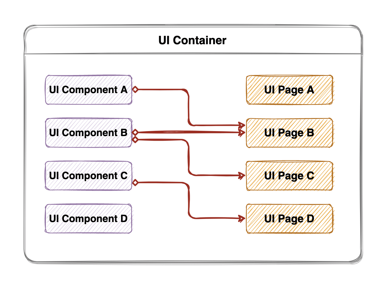
As you can see, there are four UI Components and four UI Pages. You can see that a particular UI Component (B) can be used in different UI Pages, or the component (D) may not be used on any UI Page yet.
At the same time, a page may use numerous UI Components. Hopefully this clarifies the main vision of the UI Components’ role in a UI Container.
Creating New Custom UI Component
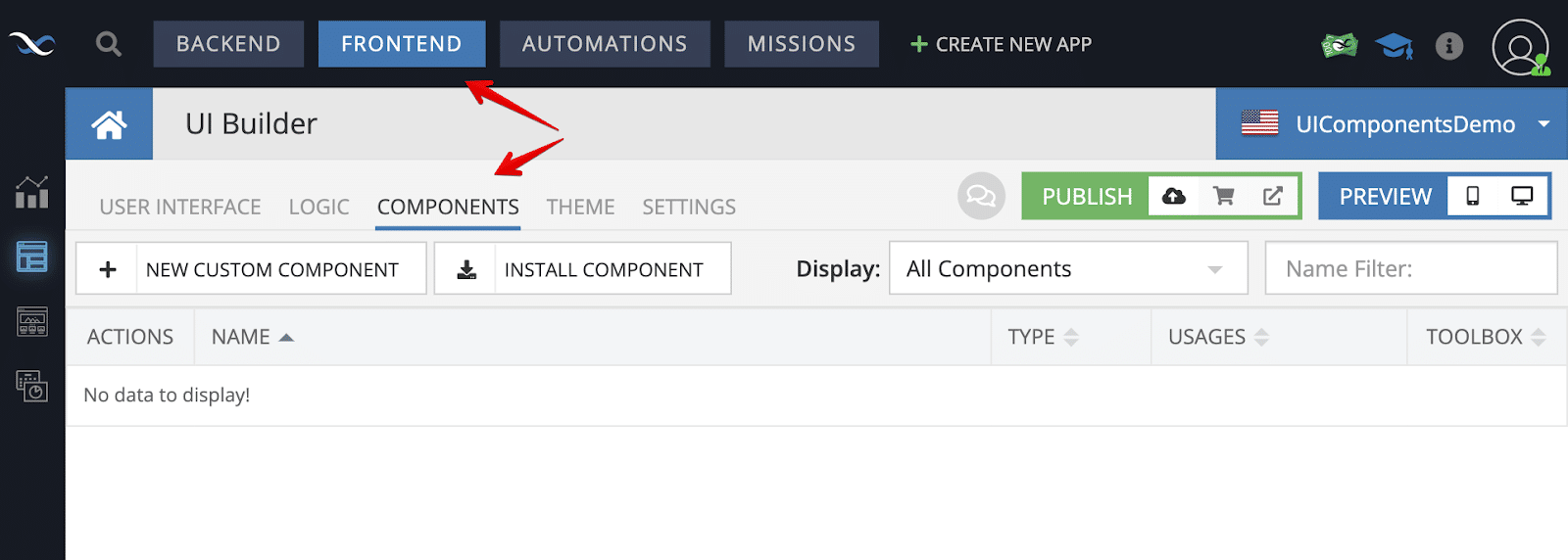
Alright, let’s move to more interesting things and create our first UI Component. To do so, go to the UI Builder designer and open the “Components” section.
On the following screen, you can see all your Custom and Reusable components. We’ll talk about Reusable Components in another article because this is no less important than the Custom Components feature.
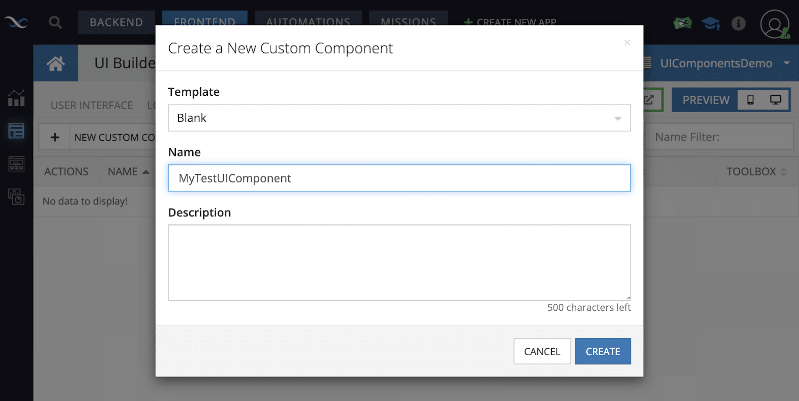
In order to start developing your first UI Component, click on the “New Custom Component” button to create a new one.
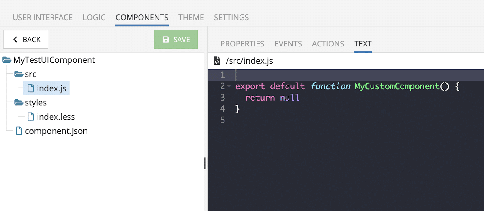
Once you’re done with the previous step, it immediately opens the component editor where we will actually develop the component.
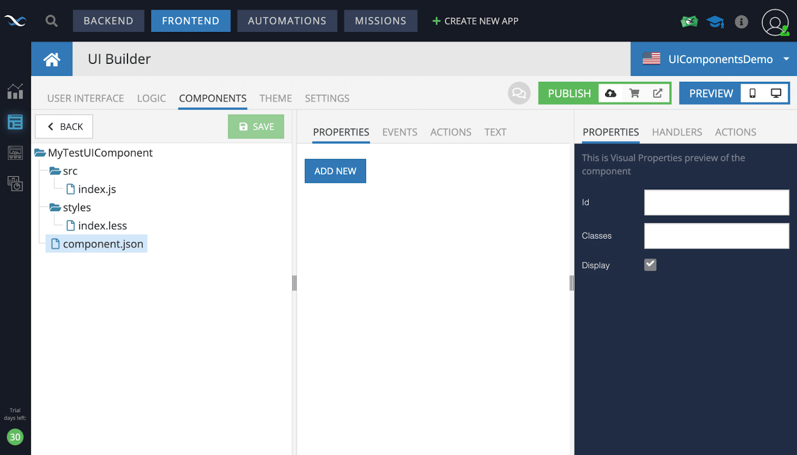
On the screenshot above, you can see the UI Component editor which is divided into 3 sections:
- On the left-hand side, you can see the component files; you can manage your source files here; uploading files using drag-and-drop is supported as well
- In the middle section, there are four sub-sections to edit the component “properties/events/actions” and the “TEXT” section for editing a selected file content.
- And finally, the last section is a preview of the component “properties/events/actions”
A little bit later, we will touch on each section in more detail, but for now, let’s create a simple component to see how it works on a UI Page.
Select the “src/index.js” and you will see the basic code of the UI Component. At this point, the component doesn’t render anything and if you place the component on a UI Page, it won’t make any difference.
As you recall, I wrote at the beginning of the article that our UI Builder is based on the ReactJS library, so we actually develop a React component and we use everything we can use in a React application.
This means we can use Hooks, create Higher-Order Components, and of course, we are allowed to create components using JSX syntax.
Let’s render a native Input HTML Element to see what it will look like in the UI Builder app.
Copy/paste the following code in the editor and then save the component by clicking on the green “SAVE” button.
export default function MyCustomComponent() {

 return (
   <input type="text" placeholder="input your value here..."/>
 )
}

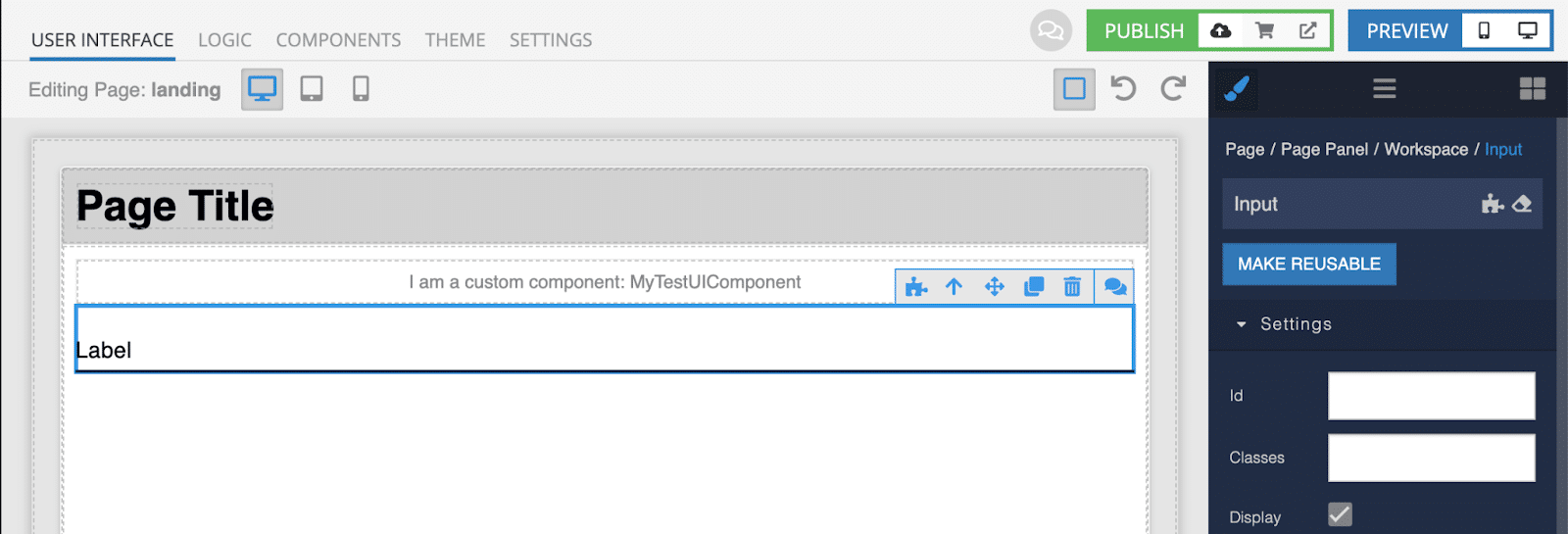
Once it’s saved, go to the User Interface screen and add the UI Component onto the landing page. You can find all your Custom Components in the components toolbar on the right side.
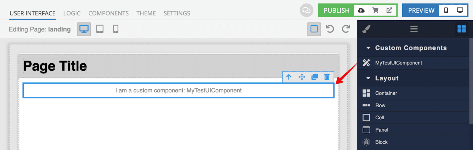
Now, let’s open the page in preview mode to how it looks.
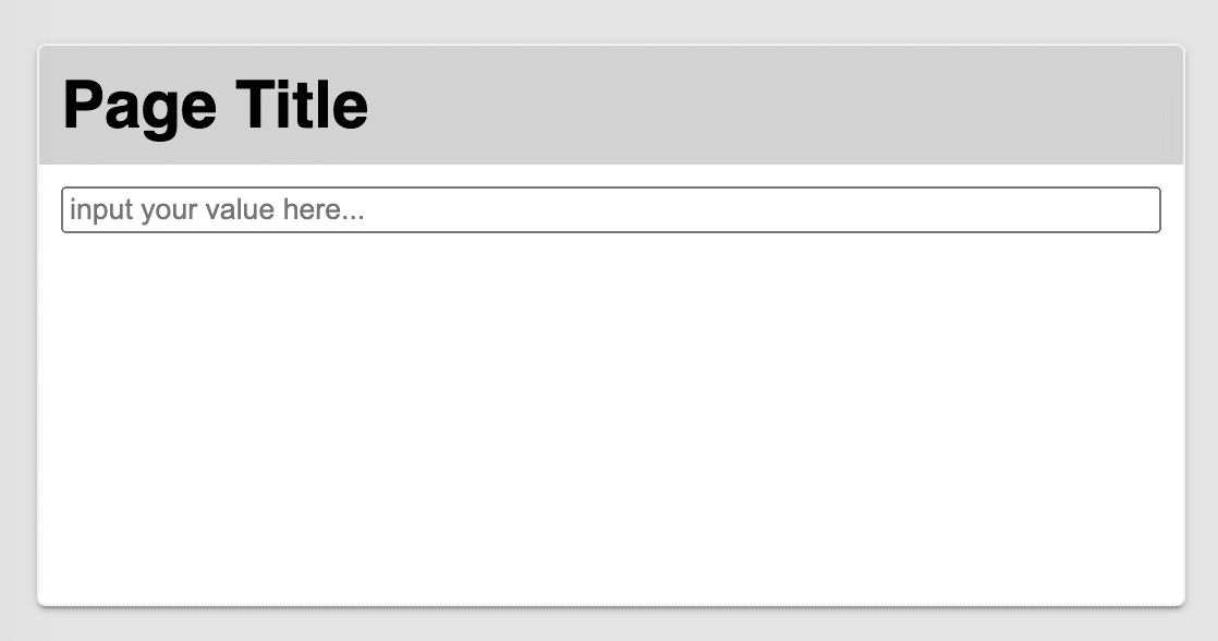
Congratulations, you made your first custom UI component! Although it doesn’t look pretty at the moment, the main goal was to inject your own component into the UI Builder environment and we did it perfectly. It was easy, wasn’t it?
Custom Component Logic
Next, we are going to expand upon our component by adding its own state and behavior.
Let’s create a greeting form that will show an alert with a greeting message on a button click. Go back to the component editor and select the “src/index.js” file for editing, replace it with the following code, then save the component.
import { useState } from 'react'

export default function MyCustomComponent() {
 const \[name, setName\] = useState('')

 const sayHi = () => {
   alert(\`Hello ${name}\`)
 }

 return (
   <div>
     <h4>Greeting!</h4>

     <input
       value={ name }
       placeholder="input your name here..."
       onChange={ e => setName(e.target.value) }
     />

     <button onClick={ sayHi }>Say Hi</button>
   </div>
 )
}
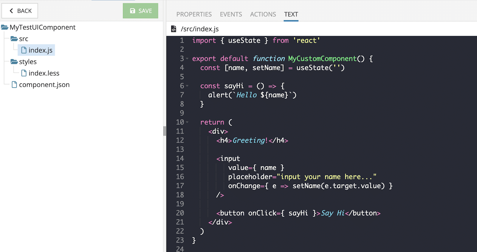
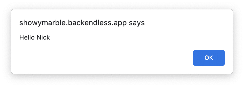
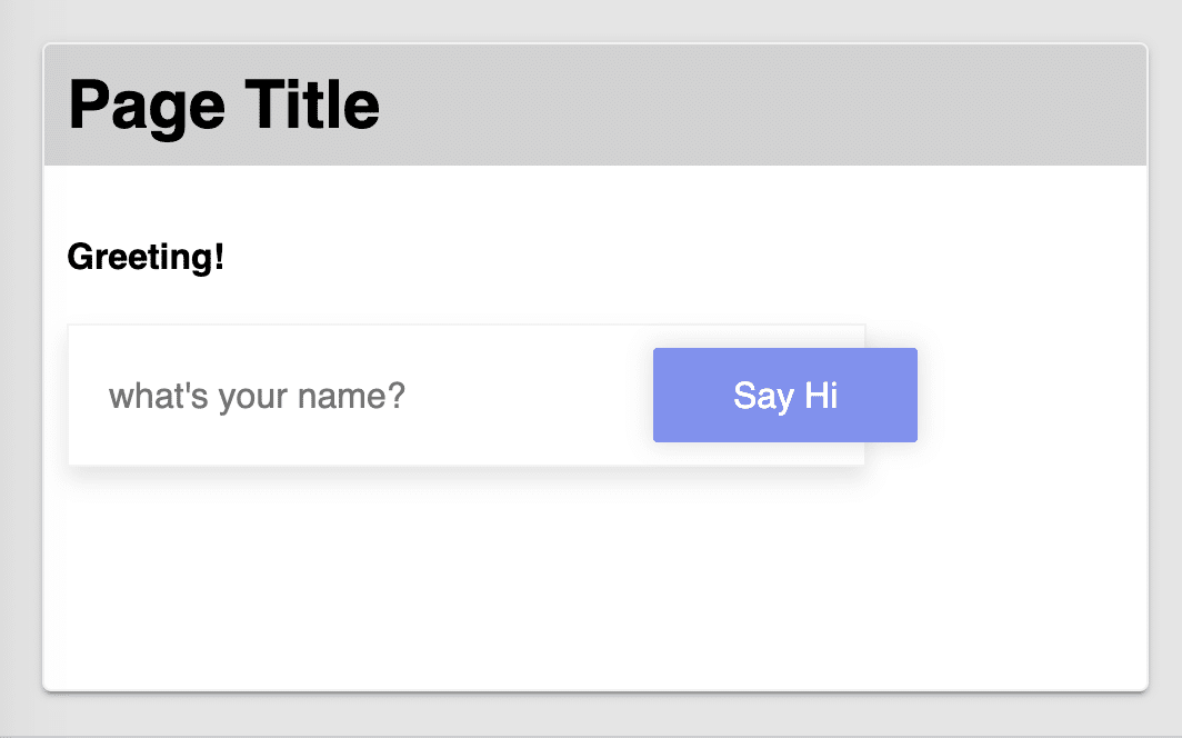
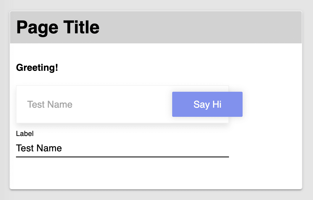
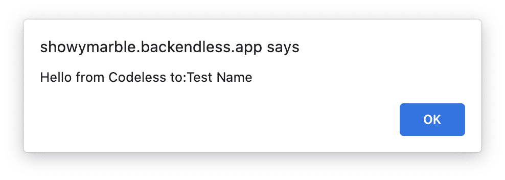
We gave the component its own state by using the useState hook from the React library to create a controlled input component and use the value in the “sayHi” handler. That’s it, let’s switch to the preview and refresh the browser page.
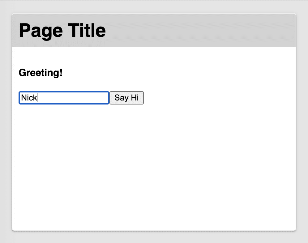
Type any text into the input and click on the “Say Hi” button. You should see an alert as it’s shown on the screenshot below:
Amazing, right? In a few minutes, we have created a new custom component, typed a couple of lines of code and boom, it works like a charm.
Can you imagine how many cases it can cover and how many problems it can solve? This very powerful feature, wouldn’t you say?
Styling UI Components
The default UI Containers have their own HTML element and can be decorated to look more attractive. That’s why we included the ability to add styles for every single component. You can use CSS but LESS is supported as well.
On top of that, each UI Container has a Theme and App Extensions where styles can be made available globally for all pages and UI Components, so you can decorate your component according to the applied theme by using LESS variables.
Back to our project, let’s customize our greeting component from the previous part.
Open the component editor and select the “src/index.js” file for editing and add a “greeting-form” class name to the root div to create a CSS scope for the component.
export default function MyCustomComponent() {
  …


  return (
    <div className="greeting-form">
    …

    </div>
  )
}
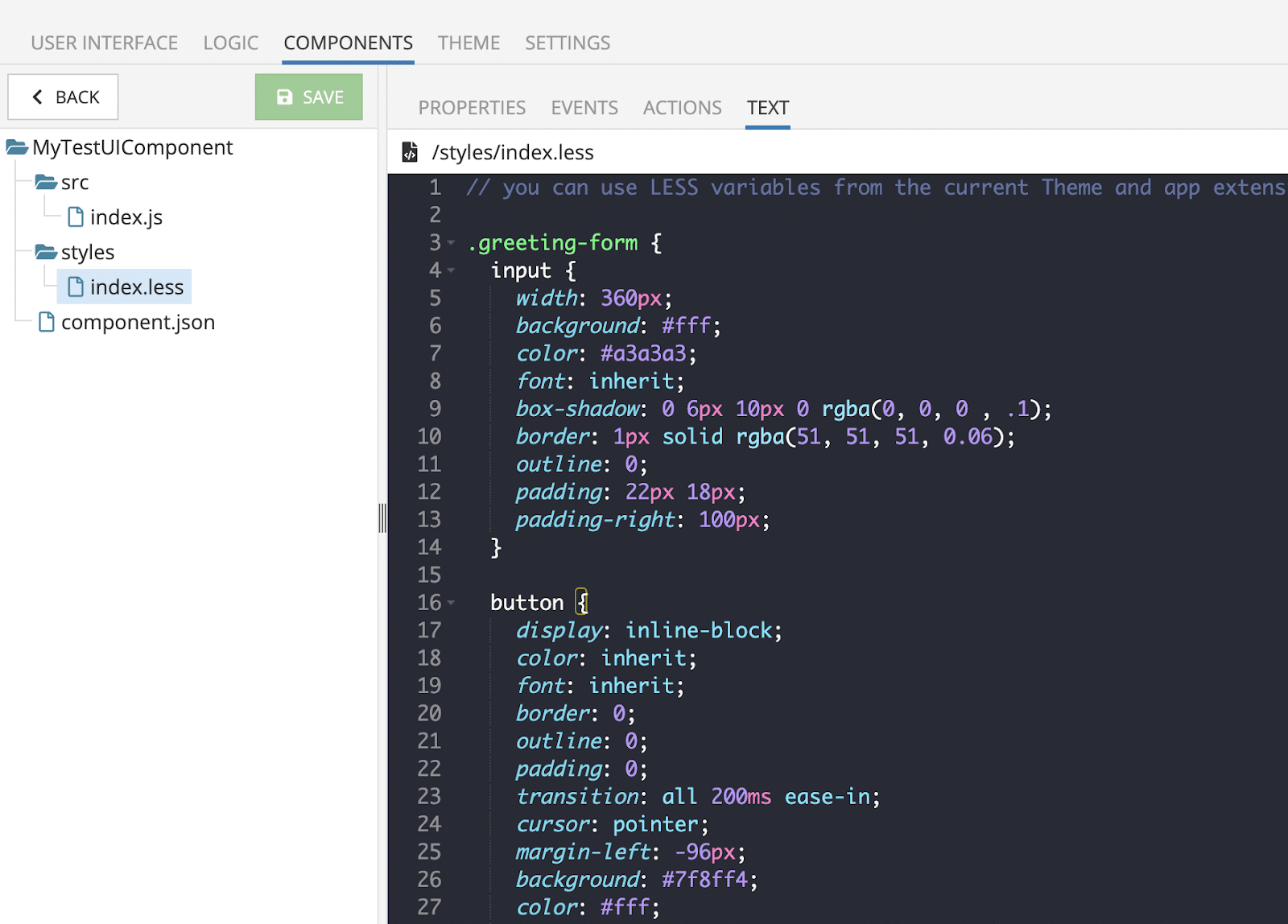
Next, open the “styles/index.less” file for editing after the following content:
// you can use LESS variables from the current Theme and app extensions of the UI-Container
Add the following code:
.greeting-form {
  input {
    width: 360px;
    background: #fff;
    color: #a3a3a3;
    font: inherit;
    box-shadow: 0 6px 10px 0 rgba(0, 0, 0 , .1);
    border: 1px solid rgba(51, 51, 51, 0.06);
    outline: 0;
    padding: 22px 18px;
    padding-right: 100px;
  }

  button {
    display: inline-block;
    font: inherit;
    border: 0;
    outline: 0;
    padding: 0;
    transition: all 200ms ease-in;
    cursor: pointer;
    margin-left: -96px;
    background: #7f8ff4;
    color: #fff;
    box-shadow: 0 0 10px 2px rgba(0, 0, 0, .1);
    border-radius: 2px;
    padding: 12px 36px;

    &:hover {
      background: #5e6fd8;
    }

    &:active {
      background: #5e6fd8;
      box-shadow: inset 0 0 10px 2px rgba(0, 0, 0, .2);
    }
  }
}
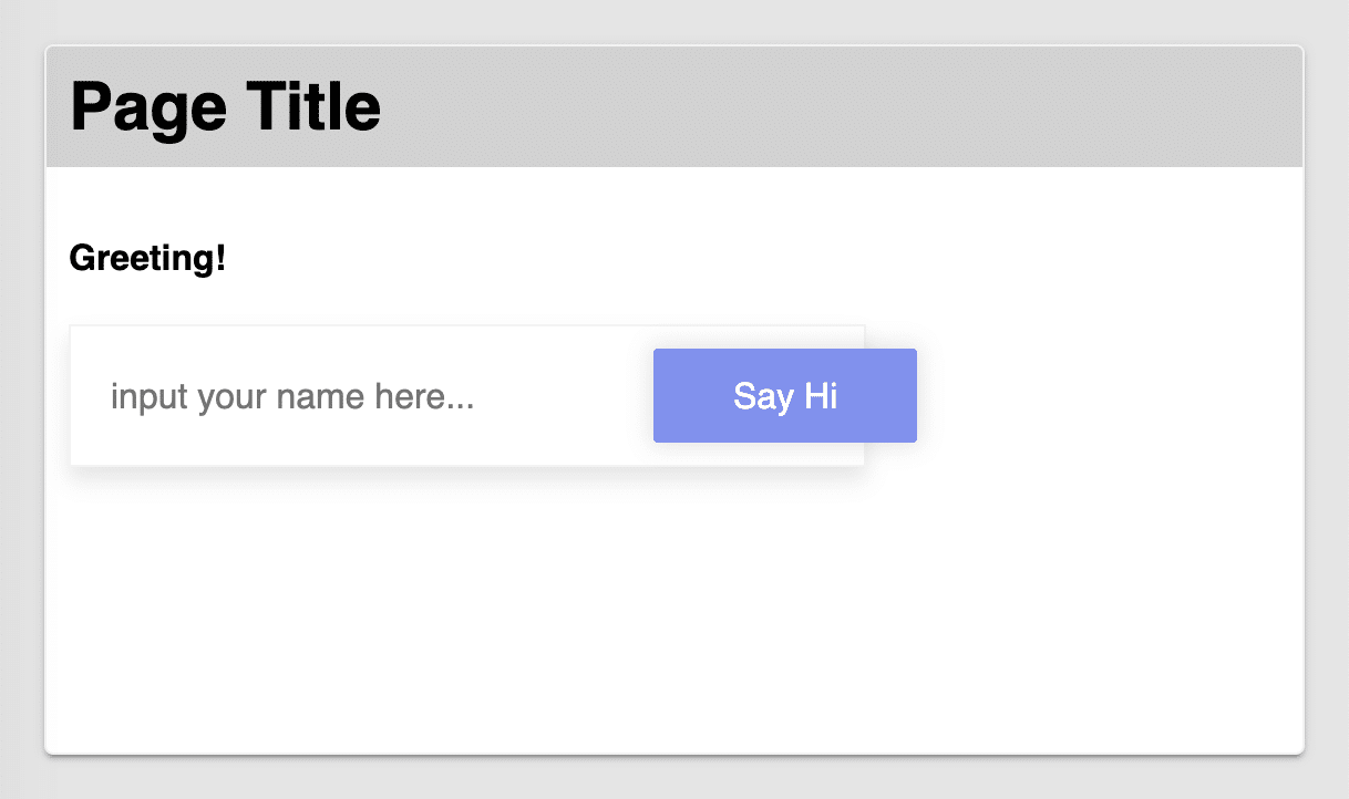
Save it and check this out on the preview page, you will be definitely surprised!
Component Properties
Now it’s time to start increasing the functionality of the component. The first one I am going to teach you is to add a couple of properties to the component and show you how you can use it with Codeless.
Let’s add a new property for configuring the “placeholder” value of the input inside our component because frequently your component will be used on different pages/places and you will need to configure each instance of the component.
For that, open the component editor and open the “Properties” tab and click on the “Add New” button and fill inputs as it’s shown on the screenshot below.
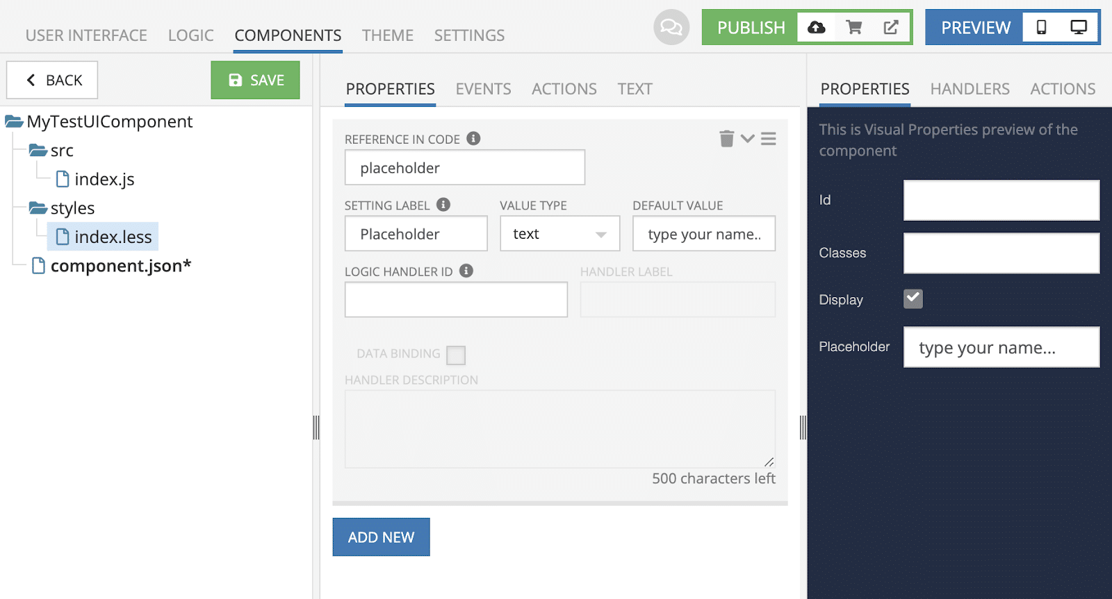
Let’s examine each filled input in more detail:
- Reference In Code: we typed “placeholder” to define the property in the component definition to be able to use the property in the component code
- Setting Label: we typed “Placeholder” to display the setting in the component settings toolbar; if you take a look on the 3rd panel, you can see what it will look like
- Value Type: in our case, it’s “text”; in the select, you can see the different types available now with more added as they become available
- Default Value: this is a default value of the property which each use of the component will have
Now open the “src/index.js” file and let’s apply the property to the Input component.
export default function MyCustomComponent({ component }) {
  …

  return (
    <div className="greeting-form">
      …

      <input
        …
          placeholder={ component.placeholder }
        …
      />

      …
    </div>
  )
}
As you can see, the interface is quite simple. We just define the “component” argument and then use a particular property where we need it.
Save the component and open the UI section to see how the settings for our component were changed. There should be a new property “Placeholder” with default value.

If you open the current page in the preview you can see the input has the new “type your name…” instead of “input your name here…”

You can go to the UI and play with the property to see how it’s changed.
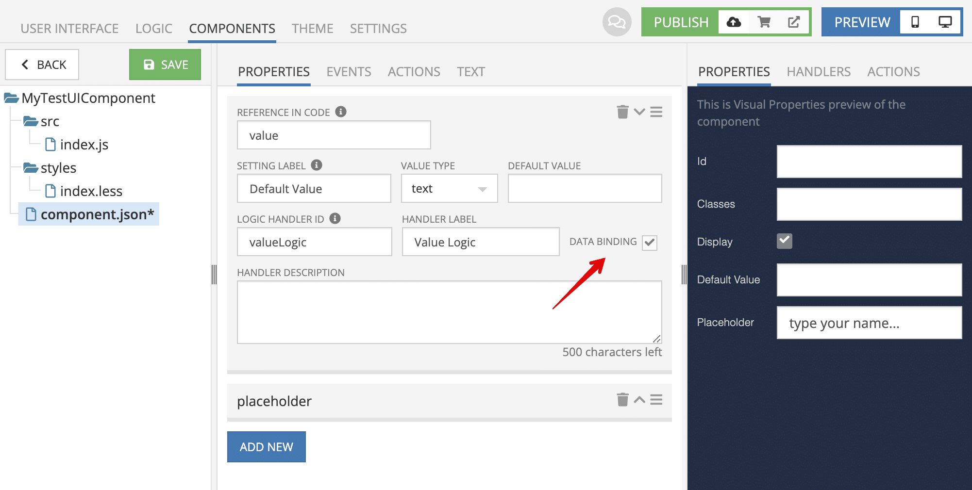
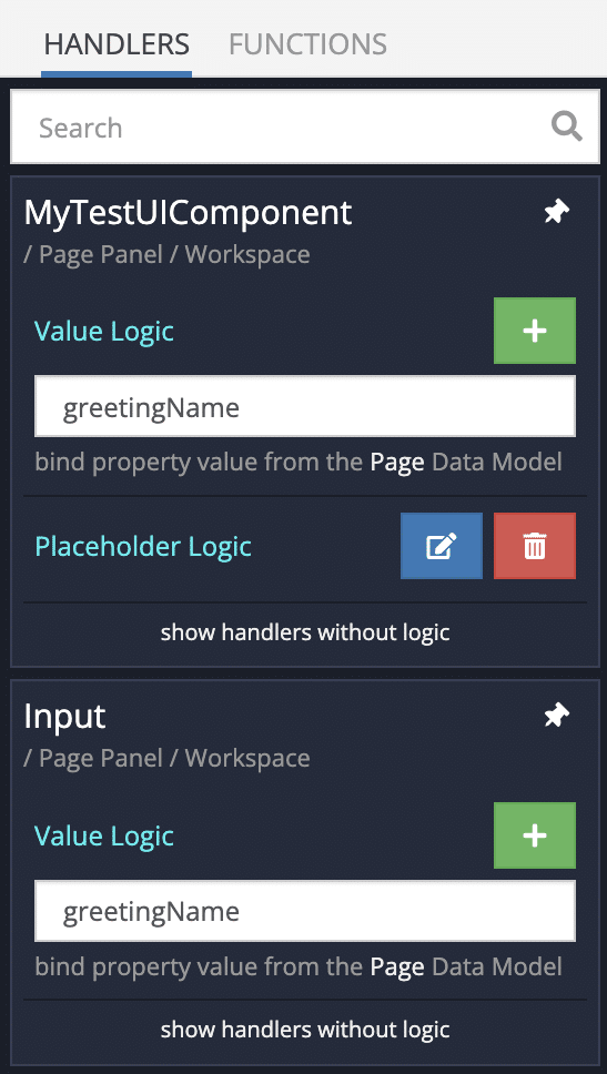
Let’s move forward and enable LogicHandler to control the value using Codeless. Just specify the “Logic Handler ID” value and optionally set the “Handler Label” value.
As a result, you can see it in the handlers preview.

After saving these changes, go to the UI and select the component. You will see that it’s possible to add Logic for the component.

Let’s add logic for the component and return a simple message. Of course, the logic can get much more complicated, but for this example, it will be quite enough to return plain text.

As you can see it displays the provided message instead of the default one:
Component Property With Data Binding
Ok, we have learned how to specify new properties for a Custom Component, however, there is one more important option, this is Data Binding.
You have probably already used data binding when developing your application. Data binding is an extremely useful tool in built-in components, so naturally we implemented this mechanism for the Custom Components as well.
You can learn more about data binding by watching our videos here and here.
Let’s create a new property to control the Input value and bind the property to the DataModel to retranslate the value in another built-in Input component.
Modify the “src/index.js” code with the following code:
export default function MyCustomComponent({ component }) {
  const onInputChange = e => {
    component.value = e.target.value
  }

  const sayHi = () => {
    alert(\`Hello ${component.value}\`)
  }

  return (
    <div className="greeting-form">
      <h4>Greeting!</h4>

      <input
        value={ component.value }
        placeholder={ component.placeholder }
        onChange={ onInputChange }
      />

      <button onClick={ sayHi }>Say Hi</button>
    </div>
  )
}
Notice that we do not need the useState hook anymore. Save the component and make sure it still works in preview mode.
Now add a built-in Input component to the page.
Open logic and create a data binding between these two input components using the PageData model:
Open the page view preview and play with both inputs, you will see they both are changing synchronously.
Component Event Handlers
Sometimes your component may fire an event and you need to add Codeless logic for the event of the component instance. In this section, I am going to show you how to specify event handlers and use them on a page.
Let’s consider a case where we need to know when a user clicked on the “Say Hi” button and what was typed in the input. For that, let’s register a new Event Handler with one context block “Name”.
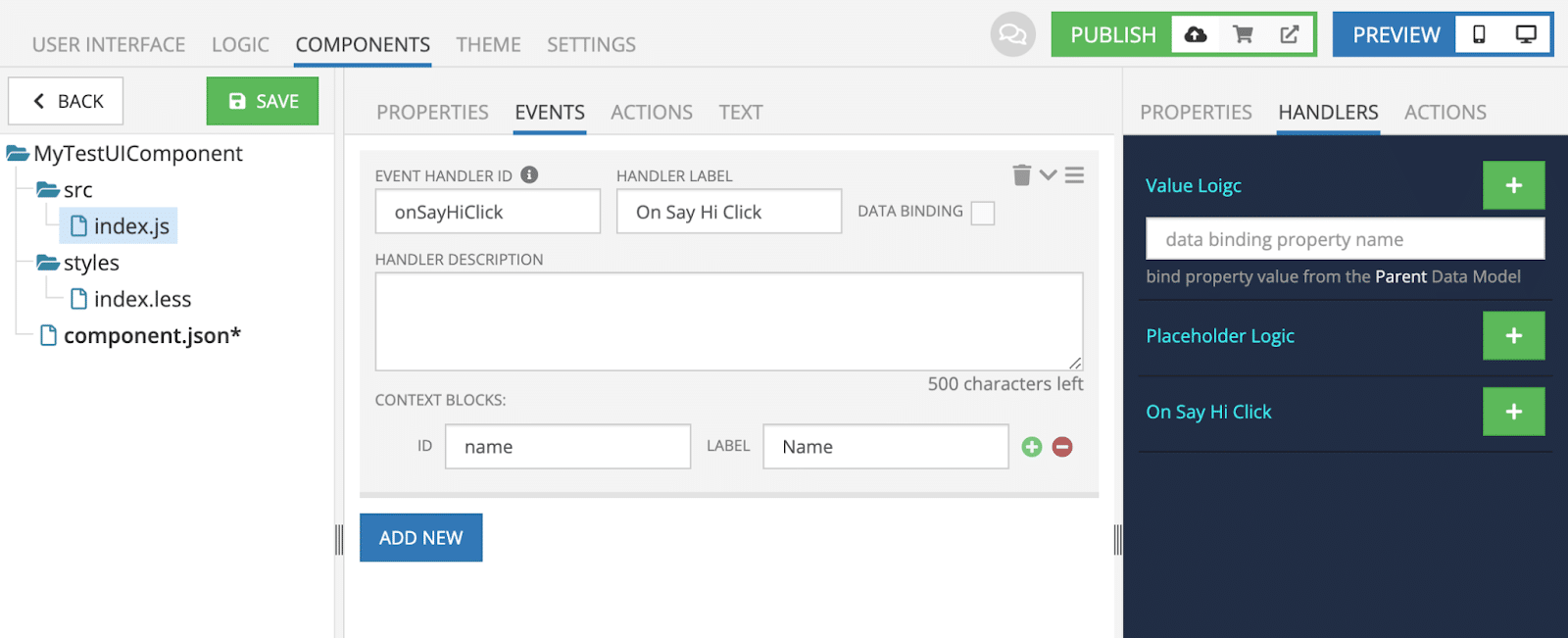
Then, open the “src/index.js” file and modify the current code.
export default function MyCustomComponent({ component, eventHandlers }) {
  …

  const sayHi = () => {
    eventHandlers.onSayHiClick({ name: component.value })
  }

  return (
    <div className="greeting-form">
      …
    </div>
  )
}
Save the component and add logic for the event of component instance.
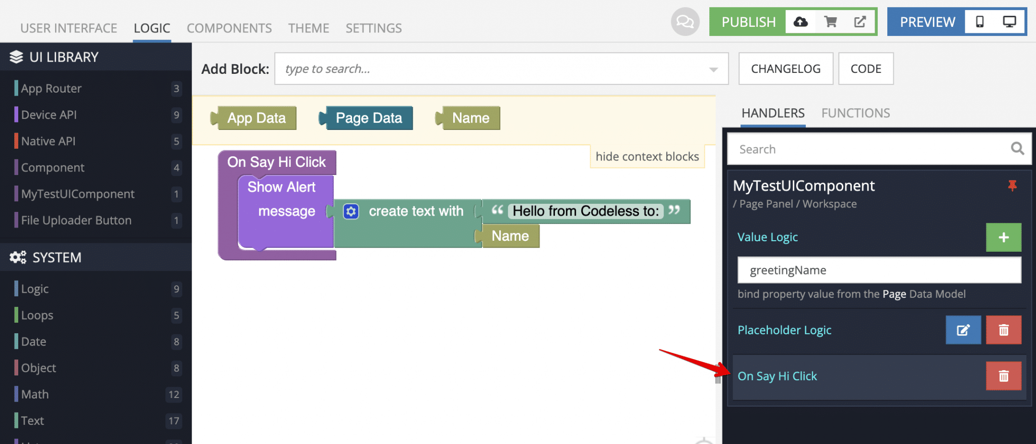
Now if you refresh your preview, type any value into the input and click on the button you will the following message:
Component Actions
Custom component actions can be helpful when you need to affect the component outside of the component.
Let’s say you want to clear the input value by clicking on the built-in Button component using a Codeless block. For that, there is the “Actions” editor section which allows us to register actions for Custom Components.
Just add a new action, and you can see how the block will look in the actions preview panel.
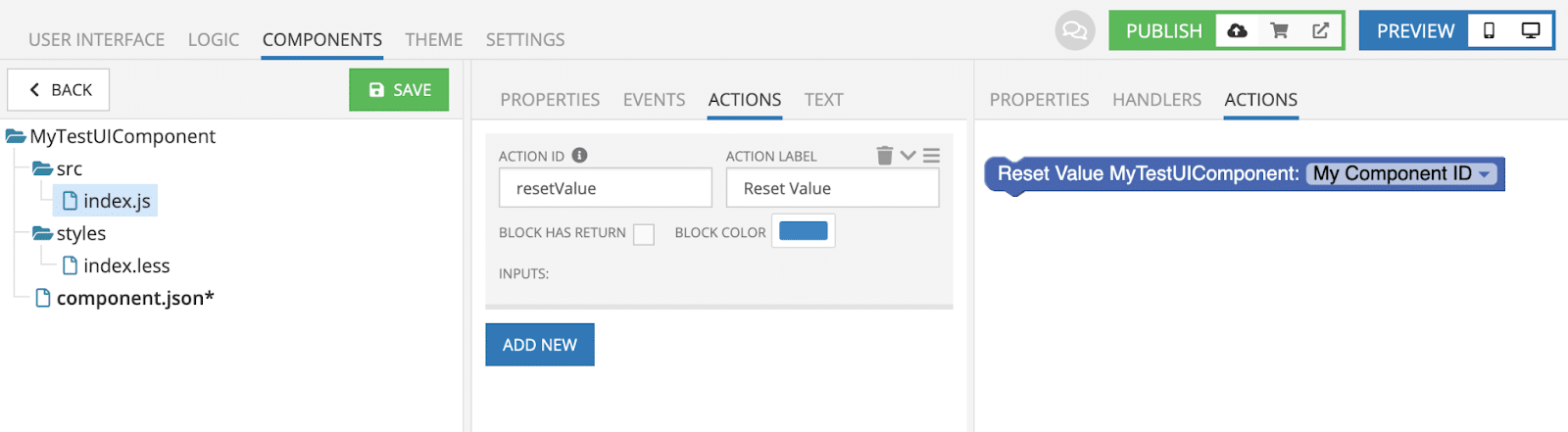
“Action ID” is a required field and we will use it in the component code to define what exactly should happen when we run the action. So, open the “src/index.js” file and modify the current code.
export default function MyCustomComponent({ component, eventHandlers }) {
  component.resetValue = () => {
    component.value = ''
  }

  …
Now that you’ve added the code:
- Save the component
- Go to the UI screen
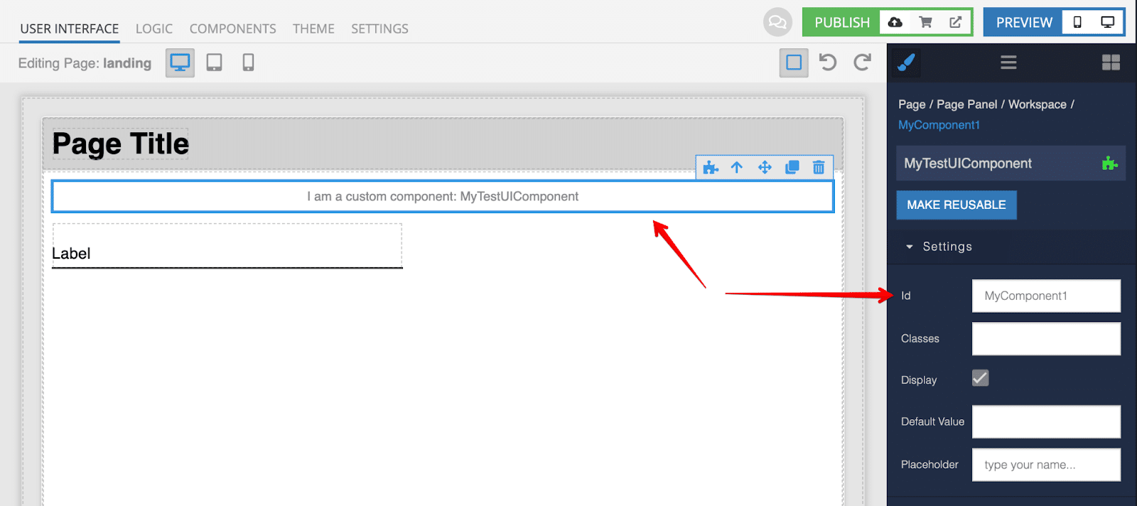
- Add an
idfor the custom component, because otherwise you won’t be able to see the component actions in the Codeless Toolbar - Add a built-in Button component to the page
- Add “OnClick” handler for the button
- and use the action codeless block
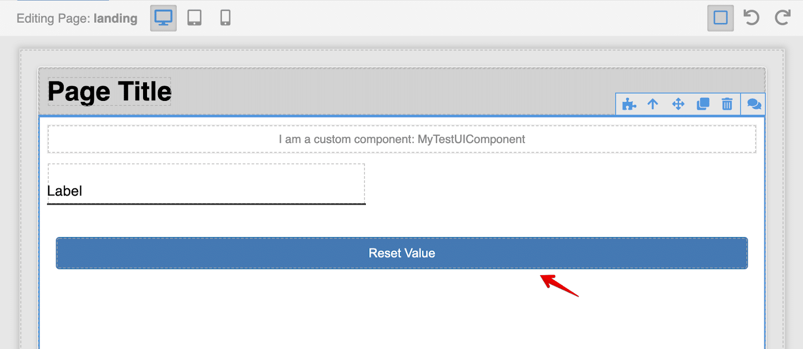
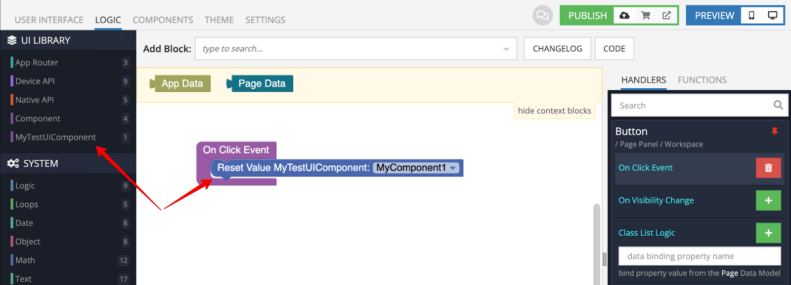
Everything is done, open the page in preview and check out how it works.
Use Third-Party Libraries
Creating your own components is a very useful feature, however, sometimes there is an already-implemented module that you want to use in your UI Builder application.
Next, I am going to show you how to use a third-party library in a Custom Component.
For example, let’s create a new custom component to use the SignaturePad module. Download the component file: https://unpkg.com/signature_pad@4.0.5/dist/signature_pad.umd.min.js and then upload it into your “src/lib/” folder.
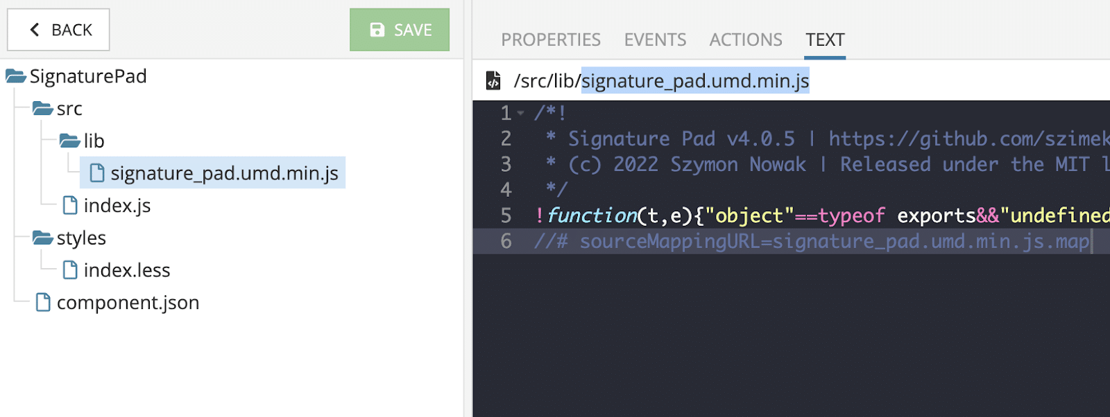
Then, open the “src/index.js” file and replace the current code with the following:
import { useEffect, useRef } from 'react';

import SignaturePad from './lib/signature\_pad.umd.min';

export default function SignaturePadComponent() {
  const canvasRef = useRef(null);
  const signaturePadRef = useRef(null);

  const savePNG = () => {
    const fileDataURL = signaturePadRef.current.toDataURL();

    download(fileDataURL, 'signature.png')
  }

  useEffect(() => {
    signaturePadRef.current = new SignaturePad(canvasRef.current, {
      backgroundColor: 'rgb(255, 255, 255)',
    });

    window.addEventListener('resize', () => {
      resizeCanvas(canvasRef.current, signaturePadRef.current);
    });

    resizeCanvas(canvasRef.current, signaturePadRef.current);
  }, \[\]);

  return (
    <div className="my-customComponent-signature-pad">
      <div className="pad-body">
        <canvas ref={ canvasRef }/>
      </div>

      <div className="pad-controls">
        <button onClick={ savePNG }>save as PNG</button>
      </div>
  </div>
  );
}

function resizeCanvas(canvas, signaturePad) {
  const ratio = Math.max(window.devicePixelRatio || 1, 1);

  canvas.width = canvas.offsetWidth \* ratio;
  canvas.height = canvas.offsetHeight \* ratio;
  canvas.getContext('2d').scale(ratio, ratio);

  signaturePad.clear();
}

async function download(dataURL, filename) {
  const a = document.createElement('a');

  a.href = dataURL;
  a.download = filename;

  a.click();
}
Next, specify styles in the “styles/index.less” file:
.my-customComponent-signature-pad {
  .pad-body {
    width: 400px;
    height: 200px;
    position: relative;
    border: 1px solid red;
    border-radius: 4px
    overflow: hidden;

  canvas {
    position: absolute;
    left: 0;
    top: 0;
    width: 100%;
    height: 100%;
  }
}

  .pad-controls {
    margin-top: 5px;
  }
}
Save all the changes, place the component in a page and open it in preview.
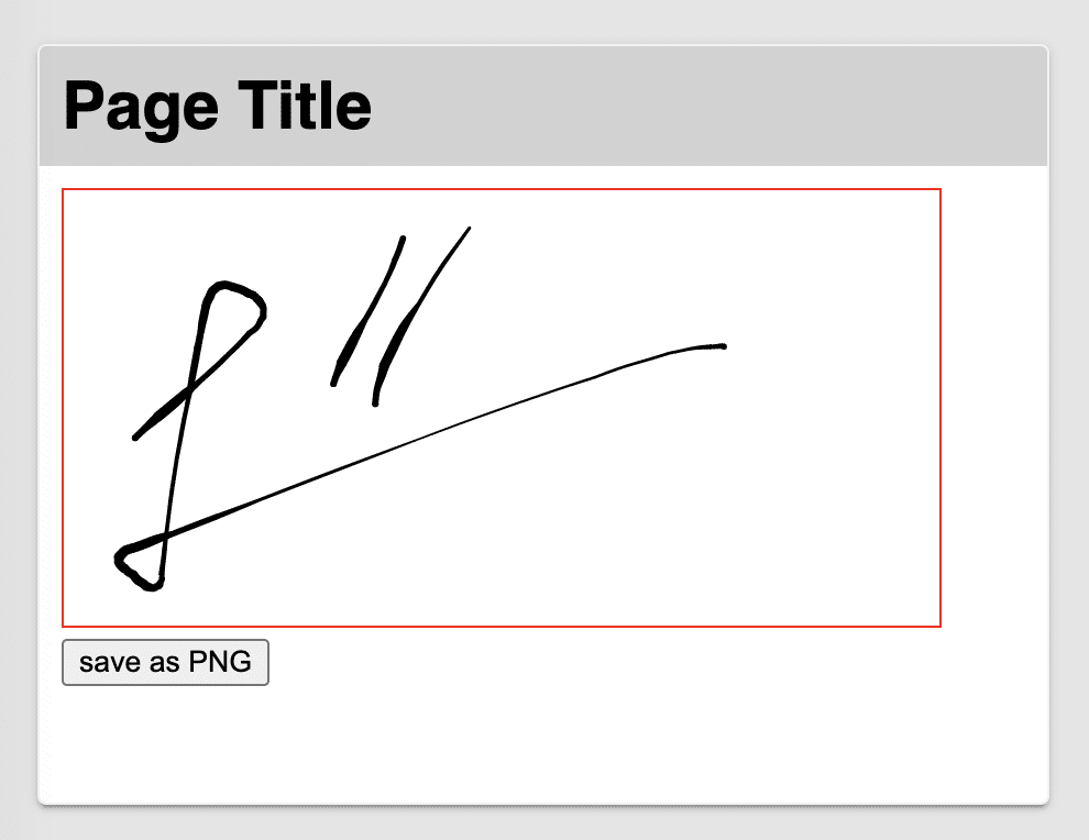
There you go, in less than a minute you integrated a module from NPM into your UI Builder application! This is amazing, isn’t it?
Marketplace
If you’re not familiar with JavaScript or React, don’t fret. Right now, we are working on numerous components that will be accessible using our Marketplace.
For instance, the SignaturePad above has already been implemented and it’s going to be released very soon. You can follow up on this Git Repository to check how we build our components.
Closing
In this guide, we touched on the new Custom UI Components feature and learned how to build your own component with and without external libraries.
We also learned how to register a component’s properties, events and actions, and how to use it with Codeless.
Of course, we are still adding to the feature and in the near future you will see some exciting improvements and additions.
I hope you enjoyed this article, if you have any questions please leave comments here or contact us on our support forum or our Slack channel. Thanks for reading and Happy Codeless Coding!

Top comments (0)