Carrying on from my accessibility post last week, I thought I’d spend some time putting knowledge to practice. I spent my morning looking into Chrome’s Lighthouse feature and worked at improving my website to see what differences it would make to my Lighthouse scores.
Starting point
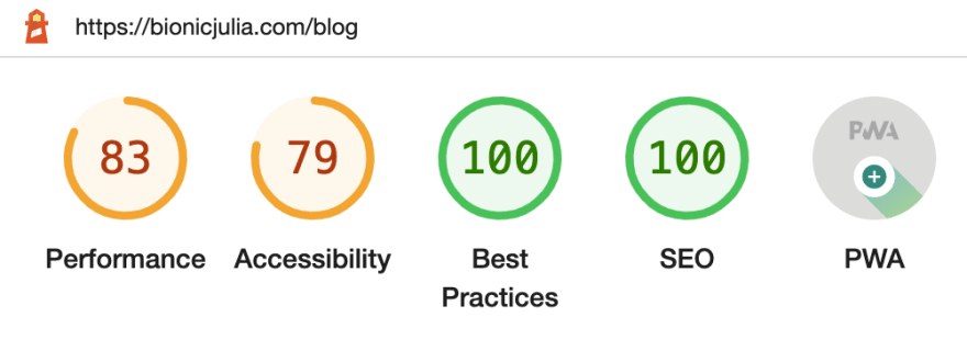
Though the main landing page of my website is bionicjulia.com, I thought I’d try to optimise bionicjulia.com/blog as this is the page that I want people to visit the most. Here are my starting scores - not too bad, but the accessibility score could definitely do with a boost.
Performance
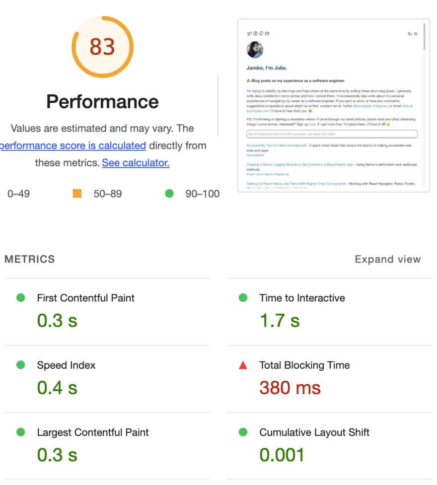
The really nice thing about Lighthouse is the detailed suggestions it provides on how to improve your scores. If we look at the “Performance” score, it was mainly the “total blocking time” that was letting me down. Delving into it further, the diagnostics showed there were a number of long main-thread tasks being run, which was useful in identifying the worst contributors to input delay. You can read more about what causes this here.
Accessibility
I found the accessibility section to be extremely useful. There are relevant external links to help you understand more about what makes a site accessible in general, but also very specific improvement points for your site. Check out the snapshot below to see what I mean - each suggestion can be expanded to give you even more precise information on where in your code base, the problems were identified.
After the improvements were made...
I use NextJS and Vercel to serve up bionicjulia.com. Some of the suggestions on how to optimise my site was therefore out of my control, but I tried my best to improve as much as I could. Here are my post-improvement Lighthouse scores.
Not bad at all (if I may say so myself!), considering how quick and easy it was to make the fixes. I’m somewhat gutted that my performance score isn’t in the green (I need to dig deeper into NextJS if I want to improve this further), but I’m very pleased with my accessibility score improvement.
Performance
The improvement in my performance score does seem to have been led by the decrease in total blocking time and time to interactive. This was mostly achieved by reducing the size of some of my images and scripts.
Accessibility
For accessibility, I made all of the suggested changes (bar one which didn’t work for the way I had set up my website), which were mostly around:
- Ensuring any links that used SVGs instead of text, had ARIA labels specifying what the link related to for screen readers.
- Ensuring that my unordered lists had child
<li>tags. - Improving the colour contrast ratio of my links.
- Basic HTML syntax improvements.
Summary
Though I didn’t set out to optimise the main landing page at bionicjulia.com, the improvements I made also affected my index page...where I’m pleased to say I got top marks. 🎉
There’s definitely still room for improvement though, and next steps would be to run this analysis on each of the individual pages of my site. Lighthouse is also only one such tool, but it’s a good start. 🤓
If you have any suggestions on how I might improve this post, please do also let me know. I'm at https://bionicjulia.com, Twitter and Instagram.


Top comments (0)