
Written by Paramanantham Harrison✏️
Introduction
Ever heard of tours in product UI?

Product tours are self-explaining tips UI for the website user to break down complex UX and make it easily useable.
Product tours play a vital role in B2B product UI. It helps save customer support time related to repeated ‘how-to-use’ questions about the UX.
What problems do product tours solve?
Product tours help with onboarding users to new and complex UX and helps to get users familiar with UI functionalities. They’re also useful for showcasing new updates on product UI, and they can save time for the customer success team.
Slack, Trello, Asana, and Invision are some of the big products that use product tours for different UX needs.
The indirect alternative to product tours including FAQs about product functionalities, product video demos and tours, and on-demand tips UI.
However, video tours or FAQs don’t have the same level of impact as inline product tours.
The majority of users don’t look for tutorials outside the UI.
On the other hand, on-demand tips UI are similar to product tours and can have a similar impact.
In this post, you’ll learn how to build a simple product tour for your React application. Before building, it you’ll first need to learn about existing React libraries.

Existing React libraries for product tours
Even though product tours are used by lot of companies, there aren’t many React-based tour UIs. Some of the libraries are React Tour and React Joyride.
React Tour library
React Tour has around 1.4k stars on Github and is moderately active.
It has very nice UI if you need a simple product tour without much customization. If this is the case, React Tour UI will be good enough.
You can view the demo for React Tour here.
How it works
With React Tour, you pass the classname selector and content for each step to the component.
It will render the tour UI based on a button click, or after mounting the component. It’s simple for static pages and UI:
const steps = [
  {
    selector: '.tour-first-step',
    content: 'This is the first Step',
  },
  {
    selector: '.tour-second-step',
    content: 'This is the second Step',
  }
  // ...
]
However, if you need to customize for a custom behavior, then it won’t work very well. The component is very rigid, and styles aren’t exposed well enough to make it reusable.
One drawback is that if you don’t use styled-components in your project, then you won’t have any luck using the component. There is no other way — the library has a hard dependency for styled components.
Additionally, if a classname selector is not present in the current screen, then React Tour just displays the non-matched content in the center of the screen. There is no way to hide it.
The only way to overwrite such behavior is to trigger the next steps through our own logic, but that defeats the purpose of the component.
It’s almost as complex as writing your own component for product tours.
React Tour really shines when you don’t want to customize a lot, and when you want basic tour functionality with beautiful UI and UX.
It also works well for static content or dynamic content where the selector labels always exist on the UI.
React Joyride library
The next famous React product tour library is React Joyride. It has 3k stars on Github and is also actively developed.
The UI isn’t as elegant as React Tours, but the API is less rigid. It allows for some level of customization.
Of course, it has its own limitations.
The docs aren’t good enough if you need custom solution on top of basic React tour functionality. The props API also isn’t very intuitive or simple.
The only difference is that it has solutions for most use cases in product tours. They expose all the events and actions to the end user, so you can capture those actions and do whatever customization you want.
Building a simple product tour in a React app
First, let’s build a simple React tour without any custom functionality.
We’ll use react-dashboard by creative tim as our base application.
This loads the product tour on top of it.
This is what the dashboard UI looks like:

We’ll do a product tour on this UI. You can see the final product tours UI here.
Let’s create the simple product tour component:
// tour.js

import React from "react";
import JoyRide from "react-joyride";

// Tour steps
const TOUR_STEPS = [
  {
    target: ".tour-search",
    content: "This is where you can search the dashboard."
  },
  {
    target: ".tour-orders",
    content:
      "Bar chart for total order. You can see beautiful graphs here, thanks to creative tim for such UI."
  },
  {
    target: ".tour-external-links",
    content: "This is where you can find the external links."
  },
  {
    target: ".tour-footer",
    content: "This is where you can see the footer links."
  }
];

// Tour component
const Tour = () => {
  return (
    <>
      <JoyRide steps={TOUR_STEPS} continuous={true} />
    </>
  );
};

export default Tour;
Load this tour component anywhere on the page to load the blinking beacon UI. If you click that beacon, it will open the tour. The next button will let you navigate til the end of the tour.
How it works
Joyride components take a lot of props. The most important ones are steps props. It accepts an array of objects with target selector elements and content.
Continuous props are used for showing the next button on each step.
You can see the demo for this simple tour component here.
Now let’s add more features and make our product tour more customized. Simple features are:
- Skip option on each step
- Change locale text labels
- Hide / show buttons (next, skip, back buttons)
- Custom styles like button colors and text alignment
Then we’ll add the custom feature like:
- Auto start the tour
- Start the tour by manual triggers (i.e., through link or button click)
- Hide blinking beacon
- Auto start tour once and only show tour on manual triggers next time
Most of the basic functionalities can be achieved through the props provided by Joyride docs.
Skip option on each step
Adding showSkipButton to true will do the trick. Skip link will skip the remaining step on the tour.
const Tour = () => {
  return (
    <>
      <JoyRide steps={TOUR_STEPS} continuous={true} showSkipButton={true} />
    </>
  );
};
How to change text labels for buttons and links
Let’s change the last button text as end tour and skip button text to close tour.
const Tour = () => {
  return (
    <>
      <JoyRide
        steps={TOUR_STEPS}
        continuous={true}
        showSkipButton={true}
        locale={{
          last: "End tour",
          skip: "Close tour"
        }}
      />
    </>
  );
};
How to hide Back, Next and Skip buttons
- For the Skip button, use
*showSkipButton*props - For the Back button, use
hideBackButton - For the Next button, use
continuousprops
Unlike other props, continuous props work differently. They either show the Next button or show a Close button, depending on the boolean value passed to the props.
You can see how inconsistent the props API naming are. It isn’t very easy to find lot of hidden features unless you read the complete docs for Joyride couple of times😅.
Custom styles like button colors and text alignment
Styles are exposed as an object. So if you pass a style object to the component, the component will merge it with their default styles.
const Tour = () => {
  return (
    <>
      <JoyRide
        steps={TOUR_STEPS}
        continuous={true}
        showSkipButton={true}
        styles={{
          tooltipContainer: {
            textAlign: "left"
          },
          buttonNext: {
            backgroundColor: "green"
          },
          buttonBack: {
            marginRight: 10
          }
        }}
        locale={{
          last: "End tour",
          skip: "Close tour"
        }}
      />
    </>
  );
};
A caveat to this way of styling is that it only supports a handful of the object styles, which are already defined on the component.
It won’t allow you to customize everything on an element level. Also, the classnames used in the rendered elements are not very easy to customize.
However, the library exposes props to use your own elements instead of the default elements.
Some of the components are:
- Beacon component (
beaconComponentprop) - tooltip component (
tooltipComponentprop)
Controlled product tour
So far, you’ve learned how to use the Joyride library to create a basic product tour and customize it using props.
You’ve also seen some of the limitations to styling the component.
Until now, the tour has been controlled in the library. You just pass the steps and tweak some props.
It’s possible to control the tour and trigger goto a particular step directly through button click, but it requires some coding.
We’ll see how to do it by achieving a few of the features.
The Joyride component exposes some of the actions and events through callback. You need to capture the callback and, based on the function, you can customize your functionality.
It’s simple to make the component controlled by passing a prop stepIndex.
stepIndex is the index number and starts from 0. Once you pass the values, the Next and Back button clicks need to be handled by you.
Let’s get to it. First, we will define the steps:
const TOUR_STEPS = [
  {
    target: ".tour-search",
    content: "This is where you can search the dashboard.",
    disableBeacon: true // This makes the tour to start automatically without click
  },
  {
    target: ".tour-orders",
    content:
      "Bar chart for total order. You can see beautiful graphs here, thanks to creative tim for such UI."
  },
  {
    target: ".tour-external-links",
    content: "This is where you can find the external links."
  },
  {
    target: ".tour-footer",
    content: "This is where you can see the footer links."
  },
  {
    target: ".tour-link",
    content: "This is where you can start the tour again in future."
  }
];
Here’s the initial state to make the component controlled:
// Initial state for the tour component
const INITIAL_STATE = {
  key: new Date(), // This field makes the tour to re-render when we restart the tour
  run: false,
  continuous: true, // Show next button
  loading: false,
  stepIndex: 0, // Make the component controlled
  steps: TOUR_STEPS
};
To auto start the tour, you need to pass disableBeacon: true in the first step. This will just disable the beacon. But you need to trigger start by changing the state run: true:
// Reducer will manage updating the local state
const reducer = (state = INITIAL_STATE, action) => {
  // TODO: Implement reducer
};

// Tour component
const Tour = () => {
  // Tour state is the state which control the JoyRide component
  const [tourState, dispatch] = useReducer(reducer, INITIAL_STATE);

  useEffect(() => {
    // TODO: Auto start the tour
  }, []);

  const callback = data => {
    const { action, index, type, status } = data;

    // TODO: Capture close, skip, next / prev action
  };

  const startTour = () => {
    // TODO: Start the tour manually
  };

  return (
    <>
      <JoyRide
        {...tourState}
        // Callback will pass all the actions
        callback={callback}
        showSkipButton={true}
      />
    </>
  );
};
The actions that are important to make the functionality are Close button click, Skip button click, Next, and Back button click.
Let’s implement the reducer function:
// Reducer will manage updating the local state
const reducer = (state = INITIAL_STATE, action) => {
  switch (action.type) {
    // start the tour
    case "START":
      return { ...state, run: true };
    // Reset to 0th step
    case "RESET":
      return { ...state, stepIndex: 0 };
    // Stop the tour
    case "STOP":
      return { ...state, run: false };
    // Update the steps for next / back button click
    case "NEXT_OR_PREV":
      return { ...state, ...action.payload };
    // Restart the tour - reset go to 1st step, restart create new tour
    case "RESTART":
      return {
        ...state,
        stepIndex: 0,
        run: true,
        loading: false,
        key: new Date()
      };
    default:
      return state;
  }
};
Now we’ll listen to the events and dispatch proper state changes to manage the tour:
import JoyRide, { ACTIONS, EVENTS, STATUS } from "react-joyride";

// Listen to callback and dispatch state changes
const callback = data => {
    const { action, index, type, status } = data;

    if (
      // If close button clicked then close the tour
      action === ACTIONS.CLOSE ||
      // If skipped or end tour, then close the tour
      (status === STATUS.SKIPPED && tourState.run) ||
      status === STATUS.FINISHED
    ) {
      dispatch({ type: "STOP" });
    } else if (type === EVENTS.STEP_AFTER || type === EVENTS.TARGET_NOT_FOUND) {
      // Check whether next or back button click and update the step
      dispatch({
        type: "NEXT_OR_PREV",
        payload: { stepIndex: index + (action === ACTIONS.PREV ? -1 : 1) }
      });
    }
};
Here’s a quick overview of how each action, event, and state update works:
If the Close button, Skip button, or End Tour button are clicked, then STOP the tour. Meanwhile, if the Next or Back button are clicked, then check whether the target element is present in the page.
If the target element is present, then go to that step. If it’s not present, find the next step target and iterate.
Joyride expose EVENTS, STATUS, and ACTION labels. You can use those to listen to the callback event without hardcoding it.
Let’s also auto start the tour when the page loads:
useEffect(() => {
    // Auto start the tour if the tour is not viewed before
    dispatch({ type: "START" });
  }, []);
You can even trigger the start of tour using button click:
// Call startTour to start the tour
const startTour = () => {
    // Start the tour manually
    dispatch({ type: "RESTART" });
};
Right now, we have it set up so that the tour will be shown every time you refresh the page.
If you only want to show the tour once and then trigger it only through manual click, you can do so using localStorage.
You can find the working example code here and the demo here.
Steps for building a custom product tour in React
We’ve achieved the product tour using the Joyride library.
But what if we need to create our own?
Let’s walk through building a tour component.
The biggest challenges to building tour components include finding the target element and showing a popover component, as well as ensuring the popover component calculates the available window space and automatically displays by the target element.
It can also be difficult to ensure the tour component is reusable and that styles are easily extended.
To build a custom tour component in React, it’s easiest to isolate the functionality and component UI with these React Hooks:
-
useTour– a custom Hook to build your own UI on top of functionality -
Tour– a dumb UI component that consumesuseTourto load the tour portal UI
This mock code shows how useTour works:
/*
  targetPosition - top, left position of the target element with respect to window
  gotoIndex - function that accepts stepNumber
  endTour - function to end tour
  restartTour - function to restart tour
  nextStep - function to update the state tonext step
  prevStep - function to update the state to previous step
*/

const { targetPosition, gotoIndex, currentStep, endTour, restartTour, nextStep, prevStep  } = useTour({
  steps,
  // ... props
})
Conclusion
I hope this article helped you learn the tricks of creating product tour components in your React application. Let me know your experience on tour UX in the comments🤗.
Full visibility into production React apps
Debugging React applications can be difficult, especially when users experience issues that are difficult to reproduce. If you’re interested in monitoring and tracking Redux state, automatically surfacing JavaScript errors, and tracking slow network requests and component load time, try LogRocket.
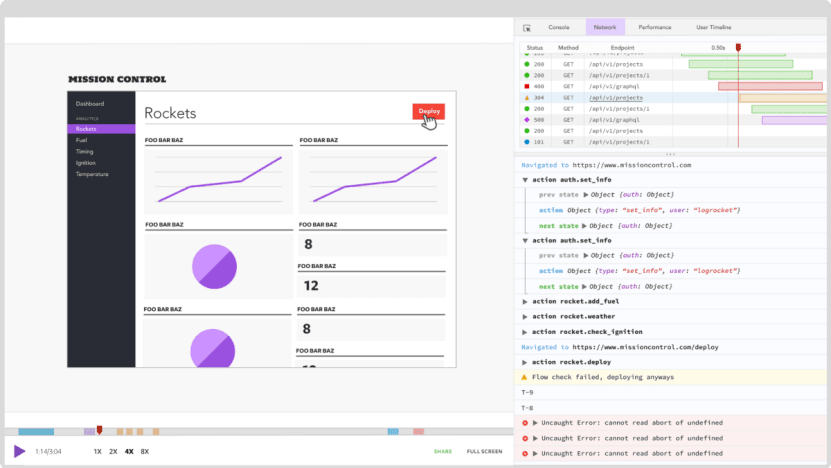
LogRocket is like a DVR for web apps, recording literally everything that happens on your React app. Instead of guessing why problems happen, you can aggregate and report on what state your application was in when an issue occurred. LogRocket also monitors your app's performance, reporting with metrics like client CPU load, client memory usage, and more.
The LogRocket Redux middleware package adds an extra layer of visibility into your user sessions. LogRocket logs all actions and state from your Redux stores.
Modernize how you debug your React apps — start monitoring for free.
The post Complete guide to building product tours on your React apps appeared first on LogRocket Blog.

Top comments (0)