
Written by Yusuff Faruq✏️
In mid-July, Adobe announced the release of React Spectrum, a collection of tools for building adaptive, accessible, and rich user experiences. At its core, React Spectrum is composed of three main parts:
- React Spectrum, which is concerned with UI
- React Aria, which is concerned with accessibility
- React Stately, which deals with state management and logic
In this article, we will take a look at each of these parts in turn. Note that you should have a fair amount of experience with JavaScript and React to be able to follow along.
React Spectrum
React Spectrum, as we learned earlier, focuses on the UI. It is an implementation of Spectrum, Adobe’s design system; it is what Material UI is to Google’s Material Design. You can learn more about it here. React Spectrum provides us with a vast array of components with which to build accessible, adaptive, responsive, and robust user interfaces and experiences.

Installing React Spectrum
React Spectrum can be installed via a package manager like npm or Yarn. It also works perfectly with create-react-app.
So, first of all, create a new React project (preferably with create-react-app):
npx create-react-app intro-react-spectrum
Then install React Spectrum:
//npm
npm install @adobe/react-spectrum

//yarn
yarn add @adobe/react-spectrum
We can now test it out by using this very simple example code from the documentation. In your app.js, type out the following:
import {
  Provider,
  defaultTheme,
  Button
} from "@adobe/react-spectrum";
import React from "react";
function App() {
  return (
    <Provider theme = {defaultTheme}>
      <Button
        variant = "primary"
        onPress = {() => alert("Hey there!")}
      >
        Hello React Spectrum!
      </Button>
    </Provider>
  );
}
This should render a single button on the screen, which opens an alert that says “Hey there!” when clicked.
Now that we’ve got React Spectrum set up, we can start exploring what it offers.
Providers
At the root of every React Spectrum app is a provider that is used to define application-level configurations like themes, locales, etc. In the sample code block above, for example, we set the theme of our application to defaultTheme, which uses the “light” and “darkest” color themes.
React Spectrum allows us to set color schemes on the provider component to force a particular color scheme. For example, we can force our application to use the “dark” color scheme of our current application theme by using the colorScheme prop, like so:
<Provider theme = {defaultTheme} colorScheme = "dark">
      <Button
        variant = "primary"
        onPress = {() => alert("Hey there!")}
      >
        Hello React Spectrum!
      </Button>
</Provider>
Provider also has a very handy use case that I have become fond of: setting common properties for a group of elements. For example, we can disable a group of elements by wrapping them with a provider and using the isDisabled prop, like so:
<Flex direction = "column" alignItems = "center" flex gap = "size-100">
        <Provider isDisabled>
          <ActionButton
            width = "size-2000"
            variant = "primary"
          >
            Button 1
          </ActionButton>
          <Button
            width="size-2000"
            variant = "cta"

          >
            Button 2
          </Button>
        </Provider>
      </Flex>
Provider also has other similar props, like isQuiet, isHidden, and so on.
Layout
React Spectrum supports the two most popular layout systems in CSS3, which are the flexbox system and the grid system. It does this by providing two container components called Flex and Grid. With these two components, we can build flexible and responsive UI.
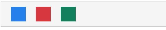
Flex is a container component that implements CSS flexbox, and it allows us to use all the properties that flexbox provides — such as justify-content, align-content, align-items, etc. — in the form of props. Here’s some sample code using Flex:
<View borderWidth="thin" borderColor="dark" padding="size-200">
          <Flex width="size-3000" justifyContent="space-around">
            <View
              height="size-600"
              width="size-600"
              backgroundColor="blue-400"
            ></View>
            <View
              height="size-600"
              width="size-600"
              backgroundColor="red-500"
            ></View>
            <View
              height="size-600"
              width="size-600"
              backgroundColor="green-600"
            ></View>
          </Flex>
      </View>
And here’s the result as displayed in the browser:
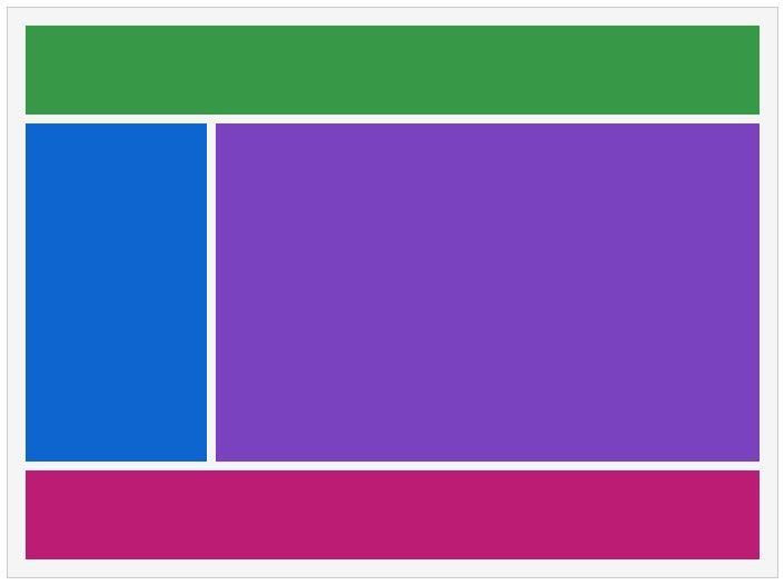
Grid is an implementation of the CSS grid system, and, like Flex, it allows us to use the various CSS grid properties in the form of props. Here’s some example code from the documentation of how you’d use the Grid component:
<View borderWidth="thin" borderColor="dark" padding="size-200">
      <Grid
            flex
            areas={["header  header", "sidebar content", "footer  footer"]}
            columns={["1fr", "3fr"]}
            rows={["size-1000", "auto", "size-1000"]}
            height="size-6000" gap="size-100" >
            <View backgroundColor="celery-600" gridArea="header" />
            <View backgroundColor="blue-600" gridArea="sidebar" />
            <View backgroundColor="purple-600" gridArea="content" />
            <View backgroundColor="magenta-600" gridArea="footer" />
          </Grid>
      </View>
And here’s the result:
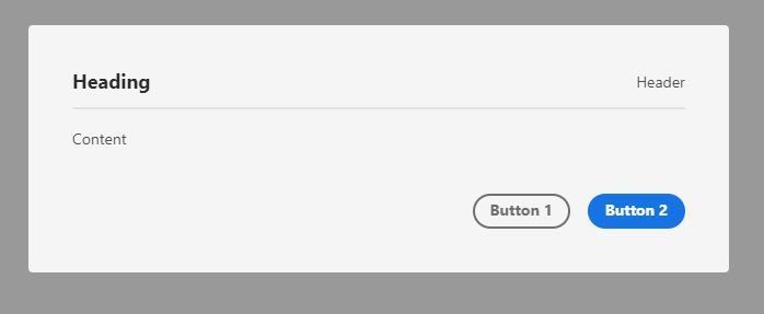
Aside from Flex and Grid, React Spectrum also has a concept known as slots. To quote from the documentation, “Slots are named areas in a component that receive children and provide style and layout for them.”
With slots, we can provide certain children to a component that provides layout and styles for these children. Examples of components that use slots are the Dialog, Picker, and Menus components.
Let’s take Dialog as an example. It takes in Heading, Header, Content, and ButtonGroup components and provides predefined layouts and styling for each of these components. Here’s what the code for a simple Dialog would look like:
<Dialog>
  <Heading>Heading</Heading>
  <Header>Header</Header>
  <Divider />
  <Content>
    <Text>Content</Text>
  </Content>
  <ButtonGroup>
    <Button variant="secondary" onPress={close}>
          Button 1
    </Button>
    <Button variant="cta" onPress={close}>
       Button 2
     </Button>
   </ButtonGroup>
</Dialog>
And the resulting dialog should look like this:
Theming
Themes in React Spectrum allow us to define the color schemes and platform scales used in our applications.
Color schemes define the different theme modes of our application, such as “light” and “dark,” while platform scales define the extent to which components scale up (on mobile devices) or scale down (on desktop) in size. Platform scales ensure a fluid experience for all users regardless of the type of device they might be using. You can read more about platform scales in Spectrum here.
To create a custom theme, you would have to define your own Theme object. The structure of a Theme as seen from React Spectrum source code is as follows:
interface Theme {
  /** CSS module defining the global variables, which do not change between color schemes/scales. */
  global?: CSSModule,
  /** CSS module defining the variables for the light color scheme. */
  light?: CSSModule,
  /** CSS module defining the variables for the dark color scheme. */
  dark?: CSSModule,
  /** CSS module defining the variables for the medium scale. */
  medium?: CSSModule,
  /** CSS module defining the variables for the large scale. */
  large?: CSSModule
}
You can find the list of variables that should be defined for each CSS module here.
If your goal is to build an Adobe-styled product with React, then React Spectrum is perfect for all the needs you might have. However, it is a bit limited in terms of customization. It’s definitely customizable through the use of themes, but it’s not a quick process.
React Aria
React Aria mainly handles three things: accessibility, user interactions, and internationalization. Basically, it helps developers ensure that we provide the best experiences for all users regardless of ability, choice of device, or choice of browser. It does this by providing us with React Hooks that return props we can spread in our JSX elements. We will take a brief look at some of these Hooks.
Installation
React Aria is, according to the documentation, incrementally adoptable. Therefore, each component is published as a separate package, and you would have to install each component individually as you need it. For the purposes of this article, we will be installing both the useButton and useFocusRing Hooks.
npm install @react-aria/button @react-aria/focus
useButton
The first Hook we will discuss is the useButton Hook. This Hook provides accessibility and adaptive behavior for a Button component. We can use this Hook with the regular semantic <button> element or a presentational element like a <div> if we want to implement more custom styling. It handles all accessibility concerns so that developers can focus on styling.
The useButton Hook takes in two arguments: the props from our component and a ref. Here’s a sample code block from the documentation:
function Button(props) {
  let ref = useRef();
  let {buttonProps} = useButton(props, ref);
  let {children} = props;
  return (
    <button {...buttonProps} ref={ref}>
      {children}
    </button>
  );
}
We can also choose to use other JSX elements like <div> or <span> instead of a <button>, and React Aria will ensure it remains fully accessible.
function Button(props) {
  let {children} = props;
  let ref = useRef();
  let {buttonProps, isPressed} = useButton(
    {
      ...props,
      elementType: 'span'
    },
    ref
  );

  return (
    <span
      {...buttonProps}
      style={{
        cursor: 'pointer',
        userSelect: 'none',
        WebkitUserSelect: 'none'
      }}
      ref={ref}>
      {children}
    </span>
  );
}
useFocusRing
useFocusRing allows us to apply styles to HTML elements with keyboard focus. Focus rings only work with keyboard focus and not mouse or touch focus. Here’s a brief example of the useFocusRing Hook in use:
function Example() {
  let {isFocusVisible, focusProps} = useFocusRing();

  return (
    <button
      {...focusProps}
      style={{
        WebkitAppearance: 'none',
        appearance: 'none',
        background: 'green',
        border: 'none',
        color: 'white',
        fontSize: 14,
        padding: '4px 8px',
        outline: isFocusVisible ? '2px solid dodgerblue' : 'none',
        outlineOffset: 2
      }}>
      Test
    </button>
  );
}
React Aria is home to a variety of very handy Hooks that ease some common frontend tasks, such as creating custom components, building the best user interaction feedback, and internationalization.
React Stately
The final component of React Spectrum is React Stately. React Stately is a library of Hooks that provide state management and core logic that can be used across React (on the web) and React Native. It can be used alongside React Aria on the web to provide behavior and user interactions for custom components like a Switch.
Installation
Just like React Aria, React Stately is incrementally adoptable, so you would have to install each component as a separate package under the @react-stately scope.
Collections
React Stately has this concept of collections which are basically lists of items. Collections are very common and can be found in many UI components some of which are menus, lists, trees, selects, tables and so on. Collections can either be static (represent static data such as menus) or dynamic (such as lists representing data fetched from an API).
With React Stately, we can implement collections easily using a bunch of hooks and components. For example, let’s say we want to create a custom Select component, whose items have to be fetched from an API.
Since fetching the data is an asynchronous operation, we have to let the user know when the data is still being fetched. We can easily achieve this through one of React Stately’s Hooks, useAsyncList.
Using the useAsyncList Hook, we can determine the state of the asynchronous operation (loading or failure) and use it alongside our own custom components or some React Spectrum components that implement the collections API like Picker.
Since Picker implements the collections API, we can easily integrate it with useAsyncList. For example, using the isLoading prop of the Picker component, we can easily inform users that data is still being fetched, and, as such, they would not be able to use the Picker component.
Here’s a simple example of the Picker component being used with useAsyncList to create a Select component that allows users to select from a list of Nigerian banks.
function App() {
  let list = useAsyncList({
    async load({signal}) {
      let res = await fetch('https://nigerianbanks.xyz/', {signal});
      let json = await res.json();
      console.log(json);
      return {items: json};
    }
  });
  return (
    <Provider theme={defaultTheme}>
      <View borderWidth="thin" borderColor="dark" padding="size-200">
        <Picker label="Select a bank" items={list.items} isLoading={list.isLoading}>
          {(item) => <Item key={item.name}>{item.name}</Item>}
        </Picker>
      </View>
    </Provider>
  );
}
useAsyncList can also be used to implement infinite loading, sorting, and many other useful operations that can be performed on a list of data.
Finally, and this should go without saying, React Stately integrates very nicely with React Spectrum and React Aria and can be used in conjunction with either of those two libraries.
Conclusion
React Spectrum is home to a wide variety of tools, some of which can be integrated into your own design systems to build fully accessible custom components and applications. You can learn more about React Spectrum here.
LogRocket: Full visibility into production React apps
Debugging React applications can be difficult, especially when users experience issues that are difficult to reproduce. If you’re interested in monitoring and tracking Redux state, automatically surfacing JavaScript errors, and tracking slow network requests and component load time, try LogRocket.
LogRocket is like a DVR for web apps, recording literally everything that happens on your React app. Instead of guessing why problems happen, you can aggregate and report on what state your application was in when an issue occurred. LogRocket also monitors your app's performance, reporting with metrics like client CPU load, client memory usage, and more.
The LogRocket Redux middleware package adds an extra layer of visibility into your user sessions. LogRocket logs all actions and state from your Redux stores.
Modernize how you debug your React apps — start monitoring for free.
The post Richer, more accessible UIs with React Spectrum appeared first on LogRocket Blog.

Top comments (0)