
Written by Paul Ryan✏️
Accessibility is a crucial consideration when building a web application because it ensures that users with disabilities can enjoy the full range of your app’s features. Unfortunately, accessibility is often overlooked due to lack of awareness or, worse, lack of time.
The latter excuse is an especially bad one — the web should be universally accessible, and for that, there is always time. According to the U.S. Census Bureau, 18.7 percent of U.S. citizens have some kind of disability, and that could represent a significant portion of your users. What’s more, failure to make your web app accessible could potentially lead to legal ramifications.
In this tutorial, we’ll demonstrate how to debug your website for accessibility. We’ll discuss some tools you have at your disposal and how to deal with common pitfalls.
We’ll audit my own personal website (since I am using a Gatsby template that I edited and have done no other enhancements) to show how a user could run into problems while navigating even a simple page. We will also examine the homepage of networking platform Dribbble to gauge its accessibility.
Let’s get cracking!
Start debugging your website
Debugging your website for accessibility involves the following steps.
- Check whether you can navigate the website using only a keyboard. If you can’t, the website is not accessible
- Similar to how a web application is scored based on PWA performance, do the same with accessibility web extensions
- Implement skip links to help users navigate your site quickly
- Reduce motion, since some animations can negatively impact the user experience
Let’s explore these tasks in more detail.
Keyboard navigation
We’ll demonstrate by testing my website for accessibility. If you want to play along, head over to Paul Ryan Codes and see can if you navigate the site using a keyboard.

As you can see, we can navigate to the necessary buttons using the tab key. My website is very simple, so you would expect this to be the case. I did encounter one bug, however: when I opened my modal, I found that it would not close.

So if a user were to navigate my website using the keyboard, they would end up getting trapped here. This is not ideal from an accessibility standpoint, so let’s troubleshoot.
First, examine the code to identify the problem.
<div
  className="close"
  onClick={() => {
    this.props.onCloseArticle()
  }}
></div>
This code doesn’t exactly lend itself to accessibility. How can we identify that this is even a button? To remedy this, we’ll change our div to a button.
 <button
  className="close"
  onClick={() => {
    this.props.onCloseArticle()
  }}
></button>
Now we can close the modal, but there is no outline on the button when it is active. This is a very common issue, and I myself am guilty of writing code like the following (normally for design reasons).
button {
  outline: none;
}
Let’s add the following code to make sure our button has an outline when it is active.
button:focus {
  outline: auto;
}
Now we can close the modal, as shown below. We can also navigate through the list of articles using the keyboard.
Let’s head over to the Dribbble homepage and see if can we navigate the homepage using only the keyboard.

Everything goes smoothly until we tab onto one of the designs and notice a weird white space at the bottom. This may seem like a minor UI bug, but it prevents the user from liking or saving the image.
As shown below, the options are visible when we hover over the image with the mouse.

Later on, we’ll discuss prefers-reduced-motion, which can help resolve this bug.
Now let’s press enter on one of the designs and open the modal.

Uh oh — looks like we can’t tab in the modal. This is a common problem with many websites. If you were to click on the modal, it would have focus and work as expected. We can use tabindex to make this more accessible.
Now let’s check the footer.

Looks like the footer is working as expected — great!
As a side note, Dribbble is a fantastic, beautifully designed website and an excellent resource. The above points are meant not to criticize Dribbble, but to show that even the most elegant, carefully planned websites can have accessibility issues.
Web extensions
The methods we demonstrated above are very manual; as you can imagine, it would take quite a bit of time and work to fully audit a website for accessibility this way. Thankfully, some smart people out there have built tools we can use to automate parts of the process.
One such tool is called axe. I am working with Chrome, but this tool is also available for Firefox, if that’s your cup of tea. When axe is added to your extensions, you can view a new tab in your dev tools called Axe.

Let’s shift our focus back to my site — though, admittedly, I’m a bit nervous to see how many issues axe might identify.
Go ahead and hit that Analyze button.

Yikes! According to this analysis, my tiny little website has 10 accessibility issues. Thankfully, there are only three distinct issues. Let’s go through each one.
Links must have discernible text
This boils down to my social buttons.

I have neither a description for the link nor an inner link label, as shown below.
![]()
To fix this, we just need to add an aria-label to our anchor tag (we also do this to the other three social links).

Document must have one main landmark
You may be asking what this means, exactly. The axe documentation defines it as follows:
It is a best practice to use both HTML 5 and ARIA landmarks to ensure all content is contained within a navigational region. In HTML5, you should use elements like
header,nav,main, andfooter. Their ARIA counterparts arerole="banner",role="navigation",role="main", androle="contentinfo", in that order. By using both HTML5 and ARIA markup, you make the webpage more robust and functional no matter what screen reader technology is used.
My website has neither a main tag nor any ARIA equivalent set. As stated above, it is best to use both, so let’s get that in.
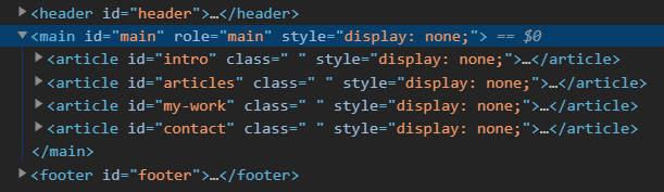
Cool, another accessibility issue fixed. We are nearly there!
Elements must have sufficient color contrast
On my website, this issue occurs five times. Using the highlight button in axe, I can see my first color contrast issue.

axe is flagging that my background image contains light colors in some places. Here’s where the tool struggles a little. Below the reported issue, axe displays the following text.

You will likely come across this when debugging your own site. For what it’s worth, axe offers a great color contrast analyzer. In this case, I think my website’s contrast is good, so let’s continue (although I plan to test this further myself at some point).
Now let’s run axe on the Dribbble homepage.
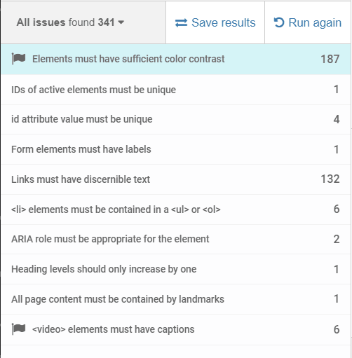
The tool found 10 distinct errors on the Dribbble homepage, which is really good considering everything the page has going on.
Most of the issues above are quite basic, but the following may need some explaining.
- IDs of active elements must be unique : Any ID you use on your page should be used only once, especially for active elements
- Heading levels should only increase by one : All headings should be in a logical order (e.g., h1 followed by h2)
-
All page content must be contained by landmarks : All rendered content must be placed inside container elements with ARIA tags. This is similar to the issue we faced when we discovered that my site was missing the
maintag. Tags you should add includenavigation,main,header, andfooter
axe is a powerful tool to help web developers make their websites more accessible. Although it is not flawless and tends to miss some issues, it will save you a whole lot of time when auditing your site for accessibility.
Skip links
Skip links are the unsung heroes of accessibility, and for disabled users, they are a godsend. Let’s audit the website of Raidió Teilifís Éireann, Ireland’s national public service broadcaster.
What, exactly, is a skip link? Let’s imagine an elderly Irish user with Parkinson’s is reading the news online. Below is the navigation bar on the RTE site.

They then tab over to the menu item labeled Culture and press enter.

To access the content on this page, the user would need to navigate through all the menu items once more. Surely, there is a better way. That’s where skip links come in.
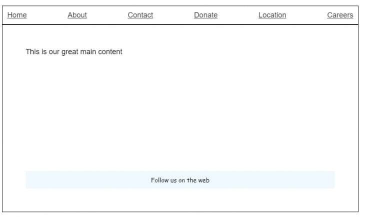
Skip links enable users to skip to the content of a particular page, as you can see below on the Parramatta Park website.

The homepage includes a skip link labeled “SKIP TO MAIN CONTENT,” which saves the user from having to cycle through the navigation bar to access the content on the page they’re interested in.
This is all great in theory, but let’s get more practical and discuss how to actually create a skip link. To demonstrate, we’ll use this very basic page I created in Codepen.
In this example, we have six navigation items. Let’s give our users the option to skip the navigation links and go right into the content.
First, we’ll create a skip link.
<a id="skip-link" href="#maincontent">Skip to main content</a>
Next, we’ll add an id to the page we would like to navigate to. In our case, it is the main element.
<main role="main" id="maincontent">
Now let’s create the CSS for our skip link.
a#skip-link {
  position: absolute;
  padding: 10px;
  border: 1px solid black;
  background: #00aced;
  text-decoration: none;
  color: #fff;
  left: 250px;
  top: 10px;
  visibility: hidden;
}
By default, we set visibility to hidden since we only want the skip link to be visible when the user beings to tab.
With the skip link in place, it’s time to add our beautiful JavaScript.
// local variable we use to check if we already showed the skip link
let showSkiplink = true;
// get a reference to our skip link
const skipLink = document.querySelector('#skip-link');
// fuction to check if tab was pressed
function checkTabPress(e) {
    'use strict';
    // get a reference to active element
    var ele = document.activeElement;
    // our boolean showSkipLink is true so we haven't shown it already
    if(showSkiplink) {
       // if the keycode is tab we are on a a element
       if (e.keyCode === 9 && ele.nodeName.toLowerCase() === 'a') {
          // show our skip link
          skipLink.style.visibility ='visible';
          // focus the skip link
          skipLink.focus();
          // from here on out we don't want to show it
          showSkiplink = false;
        }
    } else {
      skipLink.style.visibility ='hidden';
    }
}
// add a listener to keypress
document.addEventListener('keyup', function (e) {
    checkTabPress(e);
}, false);
Our skip link is now in place.

This is about as basic an example as you’ll find, but it’s a good model to demonstrate how to implement skip links in your own website. For an excellent real-world example, I recommend checking out the Sky News website.
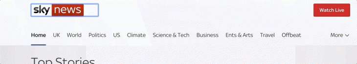
As you can see, a user can navigate to and from the skip link. This requires a bit more work, but it is definitely worth the investment.
Reduced motion
Reduced motion is one of the most overlooked aspects of accessibility. Animation on the web has become much more popular due to increased browser support and the proliferation of high-quality animation resources. But just because a website looks great doesn’t mean it’s accessible. One way to clear this hurdle is to give users control over your animations.
To explain prefers-reduced-motion, let’s look at another example I put together in Codepen. This is a simple card flip effect, which is very common on modern websites.

The flip effect is triggered when a user hovers over the image. But how would a keyboard user reach the Click Me button? Is the only solution to remove the flip? Thankfully, we can use prefers-reduced-motion to make this accessible.
Reduced motion is set at the system level. I am using Windows 10, so I toggled this setting off.

In Mac, it is under System Preferences > Accessibility > Display. This may vary based on your OS version, but you can easily Google it to find out exactly where the setting is.
With that in place, I can use the following media query.
@media (prefers-reduced-motion: reduce) {

}
I then add the following to my media query so the side with the button is the one showing by default.
.flip-card .flip-card-inner {
  transform: rotateY(180deg);
}
For reference, here is the finished pen.
This is only one of the many scenarios where you would use prefers-reduced-motion . When creating animations, you should always consider how a user with a disability would access the content. This is certainly easier said than done, but after a while it will become a habit.
Topics we did not cover
Accessibility is a huge subject; we covered some of the most common areas, but not more advanced topics such as screen readers, which play a vital role for users with vision impairments. I recommend checking out this excellent Frontend Master course in which developer and accessibility advocate Marcy Sutton discusses screen readers and many of the topics covered in this article.
Is your frontend hogging your users' CPU?
As web frontends get increasingly complex, resource-greedy features demand more and more from the browser. If you’re interested in monitoring and tracking client-side CPU usage, memory usage, and more for all of your users in production, try LogRocket.

LogRocket is like a DVR for web apps, recording everything that happens in your web app or site. Instead of guessing why problems happen, you can aggregate and report on key frontend performance metrics, replay user sessions along with application state, log network requests, and automatically surface all errors.
Modernize how you debug web apps — Start monitoring for free.
The post Debugging your application for accessibility appeared first on LogRocket Blog.

Top comments (0)