
Hopefully, you're familiar with this podcast, but if you aren't it's about two friends, Jacob Bennett, and Michael Dyrynda, conquer a 14.5 hour time difference to talk about life as web developers.
This story started with this message on Twitter:
Hey bud, just reaching out to see if you have any capacity to put together a new logo for the north meets south web podcast?
Let me know what you charge, etc. :)

Moments later, after I've finally composed myself, I've kindly said yes to Michael and we were in business.
Let's talk logos.
The first question that I normally do, when it's a case of rebranding, it's asking the client the reasons behind the change. With this obvious question it's possible to find out their feelings with the current logo and get tips and hints for the new.
In this case, they were looking for a logo that would give a better indication of the show. They also hinted their feelings about typography logo or a mark that can be recognisable in smaller sizes.
It's time to design.
A week later I call the boys and showed some of the designs that I liked the most from the sketchbook. And it's easy to discover the final picks…
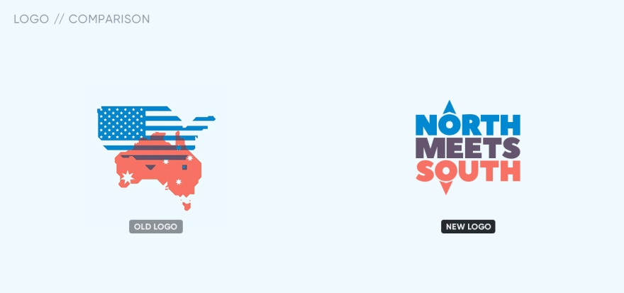
Another important thing it's choosing the color, and I kind of needed three colors to paint the logo I was thinking to get new palette, but I liked very much the old colors… What should I do?
And in the end it was the old logo that kindly gave me the third color I was looking for.

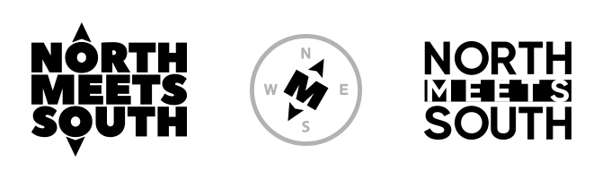
That would do it. It's time to show the new NORTH MEETS SOUTH logo
to the world - even with the cute compass variation mark in the early sketches.


But with any logo the best part it's playing with it. So, looking where the logo often appears on media and the audience interests I've pulled off this trendy designs for the avatars and posts:


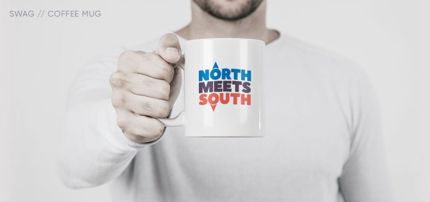
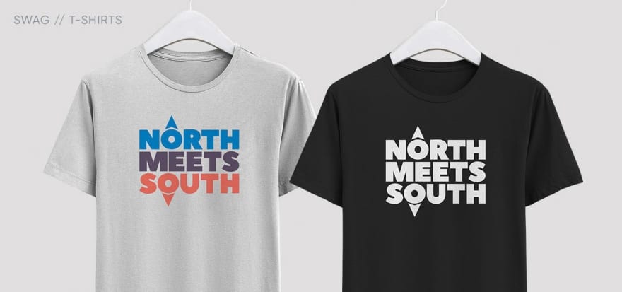
What about SWAG? Everybody loves good looking swag.
So far, I love all the concepts I've done, but the ones that I'm most proud of are the ones where I fused the host's personalities to the cardinal directions of the logo brand.


And, just for fun, why not pushing this idea a little bit? 🤣

Well… Like you probably heard on the podcast that I've done all of this pro bono. Yes, that's true despite all the attempts of Michael and Jake to accept a payment. But from the start, I wanted that this to be sort of a "thank you" gift.
A thank you for all the time and heart they put on this podcast and the official Laravel News Podcast - for all their effort even with such a big-time difference; for their time they take from their wives, playtime of their kids; and diapers to change.
Thank you for that.

Top comments (0)