
Hi friends!
Today I want to tell you a little bit about media queries! Let's keep it short and simple as usual, yes?
What is a media query?
THIS is a media query:
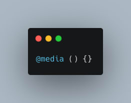
Simple looking, right?
Our media queries specify what css to display in a browser given a device's specific dimensions. It gives our browser information about the device a user is on, the width of that device, and the orientation of the device, amongst other things.
Without specifying a type of media like say, "print" or "screen", the query will default to "All". Read about more media query types here.
What goes in a media query?
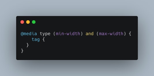
As you can see, we create the @media rule, add the query type, and then specify widths. Not all media queries will include both a min and max width, but notice that you can specify different conditions using logical operators.
What does this mean for mobile-first design?
Well, this means that you should design websites mobile-first, and then use media queries to size up your sites, not down.
*tablets: use a min-width of 768px.
*desktops: use a min-width of 1200px
These are pretty good standards according to Skillcrush.
DON'T FORGET
Don't forget to include the following line of code in the head tag of your html!
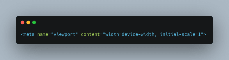
It is the HTML5 method that allows us to control the size of the viewport, or the user's visible screen, and gives it instructions for the width and scale. Read more about it here.
Care to see an example of media queries in action?
Tada!
body, html {
      font-family: Gotham, Helvetica, Arial, sans-serif;
      font-size: 1em;
      text-align: center;

    }

    section {
      width: 50%;
      margin: auto;
    }

    h1 {
      font-size: 2em;
      color: #7b7d70;
    }

    h2 {
      font-size: 1.5em;
      color: #4eafb8;
    }

    p {
      color: #ff8641;
    }


/***** TABLETS *****/
@media (min-width: 768px){
  h1 {
    color: #02cbd2;
  }

  h2 {
    color: #fcc02a;
  }

  p {
    color: #7b8f8e;

  }
}


/***** DESKTOPS *****/
@media (min-width: 1200px){
  h1 {
    color: #6e4b61;
  }

  h2 {
    color: #cabd61;
  }

  p {
    color: #c19e74;
  }
}
This CSS is written mobile first, which is why we don't specify the widths for viewport widths smaller than 768px. Then, we create a note in our CSS to separate sections for tablets and desktops. Notice the min widths, as well as the lack of a media query type.
That's all, folks!
As always, feel free to comment, critique, and make suggestions! Happy coding!

Top comments (0)