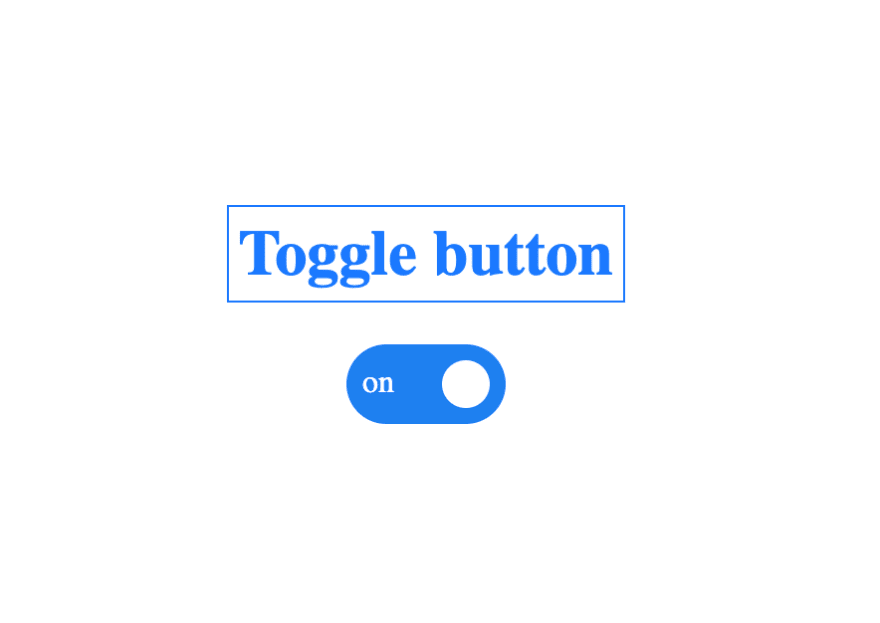
In this tutorial I'll try to show you how you can build a toggle button using only HTML and CSS.
Ready?
1.HTML
 <div class="toggle-container">
      <input type="checkbox" />
      <div class="slider round"></div>
 </div>
First we need a container where our toggle button is going placed in:
 <div class="toggle-container">
....
</div>
Then we need a input with type checkbox which will be used as a state for our toggle button
<input type="checkbox" />
And the actual slider with the thumb and label for our toggle button.
<div class="slider round"></div>
Done? CSS part coming right now.
2. CSS
First, the container:
.toggle-container {
  position: relative;
  display: inline-block;
  width: 80px;
  height: 40px;
  pointer-events: none;
}
What we did here?
position: relative;
Since we are are going to try to position our slider and thumb like pixel perfect, we need to set the position property to relative on the container and later on use the absolute position for those elements that are positioned relative to the toggle-container class.
display: inline-block;
By default a div it's displayed as a block, we need to fix that by adding display: inline-block and then setting the desired width and height properties.
pointer-events: none;
We are going to set pointer-events to none for all elements that are placed higher than our input because they will steal our pointer events intended to be handled by our input.
Now we need to style our input:
.toggle-container input {
  opacity: 0;
  width: 100%;
  height: 100%;
  pointer-events: all;
}
We need our input to be spread across our container so when we click anywhere inside the container our input will catch those events.
The following will do exactly that:
 ...
  width: 100%;
  height: 100%;
  pointer-events: all;
...
opacity: 0; will hide our input, but it will not remove it from the DOM.
The next thing that we need styled is our slider:
.slider {
  position: absolute;
  top: 0;
  left: 0;
  right: 0;
  bottom: 0;
  cursor: pointer;
  background-color: #808080;
  transition: 0.4s;
  pointer-events: none;
}
Our slider need to be spread throughout the container:
  position: absolute;
  top: 0;
  left: 0;
  right: 0;
  bottom: 0;
The next css properties will help us set the background color and also add a transition of 0.4 seconds for all of slider properties that gets changed during its lifetime.
  cursor: pointer;
  background-color: #808080;
  transition: 0.4s;
  pointer-events: none;
Adding the thumb using ::before pseudo-element
.slider::before {
  content: "";
  position: absolute;
  height: 24px;
  width: 24px;
  left: 8px;
  bottom: 8px;
  background-color: #fff;
  transition: 0.2s;
  pointer-events: none;
}
::before and ::after pseudo-elements can be used in various ways to add content before and after an element. They will not work with replaced elements such as inputs and image HTML elements.
In order to finish our thumb we first need to set a width: 24px; and
a height: 24px; and then position: absolute; using bottom: 8px; and
left: 8px;.
transition: 0.2s; needs to be added because we would like a smooth animation when the position of the thumb gets changed.
For our 'ON'/'OFF' labels we are going to use the ::after pseudo-element
.slider::after {
  position: absolute;
  content: "off";
  height: 24px;
  width: 24px;
  right: 10px;
  bottom: 6px;
  transition: 0.2s;
  pointer-events: none;
  color: #fff;
}
::after it's pretty similar to what we've done so far for our thumb using ::before pseudo-element.
Final part: When our input is clicked we need to change some CSS
Slider background color when we click anywhere in the container.
input:checked + .slider {
  background-color: #2196f3;
}
Using :checked pseudo class helps us determin when the input gets clicked and based on that we're going to use the adjacent sibling selector + and change our slider background color to #2196f3.
Move the thumb by some pixels:
input:checked + .slider:before {
  transform: translateX(40px);
}
Using transform property set to translateX(40px) we're able to move our thumbnail and because we've set the transition on '0.2s' we're going to see a smooth translation by 40px.
Now we have to add the 'on' label when our checkbox gets clicked
input:checked + .slider:after {
  content: "on";
  left: 8px;
}
And we're pretty done, just one more step:
Add rounded corners for both the slider and the thumb:
.slider.round {
  border-radius: 34px;
}

.slider.round:before {
  border-radius: 50%;
}
Enjoy!
Hope you liked this tutorial.

Top comments (0)