As people that build software, we've all been in that 'flow' state; completely immersed in an activity, hyper-focused, and super-productive.
When we're designing our software, we need to consider the interactions we ask the user to perform in the context of the wider user experience - maintaining the user's 'flow'..
Don't make me switch pages
Switching from one page to another is one of the worst offenders for breaking flow.
Even if the page loads quickly and the user doesn't have to wait, they have to re-build their mental model and figure out what they need to do on a whole new page.
This might not feel like a big deal, but this context switch has a very negative effect on a user's experience.
Rule of thumb: Don't make the user switch to another page unless the context is also changing
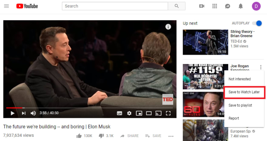
Example: YouTube's 'Save to watch later' is a good example of this. When you're watching a video and see something 'Up next' that interests you, you can add it to a list without leaving the page you are on. Later, when you are actively looking for something new to watch (you're now in a different 'context'), you can navigate to a new page that shows you that list.
Don't make me change my input device
As a developer, my main input device is the keyboard. When I'm writing code, switching to the mouse slows me down and breaks my flow. I like everything to be accessible using keyboard shortcuts.
For example, in the case of TeamTools, the user needs to be able to open the search modal, search for a code snippet and insert it into their code entirely with the keyboard.
You can use the mouse if you prefer, but forcing the user to switch to the mouse when they were typing is enough friction that it's likely nobody would use it at all.
Rule of thumb: Try to stick to a consistent input device throughout a given interaction
Example: Despite not being great for flow in general, Slack gets this right. When you're typing a message and want to add an emoji, you don't need the mouse at all. Emojis can be added by typing :. That brings up a list where you can continue typing to filter the list, then use the arrow keys (or the mouse, if you prefer) to pick one. The entire 'send a message' interaction can be executed entirely with the keyboard.
Don't show me a notification unless it's urgent
This is why chat tools can be a productivity killer.
By default, you'll usually get notifications any time you're mentioned. Not only that, but they encourage the behaviour of @mentioning the whole channel to make sure somebody replies - otherwise the message scrolls away and might never be answered.
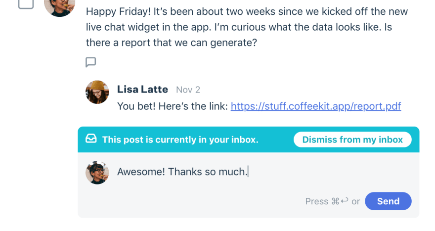
If you are going to pop up a notification or show a 'toast' message, only do it when it requires the user's input now. Otherwise, a small (1) notification that the user can visit when they're not in 'flow' is generally fine.
Rule of thumb: Don't interrupt a user with notifications unless it needs their attention immediately.
Example: Level is a communication tool designed around this premise. Instead of encouraging distracting notifications, non-urgent conversations are kept safe for users to view in their own time.
When to break flow on purpose
Sometimes an action has serious enough consequences that you need to force the user to stop and think.
It's easy to be clicking around and do something accidentally, so sometimes doing the opposite of one of the 'rules of thumb' above is useful to break the user's flow, force them to stop and think, and save them from making a costly error.
Rule of thumb: Break a users flow deliberately when the consequence of an action requires more deliberate thought
Example: When deleting a repository in GitHub, a click isn't enough. You're probably using the mouse at this point, but are forced to stop and type the name of the repository before it can be deleted (see 'don't make me change my input device'). Just showing a confirmation dialog that required another mouse click probably wouldn't prevent a distracted user from accidentally deleting the wrong repository.
Conclusion
Building for flow needs to be a deliberate thought process from the outset, it's very difficult to retrofit later when something doesn't 'feel' right. At every point during the design and build process we need to be mentally checking off the things on this list.
Finally, there's no substitute for getting things in front of the user and watching somebody use it for real.
This was originally written for the TeamTools blog. TeamTools is a Visual Studio plugin designed to keep your team in flow! Feel free to take a look and let me know your thoughts 😊


Top comments (0)