
Did you know that color psychology has a tremendous impact on your branding and marketing efforts? This concept is highly debated and discussed for a long time.
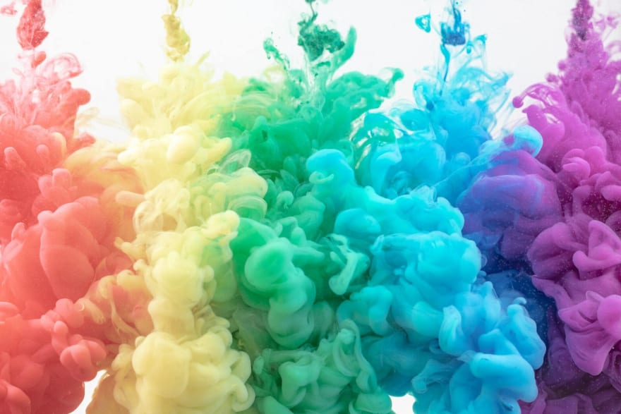
Colors and emotions are closely knit in terms of impact. Colors can certainly make us feel happy, or sad, and they make us feel hungry or relaxed. The reactions we have to colors stem from psychological effects and biological conditioning. The way in which an individual perceives a certain color is also framed by cultural appropriations.
When it comes to branding, your product will be seen by customers through the kind of marketing that you do. The marketing would usually involve heavy visuals in the form of logos, graphics, design or flyer maker. Since they will be viewed by masses and perceived by them in their individual contexts, paying attention to color detail is very important.
You should be able to make a choice of color to convey the right message through your branding efforts. However, you will have to educate yourself on the significance of colors in branding and what these colors convey to your audience before making a choice.
Understanding the basics of colors
There are multiple models and systems to understand colors but we will particularly focus on the most popular one i.e. the color wheel. The very first color wheel was designed by Sir Isaac Newton and artists use it to develop color harmonies, mixing, and palettes till date.
As per the wheel, the following categories of colors exist:
Primary colors – red, yellow, blue
Secondary colors – green, orange, purple
Tertiary colors – these are colors made by combining primary and secondary colors like blue-green, or red-violet.
There is also the separation of warm colors from the cool ones. The warmer tones include reds, oranges, and yellows. The cool tones have blues, greens, and purples in their stride.
How different colors would make you feel
Colors are a very powerful medium of communication in any aspect. These can be instrumental in instigating an action, influencing moods, and even spur psychological reactions.
The emotions spurred by warm colors can be different than that of cool colors. Bright colors are capable of creating feelings that are different from what muted colors can create.
People have a certain kind of universal reaction to any specific color. That is why it is important to understand the psychological effects of different colors on people and pair it with your branding efforts.
Let us see how different colors can affect how you feel:
Red
Red is the warmest, most dynamic color. It symbolizes energy and passion. This color is quite often associated with passion and love, as well as anger and danger. Your heart rate might pace up and you might get excited when you come into visual contact with Red.
Therefore, if your aim is to draw user attention to a specific element, use the color Red. Keep in mind that it should be used in moderation since it can get pretty overwhelming if used in high proportions.
Orange
Just like the color Red, Orange is capable of drawing attention but is not as powerful or overwhelming. This color would make you feel enthusiastic and energized. There is a sense of happiness and vitality attested to it. There is aggression but also balance, it can be energetic yet friendly. This color works perfectly well for a call to action icon or subscribe icon.
Yellow
This is hands down the most energetic amongst the warm color family. Yellow will evoke a feeling of happiness and spontaneity. This is a sense of laughter, sunshine, and hope.
When inculcated in design, Yellow accents will bring an influx of energy and optimism. You should be careful while deciding its proportion though because it reflects light heavily and can be too much for a person's eyes. The color should grab attention in an energetic yet a comforting manner.
Green
The color Green is all about good things like health, wealth, and new beginnings. It is bound to make you feel optimistic and refreshed. Green delivers a sense of relaxation and goes easy on the eyes. So, you should use it to create balance in your design. If your brand wants to communicate growth, security, and hope, green is your color.
Blue
Blue, the bad boy of colors!
Just kidding, Blue is actually a really well behaved member of the color family. It inspires feelings of calmness and spirituality paired with trust and security. When you see Blue, you will feel safe and relaxed because your body will immediately release chemicals that are calming in nature.
Hence, the most loved member of the family!
Be careful not to use too much dark blue in your corporate designs because that comes off as cold and detached. Lighter shades of Blue are always more friendly and approachable.
Purple
Want to get your creative juices flowing? Get Purple!
This color is mysterious, creative, royal and wealthy when thought of. Lighter shades of Purple will render a soothing and a calming effect to the viewer. The color is best used in beauty products for that reason.
Pink
Nothing gets more playful than the way Pink does! It is sensitive and tender, and it symbolizes femininity as well as romance. Pink is just meant to be sweet, cute and charming, just all things nice.
Brown
The color Brown is super grounded in its aura. It will deliver a sense of support and stability. It is warm, friendly, trustable, and practical. Brown is sometimes used to represent the vintage.
Black
Perhaps the most intimidating color, Black is all about elegance, luxury, and power. At the same time, it can also convey simplicity, professionalism, and neutrality. Black is bold and it feels mysterious. You should note that in some cultures Black is a denotation of sadness or mourning.
White
White is the most straightforward color. It translates into simplicity and minimalism. When you use a significant amount of this color, your design will look clean, simple, and fresh. It is the most neutral in the color family.
Gray
If you want to go with something that is a little more mature or responsible, Gray would be the choice to make. It feels professional and serious. Gray has two areas of connotations. The positive side conveys formality and dependability whereas the negative side can translate an attitude that lacks emotion, is conventional, or conservative.
How Do Colors Affect Branding
According to the concept of associative learning, we have certain perceptions towards the colors we see as we grow into adults. It is human tendency to associate colors with things.
When you design branding for your company, you must know that it is not just limited to the color or fonts of what you present. It is about how your viewers feel after receiving your presentation. It is about what emotion your brand conveys. Your color combinations should represent your look and personality. They should speak volumes about what your brand stands for.
Think of brands like Tiffany’s, Coca-Cola or Cadbury, we would immediately know these by seeing their signature colors. We would get a rush of emotions when we hear about them or see their logos. These brands have managed to associate their logo’s color with their identity and personality flawlessly.
Big brands invest heavy sums into research on how their branding impacts their consumers. They can also afford to find out which color works the best for their brand by conducting extensive research. However, if yours is a small business, you certainly cannot afford to do that. Therefore, you must focus on how your consumers feel about your brand over time when you give them different design options to choose from. The ultimate goal is to develop a connection with your audience.
How to build perfect color combinations for your brand
There is no definite way to crack your brand’s color scheme. Brand identity can be an abstract concept and to restrict it to certain principles would be impractical.
A little guidance goes a long way here because selecting a color scheme for your brand can be confusing and scary. We have enlisted steps that you can follow for a seamlessly color scheming process:
Think of going with 3 colors
The three colors will include your base, accent, and neutral. Any color scheme for a brand would usually include between 1 to 4 colors. This can be different for different types of brands of course. However, even monochromatic schemes would need some kind of variation in hues.Select your base color
The color that you go with for your scheme’s base should be a tell-all about your brand’s dominant personality trait. The value that you want to put across the most should translate through your base color. It should also appeal to the target audience. All the other tones should be selected in accordance with the base tone.Select the accent for your scheme
This is where the process gets a little tricky. Choosing a color to support your base color is a little difficult because this will be the tone that you use the most after your base tone. This color should match with your brand’s personality trait and at the same time pair perfectly well with your base color visually.Selecting a neutral
The neutral tones would most likely be added to prevent attention and can be different hues of gray, whites or off-whites, and beige. The neutral color chosen by you will mostly be the background color.
Common color schemes that brands can use
All the colors that you choose for your branding should be in sync with your chosen color scheme. Here are the most common color schemes that your brand can use:
Complementary
The colors that are opposite to each other on the color wheel are complementary in nature. They bring out the best in each other and therefore when combined, they look stellar. Using complementary color schemes is a great idea for dynamic or stimulating visuals.
Monochromatic
This scheme would be perfect when your brand wants to highlight a single personality trait. This is especially good for brands that don’t want to go overboard with their designs. It is also tricky to maintain the differentiation in the color hues in a monochrome setting.
Triadic
This branding color scheme is stable but it has the ability to offer a more stimulating variety. All the three colors should be in sync with the traits of your brand’s personality.
Analogous
This scheme entails colors that are next to each other on the color wheel. They are harmonious and tend to have similar emotional effects. If you want to play it safe and are not looking to draw attention or stand out, analogous themes would be great for you.
Final thoughts
This article would give you a pretty clear idea about how colors matter when it comes to branding. Different colors represent different emotions and personalities. The color scheme chosen by your brand will decide how your website, logo, advertisements, and physical stores look.
It does not matter if you are an established firm or a small business owner. If you are serious about creating a brand that is going to survive in the long run, you will have to focus on the colors that you choose for your branding.
There is no definite guideline or framework that you can follow for choosing the best colors for your brand designs. This blog can educate you on how the colors work with each other and the types of schemes that you can go for. But the final decision should always consider your gut feeling. Your aim should be to build an emotional connection with your audience and your colors should do exactly that.
Did you know there is one more factor that can ensure the success of your branding efforts? Social media automation! When you choose to automate your social media marketing activities, you sign yourself up for success with your content marketing.

Top comments (2)
wow
loved it, thanks for sharing